Sing Sing 首页以陶土色画布、条纹图形和精简的工作室介绍构成鲜明视觉。醒目的品牌字样、克制的字体与鲜活的项目影像,让页面呈现出艺术指导工作室作品集的气质。
North star · Let a warm, uninterrupted canvas and one strong graphic gesture frame spacious, art-directed imagery and concise studio content.
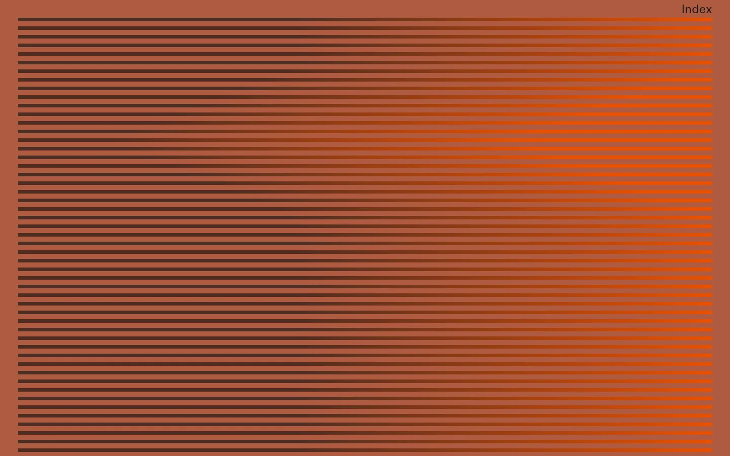
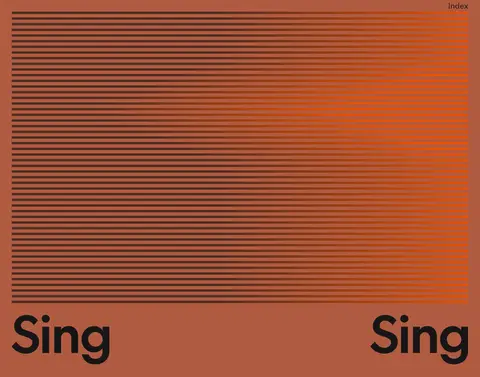
The visual identity is built around a single warm terracotta canvas, #b05b41, which fills the page rather than dividing it into conventional cards or bands. A fine horizontal stripe field creates a dense, dark-to-orange gradient gesture near the top; its brown and vivid orange tones are graphic accents, not a replacement for the page’s dominant background. Near-black #171717 carries the wordmark, navigation, and reading text. Typography contrasts a clean, contemporary sans for display and navigation with a more literary serif for studio prose. The layout uses broad open areas and deliberately unusual placement: the wordmark repeats across the width, while a large project image and compact introduction sit apart from one another. Project photography is vivid and art-directed, adding luminous orange and red against the quiet flat canvas. Spacing feels generous and the overall composition favors visual rhythm over conventional boxed content.
配色
点色块复制色值。用途说明来自对页面的实测位置(背景、文字、描边、按钮)与截图判读。
品牌色
强调色
中性色
页面底色 · Studio Terracotta主文字 · Soft Ink强调 · Studio Terracotta强调 2 · Signal Orange
Large Sing Sing wordmark in the lower introductory area.
The quick brown fox 敏捷的狐狸
23.5px
400
1
-0.025em
正文
Serif studio description and compact supporting text.
The quick brown fox 敏捷的狐狸
19.5px
400
1.2
0
导航
Index navigation label at the upper-right edge.
The quick brown fox 敏捷的狐狸
23.5px
400
1
-0.025em
链接
More link beneath the studio introduction.
The quick brown fox 敏捷的狐狸
22.5px
400
1.22
-0.02em
间距与布局
基准单位 1px · 密度:适中
59px版块间距
—元素间距
—卡片内边距
1370px内容最大宽度
5px
7px
35px
The page reads as one broad, single-column canvas rather than a card grid. A stripe graphic spans nearly the full content width near the top, with the Index link aligned to the upper right. Below, the wordmark repeats across the page width; project imagery sits to the left and a compact text block is positioned separately to the right. The measured maximum width is 1370px. Comfortable spacing and a measured section gap of 59px support the deliberately open composition.
圆角与层次
没有测到阴影:页面是扁平的,层次靠底色和描边区分。
The composition is predominantly flat: the terracotta canvas runs continuously behind text and media, with no measured shadows or card surfaces. Avoid adding depth through generic UI treatments. Separate elements through position, whitespace, image composition, and the thin horizontal stripe pattern rather than borders or rounded containers.
组件
下面的预览按实测的按钮、输入框、徽标、卡片样式重建(字体用替代字体)。
Index navigation
A small, near-black “Index” label sits at the upper-right edge of the canvas; keep it visually quiet beside the large graphic.
Stripe graphic
A wide field of closely repeated horizontal bands transitions from #4d2d22 toward #eb5100 over the terracotta canvas.
Wordmark
Large near-black “Sing” lettering is repeated across the width below the stripe field, using the clean sans display face.
Featured project image
A vivid rectangular project image provides a strong visual anchor, with saturated orange light and sculptural forms.
Studio introduction
A restrained serif text block sits separately from the image, followed by a near-black sans “More” link.
Footer note
Small, understated studio/contact information rests on the same flat terracotta canvas.
Imagery · The homepage combines a graphic stripe field with vivid, art-directed project media. A featured image shows a sculptural, illuminated circular form and geometric architecture in saturated orange and red. Imagery is presented as a prominent rectangular composition rather than enclosed in a bordered card; the stripe gradient acts as graphic artwork. The broader studio portfolio includes film and photography, so preserve a cinematic, image-led sensibility.
Keep the stripe gradient a prominent, graphic gesture.
Set navigation and display lettering in the clean sans.
Use the serif sparingly for studio prose.
Pair bold project imagery with quiet surrounding space.
Keep links and wordmarks near-black and unboxed.
✕ 不该做
Do not introduce unmeasured colors or generic neutral surfaces.
Do not turn the page into a conventional card grid.
Do not add shadows, borders, or rounded card treatments.
Do not let bright orange replace the terracotta canvas.
Do not crowd the imagery with dense supporting copy.
Do not use a single typeface for every content role.
给 AI 的提示词
想快速出一个同风格的新页面,把这段话连同 DESIGN.md 一起发给 AI。
Build a new creative-studio page in Sing Sing’s visual language. Use Studio Terracotta (#b05b41) as a continuous canvas and Soft Ink (#171717) for navigation, display text, and links. Create one confident horizontal stripe graphic transitioning from Roasted Umber (#4d2d22) to Signal Orange (#eb5100); treat these as graphic accents, not broad UI surfaces. Use a clean sans similar to DM Sans for wordmarks and navigation, paired with a restrained literary serif similar to Newsreader for prose. Favor broad open composition, deliberate off-center placement, and large art-directed project imagery. Keep components flat and unboxed, with no shadows or rounded cards. Make the content feel like a studio portfolio: concise introduction, a clear project image, and quiet contact or navigation details.