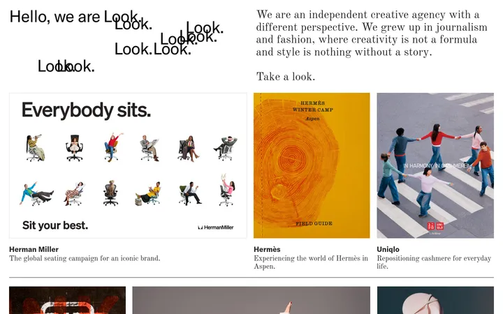
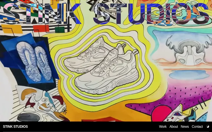
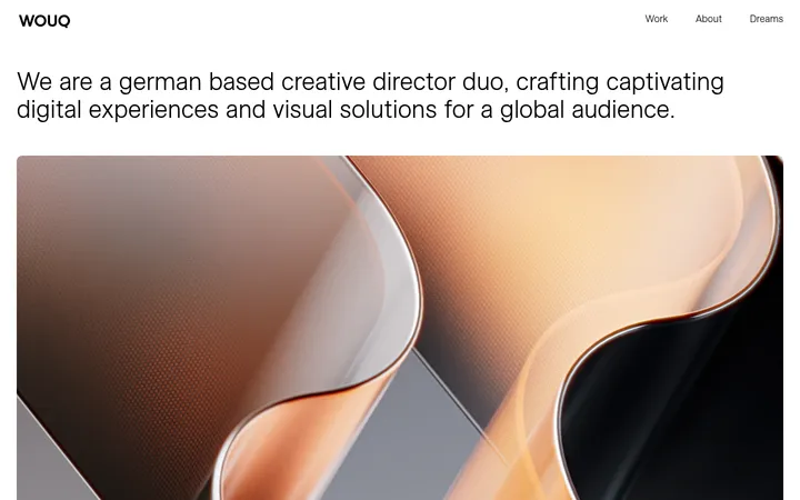
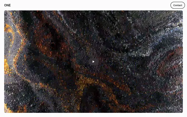
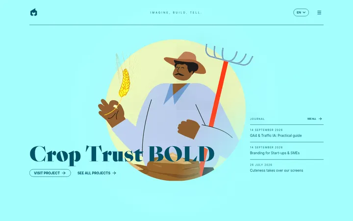
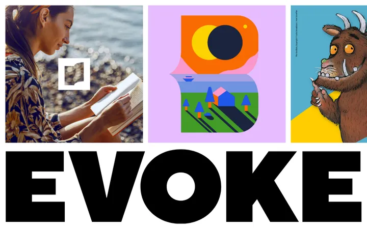
North star · Keep the interface quiet and spacious so expressive, full-bleed project imagery carries the visual impact.
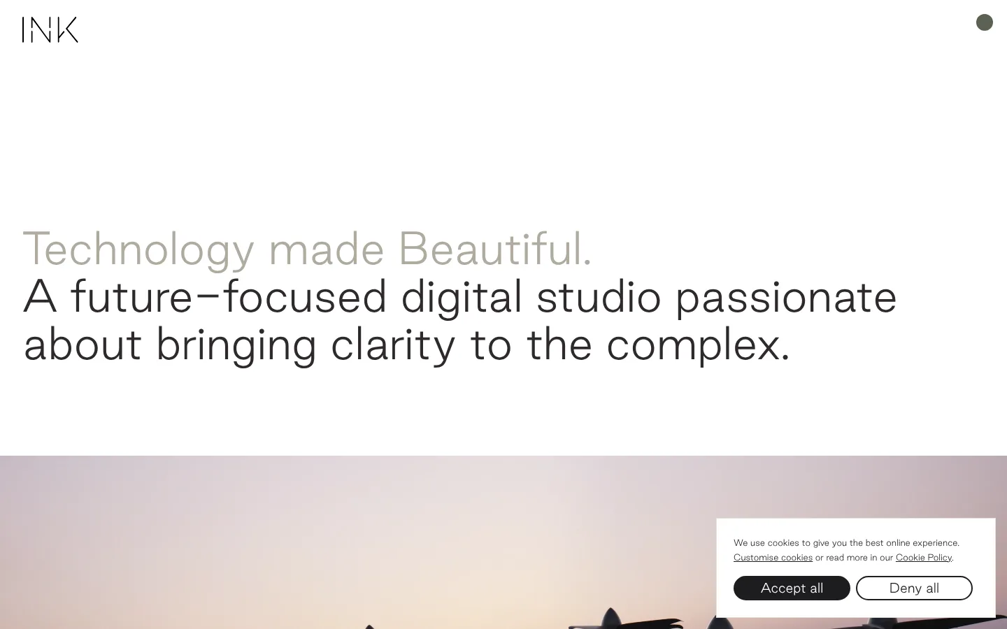
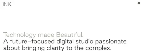
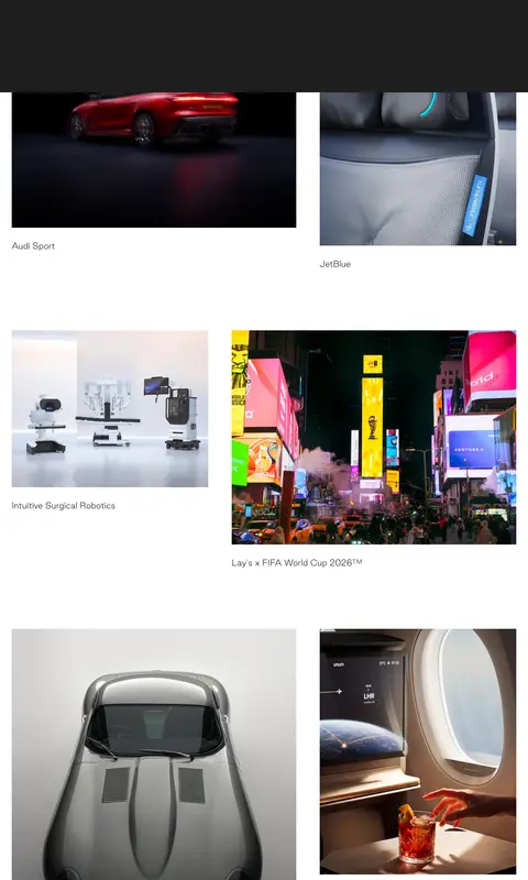
The page uses white as its primary canvas, keeping the header and opening statement exceptionally quiet. Near-black text gives the main message contrast, while a softer warm grey distinguishes the introductory phrase. Good Sans is used in a light, unembellished manner: the large display statement has open line spacing and no tracked-out capitals, with smaller, understated project labels. The layout moves from a spacious, left-aligned hero into a full-bleed video, then a long portfolio feed with alternating image widths and generous gaps. Project imagery supplies saturated colour; bright blue and other measured accent hues appear in project or feature bands rather than defining the overall canvas. Cards remain flat, without shadows or rounded corners, and fine warm-grey rules provide the principal border treatment. The result is a calm frame for cinematic, varied work.
配色
点色块复制色值。用途说明来自对页面的实测位置(背景、文字、描边、按钮)与截图判读。
品牌色
强调色
表层色
中性色
页面底色 · Gallery White表层 · Slate Blue表层 2 · Pale Sky表层 3 · Studio Ink表层 4 · Warm Hairline主文字 · Studio Ink次要文字 · Gallery White描边 · Warm Hairline强调 · Signal Coral强调 2 · Electric Blue强调 3 · Bright Teal
文字
背景
对比度
WCAG
#1d1d20 Studio Ink
#ffffff Gallery White
16.82:1
AAA
#1d1d20 Studio Ink
#44687e Slate Blue
2.82:1
不达标
#1d1d20 Studio Ink
#b6d0e2 Pale Sky
10.5:1
AAA
#ffffff Gallery White
#44687e Slate Blue
5.95:1
AA
#ffffff Gallery White
#b6d0e2 Pale Sky
1.6:1
不达标
#ffffff Gallery White
#1d1d20 Studio Ink
16.82:1
AAA
字体
字号阶梯:Custom(比例约 1.826,正文 18px)。示例用免费替代字体渲染,数值为实测。
Aa 设计
Good Sans
网络字体 · 字重 400 · 占比 100%
免费替代:Manrope
Display statement, body copy, navigation, project labels, links, and cookie controls.
角色
示例
字号
字重
行高
字距
特大标题
Oversized opening statement and major display copy.
INK
60px
400
1.14
0
一级标题
Supporting introductory heading or compact page-level heading.
The quick brown fox 敏捷的狐狸
22px
400
1.6
0
正文
General explanatory text and longer content.
The quick brown fox 敏捷的狐狸
18px
400
1.75
0
辅助文字
Small project captions and cookie-consent copy.
The quick brown fox 敏捷的狐狸
12px
400
1.75
0
按钮
Cookie-consent action labels.
The quick brown fox 敏捷的狐狸
18px
400
1.75
0
导航
Large full-screen menu links when navigation is opened.
INK
60px
400
1.25
0
链接
Small utility and inline links.
The quick brown fox 敏捷的狐狸
12px
400
1.75
0
间距与布局
基准单位 8px · 密度:宽松
256px版块间距
16px元素间距
24px卡片内边距
1376px内容最大宽度
3px
8px
16px
24px
32px
64px
160px
The desktop canvas is capped at the measured 1376px page width, with a spacious left-aligned hero and a simple header. The page unfolds in large vertical beats: introduction, full-bleed video, a coloured project feature, then a long portfolio feed. Portfolio entries use an asymmetric two-column rhythm, varying image proportions and alternating visual weight. The measured spacing system is generous, with a 256px section gap and 16px element gap; preserve ample white around captions and imagery rather than compressing the feed.
圆角与层次
按钮 · 9999px
导航 · 50%
没有测到阴影:页面是扁平的,层次靠底色和描边区分。
The visual language is predominantly flat: no measured shadows or gradients. Separate content through whitespace and occasional fine warm-grey borders, not raised cards. The cookie panel is a plain white rectangle with a subtle border; its dark pill button supplies a small, clear focal point. Full-bleed media and solid section bands create depth through contrast, not layered effects.
组件
下面的预览按实测的按钮、输入框、徽标、卡片样式重建(字体用替代字体)。
Header
Minimal white header with the INK wordmark at the left and a compact circular menu control at the right.
Introductory hero
Large left-aligned Good Sans statement on white, with a muted first phrase followed by dark supporting copy.
Full-bleed project media
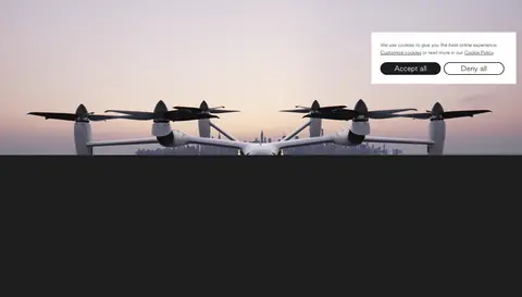
Wide video-led section that transitions from the white introduction into immersive project imagery.
Project feature band
A distinct coloured project section, including the measured blue Joby Aviation feature.
Portfolio feed
Long-form project gallery with varied image sizes, asymmetric two-column positioning, and small captions.
Cookie consent panel
White bordered panel with compact copy, underlined policy links, a dark filled Accept all pill, and outlined Deny all pill.
Imagery · Use cinematic, full-bleed video for the opening project transition, then a varied portfolio of high-quality project photography and rendered product imagery. Images span automotive, aviation, technology, sport, and brand campaigns. Crop each image with deliberate subject framing and let its native colours remain vivid; captions are small and restrained. The imagery, rather than decorative UI, brings colour and texture to the otherwise quiet page.
Use Good Sans or a close, regular-weight geometric substitute.
Set introductory copy large, left aligned, and generously spaced.
Give video and project imagery room to dominate.
Vary portfolio image widths while preserving an orderly two-column rhythm.
Reserve accent colours for specific project or section bands.
Use small restrained captions and thin borders where needed.
✕ 不该做
Do not fill the page with persistent bright accent colours.
Do not add heavy shadows or gradient effects.
Do not put every project into identical rounded cards.
Do not center the hero copy or crowd it with controls.
Do not overpower project captions with display typography.
Do not treat colours inside project imagery as global interface colours.
给 AI 的提示词
想快速出一个同风格的新页面,把这段话连同 DESIGN.md 一起发给 AI。
Build a new agency page in INK’s restrained portfolio style. Use Gallery White (#ffffff) as the dominant canvas, Studio Ink (#1d1d20) for primary text, Soft Charcoal (#2e2a2b) for navigation, and Warm Hairline (#e4e1d7) for fine borders. Use regular-weight Good Sans or Manrope, with a large left-aligned opening statement and generous line spacing. Organize the page as spacious editorial sections, followed by immersive media and a long asymmetric two-column project gallery. Let project photography supply most colour; use measured accents such as Electric Blue (#007ae6) only for contextual project bands. Keep cards flat, captions small, and section spacing generous. Avoid gradients, heavy shadows, uniform rounded-card grids, and decorative interface clutter.