North star · Keep a charcoal editorial canvas, use coral and blue as selective signals, and let real product UI carry the technical story.
The page is built on a near-black, charcoal-toned canvas, with darker inset surfaces and restrained hairlines separating dense content without turning the layout into a stack of boxed cards. White headlines carry the message; muted grays handle supporting copy, while coral red gives the announcement strip, eyebrow labels, and primary calls to action a distinctive signal. Electric blue appears in select feature and comparison moments, including prominent illustrated sections, rather than as a general-purpose UI color. Whyte display faces give headings a geometric, editorial character, while CircularXX keeps paragraphs approachable. WhyteMonoV1 supplies uppercase navigation, labels, and buttons, reinforcing the developer-tool context. The long page alternates large headline-led bands with code, dashboard screenshots, testimonials, feature grids, and a split comparison. Broad breathing room around these blocks contrasts with compact, information-dense product visuals; thin rules and restrained borders preserve a technical, low-gloss mood.
配色
点色块复制色值。用途说明来自对页面的实测位置(背景、文字、描边、按钮)与截图判读。
品牌色
强调色
表层色
中性色
功能色
页面底色 · Charcoal Canvas表层 · Deep Soot表层 2 · Graphite Surface主文字 · Signal White次要文字 · Soft Ash弱文字 · Code Gray描边 · Divider Gray强调 · Signal Coral强调 2 · Electric Blue
Oversized uppercase editorial hero display, including outlined emphasis.
Inngest
72px
400
0.95
-0.02em
一级标题
Primary page and section headings.
Inngest
64px
400
1.25
-0.035em
二级标题
Major feature, testimonial, and content-section headings.
Inngest
43px
400
1.1
-0.02em
三级标题
Feature titles and secondary content headings.
Inngest
40px
400
1.25
-0.01em
四级标题
Compact subheadings within cards and content blocks.
Inngest
32px
400
1
0
正文
Readable explanatory paragraphs and feature descriptions.
The quick brown fox 敏捷的狐狸
18px
400
1.5
-0.01em
辅助文字
Supporting copy, product labels, and secondary interface text.
The quick brown fox 敏捷的狐狸
16px
400
1.5
-0.01em
按钮
Uppercase CTA text in compact mono styling.
The quick brown fox 敏捷的狐狸
12px
600
1.5
0.067em
导航
Uppercase primary navigation labels.
The quick brown fox 敏捷的狐狸
12px
600
1
0.067em
链接
Compact uppercase calls to action and documentation links.
The quick brown fox 敏捷的狐狸
12px
600
1.5
0.067em
眉题
Uppercase section labels and hero category text.
The quick brown fox 敏捷的狐狸
16px
400
1
0.05em
代码
Monospaced code examples and technical snippets.
const style = 1;
13px
400
1.54
0
间距与布局
基准单位 4px · 密度:适中
32px版块间距
16px元素间距
10px卡片内边距
1376px内容最大宽度
1px
4px
5px
6px
8px
10px
12px
16px
20px
24px
32px
48px
64px
160px
Use a wide, centered content frame with a measured maximum width of 1376px. The opening hero is a two-column composition, balancing left-aligned headline and copy against code imagery. The full page runs as a long, single-column sequence of distinct section bands, with internal grids for features, testimonials, and footer navigation. Measured spacing uses a 4px base unit, comfortable density, and broad section breathing room; keep text and product visuals aligned to clear columns rather than centering every block.
圆角与层次
按钮 · 6px
卡片 · 8px
链接 · 6px
hairline · other
inset · button, link
inset · card
inset · card
Keep the page mostly flat: dark tonal changes, hairline borders, and outlined controls do more work than drop shadows. Use modestly rounded controls and cards, with stronger contrast reserved for selected media frames and highlighted feature areas. Product screens can sit as visibly layered images over a section band; avoid adding decorative elevation to ordinary content.
组件
下面的预览按实测的按钮、输入框、徽标、卡片样式重建(字体用替代字体)。
Announcement strip
Full-width coral band at the top with a centered, underlined video announcement link.
Hero and code visual
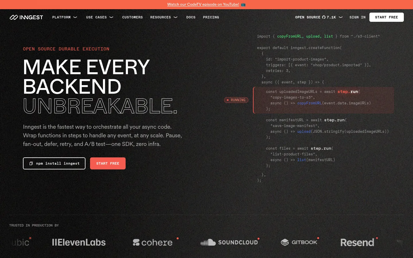
Left-aligned uppercase eyebrow, oversized multi-line headline, body copy, and paired install and coral start-free controls beside a dim code example.
Primary CTA button
Compact uppercase WhyteMonoV1 label; the primary variant uses #f65c4f with white text, while secondary actions use a white surface.
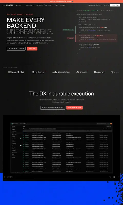
Product media panel
Wide, dark-framed dashboard video or screenshot; keep interface detail legible and avoid brightening the surrounding page.
Feature narrative
Editorial heading and supporting copy paired with screenshots, or arranged in compact multi-column feature groups.
Before-and-after comparison
Side-by-side dark and #013cf6 illustrative states with thin white framing and concise labels.
Customer story
Portrait, customer marks, quote, attribution, and restrained case-study controls on a dark background.
Footer link groups
Several compact link columns on charcoal with an operational-status control and subtle decorative background texture.
Imagery · Favor real product-interface screenshots and video frames showing dashboards, charts, workflow runs, and code. Place these in dark media panels against the charcoal canvas, often as wide crops or paired with adjacent text. The hero uses a code-led visual rather than lifestyle photography. Customer portraits appear sparingly with a monochrome, grainy treatment. Illustrative comparison and feature bands can use bold electric blue, but should remain distinct from the neutral product UI.
Reserve #f65c4f for clear actions and highlighted labels.
Use #013cf6 selectively for expressive feature moments.
Pair Whyte-style headings with CircularXX body copy.
Set navigation and CTA labels in tracked uppercase mono.
Show authentic code and product-interface visuals.
Separate long-form sections with tonal shifts and hairlines.
✕ 不该做
Do not turn every section into a raised card.
Do not use coral or electric blue as large default surfaces throughout.
Do not add unmeasured color values or ornamental gradients.
Do not center all copy; preserve editorial left alignment.
Do not let product screenshots overwhelm the page hierarchy.
Do not use generic lifestyle imagery in place of product UI.
给 AI 的提示词
想快速出一个同风格的新页面,把这段话连同 DESIGN.md 一起发给 AI。
Build a new Inngest-style developer-tool page on a #1c1c1c Charcoal Canvas, using #0c0a09 Deep Soot and #212121 Graphite Surface for restrained tonal layering. Set major headings in a geometric Whyte-like sans, body copy in a readable CircularXX-like sans, and compact uppercase navigation and actions in a tracked mono. Use #ffffff Signal White for primary contrast, #b3b3b3 Soft Ash for supporting copy, and #f65c4f Signal Coral for the main CTA and selective labels. Bring in #013cf6 Electric Blue only for a prominent feature or comparison moment. Build a clear editorial grid with left-aligned copy, real code or dashboard media, spacious section transitions, and thin borders. Keep elevation minimal, avoid generic imagery, and make product visuals the evidence for the story.