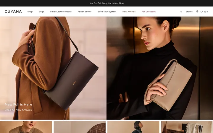
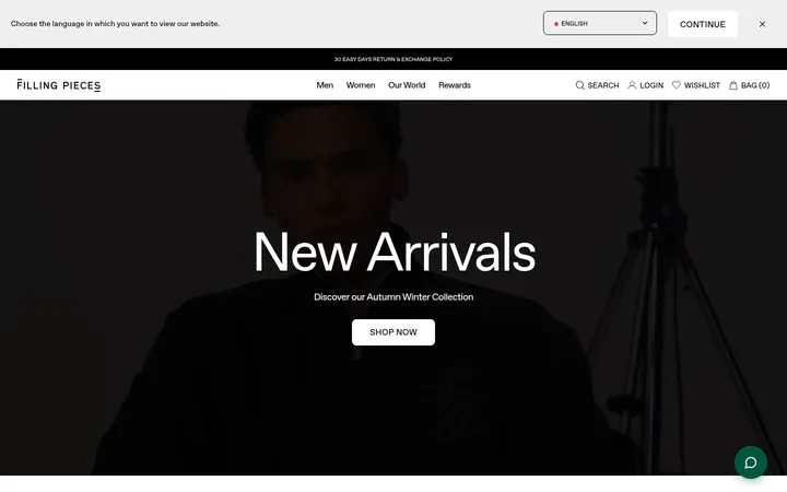
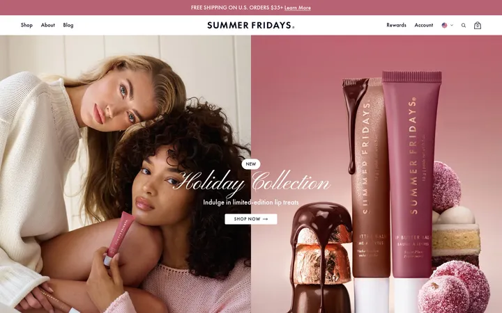
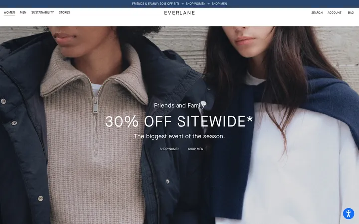
North star · Keep the interface quiet and consistent; let polished product photography and clear shopping structure provide the visual emphasis.
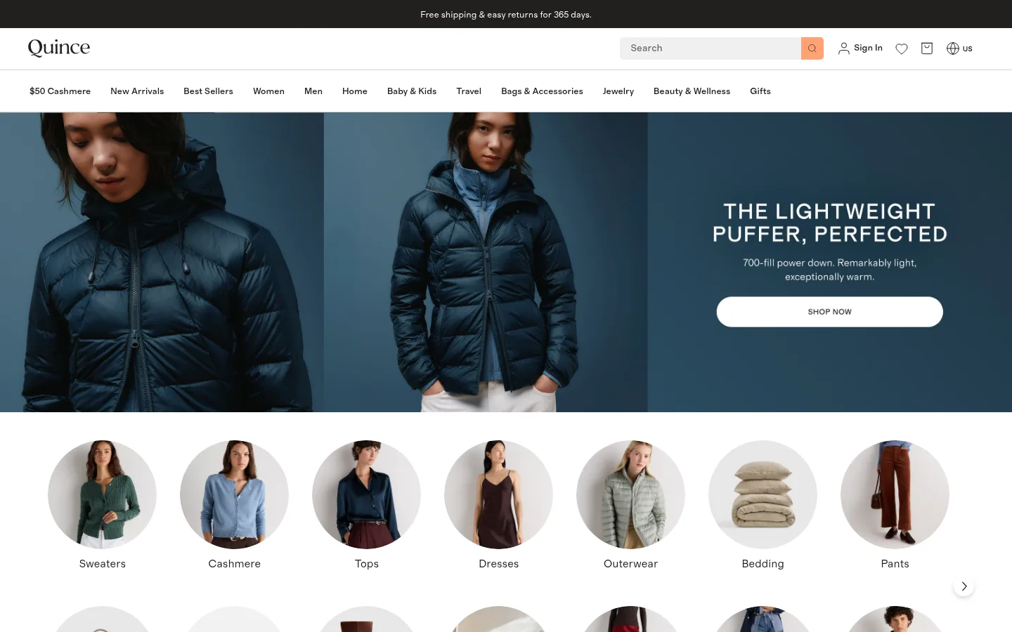
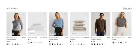
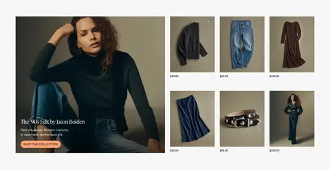
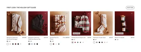
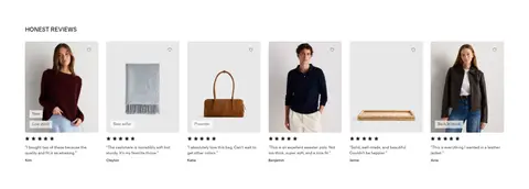
Quince’s visual strategy keeps the storefront quiet so products and campaign photography can lead. White is the dominant canvas, with near-black text, fine gray dividers, and occasional pale gray or warm stone section bands. A restrained peach accent appears on selected calls to action, while the deep slate footer provides the main dark counterpoint. The header layers an announcement strip, wordmark and utility controls, then a compact category navigation row. Editorial campaign panels use large lifestyle images with brief overlaid copy; product areas return to orderly multi-column grids with small titles, prices, ratings, and color swatches. Grosa carries nearly all interface and commerce text in compact, practical styles. Ivy Headline is reserved for a light, elegant display touch. Generous section breaks offset the dense merchandising, while cards remain mostly flat and photography stays crisp, unframed, and central.
Primary storefront typeface for navigation, body copy, product details, buttons, labels, and links.
Aa 设计
ivy-headline
网络字体 · 字重 300 · 占比 3%
免费替代:Cormorant Garamond
Light display face for the principal headline role and occasional editorial wordmark-like emphasis.
角色
示例
字号
字重
行高
字距
一级标题
Light editorial headline in campaign and hero content.
The quick brown fox 敏捷的狐狸
24px
300
1.42
0
正文
Product descriptions, supporting copy, and general storefront text.
The quick brown fox 敏捷的狐狸
13px
400
1.46
0
辅助文字
Small secondary labels and compact supporting details.
The quick brown fox 敏捷的狐狸
11.5px
400
1.46
0
按钮
Uppercase calls to action and shopping controls.
The quick brown fox 敏捷的狐狸
12px
500
1.2
0.05em
导航
Category navigation and concise menu labels.
The quick brown fox 敏捷的狐狸
13px
500
1.23
0
链接
Compact supporting links and secondary actions.
The quick brown fox 敏捷的狐狸
10px
500
1.46
0.061em
眉题
Uppercase section labels above editorial and product modules.
The quick brown fox 敏捷的狐狸
11px
500
1.33
0.05em
间距与布局
基准单位 1px · 密度:适中
72px版块间距
11px元素间距
—卡片内边距
1303px内容最大宽度
1px
2px
5px
7px
8px
10px
11px
12px
14px
22px
50px
155px
A wide, centered storefront uses a measured maximum content width of 1303px, with full-bleed campaign photography at the top. The page alternates horizontal editorial features, category circles, and six-column product grids; a three-column feature area and wider social gallery add variation. The section rhythm is comfortable, with generous separation between major modules, while individual product tiles remain tightly packed. Text and headings align to the start of their content areas, and the footer uses four columns.
圆角与层次
按钮 · 50%
图片 · 50%
导航 · 5px
sm · other, button
md · other
The page is largely flat, relying on white space, image contrast, and fine gray hairlines instead of raised cards. Product tiles have minimal framing and little visible depth. Small utility controls may use restrained shadows, while the header and footer remain clearly differentiated by bands and color rather than layered card treatments.
组件
下面的预览按实测的按钮、输入框、徽标、卡片样式重建(字体用替代字体)。
Store header
Stacked announcement, wordmark and search utilities, then a compact horizontal category navigation row on white.
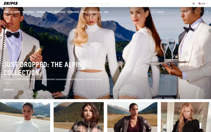
Campaign hero
Full-width fashion imagery with short white overlay copy and a rounded light SHOP NOW action.
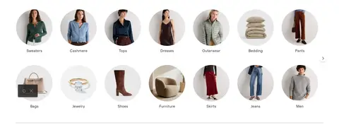
Circular category navigation
A multi-row carousel of circular product or model thumbnails, each with a concise category label.
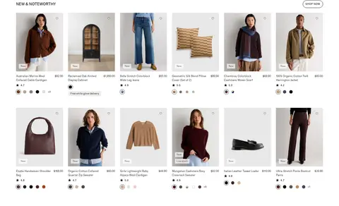
Product grid
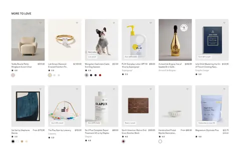
Dense multi-column product tiles with photography, small product names and prices, ratings, color swatches, and occasional badges.
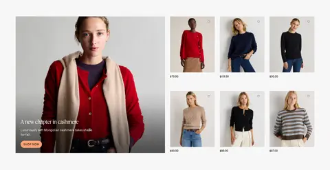
Editorial feature split
Large lifestyle image and overlay text sit beside a compact grid of related merchandise; pale bands separate some features.
Social video gallery
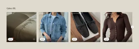
Quince IRL uses a horizontal row of video tiles on a warm stone surface, with small pill-shaped SHOP actions.
Footer and signup
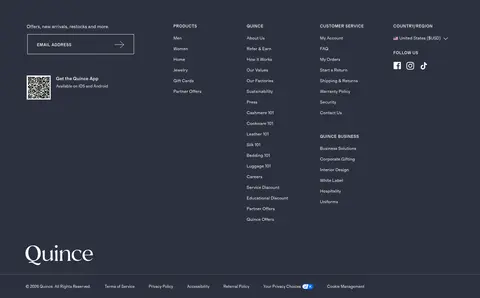
A deep slate footer combines email signup, app promotion, several link columns, social links, and a large wordmark.
Imagery · Photography is the main expressive element: polished apparel and home-product images, models in natural poses, styled interiors, and product cutouts on pale backgrounds. Campaigns use wide lifestyle panels with brief overlay copy; product grids use consistent, isolated product framing. Circular category thumbnails create a distinct browse pattern. The Quince IRL area uses social-style video tiles rather than illustrations or 3D imagery.
Use white as the primary canvas and preserve clear whitespace between major modules.
Let lifestyle and product photography carry the campaign personality.
Keep product grids orderly, with compact titles, prices, ratings, and swatches.
Use peach only for selected calls to action and small highlights.
Reserve the dark slate surface for a distinct, information-rich footer.
Use the serif display face sparingly and keep utility text in the sans-serif.
✕ 不该做
Do not apply bright accent colors broadly across the storefront.
Do not turn every product into a raised or heavily bordered card.
Do not let campaign copy overwhelm the photography.
Do not use oversized or decorative typography for routine product details.
Do not introduce unrelated gradients or ornamental effects.
Do not compress editorial sections until the page loses its comfortable rhythm.
给 AI 的提示词
想快速出一个同风格的新页面,把这段话连同 DESIGN.md 一起发给 AI。
Build a polished Quince-style ecommerce page with a restrained, editorial storefront feel. Use Gallery White (#ffffff) as the main canvas, Soft Ink (#21201f) for text and navigation, Quiet Divider (#d3d2d2) for fine hairlines, and Peach Signal (#ffa273) only for selected calls to action. Create a stacked store header, a wide lifestyle campaign, circular category browsing, and tidy multi-column product grids. Alternate these with image-led editorial features and a warm Quince IRL-style video gallery. Use compact Grosa-like sans-serif typography for commerce details and a light serif display face only for prominent editorial headings. Keep cards mostly flat, photography crisp, product information easy to scan, and the Slate Footer (#2d313f) visually distinct. Favor measured spacing and clear section breaks over decorative effects.