North star · Use warm editorial typography and generous space to make a practical developer product feel clear, human, and approachable.
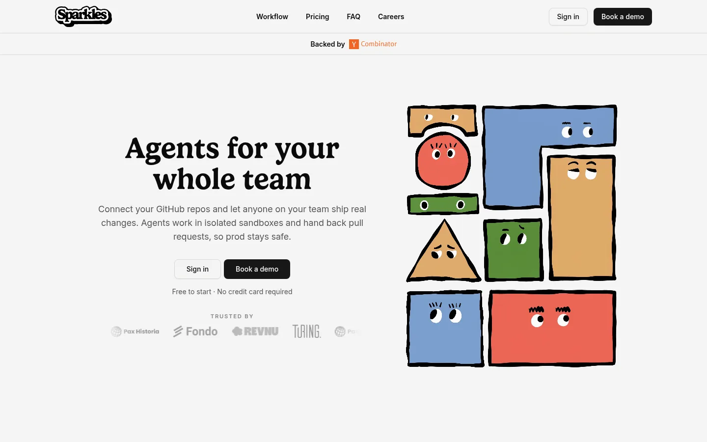
The visual strategy balances a restrained SaaS interface with a distinctive, friendly editorial voice. Warm off-white (#f5f5f4) carries most of the page, while pale gray-beige bands distinguish sections without introducing heavy contrast. Near-black headings and filled calls to action provide clear anchors; muted gray supports explanatory copy. Gelica serif headlines bring a soft, literary character to hero and section titles, while Inter handles navigation, body text, labels, and controls with practical clarity. A large hand-drawn assembly of colorful geometric characters gives the hero its memorable focal point; those illustration colors are supporting artwork, not the core interface palette. The page alternates centered introductions, paired product demonstrations, and split explanatory content, then uses a two-card pricing layout and a softly differentiated FAQ band. Generous vertical breathing room, thin borders, restrained shadows, and rounded controls keep the dense information approachable.
Navigation, body copy, captions, labels, and buttons.
Aa 设计
Gelica
网络字体 · 字重 600 / 500 · 占比 5%
免费替代:Lora
Hero display and section headings.
角色
示例
字号
字重
行高
字距
特大标题
Large serif hero or feature headline.
Sparkles
60px
600
1.04
0
一级标题
Primary page and major section headings.
Sparkles
48px
600
1
0
二级标题
Subsection titles and card headings.
The quick brown fox 敏捷的狐狸
24px
600
1.33
0
正文
Explanatory paragraphs and feature descriptions.
The quick brown fox 敏捷的狐狸
18px
400
1.56
0
辅助文字
Small helper text, notes, and supporting labels.
The quick brown fox 敏捷的狐狸
14px
400
1.43
0
按钮
Primary CTA text, with clear medium-weight emphasis.
The quick brown fox 敏捷的狐狸
20px
500
1.25
0
导航
Compact semibold navigation links.
The quick brown fox 敏捷的狐狸
14px
600
1.43
0
眉题
Small uppercase, widely tracked section labels.
The quick brown fox 敏捷的狐狸
12px
500
1.33
0.28em
间距与布局
基准单位 4px · 密度:宽松
144px版块间距
8px元素间距
—卡片内边距
—内容最大宽度
2px
4px
6px
8px
12px
16px
20px
24px
32px
40px
64px
Use a centered, wide desktop composition with a slim top navigation and a separate narrow announcement strip. The hero is a two-column split: centered copy and trust marks on one side, large character artwork on the other. Subsequent sections alternate centered introductions, paired product demonstrations, and split feature content. Pricing uses two side-by-side cards; FAQ is a distinct full-width band. Keep the vertical rhythm spacious, with large gaps between major sections and tighter spacing within controls and copy groups. The page is visually calm rather than grid-dense.
圆角与层次
按钮 · 8px
卡片 · 10px
图片 · 8px
徽标 · 9999px
hairline · button
sm · card, media, other
hairline · button
Keep surfaces largely flat. Use thin pale borders to define cards, screenshots, badges, and pricing panels, with only a restrained small shadow where measured. Layering comes from section background shifts and framed product media, not dramatic elevation, gradients, or floating overlays.
组件
下面的预览按实测的按钮、输入框、徽标、卡片样式重建(字体用替代字体)。
Top navigation
Light canvas header with a compact brand mark, semibold Inter links, sign-in control, and dark Book a demo CTA.
Announcement strip
Centered backing notice beneath the navigation, separated by thin hairlines and using a small partner mark.
Hero CTA group
Centered serif headline and muted supporting copy, paired with sign-in and dark demo buttons; trust marks sit below.
Product workflow panels
Side-by-side web and Slack product views, framed as restrained media panels with concise explanatory captions.
Pricing cards
Two bordered plan cards for credits and enterprise, with concise feature lists and full-width dark action buttons.
FAQ accordion
A pale contrasting band with character artwork on one side and a question list with compact dividers on the other.
Dark closing CTA
Near-black full-width conversion band with a serif headline, outlined sign-in option, and light-filled demo button.
Green footer
Fresh green closing surface with brand artwork, grouped link columns, social marks, and legal details.
Imagery · The signature visual is a hand-drawn arrangement of geometric characters with heavy black outlines, simple eyes, and warm, saturated fills. It appears large in the hero and again beside FAQ content. Product UI is shown in framed screenshots or demos, sometimes paired to explain workflow; keep those images subordinate to the surrounding copy. The page relies on illustration and interface imagery rather than lifestyle photography or polished 3D.
该做与不该做
✓ 该做
Use Warm Canvas (#f5f5f4) as the primary page background.
Set major headlines in an expressive serif and interface copy in Inter.
Keep section transitions spacious and visually calm.
Use Near Black (#0a0a0a) for strong text and primary dark actions.
Frame product screenshots with restrained borders rather than dramatic effects.
Treat the colorful character artwork as illustration, not as the interface palette.
✕ 不该做
Don't introduce gradients or glossy, high-elevation cards.
Don't use the illustration's colors as broad page backgrounds.
Don't compress the long-page section rhythm into a dense dashboard.
Don't replace the serif headlines with generic all-sans typography.
Don't make every section a card grid.
Don't use heavy borders where a subtle hairline is sufficient.
给 AI 的提示词
想快速出一个同风格的新页面,把这段话连同 DESIGN.md 一起发给 AI。
Build a new page in Sparkles' warm editorial SaaS style. Use Warm Canvas (#f5f5f4) as the dominant background, Near Black (#0a0a0a) for primary text and dark CTAs, Soft Graphite (#555555) for supporting copy, Stone Band (#efeeec) for subtle section contrast, and Quiet Line (#dad9d7) for borders. Pair expressive Gelica-style serif headlines with Inter-like navigation, body text, and controls. Favor a spacious centered layout with clear section groupings, split product-and-copy areas, and restrained two-card panels where useful. Use hand-drawn geometric character artwork as a distinctive supporting visual, not as a cue to flood the interface with bright colors. Keep shadows minimal, corners softly rounded, CTAs obvious, and content readable. Avoid gradients, dense dashboard styling, and excessive decoration.