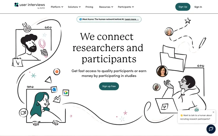
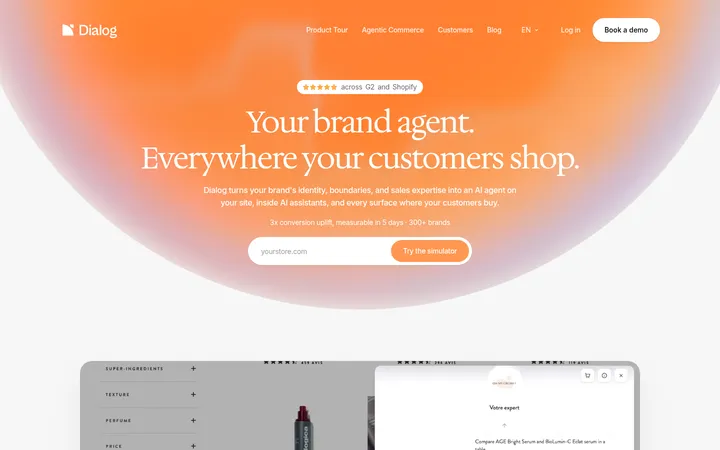
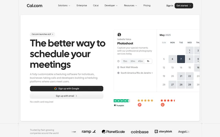
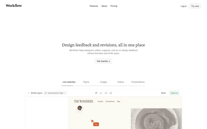
North star · Keep the interface quiet and editorial, using generous space and product imagery to make the software story tangible.
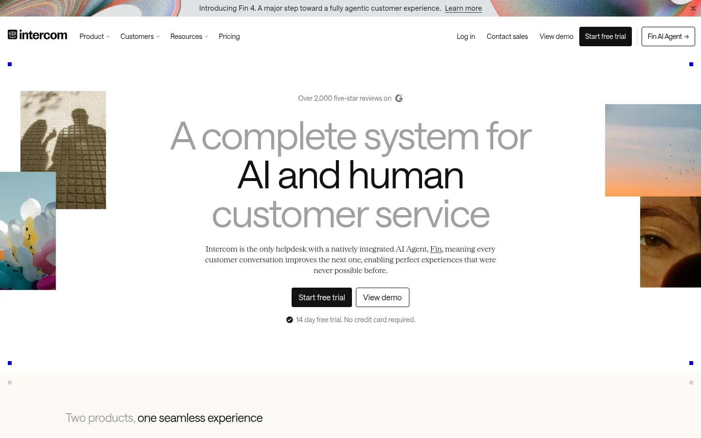
The page is built on a white canvas with recurring warm ivory bands, creating a quiet editorial rhythm rather than a dense software dashboard. Near-black text and primary buttons provide strong contrast; muted gray is reserved for secondary copy, while saturated blue is a small interaction accent. Saans carries navigation, controls, and compact headings, while the lighter serif face gives body copy and selected links a more human, magazine-like voice. Large centered hero typography sits between loosely framed image fragments, then gives way to wide product-interface imagery and alternating feature sections. The layout uses a measured central content width, broad section intervals, and generous internal breathing room. Product screenshots are framed by warm neutral fields; occasional human and illustrative imagery adds character without overwhelming the interface. Cards remain mostly flat, with fine hairlines defining testimonial and content boundaries.
配色
点色块复制色值。用途说明来自对页面的实测位置(背景、文字、描边、按钮)与截图判读。
品牌色
强调色
表层色
中性色
功能色
页面底色 · Gallery White表层 · Warm Canvas表层 2 · Oat Surface表层 3 · Putty Panel主文字 · True Black次要文字 · Soft Ink弱文字 · Quiet Gray描边 · Fine Rule强调 · Signal Blue
Navigation, headings, buttons, and interface labels
Aa 设计
Serrif
网络字体 · 字重 300 · 占比 35%
免费替代:Lora
Body copy and selected text links
Aa 设计
SaansMono
网络字体 · 字重 400 / 500 · 占比 4%
免费替代:IBM Plex Mono
Eyebrows and code-like labels
角色
示例
字号
字重
行高
字距
特大标题
Oversized centered hero headline.
Intercom
80px
400
1
-0.03em
一级标题
Primary page and feature-section headings.
Intercom
54px
400
1
-0.03em
二级标题
Editorial serif section headings.
Intercom
40px
300
1
-0.03em
三级标题
Feature titles and supporting section headings.
Intercom
28px
400
1
-0.034em
四级标题
Smaller card and subsection headings.
The quick brown fox 敏捷的狐狸
24px
400
1
-0.02em
正文
Explanatory copy, often in the light serif face.
The quick brown fox 敏捷的狐狸
16px
300
1.4
-0.01em
辅助文字
Image captions and compact supporting labels.
The quick brown fox 敏捷的狐狸
14px
400
1.25
0
按钮
Primary and secondary CTA labels.
The quick brown fox 敏捷的狐狸
16px
400
1.5
0
导航
Main navigation and announcement text.
The quick brown fox 敏捷的狐狸
14px
400
1.1
0
链接
Inline explanatory and editorial links.
The quick brown fox 敏捷的狐狸
16px
300
1.4
-0.01em
眉题
Uppercase mono section labels.
The quick brown fox 敏捷的狐狸
12px
400
1
0.05em
代码
Compact mono labels and technical-style annotations.
const style = 1;
12px
400
1
0.05em
间距与布局
基准单位 8px · 密度:适中
80px版块间距
8px元素间距
32px卡片内边距
1171px内容最大宽度
4px
8px
12px
14px
16px
20px
24px
32px
48px
64px
80px
96px
112px
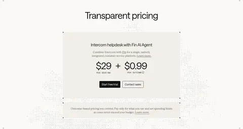
Use a centered content frame with a measured maximum width of 1171px and comfortable density. The hero is centered and spacious, with cropped image fragments positioned asymmetrically around its text. Below it, alternate white and warm ivory section bands, mixing split feature introductions with wide product screenshots, card rows, logo grids, testimonials, and pricing. Keep headings and copy aligned to clear columns, and preserve large section intervals rather than compressing content. The footer changes to a dense multi-column link layout.
圆角与层次
按钮 · 4px
导航 · 6px
xl · other
The design is predominantly flat: white and warm ivory bands do most of the grouping, with fine gray hairlines defining select cards. Avoid routine drop shadows and elevated UI panels. Layer product screenshots and collage imagery for depth, keeping borders square and restrained. A strong shadow appears only as an isolated decorative treatment, not as a general card system.
组件
下面的预览按实测的按钮、输入框、徽标、卡片样式重建(字体用替代字体)。
Announcement strip
Slim top message area with a short release announcement and a text link, set over an image-led abstract strip.
Primary CTA
Solid #111111 button with white Saans text and a small measured corner radius; hover can use the measured Signal Blue #0007cb.
Secondary CTA
Transparent button with a #111111 outline and matching dark label, paired beside the primary action.
Product showcase
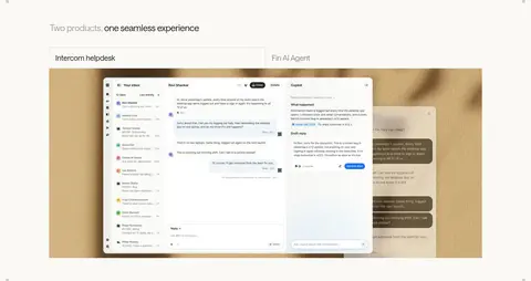
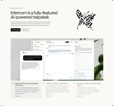
Wide product screenshot composition with overlapping UI imagery and a warm neutral backing surface.
Feature cards
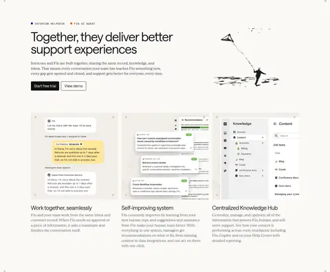
Editorial feature row with concise headings, serif supporting copy, and minimal borders or panel fills.
Testimonial
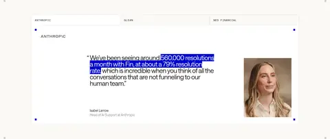
Quote-led customer proof block with a fine #e7e7e7 border, generous padding, and portrait imagery.
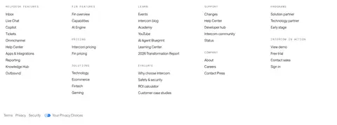
Footer link columns
Compact multi-column navigation group with small uppercase category labels and dense, understated links.
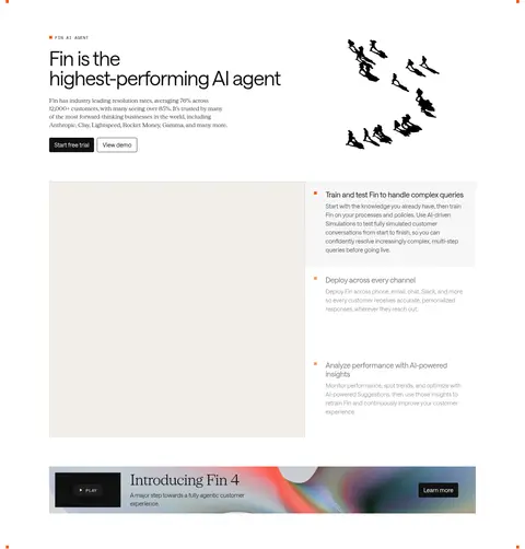
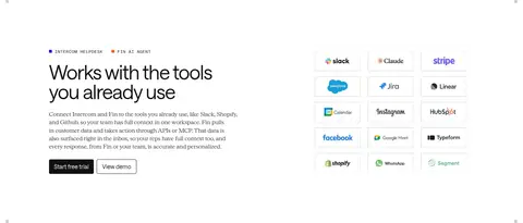
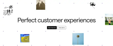
Imagery · Use product-interface screenshots as the main evidence of the offering, displayed large and often layered over warm neutral backdrops. Mix in cropped photographic fragments, customer portraits, and sparse hand-drawn or cutout illustrations for a human editorial feel. Keep images integrated into open compositions rather than enclosing every visual in a heavy card. The announcement strip can use a vivid abstract image treatment.
Alternate pure white with warm ivory section backgrounds.
Use Saans for controls and clear interface hierarchy.
Reserve the serif face for editorial copy and selected links.
Let product screenshots occupy broad, uncluttered areas.
Pair primary and outlined secondary CTAs.
Use blue only as a restrained interaction accent.
✕ 不该做
Do not turn every section into a boxed card grid.
Do not replace the warm neutral bands with saturated backgrounds.
Do not use heavy shadows as the default separation method.
Do not crowd the hero with dense explanatory text.
Do not make every heading serif or every paragraph sans-serif.
Do not let decorative imagery overpower product evidence.
给 AI 的提示词
想快速出一个同风格的新页面,把这段话连同 DESIGN.md 一起发给 AI。
Build a new Intercom-style SaaS page with a calm editorial hierarchy and generous whitespace. Use Gallery White (#ffffff) as the main canvas, alternating with Warm Canvas (#faf9f6) for broad section bands. Set core headings, navigation, and controls in a clean Saans-like sans-serif; use a light editorial serif for selected body copy. Use Soft Ink (#111111) for high-contrast text and solid primary CTAs, with white labels; outline secondary actions in the same ink. Keep Signal Blue (#0007cb) rare and interaction-led. Organize content in a centered frame, mixing split feature sections, wide product screenshots, compact proof cards, testimonials, and a restrained footer. Prefer hairlines over shadows, and use human photography or sparse illustration as supporting accents rather than the main story.