Studio Few 以超大字体样张、简洁控件和黑白灰编辑式版面展示字体。温润的米白色区块与灰度主视觉形成变化,同时不抢字形本身的焦点。
North star · Let each typeface specimen dominate, while keeping controls, color, and layout quiet and consistent.
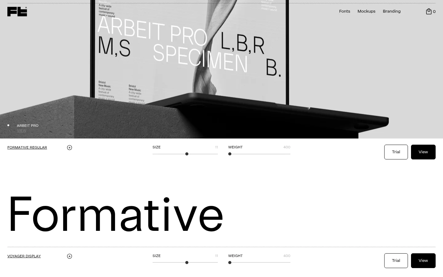
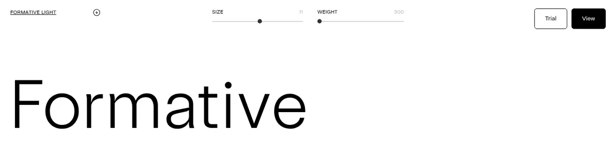
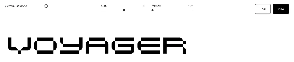
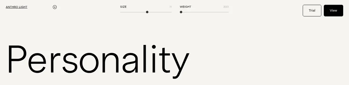
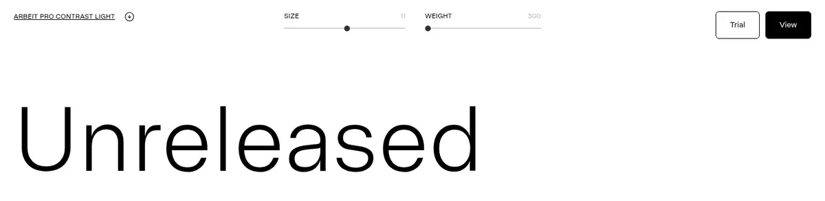
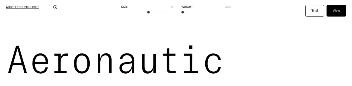
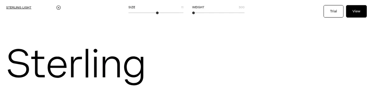
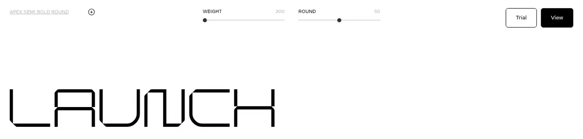
The page uses a deliberately narrow palette: white canvas, near-black type and controls, a warm off-white band for selected specimens, and muted gray for secondary values. The screenshot’s gray tones are largely the grayscale hero photograph and specimen imagery, not additional brand colors. Typography is the main visual event: display faces appear at exceptional scale, while SterlingVF handles compact uppercase labels, navigation, and controls. Specimen rows repeat a calm two-column structure, with the font name and a small expand affordance on the left, and size/weight controls plus Trial and View actions across the row. Generous white space gives each face room to read as both product and demonstration. Fine rules separate controls and rows; the hero image is cropped edge-to-edge and monochrome. Rounded buttons provide the page’s main soft detail against otherwise crisp, flat geometry.
配色
点色块复制色值。用途说明来自对页面的实测位置(背景、文字、描边、按钮)与截图判读。
品牌色
表层色
中性色
页面底色 · Paper White表层 · Warm Stock主文字 · Foundry Ink次要文字 · Paper White弱文字 · Soft Graphite描边 · Foundry Ink
文字
背景
对比度
WCAG
#000000 Foundry Ink
#ffffff Paper White
21:1
AAA
#000000 Foundry Ink
#f6f4f1 Warm Stock
19.13:1
AAA
#ffffff Paper White
#f6f4f1 Warm Stock
1.1:1
不达标
#b7b7b7 Soft Graphite
#ffffff Paper White
2.01:1
不达标
#b7b7b7 Soft Graphite
#f6f4f1 Warm Stock
1.83:1
不达标
字体
字号阶梯:Custom(比例约 3.634,正文 12px)。示例用免费替代字体渲染,数值为实测。
Aa 设计
SterlingVF
网络字体 · 字重 400 / 500 / 300 · 占比 86%
免费替代:Inter
Navigation, controls, body labels, and links.
Aa 设计
BlokVF
网络字体 · 字重 400 · 占比 3%
免费替代:Audiowide
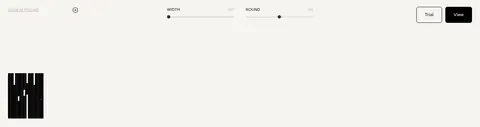
Distinctive display specimen lettering, including the Blok example.
Aa 设计
AnthroVF
网络字体 · 字重 400 · 占比 2%
免费替代:Manrope
Display specimen lettering and oversized light specimen treatment.
Aa 设计
ArbeitProContrastVF
网络字体 · 字重 400 · 占比 2%
免费替代:DM Sans
Arbeit Pro Contrast specimen lettering.
Aa 设计
Arbeittechnikvf
网络字体 · 字重 400 · 占比 2%
免费替代:Space Mono
Arbeit Technik specimen lettering.
Aa 设计
Formative
网络字体 · 字重 400 · 占比 2%
免费替代:Manrope
Formative display specimen lettering.
角色
示例
字号
字重
行高
字距
特大标题
Oversized typeface specimens that demonstrate each family’s character.
Studio Few
158.5px
400
1
-0.01em
一级标题
Large specimen or page-level headline where present.
Studio Few
115px
400
1.2
0
正文
Compact uppercase specimen names and metadata.
The quick brown fox 敏捷的狐狸
12px
400
1.6
0.017em
按钮
Trial and View action labels.
The quick brown fox 敏捷的狐狸
14px
300
1.57
0
导航
Top navigation links and footer navigation.
The quick brown fox 敏捷的狐狸
14px
400
1.86
0
链接
Small uppercase links such as ABOUT and specimen actions.
The quick brown fox 敏捷的狐狸
12px
400
1.75
0.017em
间距与布局
基准单位 4px · 密度:宽松
112px版块间距
24px元素间距
—卡片内边距
1392px内容最大宽度
2px
5px
7px
10px
12px
20px
24px
112px
160px
The page is a spacious, full-width vertical sequence, with a measured maximum content width of 1392px. A full-bleed hero sits above repeated specimen sections; those sections use a two-column control row above a large display sample. Labels align left, adjustment controls sit centrally, and paired actions align right. Section spacing is generous, while the controls themselves are compact. White sections dominate, with occasional warm off-white bands to distinguish specimen groups; the footer resolves into several aligned link columns.
圆角与层次
按钮 · 6px
没有测到阴影:页面是扁平的,层次靠底色和描边区分。
The interface is predominantly flat: no measured shadows or gradients, and little card-like separation. Thin black or pale hairlines define controls and specimen boundaries. Filled black View buttons and outlined Trial buttons provide the clearest component edges, with a small measured radius. The hero gains depth from its photographic subject, not UI layering.
组件
下面的预览按实测的按钮、输入框、徽标、卡片样式重建(字体用替代字体)。
Specimen control row
A compact metadata and control strip above each large type sample; aligns the specimen label, size and weight controls, and actions.
Trial button
White or canvas-colored button with a 1px black border, 6px radius, and SterlingVF light text.
View button
Black filled button with white SterlingVF text, a 1px black border, and 6px radius.
Specimen display
Oversized black type rendering on a plain white or warm off-white field, showcasing the face rather than functioning as ordinary heading copy.
Primary navigation
Small, quiet top-right links for Fonts, Mockups, and Branding, paired with the foundry mark and a basket count.
Footer link columns
A compact, multi-column footer with the mark and grouped studio, policy, and social links.
Imagery · A large monochrome editorial photograph leads the page, cropped edge-to-edge with the Studio Few mark and site navigation over it. The image shows printed type specimen material and a dark sculptural foreground, reinforcing the foundry context. Further down, a grayscale geometric image interrupts the type rows. Imagery is restrained and high-contrast; the primary visual content remains the typefaces themselves, rendered as large live specimens rather than decorative illustrations.
Use black-filled View actions and outlined Trial actions.
Use warm off-white selectively for specimen section bands.
Keep hero imagery grayscale and editorial.
✕ 不该做
Do not add gradients or decorative shadows.
Do not introduce extra brand colors.
Do not let controls compete with specimen lettering.
Do not place every specimen inside a card.
Do not use dense, multi-level navigation.
Do not treat grayscale image tones as new palette colors.
给 AI 的提示词
想快速出一个同风格的新页面,把这段话连同 DESIGN.md 一起发给 AI。
Build a new page in the Studio Few visual style: a calm, editorial type-foundry experience where the type specimens are the content and the interface recedes. Use Paper White (#ffffff) as the main canvas, Foundry Ink (#000000) for display type, links, borders, and filled actions, Warm Stock (#f6f4f1) for occasional section bands, and Soft Graphite (#b7b7b7) for secondary values. Arrange content in a spacious full-width vertical sequence with repeated specimen rows: small uppercase metadata and controls above oversized live type. Align labels left, controls centrally, and Trial/View actions to the right. Use Sterling-like sans typography for UI and a distinct face per specimen. Keep borders fine, buttons modestly rounded, and elevation flat. Use grayscale editorial photography sparingly; avoid extra colors, shadows, gradients, and card-heavy layouts.