North star · Keep the page bright and spacious, using bold black typography and pale product UI as the primary contrast rather than large blocks of color.
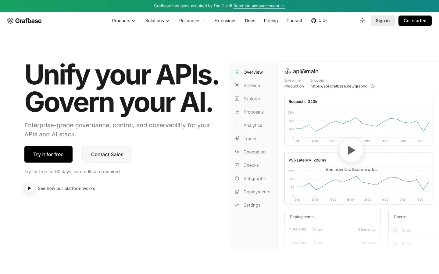
The page is built around a white canvas (#ffffff), with near-black headings (#1b1b1b) and muted gray supporting copy keeping the presentation crisp and legible. A narrow green-to-teal announcement band is the most saturated brand moment; the measured gradient uses #19a05f and #0d7f8c, while the main call to action is black rather than green. Inter carries nearly all of the interface: the hero uses large, tightly tracked bold type, and section headings, card titles, and compact navigation step down into more practical weights and sizes. The first viewport balances a text-led hero on the left with a large, pale dashboard preview on the right. Below, generous white space separates centered section headings, two-column feature cards, integration logos, and comparison content. Fine gray borders and lightly tinted panels define product surfaces without heavy shadows. Most imagery is product UI or restrained technical illustration, not photography.
Primary typeface for headings, body copy, navigation, buttons, and most links.
Aa 设计
sans
系统字体 · 字重 400 / 500 · 占比 2%
免费替代:Inter
System sans-serif fallback, measured on a small number of links.
角色
示例
字号
字重
行高
字距
特大标题
Large, bold display treatment for the primary hero statement.
Grafbase
90px
700
1
-0.05em
一级标题
Primary page headline and prominent section headline.
Grafbase
40px
700
1.1
-0.025em
二级标题
Section titles introducing feature and content groups.
The quick brown fox 敏捷的狐狸
24px
600
1.1
0
三级标题
Feature-card titles and subordinate content headings.
The quick brown fox 敏捷的狐狸
20px
400
1.5
0
正文
Hero description, feature explanations, and general paragraph copy.
The quick brown fox 敏捷的狐狸
16px
400
1.5
0
辅助文字
Compact helper text, labels, and secondary information.
The quick brown fox 敏捷的狐狸
14px
500
1.43
0
按钮
Primary and secondary CTA labels.
The quick brown fox 敏捷的狐狸
16px
500
1.5
0
导航
Header navigation and compact menu items.
The quick brown fox 敏捷的狐狸
14px
500
1.43
0
链接
Inline links, including announcement and content links.
The quick brown fox 敏捷的狐狸
14px
500
1.43
0
代码
Small technical snippets and product-interface code labels.
const style = 1;
12px
400
1.33
0
间距与布局
基准单位 4px · 密度:适中
80px版块间距
12px元素间距
24px卡片内边距
1280px内容最大宽度
4px
6px
8px
10px
12px
14px
15px
16px
20px
24px
28px
32px
48px
128px
The desktop page uses a centered content area with a measured maximum width of 1280px. The hero is a broad two-column composition: left-aligned copy and actions sit beside an oversized dashboard image. Subsequent sections alternate centered headings with two- or three-column content, while logo and integration rows create lighter transitions. Section spacing is generous, with compact gaps inside cards and controls. The overall density is comfortable, not editorially crowded.
圆角与层次
按钮 · 6px
卡片 · 20px
md · button
The interface is mostly flat. Fine gray borders and softly tinted card panels distinguish content from the white canvas; avoid pronounced shadows. Buttons and dashboard cards use restrained outlines, while the hero preview gains prominence through scale and placement rather than heavy layering.
组件
下面的预览按实测的按钮、输入框、徽标、卡片样式重建(字体用替代字体)。
Announcement strip
A slim green-to-teal top band with centered acquisition news and a contrasting announcement link.
Header navigation
Compact horizontal header with the Grafbase mark, text navigation, utility icons, a pale Sign in button, and dark Get started CTA.
Hero
Left-aligned oversized two-line headline, muted explanatory copy, black primary CTA, pale secondary CTA, and a small video link.
Dashboard preview
Large pale product-interface visual with a side menu, analytics charts, and a centered play affordance.
Feature cards
Lightly framed product visuals paired with compact titles, muted descriptions, and pale Read more buttons.
Integration row
A clean horizontal collection of technology logos with a small centered exploration button.
Footer
Sparse white footer with brand and social links at left and compact resource, company, and compliance columns.
Imagery · The hero uses a large dashboard preview rather than photography, with pale panels, charts, navigation labels, and fine interface details. Feature sections use product diagrams, integration logos, and simple technical illustrations on lightly tinted backgrounds. Keep image framing wide and clean, with low-contrast borders and ample surrounding white space; avoid decorative imagery that competes with the product UI.
Set hero and section headlines in bold near-black Inter.
Reserve the green-to-teal gradient for a narrow announcement treatment.
Use pale borders to define cards and secondary buttons.
Show product UI and technical diagrams as the main imagery.
Leave generous space between major content sections.
✕ 不该做
Do not make the page dark or color-blocked.
Do not use saturated accents as large section backgrounds.
Do not add heavy shadows to cards or dashboard panels.
Do not center-align the hero copy.
Do not let illustrations overwhelm their accompanying product content.
Do not use oversized decorative typography throughout the page.
给 AI 的提示词
想快速出一个同风格的新页面,把这段话连同 DESIGN.md 一起发给 AI。
Build a new Grafbase-style developer SaaS page with a white Gallery White (#ffffff) canvas, Carbon Ink (#1b1b1b) headings, and Slate Copy (#60646c) supporting text. Use Inter throughout, with a very bold, tightly tracked hero headline and restrained navigation. Make the top announcement the only prominent gradient treatment, blending Canopy Green (#19a05f) into Harbor Teal (#0d7f8c). Pair left-aligned hero copy and CTAs with a wide, pale dashboard preview. Continue with spacious feature grids, integration marks, and concise comparison content. Define cards and secondary controls with Soft Divider (#eaeaea) or Mist Border (#e0e1e6), keeping surfaces flat and shadows minimal. Favor realistic product UI and technical diagrams over photography. Keep the composition crisp, modular, readable, and generous with whitespace.