North star · Keep the page almost entirely quiet and near-white, letting oversized type and floating product interfaces provide the structure.
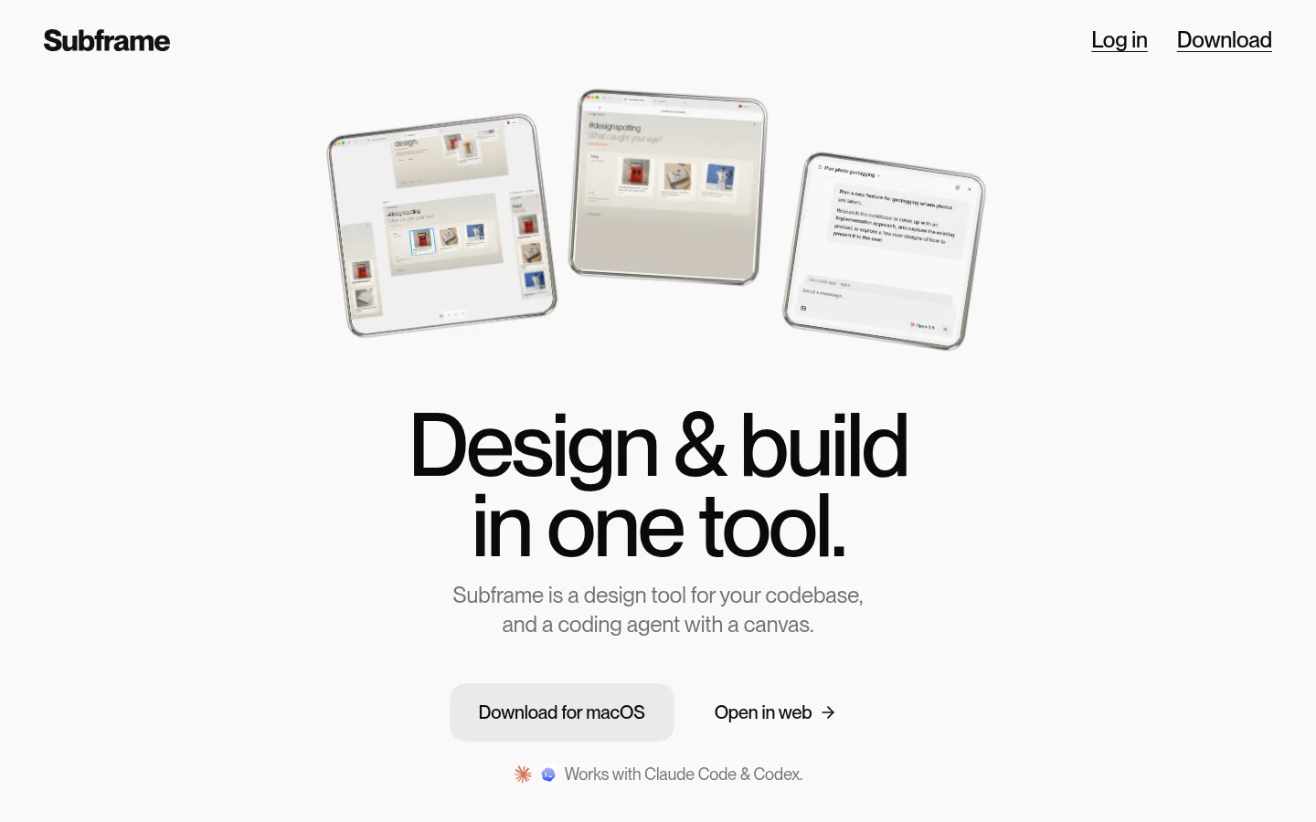
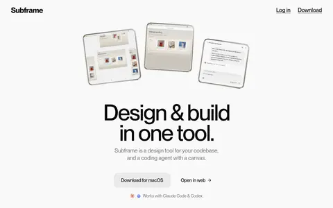
The page is built on a near-white #f9f9f9 canvas, with a mostly monochrome palette that keeps attention on the product previews rather than decorative branding. Headlines are black and oversized, using tightly tracked display typography; supporting copy is smaller, gray, and easy to scan. The opening composition centers three tilted interface previews above a two-line headline, with restrained navigation at the top and a soft gray pill-shaped primary download action below. After the hero, the page relies on generous vertical pauses and alternating text-and-product demonstrations instead of strong colored section bands. Product imagery shows interface screens inside thin, rounded device or application frames, often floating against the open background. Light gray surfaces distinguish controls and mock interface areas, while fine outlines and subtle shadows create depth without making the page feel card-heavy. A small blue accent appears in measured data but does not define the visible brand palette.
配色
点色块复制色值。用途说明来自对页面的实测位置(背景、文字、描边、按钮)与截图判读。
品牌色
强调色
表层色
中性色
页面底色 · Gallery White表层 · Mist Surface表层 2 · Pure Surface表层 3 · Warm Stone主文字 · Soft Ink次要文字 · Quiet Gray弱文字 · Near Black描边 · Signal Blue
Main interface typography for navigation, body copy, captions, and measured heading styles.
Aa 设计
PP Neue Montreal 3
网络字体 · 字重 500 / 400 · 占比 16%
免费替代:DM Sans
Display headlines and prominent promotional or action text.
Aa 设计
Fragment Mono
网络字体 · 字重 500 · 占比 1%
免费替代:IBM Plex Mono
Small monospaced interface labels and technical tags inside product visuals.
角色
示例
字号
字重
行高
字距
特大标题
Oversized hero headline and major promotional statements.
Subframe
88px
500
1
-0.035em
一级标题
Large section headline introducing a product capability.
Subframe
64px
300
1.34
-0.065em
二级标题
Feature headings and prominent explanatory titles.
Subframe
28px
500
1.29
-0.002em
三级标题
Secondary capability titles within feature content.
The quick brown fox 敏捷的狐狸
24px
400
1.33
-0.002em
四级标题
Supporting product or section headlines.
The quick brown fox 敏捷的狐狸
22px
400
1.45
-0.035em
正文
Descriptions, explanatory paragraphs, and interface copy.
The quick brown fox 敏捷的狐狸
15px
400
1.33
0
辅助文字
Small navigation labels, annotations, and compact interface details.
The quick brown fox 敏捷的狐狸
12px
500
1.33
-0.005em
间距与布局
基准单位 4px · 密度:紧凑
32px版块间距
8px元素间距
6px卡片内边距
1024px内容最大宽度
1px
2px
3px
4px
6px
8px
10px
12px
16px
20px
32px
Use a centered, compact content frame, with measured page max width of 1024px. The first viewport is a centered hero with understated top navigation, product previews above the headline, and a paired action row below. Later sections remain on the same pale canvas and alternate left-aligned section introductions with broad product demonstrations. The underlying content uses two- to four-column arrangements where appropriate, but the overall impression is sparse: large vertical pauses separate blocks, and short copy sits close to its associated visual.
圆角与层次
卡片 · 12px
徽标 · 4px
导航 · 9999px
链接 · 9999px
inset · other, card
md · badge, other, card
inset · other
sm · card, other
The page itself is largely flat, with separation created by whitespace rather than shadows or borders. Product frames use fine outlines and light inset or low shadows to suggest application windows. Pale control surfaces and rounded actions provide modest depth; keep card elevation subtle and avoid heavy, dark drop shadows.
组件
下面的预览按实测的按钮、输入框、徽标、卡片样式重建(字体用替代字体)。
Top navigation
Place the Subframe wordmark at the upper left and compact text links such as Log in and Download at the upper right, with no strong filled navigation bar.
Hero preview cluster
Float three small, slightly angled product interface previews above the centered headline; use thin frames and quiet neutral screen content.
Hero headline and copy
Set the main promise in very large, tightly tracked dark type over two lines, followed by centered gray explanatory copy.
Download action
Use a soft light-gray, fully rounded Download for macOS pill with dark text; pair it with a quieter text link to open the web app.
Feature introduction
Use a left-aligned capability label and concise heading or paragraph, with the product demo following after a noticeable vertical pause.
Product showcase frame
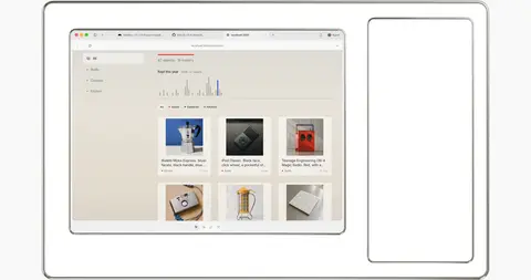
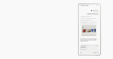
Present canvas, browser, or agent screenshots in rounded application-like frames; keep surrounding layout open and avoid decorative page chrome.
Technical badge
Use small white, lightly rounded labels or compact monospaced tags within product previews, not as prominent page-level decoration.
Imagery · Prioritize interface mockups over lifestyle photography. Show crisp screenshots or product canvases inside lightly outlined, rounded browser or device frames, sometimes with a slight floating or tilted presentation in the hero. Keep the surrounding background near-white and preserve legible interface detail. Warm gray-beige areas belong to the screens or visual mockups; avoid treating them as full-page color bands.
Give the hero headline the strongest typographic emphasis.
Use generous vertical pauses between product demonstrations.
Frame product previews with fine, quiet outlines.
Use gray copy for supporting explanations.
Keep primary actions rounded and softly surfaced.
✕ 不该做
Do not introduce saturated page-wide color bands.
Do not turn warm mockup gradients into the brand background.
Do not crowd the hero with extra copy or controls.
Do not use heavy shadows to separate every panel.
Do not make feature sections feel like a dense dashboard.
Do not use the measured blue as a dominant CTA color.
给 AI 的提示词
想快速出一个同风格的新页面,把这段话连同 DESIGN.md 一起发给 AI。
Build a new Subframe-style page on a continuous #f9f9f9 Gallery White canvas. Use near-black #0a0a0a or Soft Ink #232323 for headlines and navigation, and Quiet Gray #707070 for supporting copy. Set the main display message in a large, tightly tracked sans serif, then pair concise copy with floating product-interface previews. Favor open space, centered hero alignment, and alternating feature introductions with wide framed demonstrations. Use #f0f0f0 Mist Surface or #ffffff Pure Surface for restrained controls and mockup panels; reserve #d9d8d3 Warm Stone and related beige tones for screen imagery, not page bands. Make the macOS action a soft gray rounded pill with dark text. Keep outlines and shadows delicate, and use Fragment Mono-like labels only inside technical UI details.