Heptabase以克制的编辑式布局和大幅产品演示,呈现可视化知识工作空间。暖调米白底色、清晰深色文字与少量强调色,让复杂界面也显得易于理解。
North star · Keep the page calm and editorial, letting generous whitespace and large, legible product evidence do the explaining.
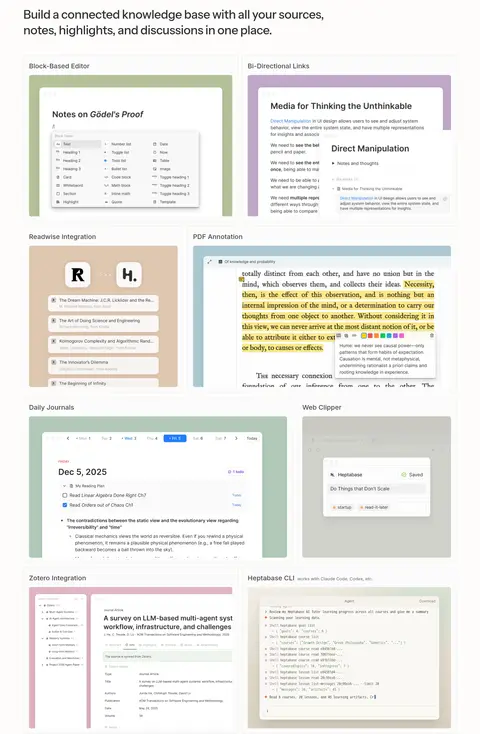
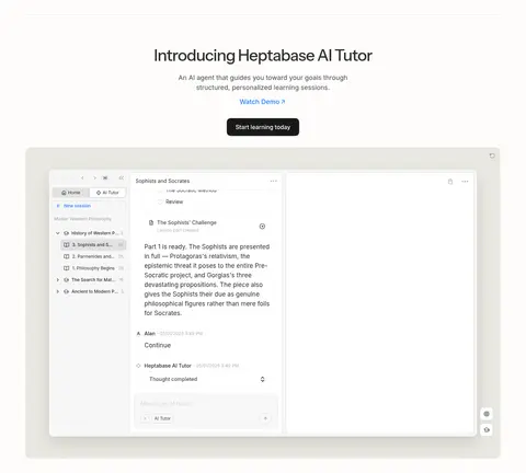
The page is built on a warm, nearly white canvas (#fdfcfb) with dark charcoal text (#2e2e2e), giving its long-form product story a quiet, readable foundation. Soft gray bands, cards, and hairlines distinguish content without strong contrast or decorative framing. Instrument Sans gives large headings a subtly editorial feel; Inter handles navigation, body copy, controls, and buttons with a practical interface tone. Centered hero messaging gives way to mostly left-aligned feature explanations and broad product screenshots, with generous vertical breathing room between sections. The imagery is primarily real product UI: whiteboards, notes, PDFs, and AI panels are shown within large framed views rather than abstract illustration. Muted greens, blue links, and occasional warm tones appear sparingly; richer colors inside screenshots belong to product content and should not be mistaken for the core brand palette.
配色 点色块复制色值。用途说明来自对页面的实测位置(背景、文字、描边、按钮)与截图判读。
品牌色
Warm Paper
#fdfcfb
Primary page canvas and the consistent background behind the hero and most content sections.
Charcoal Ink
#2e2e2e
Primary headings, navigation, body emphasis, and dark primary CTA backgrounds.
强调色
Link Blue
#207dff
Sparse inline links and informational text accents such as guide links.
Leaf Green
#5a8a5a
Restrained green text accent; use sparingly rather than as a large brand surface.
表层色
Cloud Surface
#f7f7f7
Pale card and interface surfaces that separate content gently from the canvas.
Pale Graphite
#d3d3d3
Occasional card surface or quiet border tone in secondary interface details.
中性色
Quiet Line
#e9e8e7
Primary hairline border and subdued dividers around cards and controls.
Soft Charcoal
#464646
Muted supporting copy and secondary text with a softer tone than the main ink.
Brown Slate
#5f564b
Low-frequency text color, likely confined to supporting or embedded content.
Stone Gray
#7d7d7a
Subdued footer and secondary text, kept below primary-copy contrast.
Warm Ink
#3d3832
Occasional darker text tone in embedded or supporting content.
Cool Slate
#6a6972
Muted footer text and low-priority links.
Ash Gray
#adadad
Low-emphasis text and fine interface details.
功能色
Sage Mist
#d6e3d7
Soft green gradient tone used behind product media, not a dominant standalone brand fill.
Oat Glow
#eee8dc
Muted warm gradient tone visible in the atmospheric media backdrop.
Sand Wash
#d9d1c1
Low-contrast warm gradient color in the backdrop behind product demonstrations.
文字 背景 对比度 WCAG #2e2e2e Charcoal Ink#fdfcfb Warm Paper13.25:1 AAA #2e2e2e Charcoal Ink#f7f7f7 Cloud Surface12.68:1 AAA #2e2e2e Charcoal Ink#e9e8e7 Quiet Line11.1:1 AAA #2e2e2e Charcoal Ink#d3d3d3 Pale Graphite9.07:1 AAA #464646 Soft Charcoal#fdfcfb Warm Paper9.21:1 AAA #464646 Soft Charcoal#f7f7f7 Cloud Surface8.81:1 AAA
字体 字号阶梯:Perfect Fourth(比例约 1.316,正文 16px)。示例用免费替代字体渲染,数值为实测。
Aa 设计
__Inter_611a59 网络字体 · 字重 400 / 500 / 600 / 450 / 700 · 占比 86%
免费替代:Inter
Navigation, body copy, buttons, links, and compact feature headings.
Aa 设计
ui-monospace 系统字体 · 字重 400 / 500 · 占比 9%
免费替代:Roboto Mono
Captions and code-like interface labels.
Aa 设计
__instrumentSans_c1b0f9 网络字体 · 字重 500 · 占比 6%
免费替代:Instrument Sans
Large hero and section headings.
角色 示例 字号 字重 行高 字距 一级标题 Centered hero headline introducing the learning and research proposition.
Heptabase
48px 500 1.3 -0.033em 二级标题 Major section headings introducing product capabilities and proof.
Heptabase
44px 500 1.4 -0.033em 三级标题 Secondary section titles and prominent feature group headings.
Heptabase
36px 500 1.3 -0.015em 四级标题 Compact feature-card and product capability headings.
The quick brown fox 敏捷的狐狸
20px 500 1.5 0 正文 Feature descriptions, explanatory copy, and testimonial text.
The quick brown fox 敏捷的狐狸
16px 400 1.5 0 辅助文字 Small technical labels and compact metadata.
The quick brown fox 敏捷的狐狸
13px 400 1.6 0 按钮 Primary trial CTA and other interactive button labels.
The quick brown fox 敏捷的狐狸
16px 500 1.25 0 导航 Header navigation and footer navigation links.
The quick brown fox 敏捷的狐狸
16px 400 1.25 0 链接 Small inline links and supporting calls to read more.
The quick brown fox 敏捷的狐狸
12px 400 1.5 0 代码 Code-style or technical text within interface examples.
const style = 1;
13px 400 1.6 0
间距与布局 基准单位 4px · 密度:适中
48px 版块间距
8px 元素间距
24px 卡片内边距
1300px 内容最大宽度
2px
3px
4px
5px
6px
7px
8px
10px
12px
16px
20px
24px
32px
48px
Use a centered content frame with a measured maximum width of 1300px, but let product media feel broad and prominent. The hero is center-aligned, then feature sections shift mostly to left-aligned headings and asymmetric or two-column layouts. Later proof sections use compact feature cards, testimonial tiles, and a three-column community gallery. Maintain comfortable density and a measured 48px section gap, with deliberate empty space around major headings and media.
圆角与层次 lg · media
xl · card
hairline · button, media
sm · button
Most content relies on flat warm surfaces and fine gray borders rather than heavy shadows. Product media and selected cards can sit above the page with soft, diffuse shadowing; maintain clear layering without making the interface feel glossy. Buttons remain dark, compact, and quietly elevated.
组件 下面的预览按实测的按钮、输入框、徽标、卡片样式重建(字体用替代字体)。
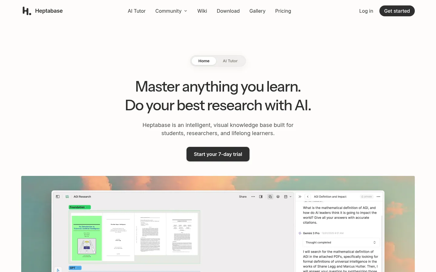
Top navigation A light, open header with left brand mark, centered product links, and right-side login plus a dark rounded Get started CTA.
Hero CTA Centered title and supporting copy above a dark trial button; keep the main message visually dominant and uncluttered.
Product media panel Large, wide screenshot framed by a subtle radius and soft atmospheric backdrop; interface content remains the focus.
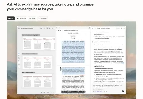
Feature introduction Left-aligned heading and short explanation paired with broad screenshots or a two-column feature layout.
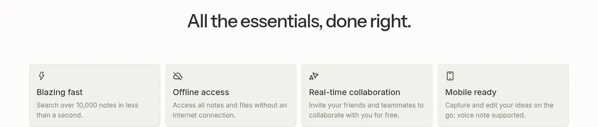
Capability cards Quiet pale-gray cards with fine borders, compact headings, and concise descriptions for essentials such as offline access.
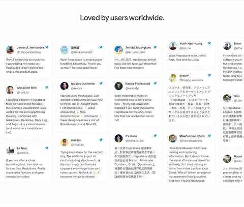
Testimonial tiles Many small user-quote cards arranged as a light, dense social-proof field with names, avatars, and restrained separators.
Footer navigation Minimal multi-column link groups on a white surface, with subdued text and a compact brand/social area.
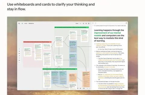
Imagery · Product imagery is the main visual evidence: large screenshots show whiteboards, documents, notes, and AI-assisted research interfaces. Frame these as broad rectangular media panels, often over softly tinted atmospheric backgrounds, with restrained rounding and subtle depth. Keep interface details legible and avoid decorative stock photography; screenshots may contain richer greens, yellows, and other colors that are product content rather than core brand colors.
页面版块 共 10 个版块,按页面从上到下排列,每个都标了类型、布局和交互套路。
该做与不该做 ✓ 该做 Use Warm Paper (#fdfcfb) as the dominant canvas. Set primary copy and core controls in Charcoal Ink (#2e2e2e). Reserve Link Blue (#207dff) for sparse inline links. Give product screenshots generous space and clear framing. Use Quiet Line (#e9e8e7) for understated boundaries. Alternate centered introductory moments with left-aligned feature content. ✕ 不该做 Don't introduce saturated section backgrounds. Don't treat screenshot colors as the brand palette. Don't crowd the hero with extra controls or copy. Don't use heavy borders or dramatic shadows across every card. Don't turn the interface into a generic gradient landing page. Don't use oversized all-caps typography or aggressive display styling. 给 AI 的提示词 想快速出一个同风格的新页面,把这段话连同 DESIGN.md 一起发给 AI。
复制 Build a new page in Heptabase’s calm, editorial SaaS style. Use Warm Paper (#fdfcfb) as the primary canvas, Charcoal Ink (#2e2e2e) for headings and primary controls, Cloud Surface (#f7f7f7) for soft card fills, and Quiet Line (#e9e8e7) for delicate borders. Set large headings in Instrument Sans or a close substitute; use Inter for navigation, body, and buttons. Start with a centered, spacious hero, then transition into left-aligned feature sections supported by broad, legible product screenshots. Keep layouts comfortable, mostly two-column for features, and reserve blue links for occasional inline actions. Use soft media shadows sparingly. Treat colorful UI inside screenshots as product content, not as a reason to expand the brand palette.
DESIGN.md Tailwind v4 CSS 变量 Design Tokens
---
title: "Heptabase design system"
variant: extended
source: https://heptabase.com/
captured_at: 2026-10-12
theme: light
industry: productivity
generator: Design DNA (https://four.wiralomi.com/style/heptabase-com)
ai_generated: true
ai_label: "本文件由 AI 辅助生成:数值取自公开网页的实测样式,命名、用途说明与建议为模型解读。商标归原所有者。 / AI-assisted content"
---
# Heptabase · Design System
> A calm canvas for structured, visual learning
**Theme:** light · **Industry:** productivity · **Source:** https://heptabase.com/ · **Captured:** 2026-10-12 (1440×900 desktop)
_AI-assisted content: values are measured from the public page at capture time; names, roles and guidance are model-written interpretations. Trademarks belong to their owners._
Heptabase pairs an understated editorial layout with expansive product demonstrations to present a visual knowledge workspace. Warm off-white surfaces, crisp dark typography, and restrained accents keep complex interface imagery approachable.
## North star
Keep the page calm and editorial, letting generous whitespace and large, legible product evidence do the explaining.
## Overview
The page is built on a warm, nearly white canvas (## Colors
| Name | Hex | Token | Group | Role |
|---|---|---|---|---|
| Warm Paper | ` | `--color-warm-paper` | brand | Primary page canvas and the consistent background behind the hero and most content sections. |
| Charcoal Ink | ` | `--color-charcoal-ink` | brand | Primary headings, navigation, body emphasis, and dark primary CTA backgrounds. |
| Cloud Surface | ` | `--color-cloud-surface` | surface | Pale card and interface surfaces that separate content gently from the canvas. |
| Quiet Line | ` | `--color-quiet-line` | neutral | Primary hairline border and subdued dividers around cards and controls. |
| Soft Charcoal | ` | `--color-soft-charcoal` | neutral | Muted supporting copy and secondary text with a softer tone than the main ink. |
| Link Blue | ` | `--color-link-blue` | accent | Sparse inline links and informational text accents such as guide links. |
| Sage Mist | ` | `--color-sage-mist` | semantic | Soft green gradient tone used behind product media, not a dominant standalone brand fill. |
| Oat Glow | ` | `--color-oat-glow` | semantic | Muted warm gradient tone visible in the atmospheric media backdrop. |
| Sand Wash | ` | `--color-sand-wash` | semantic | Low-contrast warm gradient color in the backdrop behind product demonstrations. |
| Pale Graphite | ` | `--color-pale-graphite` | surface | Occasional card surface or quiet border tone in secondary interface details. |
| Brown Slate | ` | `--color-brown-slate` | neutral | Low-frequency text color, likely confined to supporting or embedded content. |
| Stone Gray | ` | `--color-stone-gray` | neutral | Subdued footer and secondary text, kept below primary-copy contrast. |
| Warm Ink | ` | `--color-warm-ink` | neutral | Occasional darker text tone in embedded or supporting content. |
| Cool Slate | ` | `--color-cool-slate` | neutral | Muted footer text and low-priority links. |
| Leaf Green | ` | `--color-leaf-green` | accent | Restrained green text accent; use sparingly rather than as a large brand surface. |
| Ash Gray | ` | `--color-ash-gray` | neutral | Low-emphasis text and fine interface details. |
### Semantic aliases
`--color-canvas` → ` (Warm Paper) · `--color-surface` → ` (Cloud Surface) · `--color-surface-2` → ` (Quiet Line) · `--color-surface-3` → ` (Pale Graphite) · `--color-text` → ` (Charcoal Ink) · `--color-text-muted` → ` (Soft Charcoal) · `--color-border` → ` (Quiet Line) · `--color-accent` → ` (Link Blue) · `--color-accent-2` → ` (Leaf Green)
### Contrast (WCAG 2.x)
| Text | Background | Ratio | Level |
|---|---|---|---|
| ` | ` | 13.25:1 | AAA |
| ` | ` | 12.68:1 | AAA |
| ` | ` | 11.1:1 | AAA |
| ` | ` | 9.07:1 | AAA |
| ` | ` | 9.21:1 | AAA |
| ` | ` | 8.81:1 | AAA |
| ` | ` | 7.71:1 | AAA |
| ` | ` | 6.3:1 | AA |
| ` | ` | 3.77:1 | AA-large |
| ` | ` | 3.6:1 | AA-large |
### Gradients
- `radial-gradient(110% 90% at 10% 10%, rgba(255, 255, 255, 0.3), rgba(0, 0, 0, 0) 52%), radial-gradient(95% 75% at 92% 8%, rgba(206, 222, 207, 0.82), rgba(0, 0, 0, 0) 56%), linear-gradient(rgb(238, 232, 220), rgb(217, 209,`
## Typography
| Family | Token | Source | Weights | Role | Free substitute |
|---|---|---|---|---|---|
| __Inter_611a59 | `--font-body` | webfont | 400, 500, 600, 450, 700 | Navigation, body copy, buttons, links, and compact feature headings. | Inter |
| ui-monospace | `--font-mono` | system | 400, 500 | Captions and code-like interface labels. | Roboto Mono |
| __instrumentSans_c1b0f9 | `--font-display` | webfont | 500 | Large hero and section headings. | Instrument Sans |
- **__Inter_611a59:** Neutral sans-serif workhorse; mainly regular to semibold, sentence case, with untracked UI text.
- **ui-monospace:** Use sparingly for compact metadata and technical labels; regular weight and clear spacing.
- **__instrumentSans_c1b0f9:** Medium weight, sentence case, slightly tight tracking; large headlines stay clean and editorial.
### Type scale — Perfect Fourth (ratio ≈ 1.316, base 16px)
| Role | Size | Weight | Line height | Letter spacing | Case | Family | Used for |
|---|---|---|---|---|---|---|---|
| h1 | 48px | 500 | 1.3 | -0.033em | — | __instrumentSans_c1b0f9 | Centered hero headline introducing the learning and research proposition. |
| h2 | 44px | 500 | 1.4 | -0.033em | — | __instrumentSans_c1b0f9 | Major section headings introducing product capabilities and proof. |
| h3 | 36px | 500 | 1.3 | -0.015em | — | __instrumentSans_c1b0f9 | Secondary section titles and prominent feature group headings. |
| h4 | 20px | 500 | 1.5 | 0 | — | __Inter_611a59 | Compact feature-card and product capability headings. |
| body | 16px | 400 | 1.5 | 0 | — | __Inter_611a59 | Feature descriptions, explanatory copy, and testimonial text. |
| caption | 13px | 400 | 1.6 | 0 | — | ui-monospace | Small technical labels and compact metadata. |
| button | 16px | 500 | 1.25 | 0 | — | __Inter_611a59 | Primary trial CTA and other interactive button labels. |
| nav | 16px | 400 | 1.25 | 0 | — | __Inter_611a59 | Header navigation and footer navigation links. |
| link | 12px | 400 | 1.5 | 0 | — | __Inter_611a59 | Small inline links and supporting calls to read more. |
| code | 13px | 400 | 1.6 | 0 | — | ui-monospace | Code-style or technical text within interface examples. |
## Spacing & layout
- Base unit **4px**, density **comfortable**.
- Scale (most used values): 2, 3, 4, 5, 6, 7, 8, 10, 12, 16, 20, 24, 32, 48 px.
- Section rhythm 48px · element gap 8px · card padding 24px · max content width 1300px.
Use a centered content frame with a measured maximum width of 1300px, but let product media feel broad and prominent. The hero is center-aligned, then feature sections shift mostly to left-aligned headings and asymmetric or two-column layouts. Later proof sections use compact feature cards, testimonial tiles, and a three-column community gallery. Maintain comfortable density and a measured 48px section gap, with deliberate empty space around major headings and media.
## Shape & elevation
- Radius: button `6px` · card `12px` · media `50%` · nav `8px` · link `9999px` · xs `4px` · sm `5px` · md `6px` · lg `8px` · xl `9px` · 2xl `10px` · pill `9999px`
- Shadow `lg` (media): `rgba(0, 0, 0, 0) 0px 0px 0px 0px, rgba(0, 0, 0, 0) 0px 0px 0px 0px, rgba(0, 0, 0, 0.03) 0px 0px 4px 0px, rgba(0, 0, 0, 0.04) 0px 4px 8px 0px, rgba(0, 0, 0, 0.05) 0px 16px 26px 0px`
- Shadow `xl` (card): `rgba(0, 0, 0, 0) 0px 0px 0px 0px, rgba(0, 0, 0, 0) 0px 0px 0px 0px, rgba(0, 0, 0, 0.04) 0px 0px 0px 1px, rgba(0, 0, 0, 0.1) 0px 14px 32px 0px, rgba(0, 0, 0, 0.14) 0px 28px 70px 0px`
- Shadow `hairline` (button, media): `rgba(0, 0, 0, 0) 0px 0px 0px 0px, rgba(0, 0, 0, 0) 0px 0px 0px 0px, rgba(0, 0, 0, 0.05) 0px 1px 2px 0px`
- Shadow `sm` (button): `rgba(0, 0, 0, 0) 0px 0px 0px 0px, rgba(0, 0, 0, 0) 0px 0px 0px 0px, rgba(15, 15, 15, 0.1) 0px 0px 0px 1px, rgba(15, 15, 15, 0.1) 0px 2px 4px 0px`
- Shadow `xl-2` (card): `rgba(0, 0, 0, 0.06) 0px 0px 0px 1px, rgba(0, 0, 0, 0.08) 0px 14px 32px 0px, rgba(0, 0, 0, 0.05) 0px 28px 70px 0px`
- Shadow `lg-2` (media): `rgba(0, 0, 0, 0) 0px 0px 0px 0px, rgba(0, 0, 0, 0) 0px 0px 0px 0px, rgba(15, 15, 15, 0.05) 0px 0px 0px 1px, rgba(15, 15, 15, 0.1) 0px 3px 6px 0px, rgba(15, 15, 15, 0.2) 0px 9px 24px 0px`
- Motion: standard transition `0.15s cubic-bezier(0.4, 0, 0.2, 1)` on interactive elements.
Most content relies on flat warm surfaces and fine gray borders rather than heavy shadows. Product media and selected cards can sit above the page with soft, diffuse shadowing; maintain clear layering without making the interface feel glossy. Buttons remain dark, compact, and quietly elevated.
## Imagery
Product imagery is the main visual evidence: large screenshots show whiteboards, documents, notes, and AI-assisted research interfaces. Frame these as broad rectangular media panels, often over softly tinted atmospheric backgrounds, with restrained rounding and subtle depth. Keep interface details legible and avoid decorative stock photography; screenshots may contain richer greens, yellows, and other colors that are product content rather than core brand colors.
## Components
### Top navigation
A light, open header with left brand mark, centered product links, and right-side login plus a dark rounded Get started CTA.
### Hero CTA
Centered title and supporting copy above a dark trial button; keep the main message visually dominant and uncluttered.
### Product media panel
Large, wide screenshot framed by a subtle radius and soft atmospheric backdrop; interface content remains the focus.
### Feature introduction
Left-aligned heading and short explanation paired with broad screenshots or a two-column feature layout.
### Capability cards
Quiet pale-gray cards with fine borders, compact headings, and concise descriptions for essentials such as offline access.
### Testimonial tiles
Many small user-quote cards arranged as a light, dense social-proof field with names, avatars, and restrained separators.
### Footer navigation
Minimal multi-column link groups on a white surface, with subdued text and a compact brand/social area.
### Measured component styles
- **Primary button** (“Get started”): background ## Do
- Use Warm Paper (## Don't
- Don't introduce saturated section backgrounds.
- Don't treat screenshot colors as the brand palette.
- Don't crowd the hero with extra controls or copy.
- Don't use heavy borders or dramatic shadows across every card.
- Don't turn the interface into a generic gradient landing page.
- Don't use oversized all-caps typography or aggressive display styling.
## Agent prompt
Build a new page in Heptabase’s calm, editorial SaaS style. Use Warm Paper (## Page sections (top to bottom)
| # | Type | Layout | UX patterns | UI patterns |
|---|---|---|---|---|
| 1 | hero | Centered hero copy and trial CTA above a wide product demonstration. | Primary trial action, Product value proposition | Centered headline, Dark rounded CTA, Wide media frame |
| 2 | product-showcase | Left-aligned heading, compact source tabs, then a broad screenshot. | Switch source type, Show AI-assisted workflow | Tabbed labels, Large interface screenshot, Soft tinted backdrop |
| 3 | product-showcase | Single-column feature statement followed by wide whiteboard media. | Explain visual workflow, Show connected thinking | Left-aligned heading, Full-width media |
| 4 | feature-grid | Introductory heading above a two-column grid of feature demonstrations. | Browse capabilities, Connect related tools | Two-column feature grid, Fine separators, Varied screenshot panels |
| 5 | product-showcase | Centered title and supporting copy above a broad tutor interface panel. | Watch demo, Start learning | Centered CTA links, Large interface preview |
| 6 | feature-grid | Centered title above a compact row of four feature cards. | Scan essentials, Compare capabilities | Four-column cards, Small icons, Pale surfaces |
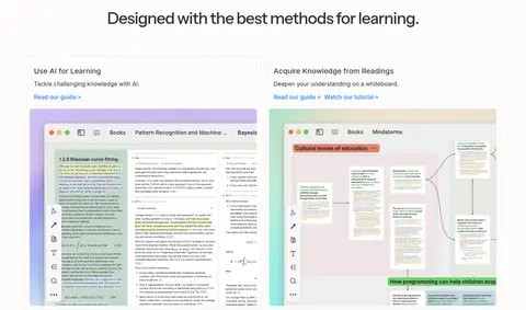
| 7 | feature-grid | Centered heading above paired learning-method cards with screenshots. | Explore learning approaches, Read guide | Two-column cards, Inline blue links, Screenshot previews |
| 8 | testimonials | Centered heading above a broad, dense field of testimonial tiles. | Build social proof, Scan user stories | Quote cards, Small avatars, Light separators |
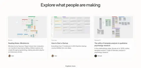
| 9 | gallery | Centered heading above a three-column row of community project cards. | Browse community work, Explore more | Three-column gallery, Preview thumbnails, Compact metadata |
| 10 | footer | Sparse footer with brand area and multi-column link lists. | Navigate product pages, Find downloads and policies | Multi-column links, Compact logo block, Muted text |
## Source CSS custom properties (selected)
```css
--background-primary: