North star · Keep the gray canvas and dark type quiet, then use oversized dot-matrix lettering and vivid, localized color bands as the event’s expressive focal points.
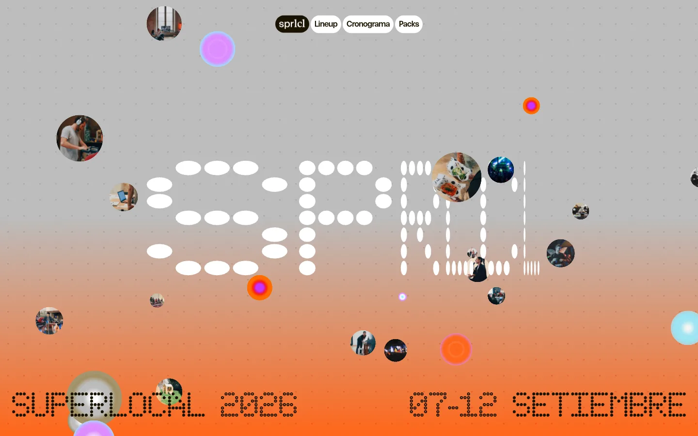
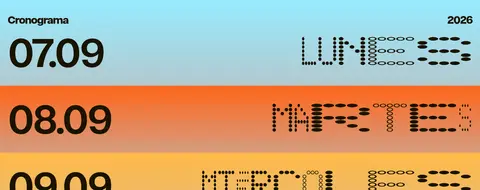
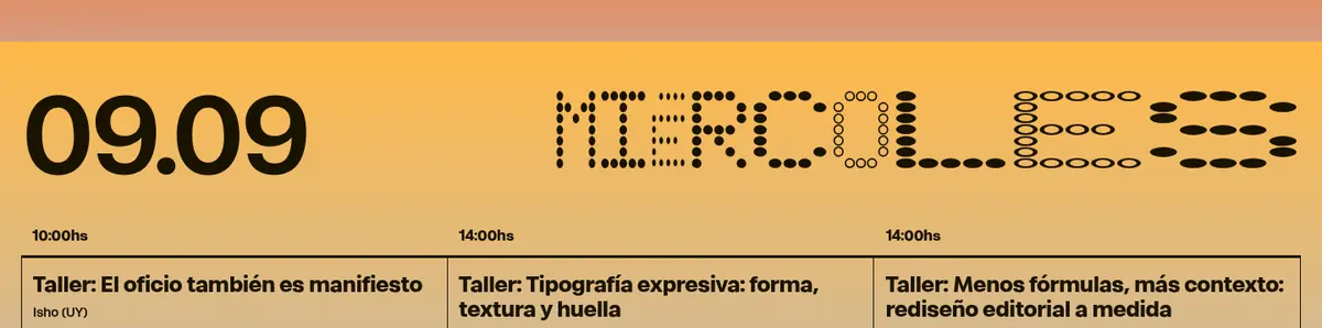
The page is anchored by a cool mid-gray canvas (#bcbcbc) and very dark brown-black text (#1a1302), creating a muted stage for the festival’s brighter moments. The hero introduces a warm orange-to-gray gradient, dotted display lettering, small circular photographs, and floating colored discs; these vivid elements belong to the artwork rather than replacing the neutral site canvas. Below the extensive quiet stretches, colorful horizontal date bands punctuate the schedule, with cyan, orange, and yellow gradients carrying oversized dates and dot-matrix day names. The sans face handles most interface and program text in bold, compact blocks, while a monospace display face gives the hero its distinctive pixel-like voice. Rounded pill navigation and registration buttons contrast with square-cornered, hairline-outlined schedule cards. The composition favors broad open space, strong typographic scale changes, and tightly organized multi-column event listings over conventional decorative cards.
配色
点色块复制色值。用途说明来自对页面的实测位置(背景、文字、描边、按钮)与截图判读。
品牌色
强调色
表层色
页面底色 · Festival Gray主文字 · Roasted Ink描边 · Roasted Ink强调 · Electric Mist强调 2 · Mango Glow强调 3 · Lilac Pop
Main interface, navigation, program listings, links, buttons, and supporting text.
Aa 设计
fontDisplay
网络字体 · 字重 700 · 占比 3%
免费替代:Space Mono
Oversized hero lettering and dot-matrix festival/date display.
角色
示例
字号
字重
行高
字距
特大标题
Oversized dotted festival identity lettering in the hero.
Superlocal
120px
700
0.9
0
一级标题
Primary hero headline and prominent festival/date display.
Superlocal
72px
700
0.95
0
二级标题
Major program section headings and large date labels.
Superlocal
42px
700
0.82
-0.06em
三级标题
Event titles and prominent content headings.
Superlocal
32px
600
1.15
-0.03em
四级标题
Secondary event names and compact card headings.
The quick brown fox 敏捷的狐狸
24px
700
1.1
-0.025em
正文
Supporting event details, times, venues, and descriptions.
The quick brown fox 敏捷的狐狸
14px
600
1.2
-0.025em
按钮
Registration and pill navigation button labels.
The quick brown fox 敏捷的狐狸
16px
600
1.3
-0.06em
链接
Large featured speaker and lineup links.
Superlocal
42px
700
0.82
-0.06em
间距与布局
基准单位 4px · 密度:紧凑
34px版块间距
8px元素间距
14px卡片内边距
1394px内容最大宽度
5px
8px
10px
12px
16px
23px
24px
34px
48px
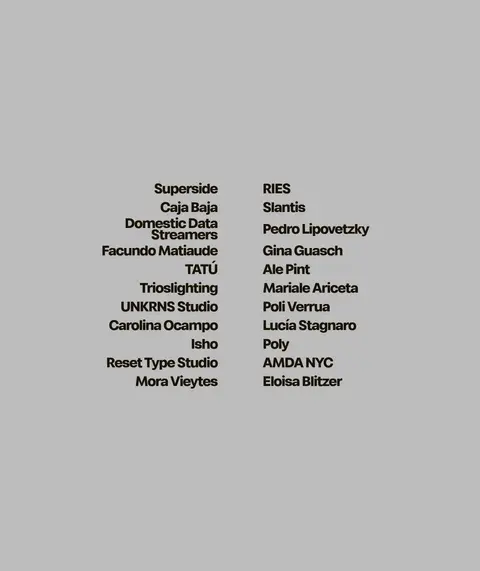
The measured content max width is 1394px, with the hero using a broad, open stage and the schedule switching to two- and three-column event groupings. Content aligns mostly to the start edge; the lineup is presented as a centered two-column name list. The measured spacing system uses a 4px base, compact element gaps, and generous section separation. Preserve the striking long quiet intervals visible between major content blocks instead of filling them with extra modules.
圆角与层次
按钮 · 9999px
没有测到阴影:页面是扁平的,层次靠底色和描边区分。
The interface is mostly flat: no measured shadows, with the gray canvas carrying the page. Use thin dark outlines for square-cornered schedule cards and rounded pills for navigation and registration controls. Hero circles and overlapping photographs supply the visible depth through composition rather than UI shadow.
组件
下面的预览按实测的按钮、输入框、徽标、卡片样式重建(字体用替代字体)。
Pill navigation
Compact rounded navigation pills sit near the top of the hero; the active brand pill is dark with light text, while neighboring controls are white with dark labels.
Registration CTA
Fully rounded dark button with accent-colored text; measured variants use cyan #97ebff or mango #ffb948.
Dot-matrix hero lettering
Large festival wordmark and date are drawn with dotted, monospace-style marks over the hero’s gradient field.
Floating image collage
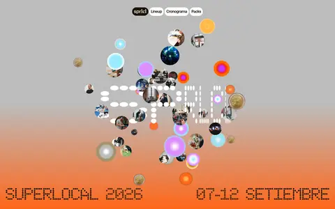
Small circular photo crops and colored discs float at different positions and scales around the hero lettering.
Lineup name list
Dense, bold speaker and contributor names arranged as a centered two-column list on the gray canvas.
Program date band
Full-width horizontal day bands use vivid gradients, oversized dates, and dot-matrix day names.
Schedule event card
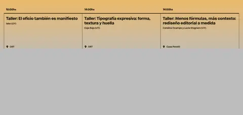
Square-cornered event modules use a 1px #1a1302 border, 16px 12px padding, bold titles, and compact event details.
Imagery · The hero combines small circular photographs with floating colored discs and a field of dotted lettering. Photographs are cropped into circular windows and scattered at varied scales around the central graphic; they read as collage accents, not conventional product photography. The remaining visible page is predominantly typographic and schedule-led, with no measured inline image counts in its program sections.
Reserve display monospace for oversized festival graphics.
Use vivid accents in localized bands, discs, or CTA labels.
Keep hero photography circular and collage-like.
Structure the schedule into clearly aligned columns.
✕ 不该做
Do not turn the full page into a bright orange background.
Do not use shadows to create depth on flat schedule cards.
Do not replace the dot-matrix display voice with generic oversized sans text.
Do not round the schedule cards; reserve pills for controls.
Do not fill the measured quiet stretches with invented sections.
Do not treat incidental illustration colors as the site’s main canvas.
给 AI 的提示词
想快速出一个同风格的新页面,把这段话连同 DESIGN.md 一起发给 AI。
Build a new page in Superlocal’s festival identity. Use Festival Gray (#bcbcbc) as the dominant canvas and Roasted Ink (#1a1302) for headings, links, outlines, and most interface text. Let fontSans-style bold sans handle navigation and content; reserve a bold monospace display face for oversized dot-matrix lettering. Introduce Electric Mist (#97ebff), Mango Glow (#ffb948), Lilac Pop (#dd8dff), Ochre Detail (#846108), and Festival Tangerine (#ff661a) in restrained graphic accents or horizontal gradient bands, not as a replacement canvas. Use compact rounded pills for navigation and CTAs, but square-cornered thin-outline content cards. Preserve broad open space, strong scale contrast, and tidy multi-column listings. Treat circular photos and floating discs as playful collage accents, not product imagery.