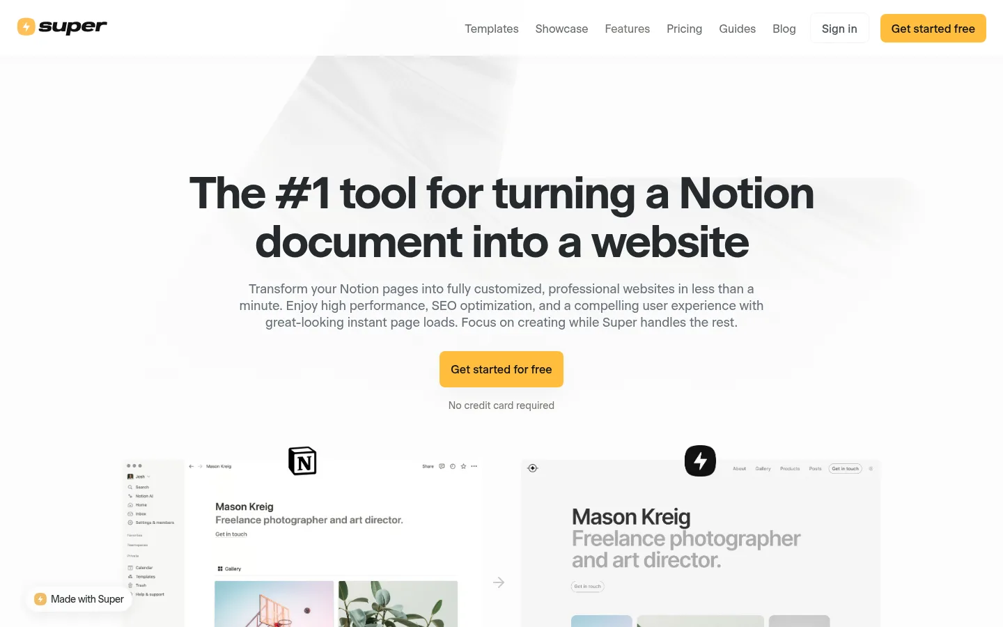
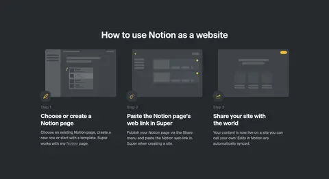
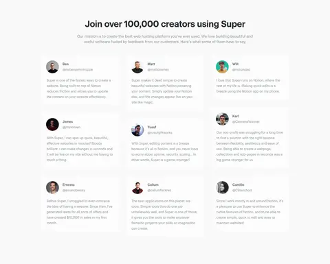
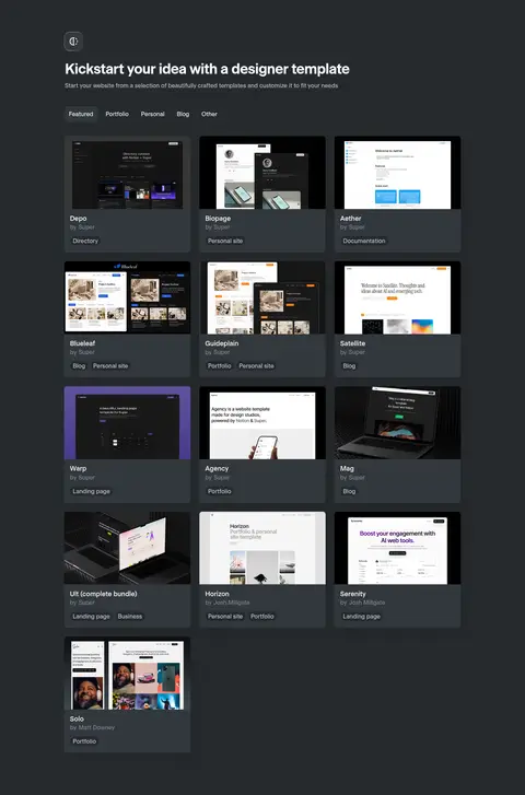
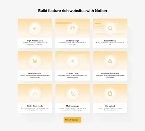
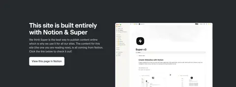
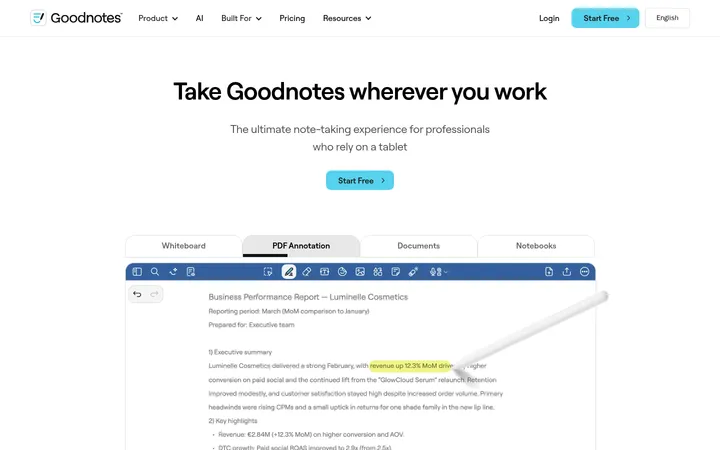
Super 以宽敞明亮的页面和醒目的炭黑色分区,展示将 Notion 页面转为网站的服务。产品预览、用户评价与模板画廊具体呈现产品价值,暖黄色按钮则贯穿全页,引导用户行动。
North star · Keep the page quiet and spacious, using charcoal section bands and yellow only to mark meaningful actions.
The page uses an almost-white canvas (#fdfdfc) as a quiet backdrop for charcoal (#262a2e) headings and alternating dark section bands. Warm yellow (#ffbe3c) is reserved for primary calls to action and small brand accents, not broad decoration. Beausite sans-serif typography gives the oversized, tightly tracked hero a crisp product feel; supporting copy is smaller, muted, and comfortably spaced. Layout is centered and modular, with a broad content frame, generous section pauses, and multi-column grids for testimonials, templates, features, and showcase examples. Screenshots and website mockups carry the product story, usually presented as clean, rectangular previews rather than expressive illustration. Cards sit on light or charcoal surfaces with restrained rounding and subtle shadows; pale gray surfaces and hairlines separate content without competing with the imagery. Dark bands create clear chapter changes while preserving a consistent, uncluttered rhythm.
Site-wide typeface for navigation, hero and section headings, body copy, captions, links, and buttons.
角色
示例
字号
字重
行高
字距
特大标题
Oversized hero headline, centered above the product comparison preview.
Super
64px
600
1.1
-0.039em
一级标题
Primary page and major section headings.
Super
38.5px
600
1.1
-0.026em
二级标题
Section titles and prominent feature or content headings.
The quick brown fox 敏捷的狐狸
25.5px
600
1.2
-0.031em
三级标题
Light-weight subheadings and secondary feature titles.
The quick brown fox 敏捷的狐狸
20px
300
1.3
0
正文
Explanatory copy, testimonials, and product descriptions.
The quick brown fox 敏捷的狐狸
16px
400
1.5
0
辅助文字
Small labels, image captions, and secondary metadata.
The quick brown fox 敏捷的狐狸
14px
400
1.71
0
按钮
Primary and secondary action labels.
The quick brown fox 敏捷的狐狸
16px
500
1.6
0
导航
Top navigation links and menu items.
The quick brown fox 敏捷的狐狸
16px
400
normal
0
链接
Text links in showcase, content, and supporting sections.
The quick brown fox 敏捷的狐狸
16px
400
normal
0
间距与布局
基准单位 4px · 密度:适中
48px版块间距
4px元素间距
—卡片内边距
1088px内容最大宽度
1px
2px
3px
4px
6px
8px
12px
16px
20px
24px
Use a centered content frame with a measured maximum width of 1088px and comfortable density. The first viewport centers the hero headline, supporting copy, CTA, and paired product previews beneath a compact horizontal navigation. Alternate broad light and charcoal section bands to define chapters. Within them, use centered headings, three-column cards, two-column feature splits, and a four-column template gallery where appropriate. Keep generous section gaps and consistent alignment; avoid dense edge-to-edge text.
圆角与层次
按钮 · 8px
卡片 · 8px
图片 · 50%
导航 · 8px
链接 · 5px
xl · card
md · card
md · nav
lg · button
Most sections and cards rely on flat color surfaces, with subtle rounded corners and restrained shadows on selected cards and the CTA. Pale borders separate light controls without becoming prominent. Layer product previews over their surroundings only when needed to communicate the Notion-to-site transformation; dark cards remain distinct through surface contrast rather than heavy outlines.
组件
下面的预览按实测的按钮、输入框、徽标、卡片样式重建(字体用替代字体)。
Primary CTA
Warm yellow (#ffbe3c) rounded button with near-black (#111111) medium-weight label; use the measured 8px radius and a soft shadow.
Top navigation
Compact horizontal links in Beausite, paired with a lightly bordered Sign in control and yellow primary action.
Hero comparison
Centered headline and supporting copy lead into two side-by-side Notion and custom-site previews, with a small transition cue.
Dark section band
Full-width charcoal (#262a2e) chapter background with light text and a centered heading or aligned content grid.
Template card
Rounded preview card in a multi-column gallery; dark graphite surfaces and subtle depth complement varied website thumbnails.
Testimonial card
Quiet light card with a small customer portrait, name, handle, and muted compact review text.
Imagery · Use product screenshots and website previews as the primary visual material: Notion interfaces, customized site mockups, and template thumbnails. Arrange previews in clean pairs or card grids, keeping their rectangular browser-like framing legible. Customer portraits appear small in testimonial cards. Feature illustrations are understated and often use warm yellow accents; avoid adding unrelated decorative photography or elaborate 3D effects.
Use Gallery White (#fdfdfc) as the dominant canvas.
Reserve Sunlit Gold (#ffbe3c) for primary actions and small accents.
Create chapter breaks with broad Charcoal Ink (#262a2e) bands.
Keep hero and section headings crisp, centered, and tightly tracked.
Show the product through legible website and Notion previews.
Use muted gray copy for supporting information and metadata.
✕ 不该做
Do not turn the yellow accent into a large background field.
Do not add gradients absent from the measured visual system.
Do not crowd the hero or card grids with excessive copy.
Do not use heavy outlines or dramatic shadows on every card.
Do not replace product screenshots with unrelated stock imagery.
Do not make every section dark; preserve the alternating light rhythm.
给 AI 的提示词
想快速出一个同风格的新页面,把这段话连同 DESIGN.md 一起发给 AI。
Build a new SaaS page in Super’s visual style. Use Gallery White (#fdfdfc) for the main canvas, Charcoal Ink (#262a2e) for strong headings and selected full-width section bands, and Sunlit Gold (#ffbe3c) sparingly for the primary CTA. Set all text in Beausite or a close sans-serif substitute such as Inter; make display headings semibold with tight tracking and body copy muted and comfortable to read. Use a centered content frame, spacious section breaks, and clear modular grids. Show the product through crisp Notion and website previews, with restrained rounded cards, quiet borders, and only subtle shadows. Alternate light content areas with charcoal chapters, keeping actions and navigation easy to scan. Avoid decorative gradients, excessive density, or unrelated imagery.