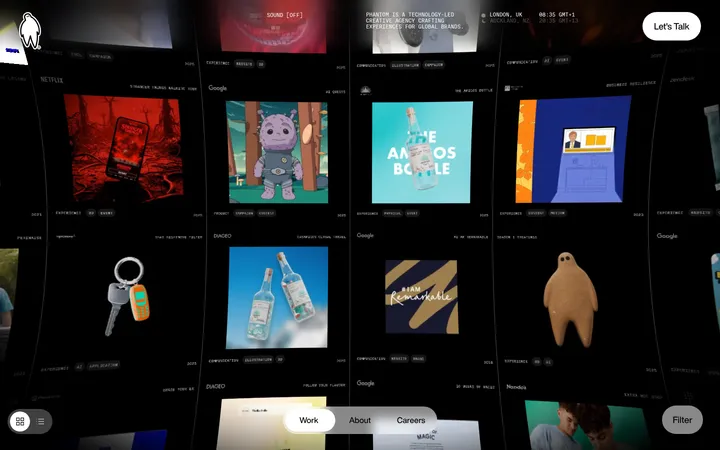
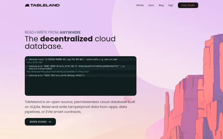
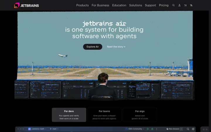
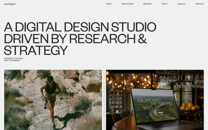
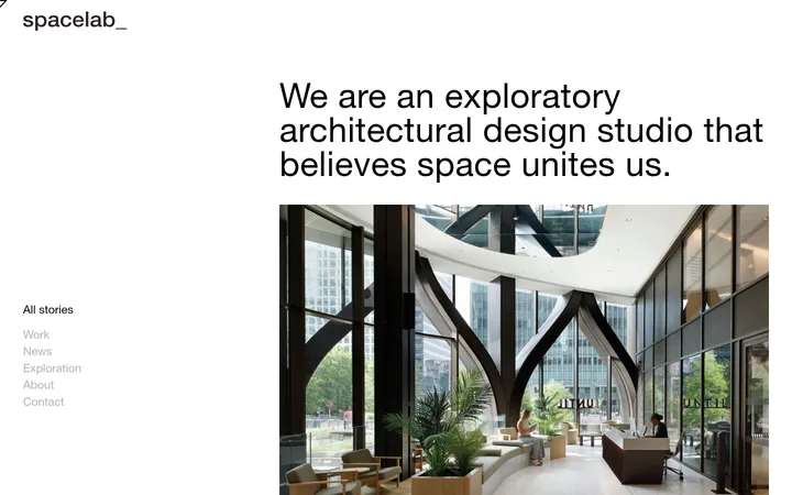
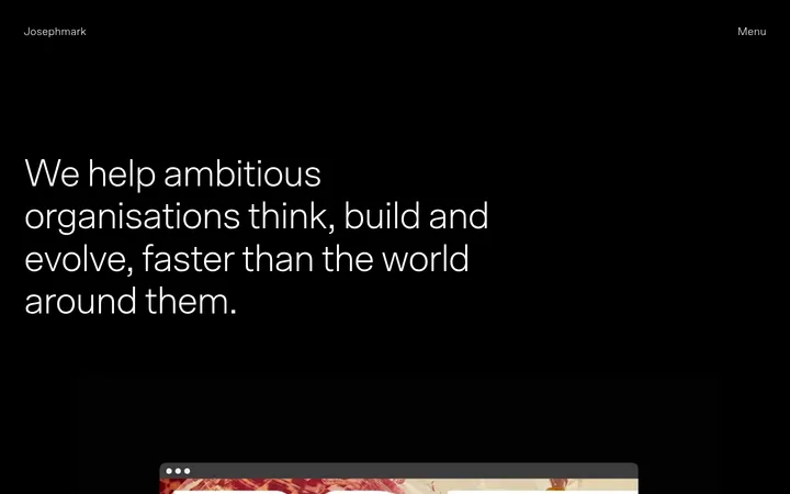
North star · Keep the canvas black and typography-led; let vivid color appear only as a deliberate accent or contained project artwork.
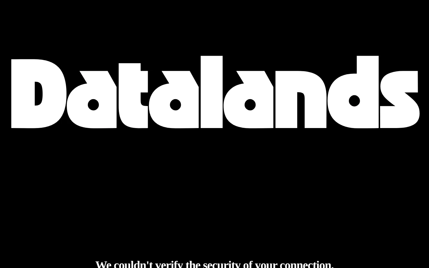
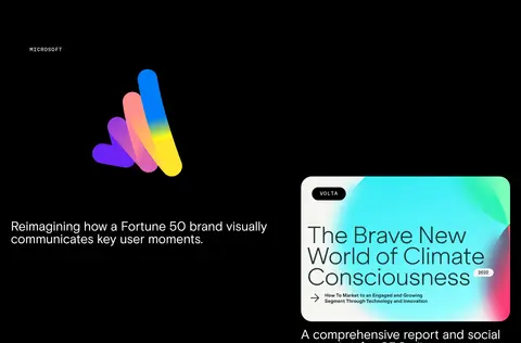
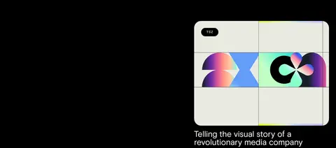
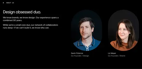
The page is built on a near-continuous black canvas, with white typography doing almost all of the brand work. Bright pink and sky blue are restrained accents rather than a general-purpose palette: pink marks newsletter controls, while blue anchors the inverse-color footer identity. Warm off-white appears in form fields and project artwork, not as a broad section background. The opening wordmark is an oversized, heavy display graphic; supporting copy uses a clean grotesque sans, while small uppercase mono labels establish navigation and editorial metadata. The long page uses open, asymmetrical compositions instead of boxed cards: project media and captions alternate across the canvas, and fine gray rules divide service, client, team, and process bands. Large gaps create a deliberate, comfortable rhythm. Photography, motion, logos, and bright case-study visuals are embedded as content, with color contained within each project rather than allowed to disrupt the predominantly monochrome identity.
配色
点色块复制色值。用途说明来自对页面的实测位置(背景、文字、描边、按钮)与截图判读。
品牌色
强调色
表层色
中性色
功能色
页面底色 · Studio Black表层 · Sky Panel表层 2 · Warm Porcelain主文字 · Paper White次要文字 · Studio Black强调 · Pulse Pink强调 2 · Sky Panel
文字
背景
对比度
WCAG
#ffffff Paper White
#000000 Studio Black
21:1
AAA
#ffffff Paper White
#94bcee Sky Panel
1.96:1
不达标
#ffffff Paper White
#f3f3ef Warm Porcelain
1.11:1
不达标
#000000 Studio Black
#94bcee Sky Panel
10.69:1
AAA
#000000 Studio Black
#f3f3ef Warm Porcelain
18.88:1
AAA
#fc74dd Pulse Pink
#000000 Studio Black
8.68:1
AAA
字体
字号阶梯:Custom(比例约 1.912,正文 14px)。示例用免费替代字体渲染,数值为实测。
Aa 设计
Basis Grotesque Pro Regular
网络字体 · 字重 400 · 占比 87%
免费替代:Inter
Main headings, project captions, explanatory copy, and most page text.
Aa 设计
Martian Mono sWd Rg
网络字体 · 字重 400 · 占比 5%
免费替代:IBM Plex Mono
Uppercase section labels, eyebrows, and compact editorial metadata.
Aa 设计
Martian Mono Std xLt
网络字体 · 字重 400 · 占比 5%
免费替代:IBM Plex Mono
Light mono details and newsletter field or control text.
Aa 设计
Martian Mono Std Lt
网络字体 · 字重 300 · 占比 2%
免费替代:IBM Plex Mono
Uppercase links and small navigation-style actions.
角色
示例
字号
字重
行高
字距
特大标题
Oversized Datalands wordmark graphic in the opening and footer.
Datalands
357.5px
900
0.8
-0.01em
一级标题
Primary introductory statements and major page headings.
Datalands
80px
400
1
-0.002em
二级标题
Large section headings, including studio and process content.
Datalands
60px
400
1
-0.003em
三级标题
Secondary feature or project statements.
Datalands
42px
400
1.1
-0.04em
四级标题
Smaller project titles and supporting headings.
Datalands
38px
400
1.1
-0.008em
正文
Project descriptions, studio copy, and explanatory paragraphs.
The quick brown fox 敏捷的狐狸
14px
400
1.2
-0.036em
辅助文字
Uppercase section labels and compact editorial annotations.
The quick brown fox 敏捷的狐狸
12.5px
400
1.25
0.05em
链接
Small uppercase project links and utility actions.
The quick brown fox 敏捷的狐狸
15px
300
1.25
0.05em
眉题
Section markers such as Case Studies, Services, and Clients.
The quick brown fox 敏捷的狐狸
12.5px
400
1.25
0.05em
代码
Mono-styled utility details and newsletter-related copy.
const style = 1;
16px
400
1.45
-0.05em
间距与布局
基准单位 2px · 密度:适中
80px版块间距
10px元素间距
—卡片内边距
1380px内容最大宽度
3px
10px
12px
14px
18px
20px
22px
24px
30px
36px
38px
40px
48px
50px
60px
80px
The page uses a wide canvas with a measured maximum content width of 1380px and a comfortable, spacious rhythm. Sections remain mostly single-column bands, but project stories and studio content shift into asymmetric multi-column compositions. Text often aligns left; project media and captions move between sides rather than following a rigid card grid. Thin horizontal rules separate major content groups. The measured section gap is 80px, with a compact 10px element gap, so generous transitions coexist with tightly grouped metadata.
圆角与层次
按钮 · 9999px
输入框 · 9999px
图片 · 9999px
链接 · 30px
inset · input
The design is predominantly flat: black bands meet without raised-card styling, and subtle hairlines provide separation. Avoid drop shadows and layered panels. Inputs are pale, pill-shaped controls with a measured inset shadow treatment; rounded media framing appears in project examples. Preserve clear content boundaries through spacing and rules rather than elevation.
组件
下面的预览按实测的按钮、输入框、徽标、卡片样式重建(字体用替代字体)。
Oversized wordmark
Use a bold white Datalands mark against black at the opening, then invert it to black over the blue footer field.
Section marker
Pair a small uppercase mono label with a leading dot and a fine horizontal divider to introduce content bands.
Project story
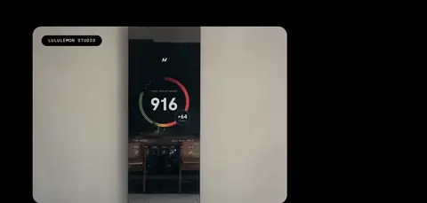
Combine project media, a concise grotesque caption, and a small uppercase mono label or link in an open, asymmetric layout.
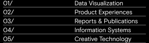
Service list
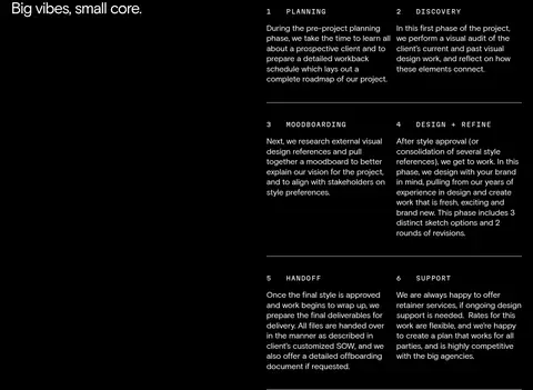
Present numbered service names in a vertical list, with thin rules separating rows instead of individual cards.
Newsletter form
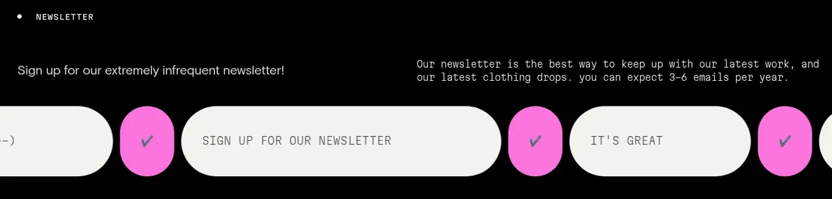
Use Warm Porcelain (#f3f3ef) pill-shaped fields and Pulse Pink (#fc74dd) pill-shaped submit controls with light mono utility text.
Footer contact panel
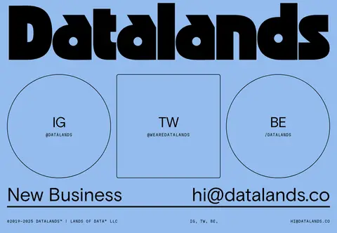
Set a black wordmark, outlined social links, and large contact details on the Sky Panel (#94bcee) surface.
Imagery · Project imagery mixes stills, video, logos, and client portraits. Keep media as contained case-study artifacts, often with rounded framing, and place captions nearby rather than overlaying them by default. The artwork can contain vivid gradients and product colors; these belong to each project, not the site-wide palette. Use restrained, dark surroundings so the media remains legible.
Use white as the default text color on dark sections.
Reserve pink for compact, high-salience controls.
Use sky blue for the inverse-color footer treatment.
Set utility labels in small, widely tracked uppercase mono.
Separate content bands with fine rules and generous space.
✕ 不该做
Do not turn the page into a grid of raised cards.
Do not spread pink or blue across large dark-page sections.
Do not use project artwork colors as global brand colors.
Do not add prominent shadows or decorative gradients to the canvas.
Do not make utility labels large or sentence case.
Do not force every project into the same alignment.
给 AI 的提示词
想快速出一个同风格的新页面,把这段话连同 DESIGN.md 一起发给 AI。
Build a new Datalands-style page as a dark, editorial studio experience. Use Studio Black (#000000) for the main canvas and Paper White (#ffffff) for the primary typography. Keep Pulse Pink (#fc74dd) limited to interaction accents, and reserve Sky Panel (#94bcee) for a deliberate inverse-color footer or callout. Use Warm Porcelain (#f3f3ef) only for form surfaces or contained media details. Pair a clean grotesque sans with widely tracked uppercase mono labels. Favor oversized brand typography, asymmetric project compositions, open space, and fine dividers over cards, shadows, or decorative gradients. Keep project imagery vivid but contained within its own media area. Use pill-shaped inputs and CTA controls, small editorial metadata, and clear section bands. Preserve an intentional long-scroll rhythm with varied alignment and generous separation.