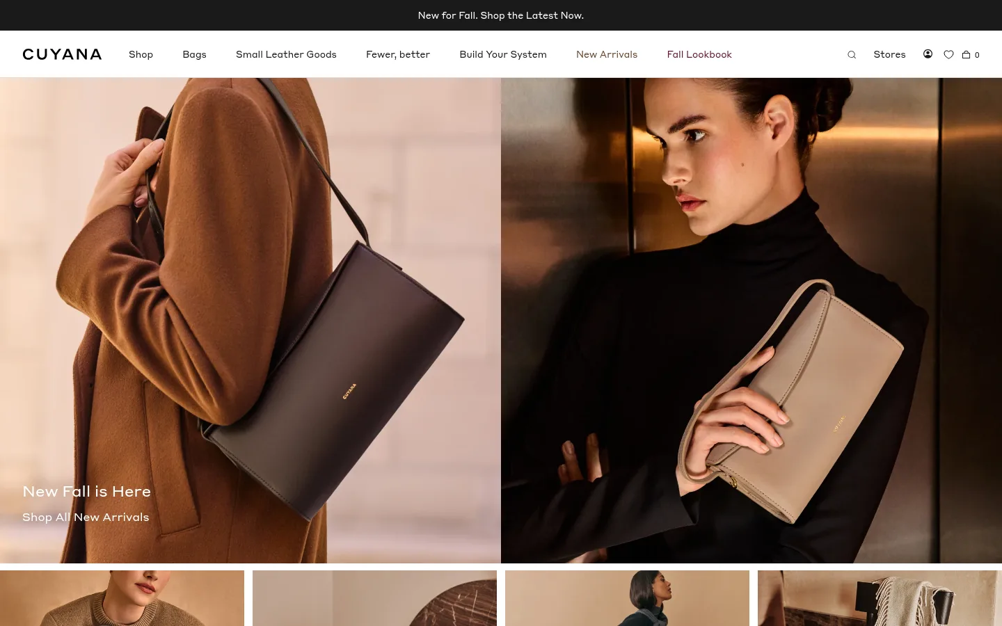
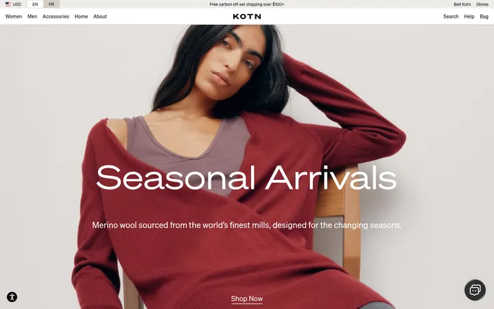
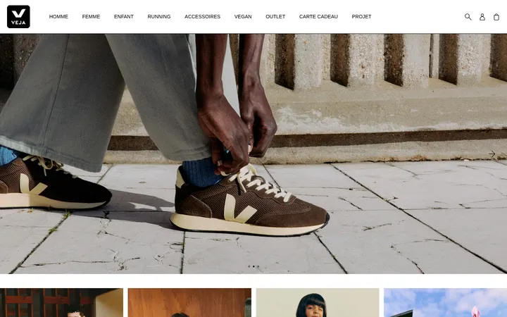
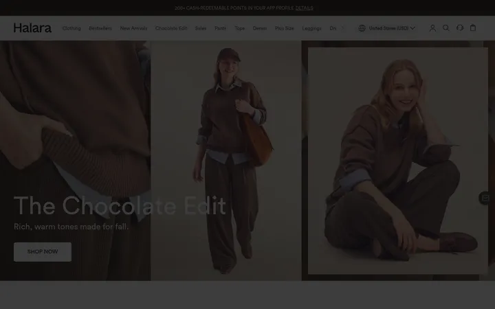
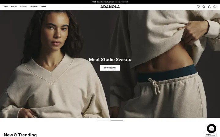
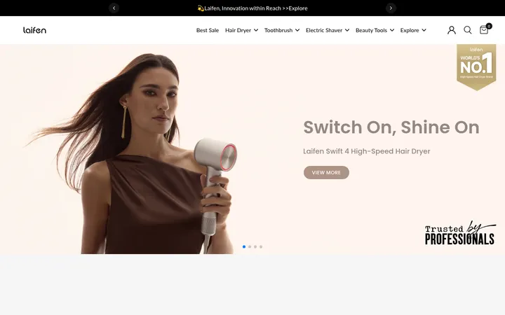
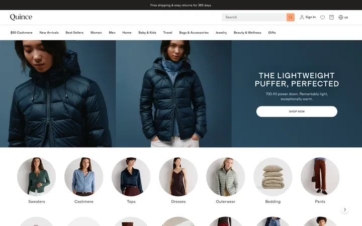
North star · Let warm, editorial product photography dominate, and use restrained typography, white space, and flat neutral surfaces to keep the storefront quiet.
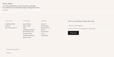
The visual strategy is quiet and image-led: white canvas and near-black typography leave the product photography to supply most of the warmth, contrast, and seasonal color. The hero spans the page with two fashion images and small white overlay copy; below it, compact category tiles and a two-panel lookbook continue the photographic rhythm. StyreneA-Regular-Web is used throughout, with regular-weight headings, compact body copy, and uppercase, letter-spaced eyebrow and caption labels. Navigation remains on a clean white band, with dark announcement strip above it and a restrained burgundy accent limited to small navigational details. The lower brand statement and multi-column footer sit on a pale warm surface, separating utility links and newsletter signup from the more immersive imagery. Thin gray rules and square-edged controls reinforce the flat, considered storefront rather than adding decorative effects.
Site-wide type for navigation, headings, body copy, labels, links, and controls
Aa 设计
Styrene A
系统字体 · 字重 400 · 占比 1%
免费替代:Inter
System fallback for the primary Styrene A interface typeface
角色
示例
字号
字重
行高
字距
一级标题
Hero headline and primary page-level heading.
The quick brown fox 敏捷的狐狸
24px
400
1.33
0
二级标题
Prominent editorial and section headings.
The quick brown fox 敏捷的狐狸
22px
400
1.27
0
三级标题
Category and secondary feature headings.
The quick brown fox 敏捷的狐狸
19px
400
1.37
0
四级标题
Smaller section and footer headings.
The quick brown fox 敏捷的狐狸
18px
400
1.33
0
正文
Brand story, descriptive copy, and supporting text.
The quick brown fox 敏捷的狐狸
13px
400
1.54
0
辅助文字
Compact uppercase supporting labels and fine print.
The quick brown fox 敏捷的狐狸
11px
400
1.55
0.065em
按钮
Uppercase newsletter and utility actions.
The quick brown fox 敏捷的狐狸
12px
500
1.67
0
导航
Primary menu and store navigation.
The quick brown fox 敏捷的狐狸
13px
500
1.54
0
链接
Category links and footer navigation.
The quick brown fox 敏捷的狐狸
13px
400
1.54
0
眉题
Small uppercase labels above or alongside content.
The quick brown fox 敏捷的狐狸
11px
400
1.55
0.065em
间距与布局
基准单位 2px · 密度:紧凑
32px版块间距
7px元素间距
—卡片内边距
1376px内容最大宽度
2px
3px
4px
6px
7px
8px
10px
12px
13px
14px
15px
18px
20px
25px
28px
32px
The page uses a wide, near-edge-to-edge storefront composition; the measured page maximum width is 1376px. A slim announcement strip and horizontal navigation lead into a full-bleed, two-image hero. Category imagery forms a four-column row, followed by two broad editorial panels. The footer shifts into a more compact multi-column arrangement. Content is mostly left-aligned, with tight gaps and little ornamental padding; section changes rely on imagery and a warm footer band rather than cards.
圆角与层次
inset · nav
The page is predominantly flat, with no visible card shadows or rounded containers. Fine gray hairlines define subtle boundaries, particularly around utility controls and footer inputs. Contrast and layering come from the black announcement strip, white navigation band, full-bleed photography, and pale footer surface rather than elevation effects.
组件
下面的预览按实测的按钮、输入框、徽标、卡片样式重建(字体用替代字体)。
Announcement strip
A narrow near-black band above the white header, with centered compact white promotional copy.
Store navigation
A single horizontal white row with the Cuyana wordmark, compact menu links, and right-aligned search, store, and account utilities.
Split-image hero
Full-width paired fashion images with a small white headline and shop link anchored near the lower-left.
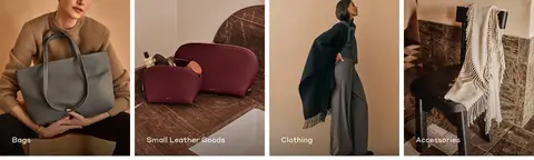
Category image tiles
Four adjacent photographic category panels with short white labels placed over the lower image area.
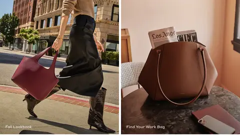
Editorial feature pair
Two large side-by-side lifestyle and product images, each identified by a concise white overlay label.
Newsletter signup
Footer form with a fine gray outlined email field and a square-edged dark button; button labels are uppercase.
Multi-column footer
Warm pale footer surface containing brand copy, contact details, customer and company links, newsletter signup, and country controls.
Imagery · Photography is the defining visual material: polished fashion and product scenes show models carrying bags, close product views, and lifestyle settings in warm leather, cream, and dark tones. Images are cropped edge-to-edge in the hero, category tiles, and paired lookbook panels. Text overlays are sparse and white where placed over images. There are no prominent illustrations or 3D renderings.
Let large product photographs carry the strongest color.
Use Styrene-like sans-serif typography consistently.
Keep navigation compact and horizontally aligned.
Use restrained uppercase labels with open tracking.
Separate utility content with thin gray rules.
Keep controls square-edged and visually flat.
✕ 不该做
Do not add gradients or decorative card shadows.
Do not use burgundy as a large background fill.
Do not crowd the photography with overlay copy.
Do not round buttons, fields, or image tiles.
Do not introduce a bright palette that competes with product imagery.
Do not turn the footer into a dark, high-contrast block.
给 AI 的提示词
想快速出一个同风格的新页面,把这段话连同 DESIGN.md 一起发给 AI。
Build a new Cuyana-style fashion storefront page with a calm, editorial hierarchy. Use Gallery White (#ffffff) as the main canvas and Soft Ink (#1a1a1a) for navigation, body text, and the dark announcement or primary action. Reserve Linen Blush (#f8f3f0) for a warm footer or brand-story band; use Quiet Rule (#dddddd) for fine borders and Muted Graphite (#525252) for secondary copy. Keep Oxblood Note (#621830) as a tiny accent, not a dominant fill. Use a restrained Styrene-like sans serif, compact navigation, regular-weight headings, and widely tracked uppercase labels. Compose the page from edge-to-edge fashion photography, clear category tiles, and paired editorial features. Keep controls flat and square-edged, and rely on image cropping and tonal contrast rather than shadows or decorative effects.