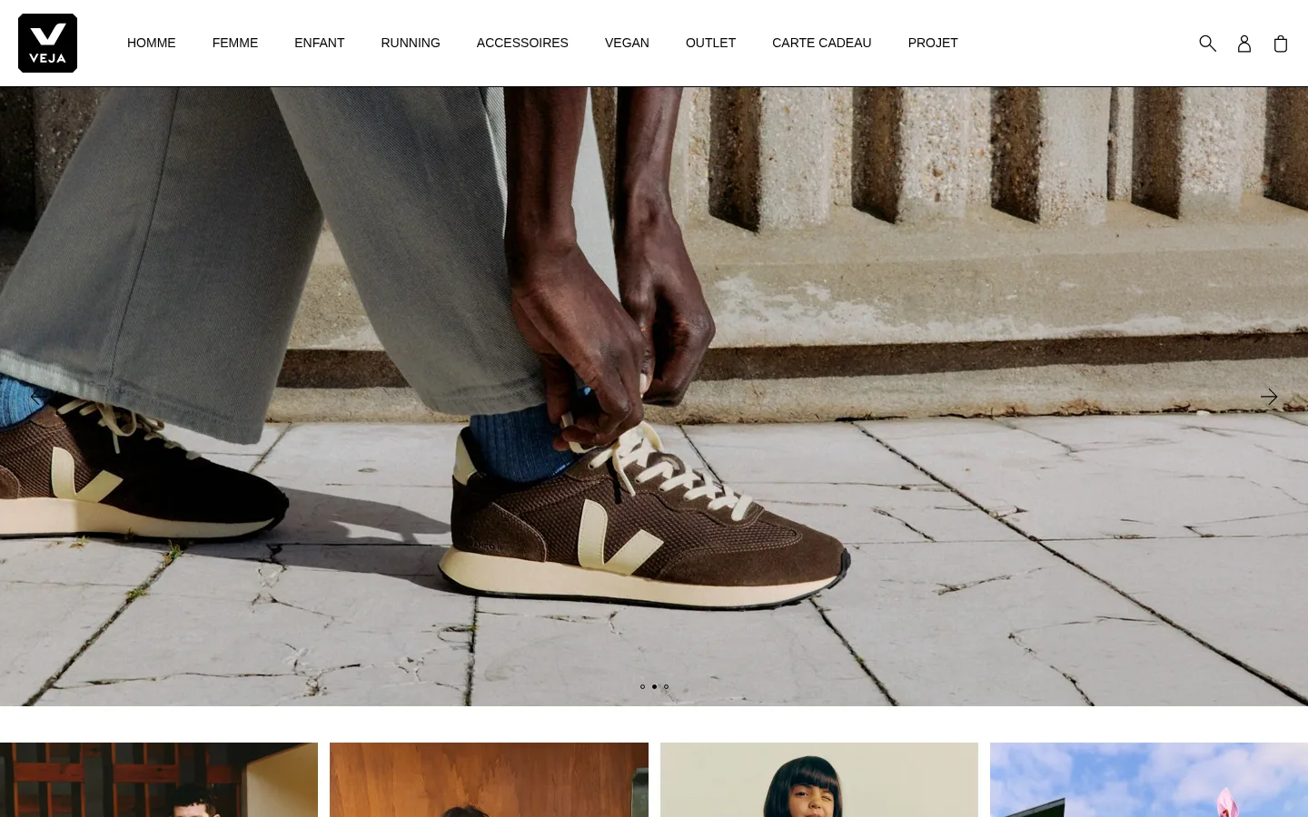
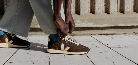
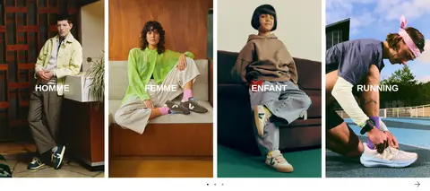
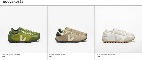
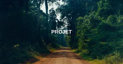
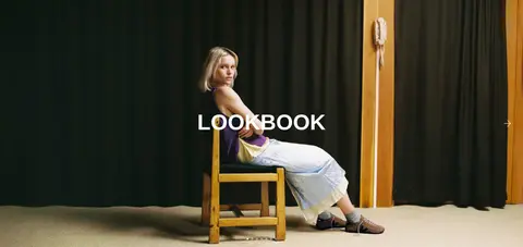
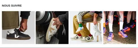
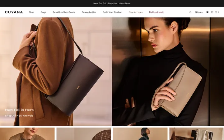
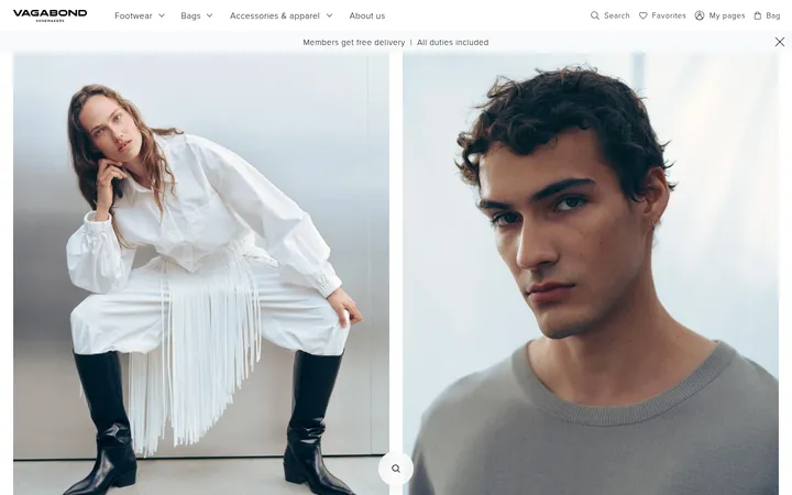
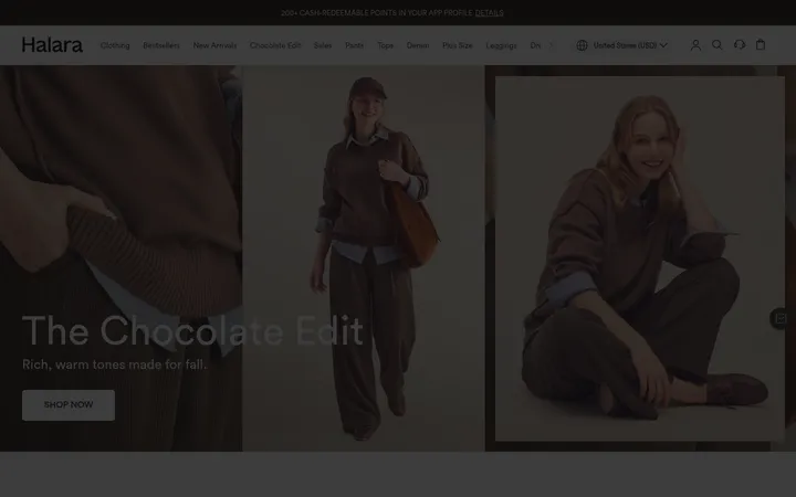
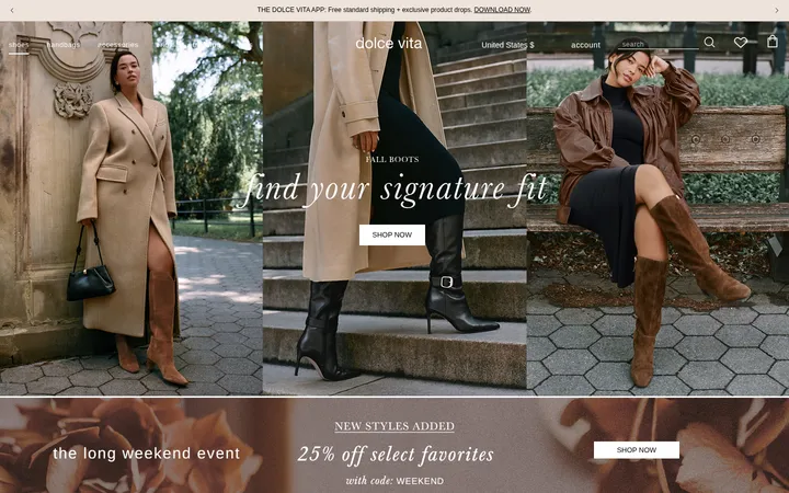
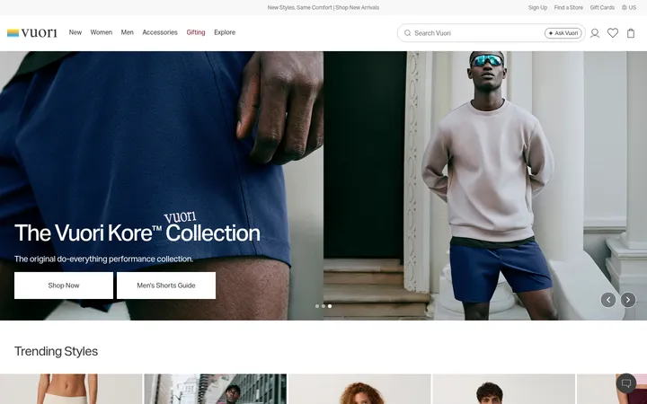
North star · Keep the interface visually quiet so authentic campaign and product photography carries the brand story.
The page uses a white canvas and near-black typography to keep attention on photography rather than decorative interface styling. Black anchors the logo, navigation, headings, and footer text; muted charcoal supports secondary copy, while gray appears in restrained form controls and hairlines. Pale gray is reserved for product-card backgrounds. Helvetica carries the entire hierarchy: uppercase navigation, labels, and headings give the storefront a direct editorial voice, balanced by sentence-case body copy. The layout alternates between full-bleed campaign imagery, compact category tiles, three-column product cards, and content-led brand storytelling. White space and thin separators distinguish blocks without relying on shadows or ornamental containers. Photography supplies the page’s changing palette—earthy footwear and natural settings, workshop scenes, and people in motion—while the interface stays consistent and neutral. The result feels practical and fashion-led, with shopping paths integrated into a story about responsible production.
Site-wide font for navigation, headings, body text, labels, links, and controls.
角色
示例
字号
字重
行高
字距
特大标题
Large uppercase campaign or editorial display headings.
VEJA
60px
700
1.2
0
一级标题
Primary uppercase section headings such as product and project titles.
VEJA
30px
700
1.15
0
正文
Descriptive brand, sustainability, and footer copy.
The quick brown fox 敏捷的狐狸
16px
400
1.88
0
辅助文字
Small uppercase product labels and compact metadata.
The quick brown fox 敏捷的狐狸
13px
400
1.15
0
按钮
Uppercase action labels, including newsletter sign-up.
The quick brown fox 敏捷的狐狸
16px
400
1.15
0
导航
Compact uppercase category and utility navigation.
The quick brown fox 敏捷的狐狸
14px
400
1.15
0
链接
Product, editorial, and footer links in regular case.
The quick brown fox 敏捷的狐狸
16px
400
1.15
0
间距与布局
基准单位 4px · 密度:适中
50px版块间距
5px元素间距
—卡片内边距
1400px内容最大宽度
5px
8px
10px
20px
40px
50px
Use a wide, responsive storefront with a measured desktop maximum content width of 1400px. The header is a single horizontal band with the logo, evenly distributed category links, and utility icons. The page rhythm alternates full-width campaign imagery with tiled category and product collections, then returns to editorial stories, newsletter, social imagery, and a multi-column footer. Product and category areas use clear columns; headings are left-aligned or centered according to section purpose. Spacing feels comfortable, with distinct section breaks and little ornamental padding.
圆角与层次
按钮 · 5px
没有测到阴影:页面是扁平的,层次靠底色和描边区分。
The interface is predominantly flat: there are no measured shadows or gradients. Separate product cards and footer columns with subtle gray or black hairlines where useful, while image blocks provide their own depth and contrast. Keep corners square across cards and layout elements; the newsletter sign-up control is the measured exception, with a small rounded outline.
组件
下面的预览按实测的按钮、输入框、徽标、卡片样式重建(字体用替代字体)。
Global navigation
White horizontal header with black VEJA mark, uppercase category links, and compact search, account, and bag icons.
Campaign hero
Full-bleed lifestyle photograph with minimal interface overlay and small carousel indicators.
Category tiles
Multi-column fashion photographs with centered white uppercase category labels.
Product cards
Three-column sneaker display on #f4f4f6, followed by small uppercase product names and prices.
Editorial story
Large project and lookbook photography paired with centered white display text or compact supporting copy.
Newsletter form
Minimal email input and outlined sign-up button; gray text and border keep the form understated.
Footer navigation
Dense multi-column help, information, project, and social links, followed by payment marks and legal details.
Imagery · Use documentary-style fashion and product photography, not illustrations or 3D. Hero and lookbook images can run edge to edge; category tiles show people wearing the products, while product cards isolate sneakers against pale neutral backdrops. Favor natural light, real locations, workshop and production details, and candid movement. Keep overlays limited to legible white labels on imagery.
Keep page chrome white, black, and restrained gray.
Let strong photography dominate the first viewport.
Use Helvetica or a close neutral sans-serif throughout.
Set navigation and display labels in uppercase.
Keep product imagery clean and product names compact.
Separate sections with whitespace or subtle hairlines.
✕ 不该做
Do not add gradients or decorative shadows.
Do not introduce bright interface accent colors.
Do not place dense text over campaign imagery.
Do not use rounded cards or pill-shaped controls.
Do not make the navigation visually heavier than the imagery.
Do not treat photographic colors as interface palette colors.
给 AI 的提示词
想快速出一个同风格的新页面,把这段话连同 DESIGN.md 一起发给 AI。
Build a responsive VEJA-style fashion storefront page with a quiet, image-led editorial feel. Use Gallery White (#ffffff) as the main canvas, Logo Black (#000000) for strong text and navigation, Soft Charcoal (#212529) for secondary copy, Quiet Gray (#888888) for muted details and outlined controls, and Mist Surface (#f4f4f6) only behind product cards. Use Helvetica or Arial, with uppercase navigation and headings and restrained regular-weight body copy. Create a compact horizontal header, large edge-to-edge lifestyle hero, category tiles, clean sneaker product cards, editorial story blocks, newsletter signup, and structured footer. Favor real, natural-looking fashion and production photography. Keep surfaces flat, corners square except for a subtly rounded signup button, and avoid gradients, shadows, and unnecessary decorative UI.