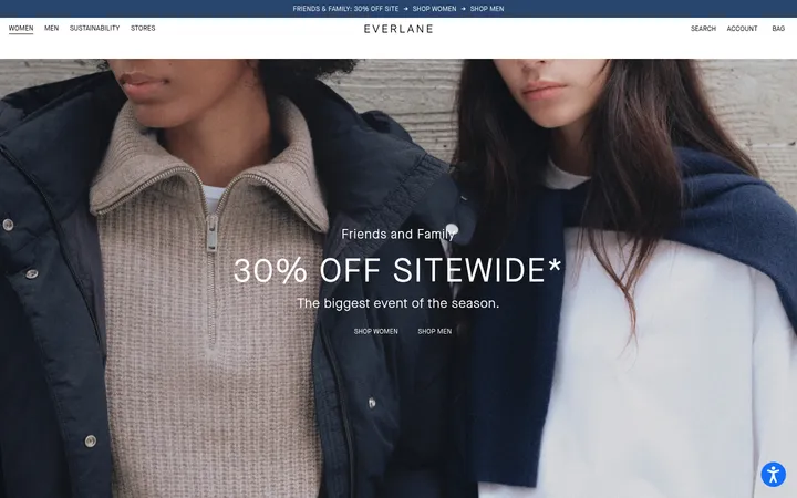
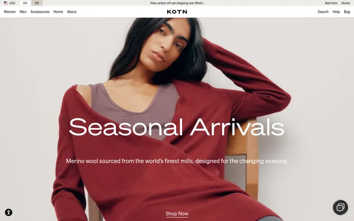
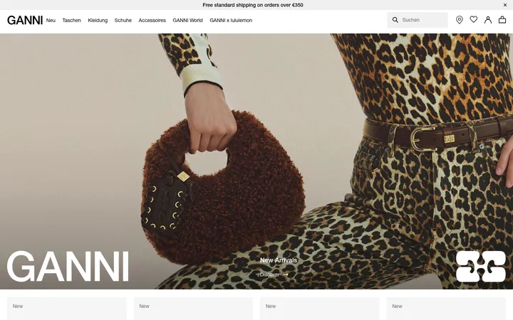
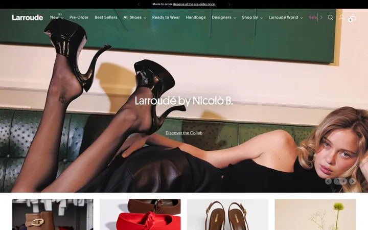
North star · Let polished apparel photography lead, while a warm-neutral interface keeps every shopping path clear and unobtrusive.
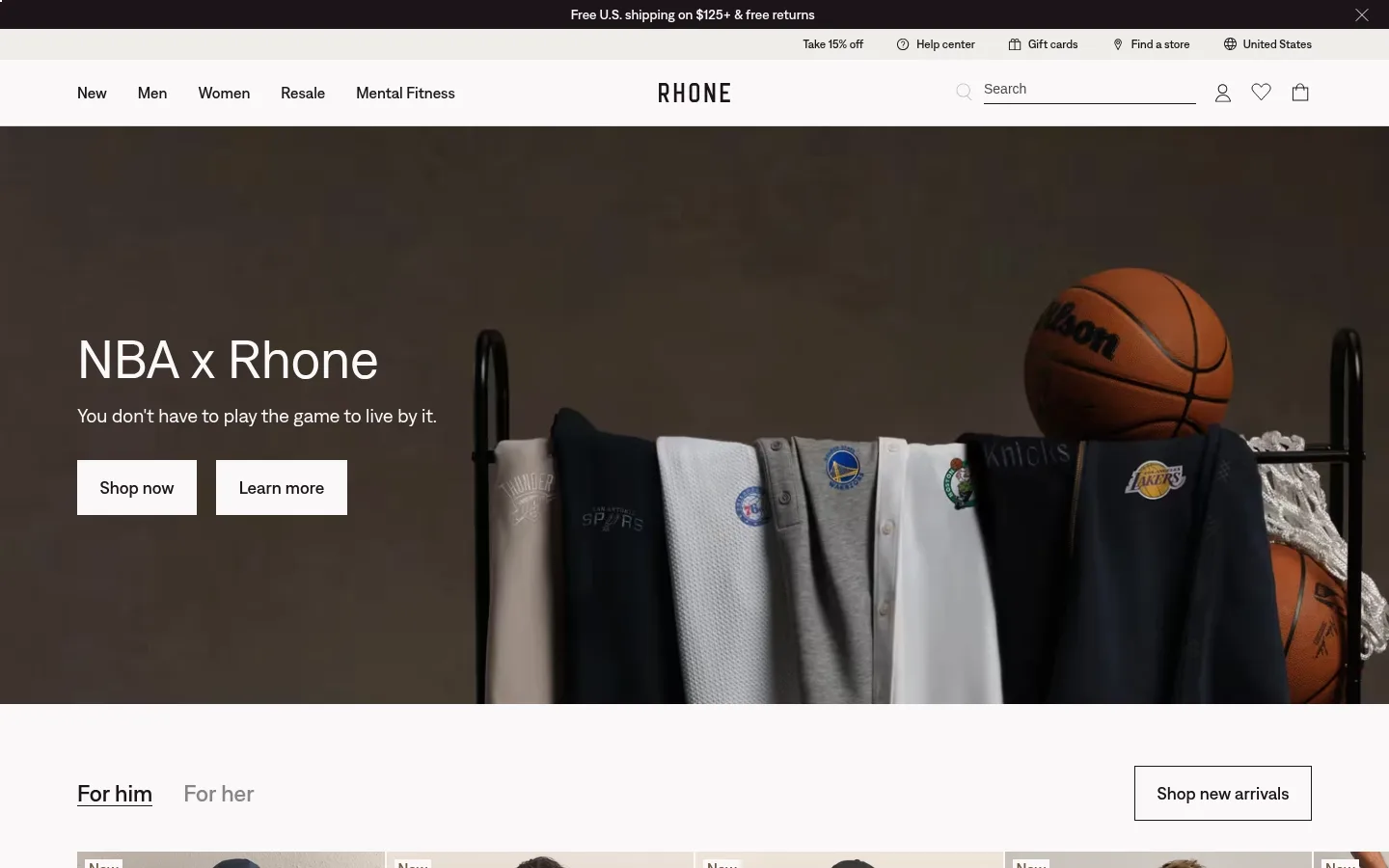
The visual system is built around a warm, near-white canvas (#fbf9f9), deep plum-black text (#1c1519), and pale stone product surfaces (#efedea). Photography supplies most of the page’s richer color: campaign scenes use dark, earthy backdrops while apparel imagery carries muted browns, blues, and greens. Denim is the dominant sans-serif, used across navigation, headings, product details, and calls to action; Reckless appears sparingly as a secondary display voice. The layout alternates full-width photographic campaigns with compact product rows and clean category grids, keeping shopping actions close to the imagery. Comfortable spacing and strong horizontal alignment let each module feel distinct without visual ornament. Thin warm-gray rules organize navigation and forms; cards remain largely flat and square-edged. The dark footer reverses the palette for support links, social icons, and an email signup.
Primary sans-serif across navigation, headings, body copy, links, product labels, and buttons.
Aa 设计
Reckless
网络字体 · 字重 400 · 占比 4%
免费替代:Cormorant Garamond
Rare secondary display face, used as a restrained editorial contrast rather than the main UI voice.
角色
示例
字号
字重
行高
字距
特大标题
Large campaign headline over full-bleed photography.
Rhone
56px
400
1.04
0
一级标题
Primary section or page heading, including campaign titles.
The quick brown fox 敏捷的狐狸
24px
500
1.08
0
二级标题
Secondary editorial and promotional headings.
The quick brown fox 敏捷的狐狸
20px
400
1.4
0
正文
Standard supporting copy and explanatory text.
The quick brown fox 敏捷的狐狸
16px
400
1.5
0
辅助文字
Compact campaign, product, and supporting labels.
The quick brown fox 敏捷的狐狸
14px
400
1.57
0
按钮
Prominent shopping and campaign calls to action.
The quick brown fox 敏捷的狐狸
18px
500
1.44
0
导航
Main and utility navigation labels.
The quick brown fox 敏捷的狐狸
16px
500
1.5
0
链接
Product names and secondary text links.
The quick brown fox 敏捷的狐狸
14px
400
1.57
0
间距与布局
基准单位 4px · 密度:适中
64px版块间距
8px元素间距
—卡片内边距
1280px内容最大宽度
2px
4px
7px
8px
16px
80px
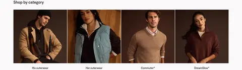
The measured content uses a 1280px maximum page width with comfortable density and a two-column structure for major campaign blocks. The homepage alternates broad image-led promotions, horizontally arranged product collections, and a four-column category row. Most content sits on the same warm-white canvas, with section gaps creating separation instead of colored bands. Align headings and shopping actions consistently within each module; the footer switches to a four-column link layout and a separate lower social/legal area.
圆角与层次
按钮 · 50%
没有测到阴影:页面是扁平的,层次靠底色和描边区分。
The interface is predominantly flat, with no measured shadows. Product cards sit directly on the page or on Warm Stone surfaces, while thin Oat Hairline borders define navigation and form details. Maintain clear image-to-canvas boundaries and use the dark footer as a strong palette reversal rather than a raised panel.
组件
下面的预览按实测的按钮、输入框、徽标、卡片样式重建(字体用替代字体)。
Announcement and utility bars
Stack a slim Plum Ink shipping announcement above a pale utility row with offer, help, gift-card, store, and region links.
Primary navigation
Place category links on the left, centered Rhone wordmark, and search plus account, favorite, and bag controls on the right.
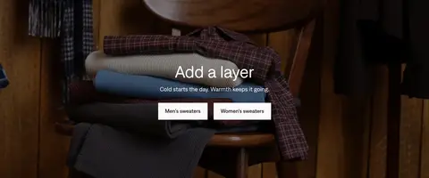
Campaign hero
Use a full-width lifestyle image with left-aligned white headline and supporting copy; pair with simple light CTA buttons.
Product carousel
Present apparel cards in a horizontal row with square imagery, product name, color swatches, price, and small promotional labels.
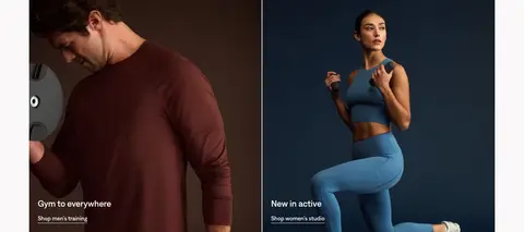
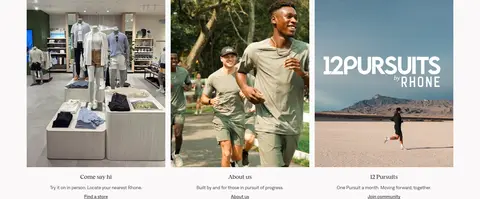
Image category tiles
Use paired feature panels or a four-column image strip with short category labels and minimal text overlays.
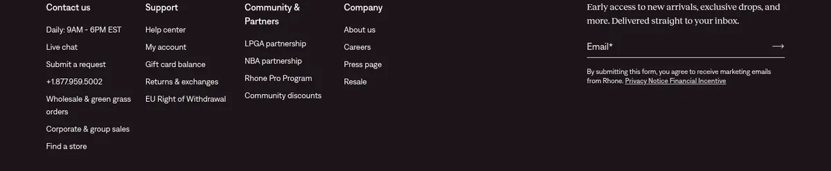
Dark footer
Reverse to Plum Ink with grouped support and company links, an email signup, social icons, and a subdued legal row.
Imagery · Use high-quality lifestyle and apparel photography, not illustration or 3D. The hero is full-bleed and dark, with campaign products framing the copy; later modules mix tightly cropped product cards, paired lifestyle panels, and four category images. Keep people and garments visually prominent, with natural earthy color and minimal graphic overlays. Text over imagery should remain legible and concise.
Keep Plum Ink for core text, navigation, and the footer.
Let authentic apparel photography carry the strongest color.
Keep product details and shopping actions close to their images.
Use warm-gray hairlines instead of decorative dividers.
Preserve generous separation between distinct shopping modules.
✕ 不该做
Do not introduce bright UI accent colors.
Do not add gradients or decorative shadows.
Do not round product cards or campaign panels.
Do not let secondary typography overpower Denim.
Do not bury product names, prices, or category links.
Do not turn image-led modules into dense text blocks.
给 AI 的提示词
想快速出一个同风格的新页面,把这段话连同 DESIGN.md 一起发给 AI。
Build a new Rhone-style fashion-commerce page with a warm, restrained palette: use Gallery White (#fbf9f9) as the main canvas, Plum Ink (#1c1519) for text and dark footer bands, Warm Stone (#efedea) for subtle product surfaces, and Oat Hairline (#e3dfd9) for borders. Use Denim, or a close sans-serif substitute, for nearly all interface typography; reserve a secondary serif for rare editorial emphasis. Organize the page into clear image-led shopping modules: a concise campaign hero, product rows, category tiles, and a compact information footer. Favor high-quality lifestyle apparel photography with earthy tones and purposeful crops. Keep cards flat and square-edged, use generous section separation, and place product labels, prices, and calls to action close to their imagery. Avoid gradients, heavy shadows, and loud accents.