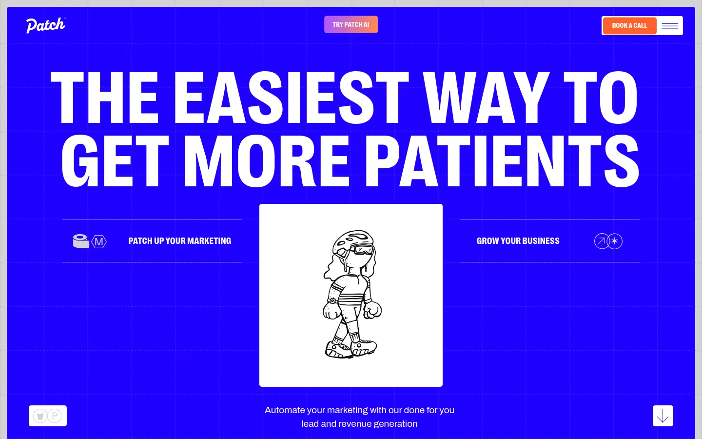
Patch以醒目的亮蓝底色、超大窄体标题和编排感十足的版式,呈现面向诊所的营销服务。手绘人物、描边卡片、橙色按钮和数据证明,让页面既有活力也显得专业可靠。
North star · Make every section feel like a bold blue editorial poster, then use precise grids, thin outlines, and clear proof to keep it usable.
Patch’s visual identity is led by saturated electric blue (#1f00ff), used as a full-bleed hero field and recurring band behind large white headlines and proof points. Cool gray (#d3d3d3) carries much of the long-form canvas, while white and pale gray panels create readable islands for process steps, testimonials, and pricing. Orange (#ff622b) is reserved for primary actions; the purple-to-peach gradient is a small navigation accent rather than a general background treatment. PP Right drives tall, uppercase display typography with tight line rhythm and slightly open tracking; Archivo handles body copy and compact interface text. Layouts use broad two-column compositions, visible grid lines, thin blue borders, and generous vertical pauses. Hand-drawn clinic-themed characters and simple diagrams add personality without competing with the typography. Overall, the system feels like a bold editorial poster translated into a clear conversion page.
配色 点色块复制色值。用途说明来自对页面的实测位置(背景、文字、描边、按钮)与截图判读。
品牌色
Electric Ink
#1f00ff
Signature blue for hero and results bands, headline text, navigation labels, card outlines, and key emphasis.
强调色
Action Orange
#ff622b
Primary inquiry and booking buttons; keep it limited to calls to action.
Violet Spark
#b15af8
One endpoint of the small navigation gradient accent.
Peach Flare
#ff8951
Warm endpoint of the navigation gradient; not a broad page background.
表层色
Cool Concrete
#d3d3d3
Main page canvas across the opening, process, and testimonial areas; also appears in muted headline states.
Soft Alloy
#ececec
Pale section band and fine card or table borders, especially around service content.
Mist Panel
#f2f2f2
Minor light panel and card variation; supporting surface rather than a defining brand color.
中性色
Paper White
#ffffff
Headline contrast on blue, card interiors, navigation controls, and the bright service-pricing area.
功能色
Graphite Detail
#212121
Small dark detail in miscellaneous interface content, not a major page color.
文字 背景 对比度 WCAG #1f00ff Electric Ink#d3d3d3 Cool Concrete5.61:1 AA #1f00ff Electric Ink#ffffff Paper White8.39:1 AAA #1f00ff Electric Ink#ececec Soft Alloy7.1:1 AAA #d3d3d3 Cool Concrete#ffffff Paper White1.5:1 不达标 #d3d3d3 Cool Concrete#ececec Soft Alloy1.27:1 不达标 #ffffff Paper White#d3d3d3 Cool Concrete1.5:1 不达标
字体 字号阶梯:Perfect Fifth(比例约 1.517,正文 19px)。示例用免费替代字体渲染,数值为实测。
Aa 设计
PP Right 网络字体 · 字重 400 · 占比 69%
免费替代:Oswald
Display headlines, section titles, navigation headings, and uppercase labels
Aa 设计
Archivo 网络字体 · 字重 400 / 300 · 占比 31%
免费替代:Archivo
Body copy, captions, CTA labels, and supporting interface text
角色 示例 字号 字重 行高 字距 特大标题 Oversized uppercase hero and statement headlines.
Patch
152.5px 400 0.85 0.02em 一级标题 Primary hero headline in large condensed uppercase.
Patch
133.5px 400 0.94 0.02em 二级标题 Major section headings and prominent statements.
Patch
90.5px 400 0.79 0 三级标题 Secondary feature and process titles.
Patch
66.5px 400 0.86 0 四级标题 Smaller uppercase headings inside cards and section blocks.
Patch
47.5px 400 1.1 0.03em 正文 Explanatory copy and supporting paragraph text.
The quick brown fox 敏捷的狐狸
19px 400 1.5 0 辅助文字 Compact card descriptions and testimonial details.
The quick brown fox 敏捷的狐狸
17px 400 1.22 0 导航 Short uppercase navigation labels.
The quick brown fox 敏捷的狐狸
14.5px 400 1 0.03em 眉题 Uppercase introductory labels above section content.
Patch
38px 400 1.13 0.04em
间距与布局 基准单位 1px · 密度:宽松
190px 版块间距
14px 元素间距
— 卡片内边距
1411px 内容最大宽度
5px
10px
11px
12px
14px
17px
19px
21px
22px
24px
26px
29px
30px
31px
33px
34px
The measured content max width is 1411px, with a spacious overall density and a 190px section gap. Sections alternate between full-bleed blue bands and gray or white canvas areas. The hero centers its oversized headline above a two-sided statement row and character illustration; later sections use wide split layouts, stacked numbered process items, proof cards, and a three-plan pricing row. Align content to a visible grid, favor strong left alignment for section titles, and preserve broad pauses between content groups.
圆角与层次 没有测到阴影:页面是扁平的,层次靠底色和描边区分。
The interface is mostly flat: measured shadows are absent, and thin blue or pale-gray borders define cards and grids. Use modest layering for testimonial panels and overlapping card-like elements, not soft floating shadows. Small measured corner radii keep buttons and cards restrained rather than pill-shaped.
组件 下面的预览按实测的按钮、输入框、徽标、卡片样式重建(字体用替代字体)。
Primary CTA Use an orange (#ff622b) fill with contrasting label text and a restrained rounded corner; reserve for booking and pricing inquiry actions.
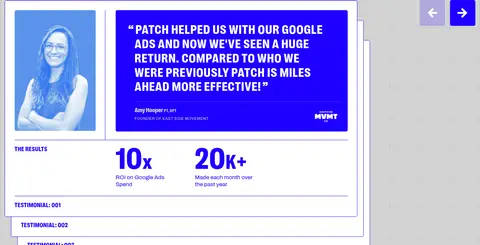
Outlined content card White panel with a fine #1f00ff border, compact content, and subtly rounded corners; used for promises and testimonials.
Oversized section heading Set PP Right in uppercase with condensed proportions and tight line rhythm; use white on blue or Electric Ink on light canvas.
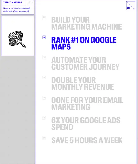
Process list Present numbered outcomes as a vertical sequence with small index markers, large uppercase titles, and a clear active blue state.
Navigation CTA group Combine a compact booking button and menu control at the top edge, with a small gradient accent for the AI link.
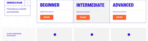
Pricing plan row Arrange three adjacent plan cards with uppercase tier titles, compact commitment details, fine borders, and orange inquiry buttons.
Imagery · Use sparse, hand-drawn black-line characters and simple conceptual illustrations, often framed by clean white panels. Supporting visuals include lightweight diagrams and client marks; they should feel illustrative rather than photographic or 3D. Keep imagery secondary to the huge typography and use blue fields or outlined cards to frame it. Do not treat incidental colors inside illustrations as core brand colors.
页面版块 共 12 个版块,按页面从上到下排列,每个都标了类型、布局和交互套路。
该做与不该做 ✓ 该做 Use #1f00ff as the unmistakable anchor color. Pair oversized uppercase display type with concise copy. Use white cards and thin blue outlines for structured content. Reserve #ff622b for primary calls to action. Alternate bold color bands with calm gray or white sections. Use illustrations as supporting accents, not focal clutter. ✕ 不该做 Do not replace the electric-blue identity with a muted palette. Do not use the gradient as a full-page background. Do not add heavy shadows or elaborate card effects. Do not set every paragraph in uppercase display type. Do not use pill-shaped controls in place of restrained corners. Do not let decorative imagery overwhelm the page hierarchy. 给 AI 的提示词 想快速出一个同风格的新页面,把这段话连同 DESIGN.md 一起发给 AI。
复制 Build a new page in Patch’s bold editorial style. Anchor major visual moments with Electric Ink (#1f00ff), especially full-width feature bands and oversized headline areas. Use Cool Concrete (#d3d3d3) as a calm canvas, with Paper White (#ffffff) panels and Soft Alloy (#ececec) dividers. Set display titles in a condensed uppercase face similar to PP Right, with Archivo-like body copy. Use Action Orange (#ff622b) sparingly for primary CTAs; keep Violet Spark (#b15af8) and Peach Flare (#ff8951) confined to small gradient details. Structure content on a clear wide grid, alternating full-bleed bands with outlined cards and roomy pauses. Favor hand-drawn line illustrations and simple diagrams over glossy product imagery. Keep surfaces flat, borders crisp, and hierarchy unmistakable.
DESIGN.md Tailwind v4 CSS 变量 Design Tokens
---
title: "Patch design system"
variant: extended
source: https://thepatchsystem.com/
captured_at: 2026-10-12
theme: light
industry: health
generator: Design DNA (https://four.wiralomi.com/style/thepatchsystem-com)
ai_generated: true
ai_label: "本文件由 AI 辅助生成:数值取自公开网页的实测样式,命名、用途说明与建议为模型解读。商标归原所有者。 / AI-assisted content"
---
# Patch · Design System
> Electric blue, oversized type, and clinic-growth confidence
**Theme:** light · **Industry:** health · **Source:** https://thepatchsystem.com/ · **Captured:** 2026-10-12 (1440×900 desktop)
_AI-assisted content: values are measured from the public page at capture time; names, roles and guidance are model-written interpretations. Trademarks belong to their owners._
Patch pairs an electric-blue canvas and oversized condensed headlines with a structured, editorial layout for a clinic-marketing service. Hand-drawn character art, outlined cards, orange CTAs, and proof-led sections make the page feel energetic but precise.
## North star
Make every section feel like a bold blue editorial poster, then use precise grids, thin outlines, and clear proof to keep it usable.
## Overview
Patch’s visual identity is led by saturated electric blue (## Colors
| Name | Hex | Token | Group | Role |
|---|---|---|---|---|
| Electric Ink | ` | `--color-electric-ink` | brand | Signature blue for hero and results bands, headline text, navigation labels, card outlines, and key emphasis. |
| Cool Concrete | ` | `--color-cool-concrete` | surface | Main page canvas across the opening, process, and testimonial areas; also appears in muted headline states. |
| Paper White | ` | `--color-paper-white` | neutral | Headline contrast on blue, card interiors, navigation controls, and the bright service-pricing area. |
| Action Orange | ` | `--color-action-orange` | accent | Primary inquiry and booking buttons; keep it limited to calls to action. |
| Violet Spark | ` | `--color-violet-spark` | accent | One endpoint of the small navigation gradient accent. |
| Peach Flare | ` | `--color-peach-flare` | accent | Warm endpoint of the navigation gradient; not a broad page background. |
| Soft Alloy | ` | `--color-soft-alloy` | surface | Pale section band and fine card or table borders, especially around service content. |
| Mist Panel | ` | `--color-mist-panel` | surface | Minor light panel and card variation; supporting surface rather than a defining brand color. |
| Graphite Detail | ` | `--color-graphite-detail` | semantic | Small dark detail in miscellaneous interface content, not a major page color. |
### Semantic aliases
`--color-canvas` → ` (Cool Concrete) · `--color-surface` → ` (Paper White) · `--color-surface-2` → ` (Soft Alloy) · `--color-text` → ` (Electric Ink) · `--color-text-muted` → ` (Cool Concrete) · `--color-text-subtle` → ` (Paper White) · `--color-border` → ` (Soft Alloy) · `--color-accent` → ` (Electric Ink) · `--color-accent-2` → ` (Action Orange) · `--color-accent-3` → ` (Violet Spark) · `--color-on-accent` → ` (Electric Ink)
### Contrast (WCAG 2.x)
| Text | Background | Ratio | Level |
|---|---|---|---|
| ` | ` | 5.61:1 | AA |
| ` | ` | 8.39:1 | AAA |
| ` | ` | 7.1:1 | AAA |
| ` | ` | 1.5:1 | fail |
| ` | ` | 1.27:1 | fail |
| ` | ` | 1.5:1 | fail |
| ` | ` | 1.18:1 | fail |
| ` | ` | 5.61:1 | AA |
| ` | ` | 8.39:1 | AAA |
| ` | ` | 7.1:1 | AAA |
### Gradients
- `linear-gradient(104deg, rgb(177, 90, 248) 12.08%, rgb(255, 137, 81) 93.89%)`
## Typography
| Family | Token | Source | Weights | Role | Free substitute |
|---|---|---|---|---|---|
| PP Right | `--font-display` | webfont | 400 | Display headlines, section titles, navigation headings, and uppercase labels | Oswald |
| Archivo | `--font-body` | webfont | 400, 300 | Body copy, captions, CTA labels, and supporting interface text | Archivo |
- **PP Right:** Use regular weight, uppercase display styling, compact line-height, and lightly positive tracking; make headings visually dominant.
- **Archivo:** Use regular or light weights, sentence case for copy, and straightforward readable line spacing.
### Type scale — Perfect Fifth (ratio ≈ 1.517, base 19px)
| Role | Size | Weight | Line height | Letter spacing | Case | Family | Used for |
|---|---|---|---|---|---|---|---|
| display | 152.5px | 400 | 0.85 | 0.02em | uppercase | PP Right | Oversized uppercase hero and statement headlines. |
| h1 | 133.5px | 400 | 0.94 | 0.02em | uppercase | PP Right | Primary hero headline in large condensed uppercase. |
| h2 | 90.5px | 400 | 0.79 | 0 | uppercase | PP Right | Major section headings and prominent statements. |
| h3 | 66.5px | 400 | 0.86 | 0 | uppercase | PP Right | Secondary feature and process titles. |
| h4 | 47.5px | 400 | 1.1 | 0.03em | uppercase | PP Right | Smaller uppercase headings inside cards and section blocks. |
| body | 19px | 400 | 1.5 | 0 | — | Archivo | Explanatory copy and supporting paragraph text. |
| caption | 17px | 400 | 1.22 | 0 | — | Archivo | Compact card descriptions and testimonial details. |
| nav | 14.5px | 400 | 1 | 0.03em | uppercase | PP Right | Short uppercase navigation labels. |
| eyebrow | 38px | 400 | 1.13 | 0.04em | uppercase | PP Right | Uppercase introductory labels above section content. |
## Spacing & layout
- Base unit **1px**, density **spacious**.
- Scale (most used values): 5, 10, 11, 12, 14, 17, 19, 21, 22, 24, 26, 29, 30, 31, 33, 34 px.
- Section rhythm 190px · element gap 14px · card padding — · max content width 1411px.
The measured content max width is 1411px, with a spacious overall density and a 190px section gap. Sections alternate between full-bleed blue bands and gray or white canvas areas. The hero centers its oversized headline above a two-sided statement row and character illustration; later sections use wide split layouts, stacked numbered process items, proof cards, and a three-plan pricing row. Align content to a visible grid, favor strong left alignment for section titles, and preserve broad pauses between content groups.
## Shape & elevation
- Radius: button `5px` · card `5px` · nav `5px` · xs `5px` · sm `10px`
- No box shadows measured: the page is flat.
- Motion: standard transition `0.3s cubic-bezier(0.5, 0, 0.25, 1)` on interactive elements.
The interface is mostly flat: measured shadows are absent, and thin blue or pale-gray borders define cards and grids. Use modest layering for testimonial panels and overlapping card-like elements, not soft floating shadows. Small measured corner radii keep buttons and cards restrained rather than pill-shaped.
## Imagery
Use sparse, hand-drawn black-line characters and simple conceptual illustrations, often framed by clean white panels. Supporting visuals include lightweight diagrams and client marks; they should feel illustrative rather than photographic or 3D. Keep imagery secondary to the huge typography and use blue fields or outlined cards to frame it. Do not treat incidental colors inside illustrations as core brand colors.
## Components
### Primary CTA
Use an orange (### Outlined content card
White panel with a fine ### Oversized section heading
Set PP Right in uppercase with condensed proportions and tight line rhythm; use white on blue or Electric Ink on light canvas.
### Process list
Present numbered outcomes as a vertical sequence with small index markers, large uppercase titles, and a clear active blue state.
### Navigation CTA group
Combine a compact booking button and menu control at the top edge, with a small gradient accent for the AI link.
### Pricing plan row
Arrange three adjacent plan cards with uppercase tier titles, compact commitment details, fine borders, and orange inquiry buttons.
### Measured component styles
- **Primary button** (“INQUIRE ON PRICING INQUIRE ON PRICING”): background ## Do
- Use ## Don't
- Do not replace the electric-blue identity with a muted palette.
- Do not use the gradient as a full-page background.
- Do not add heavy shadows or elaborate card effects.
- Do not set every paragraph in uppercase display type.
- Do not use pill-shaped controls in place of restrained corners.
- Do not let decorative imagery overwhelm the page hierarchy.
## Agent prompt
Build a new page in Patch’s bold editorial style. Anchor major visual moments with Electric Ink (## Page sections (top to bottom)
| # | Type | Layout | UX patterns | UI patterns |
|---|---|---|---|---|
| 1 | hero | Full-width blue hero with centered oversized headline, split supporting labels, central illustration, and compact top navigation. | primary booking action, scroll cue | blue canvas, oversized white type, illustration panel, orange CTA |
| 2 | feature-grid | Gray canvas with a narrow promise card beside a tall white numbered list of outcomes. | numbered benefits, active item highlight | outlined cards, vertical list, muted inactive titles |
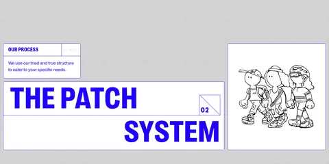
| 3 | how-it-works | Two-column light-gray section with process introduction, oversized two-line title, and character illustration. | process orientation, section numbering | large blue type, outlined text blocks, illustration card |
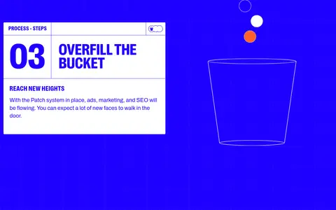
| 4 | feature-split | Full-bleed blue band with a white process card on one side and a simple bucket illustration on the other. | step-by-step explanation | white information panel, large step number, line illustration |
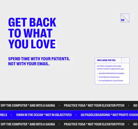
| 5 | feature-split | Pale-gray full-width section with a left-aligned headline and small service detail card. | service benefit summary | large blue heading, compact bordered card, contrasting ticker bands |
| 6 | stats | Blue two-column band with supporting clinic details at left and a huge white client count at right. | proof through scale | oversized numeric statistic, white type on blue, compact information card |
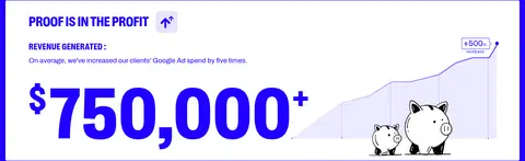
| 7 | stats | Stacked proof panel within a blue area, using a large revenue figure and compact supporting metrics. | evidence-led selling | white card, large numeric result, simple growth graphic |
| 8 | testimonials | Gray section with a short eyebrow card and large two-line headline. | social proof introduction | large blue title, outlined label card |
| 9 | testimonials | Gray canvas with layered testimonial cards, portrait and quote columns, metrics, and adjacent navigation arrows. | testimonial carousel, case study metrics | stacked outlined cards, portrait panel, blue quote block |
| 10 | logo-cloud | Single row of repeated logo tiles on a gray band. | client credibility | outlined logo tiles, muted client marks |
| 11 | other | White section with a left-aligned headline and subtle grid texture. | pricing orientation | blue uppercase heading, bright canvas, section index marker |
| 12 | pricing | White canvas with a short plan-introduction card and three adjacent tier cards. | plan comparison, inquiry CTA per tier | outlined pricing cards, uppercase tier labels, orange buttons |
---
本文件由 AI 辅助生成:数值取自公开网页的实测样式,命名、用途说明与建议为模型解读。商标归原所有者。
Generated by Design DNA · https://four.wiralomi.com/style/thepatchsystem-com