North star · Keep the page calm and spacious in white, then use Slingshot blue to spotlight the product and the next action.
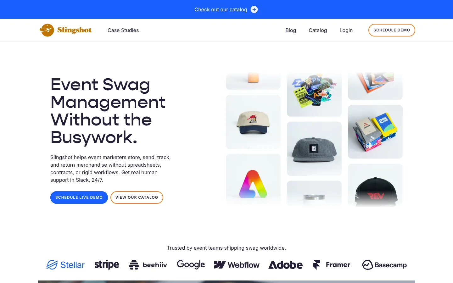
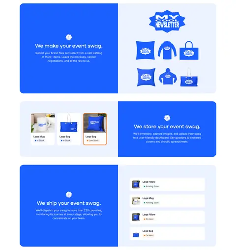
The visual system is built on a white canvas (#ffffff) and dark plum-ink typography (#241f37), with vivid Slingshot blue (#1a5fff) carrying the primary CTA and defining major feature panels. Pale blue and warm cream surfaces soften the blue-and-white contrast; the measured gray surface supports quieter supporting areas. Gopher Medium gives large headlines a rounded, distinctive voice, while Inter handles navigation, body copy, and small uppercase labels. The desktop hero balances a left-aligned message and CTA pair against a collage of swag product images. Below, the page alternates customer proof, testimonials, and feature storytelling rather than relying on dense text. Generous white space separates centered sections, and rounded panels give the imagery and CTA areas a friendly, approachable finish. Product photographs and customer logos make the offering concrete; blue line illustrations add a lightweight explanatory accent.
Body copy, navigation, links, and general interface text.
Aa 设计
Inter-SemiBold
系统字体 · 字重 600 · 占比 7%
免费替代:Inter
Eyebrows and compact captions.
Aa 设计
Gopher Medium
网络字体 · 字重 400 / 500 · 占比 6%
免费替代:DM Sans
Display headlines and section headings.
Aa 设计
Inter-Bold
系统字体 · 字重 700 · 占比 5%
免费替代:Inter
Bold Inter emphasis where stronger text weight is needed.
角色
示例
字号
字重
行高
字距
特大标题
Oversized hero and campaign headlines.
Slingshot
56px
400
1
0
一级标题
Primary page headline and prominent feature messaging.
Slingshot
32px
400
1
0
二级标题
Feature and testimonial section headings.
The quick brown fox 敏捷的狐狸
24px
500
1
0
正文
Paragraphs, navigation labels, and explanatory copy.
The quick brown fox 敏捷的狐狸
16px
400
1.5
0
辅助文字
Compact uppercase labels and customer attribution details.
The quick brown fox 敏捷的狐狸
12px
600
2
0.083em
链接
Navigation and inline links.
The quick brown fox 敏捷的狐狸
16px
400
1.5
0
眉题
Short uppercase context labels above content.
The quick brown fox 敏捷的狐狸
12px
600
2
0.083em
间距与布局
基准单位 8px · 密度:适中
40px版块间距
16px元素间距
16px卡片内边距
1200px内容最大宽度
2px
4px
8px
10px
16px
20px
24px
32px
40px
48px
96px
Use a centered desktop content frame with a measured maximum width of 1200px. The hero is a two-column composition: left-aligned headline, description, and paired CTAs; right-side product collage. Keep section alignment varied but deliberate: centered proof and campaign headings, left-aligned editorial copy, and alternating feature panels. The measured spacing system is based on an 8px unit, with comfortable density, clear section gaps, and generous white breathing room. On narrow screens, stack columns without losing the visual order of message, proof, and action.
圆角与层次
按钮 · 9999px
卡片 · 12px
图片 · 12px
链接 · 9999px
没有测到阴影:页面是扁平的,层次靠底色和描边区分。
The page reads mostly flat: large white areas, colored section blocks, and imagery do the visual separation rather than pronounced shadows. Use rounded card and media corners consistent with the measured 12px card and media radius; buttons are pill-shaped. Keep borders quiet, with the outline CTA providing a visible exception. Avoid stacking many elevated cards or adding heavy drop shadows.
组件
下面的预览按实测的按钮、输入框、徽标、卡片样式重建(字体用替代字体)。
Announcement strip
A full-width Slingshot-blue band above the navigation, with a centered catalog link and small directional icon.
Primary navigation
White horizontal header with gold logo, case-study link, compact utility links, and an outlined pill demo action.
Hero
Left-aligned Gopher headline and Inter supporting copy beside a collage of branded swag; pair a filled blue demo CTA with an outlined catalog CTA.
Customer proof
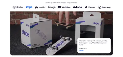
Centered trust statement and a single horizontal row of customer logos, followed by a large case-study image with an overlaid quote card.
Feature storytelling
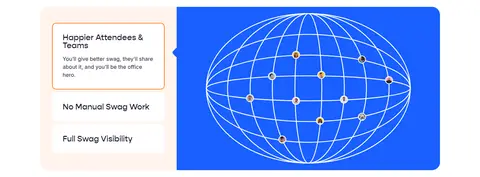
Rounded split panels combine blue copy blocks with product images, inventory screens, or a simple explanatory illustration.
Testimonial grid
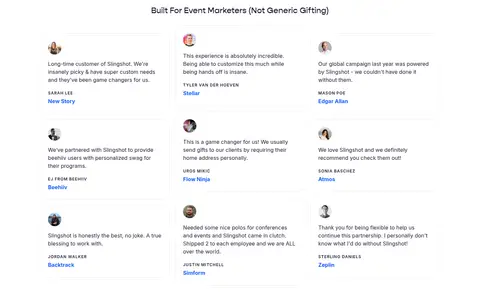
A centered section heading introduces compact customer quotes with small portraits, attribution labels, and blue company links.
Sticker CTA
A wide blue campaign panel with centered headline, concise support text, pill action, and perspective line illustration.
Imagery · Show tangible branded swag—hats, apparel, stickers, bags, and packaging—in product collages and feature panels. Customer logos and testimonials provide social proof, while a broad event photograph adds a real-world case-study moment. Use clean, softly framed product tiles and rounded media containers. Blue wireframe-style illustration can explain logistics, but should remain secondary to the actual merchandise.
Reserve Slingshot blue for prominent actions and feature moments.
Set display headings in a rounded, friendly sans serif.
Pair product imagery with concise explanatory copy.
Use generous whitespace to distinguish sections.
Round media and card containers; keep button actions pill-shaped.
✕ 不该做
Do not turn every section into a saturated blue block.
Do not add heavy shadows or dense border treatments.
Do not replace product imagery with generic abstract decoration.
Do not crowd the hero with extra copy or competing CTAs.
Do not use the gray surface as a dominant brand color.
Do not make small labels lowercase or widely scattered.
给 AI 的提示词
想快速出一个同风格的新页面,把这段话连同 DESIGN.md 一起发给 AI。
Build a new Slingshot-style SaaS page on a clean #ffffff canvas, using #241f37 for crisp, readable copy and #1a5fff for the primary CTA and a few decisive feature panels. Use Gopher Medium or a close rounded display alternative for expressive headlines; use Inter for navigation, body copy, and uppercase metadata. Keep the layout centered within the measured 1200px maximum width, with generous spacing and clear section changes. Favor a two-column hero with a product collage, then use customer logos, real testimonials, and alternating image-and-copy feature panels to establish trust and explain the service. Apply #ecf2ff and #fff4ec as restrained support surfaces; #c8c7cd is only a quiet secondary surface. Keep cards and media softly rounded, CTAs pill-shaped, and elevation minimal.