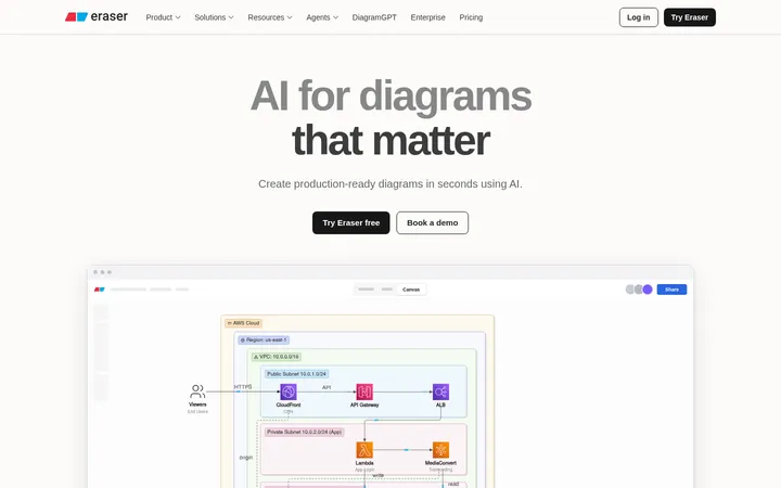
North star · Keep the page anchored in black and let violet glow, crisp type, and real product UI carry the story.
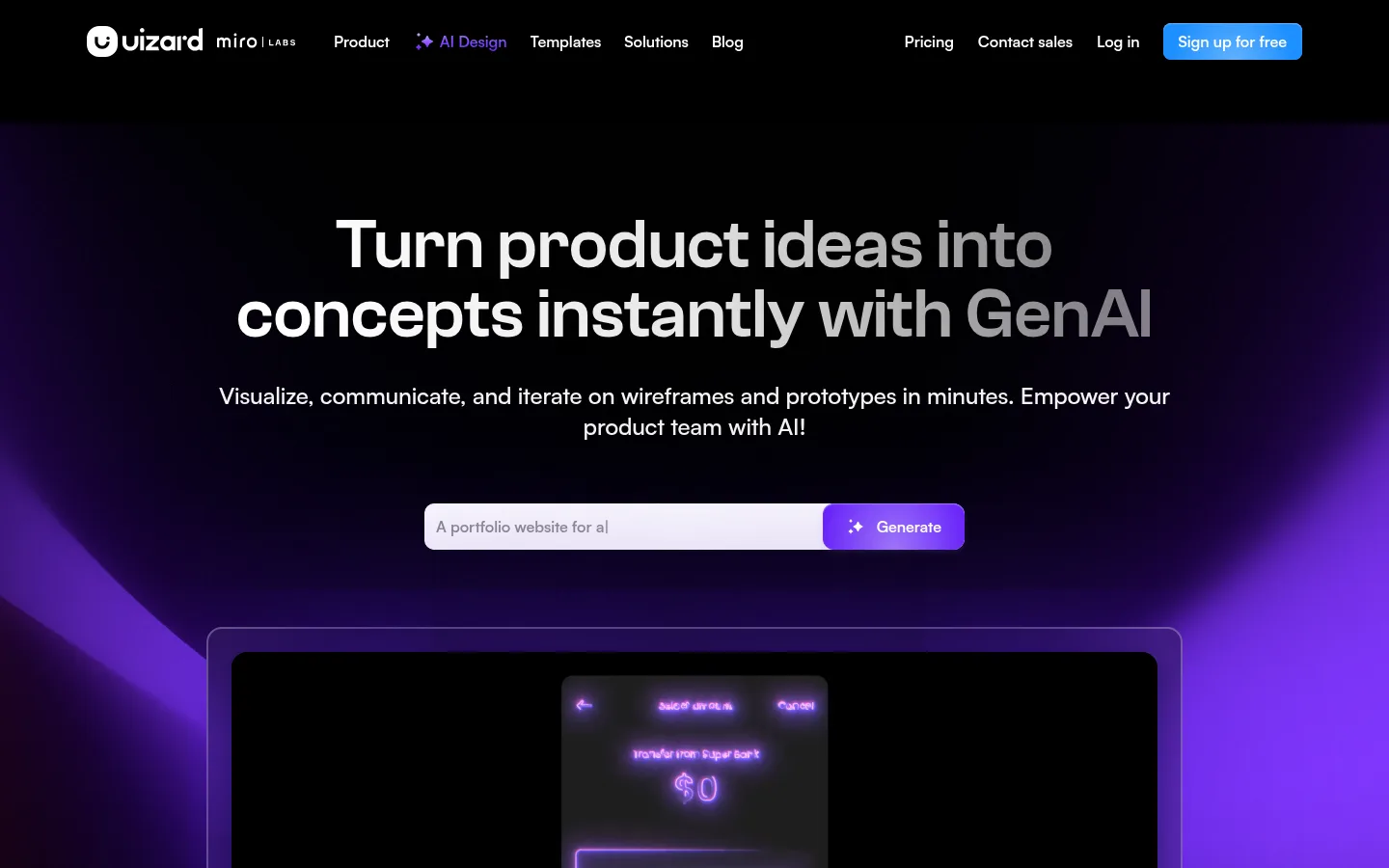
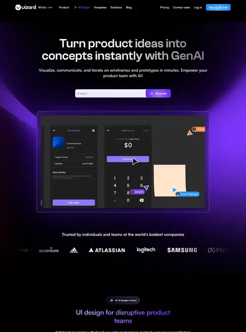
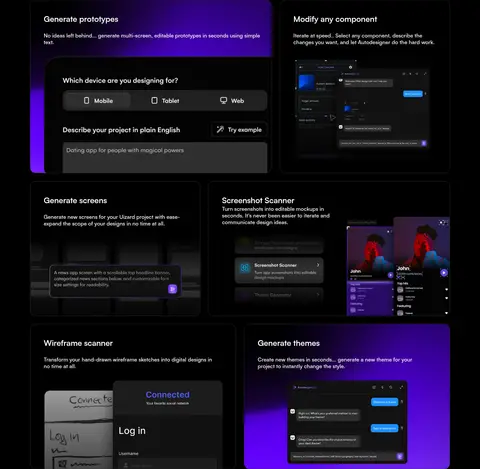
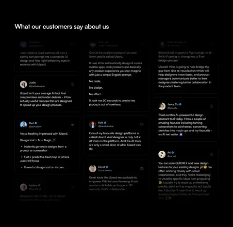
The page uses an almost-black canvas as its visual anchor, letting white and soft-white typography stay legible while violet gradients create a dramatic focal glow behind the hero and selected feature panels. Blue is reserved for the prominent free-sign-up CTA, while violet marks generation actions and AI-related accents. Satoshi-Variable supplies the consistent interface voice; a larger Clash Grotesk display treatment gives the hero headline its strong, compact presence. The opening section centers headline, supporting copy, prompt field, and a framed product preview, then transitions into trusted-brand marks and a centered introduction. Feature content is organized in bordered dark cards with embedded interface imagery, followed by a three-column testimonial field and a multi-column footer. Generous separation between major blocks contrasts with tighter card and footer content. Thin charcoal outlines and restrained shadows distinguish layers without brightening the overall dark atmosphere.
Primary interface and content type for body copy, headings, navigation, buttons, and links.
角色
示例
字号
字重
行高
字距
特大标题
Oversized hero headline establishing the page’s first focal point.
Uizard
72px
540
1
-0.008em
一级标题
Major section headings and prominent page-level messages.
Uizard
40px
640
1.2
-0.025em
二级标题
Feature-card and secondary section headings.
The quick brown fox 敏捷的狐狸
24px
640
1.33
-0.008em
正文
Hero explanation and feature descriptions.
The quick brown fox 敏捷的狐狸
18px
480
1.33
-0.011em
辅助文字
Small supporting labels and compact utility text.
The quick brown fox 敏捷的狐狸
14px
480
1.43
0
按钮
Primary CTA and generation action labels.
The quick brown fox 敏捷的狐狸
16px
640
1.38
-0.006em
链接
Navigation, footer lists, and inline links.
The quick brown fox 敏捷的狐狸
14px
480
1.43
0
间距与布局
基准单位 4px · 密度:适中
90px版块间距
12px元素间距
20px卡片内边距
1260px内容最大宽度
2px
4px
8px
12px
16px
20px
24px
32px
40px
The hero is centered within a wide desktop canvas, with headline, supporting copy, prompt control, and product preview stacked vertically. The measured page max width is 1260px; feature content uses a two-column, modular card arrangement, while testimonials form three columns and the footer spreads into six. Sections have pronounced vertical separation, with more compact spacing inside cards and dense footer lists. Alignment shifts from centered hero messaging to left-aligned card and testimonial content.
圆角与层次
按钮 · 8px
输入框 · 10px
卡片 · 12px
链接 · 12px
lg · card
inset · text
lg · card
xl · card
The page is mostly flat black, with charcoal card borders defining content boundaries. Product previews sit inside nested frames, while violet glow and selected dark shadows create depth behind the hero and feature panels. Keep elevation restrained: contrast comes from outlines, layered UI screenshots, and light effects rather than broad, bright shadows.
组件
下面的预览按实测的按钮、输入框、徽标、卡片样式重建(字体用替代字体)。
Top navigation
Compact horizontal links on black, with the AI Design item accented in violet and a blue Sign up for free button.
Hero prompt
Centered prompt input and adjacent violet Generate action beneath the headline and supporting copy.
Product preview frame
Large dark product screenshot inside a thin outlined, rounded frame with a violet ambient glow.
Feature cards
Dark modular cards with charcoal borders, rounded corners, concise copy, and embedded product UI imagery.
Testimonial columns
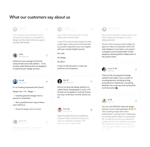
Three-column customer quote layout with subtle dark boundaries and occasional profile images.
Footer directory
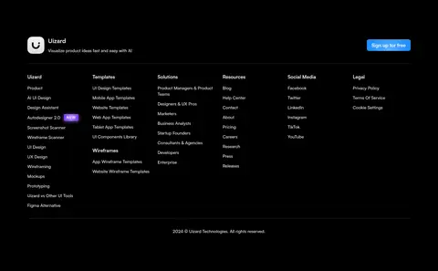
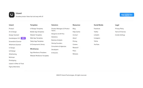
Multi-column navigation lists above a thin divider, with a small brand lockup and blue signup CTA.
Imagery · Product UI screenshots and mockups are the dominant imagery, framed inside dark panels and used to explain features rather than decorate independently. The hero preview sits within a large outlined frame over a violet glow. Feature cards embed smaller interface views, sometimes on violet-backed surfaces. Customer testimonials are primarily text-based, with small profile images; no defining photography or illustration style is apparent.
Use violet for AI actions and selective ambient glow.
Frame product imagery with thin charcoal borders.
Give major sections clear vertical breathing room.
✕ 不该做
Do not introduce bright section backgrounds.
Do not use violet as the default for every CTA.
Do not let mockup colors redefine the brand palette.
Do not replace product UI with generic stock photography.
Do not add heavy shadows to every card.
Do not crowd the centered hero with extra elements.
给 AI 的提示词
想快速出一个同风格的新页面,把这段话连同 DESIGN.md 一起发给 AI。
Build a new Uizard page with a continuous Canvas Black (#000000) background and Soft Chalk (#f5f5f5) typography. Use Satoshi-Variable for interface copy and Space Grotesk as the free display substitute for the measured Clash Grotesk hero treatment. Center the hero message and product preview; use Lavender Signal (#a881fe) or Electric Violet (#6419ff) for AI actions and restrained ambient glow, and reserve Signup Blue (#1e90ff) for the main signup CTA. Make product screenshots the visual proof: place them in dark panels outlined with Border Charcoal (#2e2e2e), with careful layered framing rather than heavy shadows. Organize feature content into modular cards, testimonials into three columns, and footer links into compact columns. Preserve generous separation between major sections while keeping card content efficient and readable.