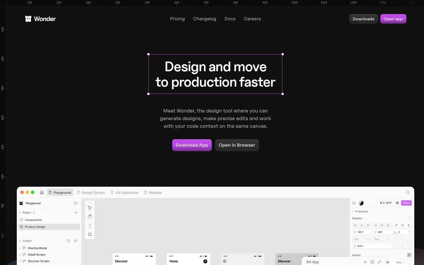
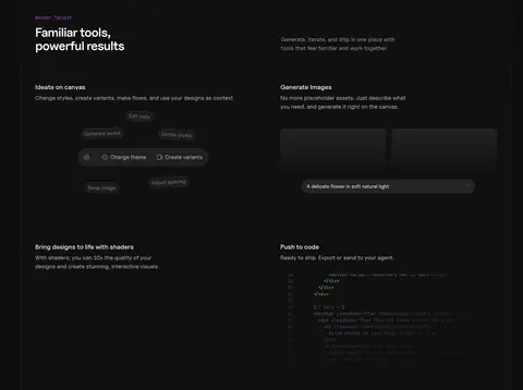
Wonder以高对比暗色首页呈现AI设计工作台,再切换到浅色功能区,让产品细节清晰易读。大幅界面预览、克制的字体和鲜明的紫色按钮,串起从设计探索到代码交付的产品叙事。
North star · Let the real product interface lead, using a near-black canvas and violet only to mark meaningful actions.
The page opens on a near-black canvas (#101010), where white headings and muted gray copy create a focused, studio-like mood. Vivid violet (#bc49e9), sometimes deepened toward #732a90, is reserved for primary actions and small accent details; it does not compete with the product UI. A broad off-white feature band (#f6f6f6) interrupts the dark sequence, giving interface captures and explanatory content a clean, readable stage before the page returns to dark pricing and closing sections. Uncut Sans Variable carries prominent page copy, with Inter used for supporting headings and labels; JetBrainsMono gives captions and code a technical register. Layouts alternate centered hero messaging with multi-column feature and pricing blocks. Large product screenshots, rather than decorative photography, are the main visual material. Compact gaps, thin dark borders, soft button insets, and restrained card shadows keep the experience crisp without making it feel heavily elevated.
配色 点色块复制色值。用途说明来自对页面的实测位置(背景、文字、描边、按钮)与截图判读。
品牌色
Studio Black
#101010
Dominant homepage canvas, hero, toolkit, pricing, and footer background.
强调色
Deep Orchid
#732a90
Deep violet accent in button gradient treatments; keep secondary to the brighter CTA violet.
Signal Violet
#bc49e9
Primary download and app buttons, highlighted links, and small emphasis details.
Sky Tint
#9ecbff
Occasional colored text accent; not a dominant page-wide brand color.
Lilac Glow
#b392f0
Occasional violet-tinted text accent; supporting rather than dominant.
表层色
Gallery White
#f6f6f6
Broad light feature bands that contrast with the dark hero and product toolkit sections.
Raised Black
#1c1c1c
Slightly lifted dark UI and input-adjacent details.
Umber Panel
#2b1a12
Warm dark tone found inside product or code imagery, not a primary page surface.
Porcelain Gray
#f0f0f0
Small light card and media details, mainly within showcased interface content.
中性色
Soft Chalk
#e5e5e5
Main light text and subtle content surfaces, especially on dark sections.
Pure White
#ffffff
High-contrast headings, button labels, and UI details; product mockups also contain white.
Quiet Silver
#b7b7b7
Muted navigation and supporting copy against dark backgrounds.
Mid Gray
#999999
Secondary text, small labels, and subdued badge copy.
Dim Gray
#777777
Low-emphasis supporting text and badge details.
Slate Gray
#404040
Subdued text details on dark surfaces.
功能色
Graphite Line
#212121
Subtle borders and separators on the dark canvas.
文字 背景 对比度 WCAG #e5e5e5 Soft Chalk#101010 Studio Black15.11:1 AAA #e5e5e5 Soft Chalk#f6f6f6 Gallery White1.17:1 不达标 #e5e5e5 Soft Chalk#ffffff Pure White1.26:1 不达标 #b7b7b7 Quiet Silver#101010 Studio Black9.49:1 AAA #b7b7b7 Quiet Silver#f6f6f6 Gallery White1.86:1 不达标 #b7b7b7 Quiet Silver#e5e5e5 Soft Chalk1.59:1 不达标
字体 字号阶梯:Major Third(比例约 1.286,正文 16px)。示例用免费替代字体渲染,数值为实测。
Aa 设计
Inter 网络字体 · 字重 400 / 500 / 600 / 700 · 占比 37%
免费替代:Inter
Secondary headings, UI labels, and compact feature text
Aa 设计
JetBrainsMono 网络字体 · 字重 400 · 占比 33%
免费替代:JetBrains Mono
Captions, code samples, and technical microcopy
Aa 设计
Uncut Sans Variable 网络字体 · 字重 400 / 500 / 600 · 占比 30%
免费替代:Inter
Hero, body copy, navigation, buttons, and primary page messaging
角色 示例 字号 字重 行高 字距 一级标题 Centered hero headline introducing faster design-to-production.
Wonder
34px 600 1.1 -0.025em 二级标题 Section titles for major product, pricing, and mission blocks.
Wonder
28px 700 1.2 -0.04em 三级标题 Subheadings within feature and toolkit content.
The quick brown fox 敏捷的狐狸
24px 600 1.25 -0.025em 正文 Explanatory copy beneath headings and beside product previews.
The quick brown fox 敏捷的狐狸
16px 400 1.5 0 辅助文字 Small technical labels and supporting interface metadata.
The quick brown fox 敏捷的狐狸
12px 400 1.5 0 按钮 Compact labels on primary and secondary calls to action.
The quick brown fox 敏捷的狐狸
14px 500 1 0.143em 链接 Navigation, inline product links, and footer destinations.
The quick brown fox 敏捷的狐狸
14px 400 1.43 0 眉题 Uppercase section labels such as feature and pricing markers.
The quick brown fox 敏捷的狐狸
10px 500 1.5 0.05em 代码 Code examples and developer-oriented interface content.
const style = 1;
12px 400 1.5 0
间距与布局 基准单位 4px · 密度:紧凑
40px 版块间距
4px 元素间距
— 卡片内边距
— 内容最大宽度
2px
4px
6px
8px
10px
12px
16px
24px
32px
40px
Use a restrained centered content area with deliberate horizontal breathing room; the measured page maximum width is unspecified, so match proportions from the screenshots rather than imposing a numeric width. The hero is centered above a wide interface showcase. Alternate broad full-width dark and pale section bands, then use two- or three-column feature and pricing layouts. Keep spacing compact within content groups but allow generous separation between major page beats. Align feature copy to the start or center according to its product visual.
圆角与层次 inset · button
inset · button
hairline · section, other
hairline · media
Favor flat section surfaces and thin, low-contrast borders over pronounced cards. Buttons have subtle inset highlights and restrained dark shadowing; media and cards use quiet hairline edges, with soft shadow only where a preview needs separation. Preserve clear overlap between the interface showcase and its background without adding heavy depth effects.
组件 下面的预览按实测的按钮、输入框、徽标、卡片样式重建(字体用替代字体)。
Primary CTA Violet #bc49e9 fill, white label, compact inset highlight, and measured 8px corner radius; used for app and download actions.
Secondary CTA Dark neutral button beside the primary action, with restrained border or highlight and white text.
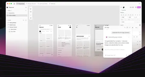
Hero workspace preview Wide product interface capture below centered headline and description; a subtle violet wave treatment adds emphasis beneath the canvas.
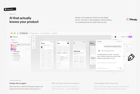
Feature band Pale #f6f6f6 section with dark copy, product UI imagery, and compact supporting feature statements.
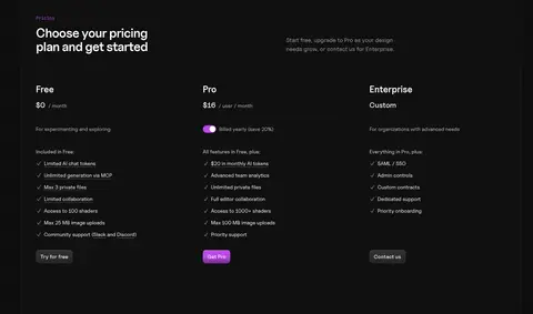
Pricing columns Three aligned plan columns on the dark canvas, with concise feature lists and a violet emphasis on the upgrade action.
Eyebrow label Small uppercase Inter label above a larger section heading, used to signal content category.
Imagery · Product interface captures are the primary imagery: large, clean screenshots of the design canvas, panels, and generated screens. Set them against the current section's dark or pale background, retaining visible interface detail rather than adding decorative framing. The hero uses a broad workspace preview with a subtle violet-lit wave beneath it. Avoid relying on lifestyle photography; code and interface mockups carry the product story.
页面版块 共 8 个版块,按页面从上到下排列,每个都标了类型、布局和交互套路。
该做与不该做 ✓ 该做 Keep the main canvas near-black and use pale bands as deliberate section breaks. Use #bc49e9 for the primary action and restrained inline emphasis. Make product interface previews the dominant imagery. Pair concise headings with subdued, readable supporting copy. Use JetBrains Mono for code and technical captions. Keep borders quiet and shadows subtle. ✕ 不该做 Do not turn the page into a bright, all-white layout. Do not use violet as a broad background wash. Do not replace product screenshots with generic lifestyle imagery. Do not add heavy shadows or stacked decorative cards. Do not use multiple competing accent colors for primary actions. Do not make every section use the same alignment or background. 给 AI 的提示词 想快速出一个同风格的新页面,把这段话连同 DESIGN.md 一起发给 AI。
复制 Build a new page in Wonder's product-led visual style. Use Studio Black (#101010) as the dominant canvas, with Gallery White (#f6f6f6) reserved for clear feature-section contrast. Set headings and body copy in a clean sans-serif close to Uncut Sans Variable; use Inter for supporting labels and JetBrains Mono for code or technical captions. Make real interface screenshots or faithful product UI mockups the central visual material. Keep the hero centered, then vary feature layouts and section alignment to create a clear page rhythm. Use Signal Violet (#bc49e9) for primary actions and occasional link emphasis, with Deep Orchid (#732a90) only as a supporting gradient tone. Maintain quiet borders, modest inset button highlights, and compact component spacing. Avoid decorative imagery, loud gradients, or heavy elevation.
DESIGN.md Tailwind v4 CSS 变量 Design Tokens
---
title: "Wonder design system"
variant: extended
source: https://wonder.design/
captured_at: 2026-10-12
theme: dark
industry: ai
generator: Design DNA (https://four.wiralomi.com/style/wonder-design)
ai_generated: true
ai_label: "本文件由 AI 辅助生成:数值取自公开网页的实测样式,命名、用途说明与建议为模型解读。商标归原所有者。 / AI-assisted content"
---
# Wonder · Design System
> Dark canvas, vivid accents, real product in focus
**Theme:** dark · **Industry:** ai · **Source:** https://wonder.design/ · **Captured:** 2026-10-12 (1440×900 desktop)
_AI-assisted content: values are measured from the public page at capture time; names, roles and guidance are model-written interpretations. Trademarks belong to their owners._
Wonder presents its AI design workspace through a high-contrast dark homepage, then shifts into light feature sections to make product details easy to inspect. Oversized interface previews, restrained typography, and vivid violet calls to action connect the story from design exploration to production code.
## North star
Let the real product interface lead, using a near-black canvas and violet only to mark meaningful actions.
## Overview
The page opens on a near-black canvas (## Colors
| Name | Hex | Token | Group | Role |
|---|---|---|---|---|
| Studio Black | ` | `--color-studio-black` | brand | Dominant homepage canvas, hero, toolkit, pricing, and footer background. |
| Deep Orchid | ` | `--color-deep-orchid` | accent | Deep violet accent in button gradient treatments; keep secondary to the brighter CTA violet. |
| Gallery White | ` | `--color-gallery-white` | surface | Broad light feature bands that contrast with the dark hero and product toolkit sections. |
| Signal Violet | ` | `--color-signal-violet` | accent | Primary download and app buttons, highlighted links, and small emphasis details. |
| Soft Chalk | ` | `--color-soft-chalk` | neutral | Main light text and subtle content surfaces, especially on dark sections. |
| Pure White | ` | `--color-pure-white` | neutral | High-contrast headings, button labels, and UI details; product mockups also contain white. |
| Graphite Line | ` | `--color-graphite-line` | semantic | Subtle borders and separators on the dark canvas. |
| Quiet Silver | ` | `--color-quiet-silver` | neutral | Muted navigation and supporting copy against dark backgrounds. |
| Sky Tint | ` | `--color-sky-tint` | accent | Occasional colored text accent; not a dominant page-wide brand color. |
| Mid Gray | ` | `--color-mid-gray` | neutral | Secondary text, small labels, and subdued badge copy. |
| Dim Gray | ` | `--color-dim-gray` | neutral | Low-emphasis supporting text and badge details. |
| Slate Gray | ` | `--color-slate-gray` | neutral | Subdued text details on dark surfaces. |
| Raised Black | ` | `--color-raised-black` | surface | Slightly lifted dark UI and input-adjacent details. |
| Lilac Glow | ` | `--color-lilac-glow` | accent | Occasional violet-tinted text accent; supporting rather than dominant. |
| Umber Panel | ` | `--color-umber-panel` | surface | Warm dark tone found inside product or code imagery, not a primary page surface. |
| Porcelain Gray | ` | `--color-porcelain-gray` | surface | Small light card and media details, mainly within showcased interface content. |
### Semantic aliases
`--color-canvas` → ` (Studio Black) · `--color-surface` → ` (Gallery White) · `--color-surface-2` → ` (Soft Chalk) · `--color-surface-3` → ` (Pure White) · `--color-surface-4` → ` (Umber Panel) · `--color-text` → ` (Soft Chalk) · `--color-text-muted` → ` (Quiet Silver) · `--color-text-subtle` → ` (Mid Gray) · `--color-border` → ` (Graphite Line) · `--color-accent` → ` (Signal Violet) · `--color-accent-2` → ` (Deep Orchid) · `--color-accent-3` → ` (Sky Tint) · `--color-on-accent` → ` (Pure White)
### Contrast (WCAG 2.x)
| Text | Background | Ratio | Level |
|---|---|---|---|
| ` | ` | 15.11:1 | AAA |
| ` | ` | 1.17:1 | fail |
| ` | ` | 1.26:1 | fail |
| ` | ` | 9.49:1 | AAA |
| ` | ` | 1.86:1 | fail |
| ` | ` | 1.59:1 | fail |
| ` | ` | 2.01:1 | fail |
| ` | ` | 6.68:1 | AA |
| ` | ` | 2.64:1 | fail |
| ` | ` | 2.26:1 | fail |
### Gradients
- `radial-gradient(circle, rgba(0, 0, 0, 0.07) 1px, rgba(0, 0, 0, 0) 1px)`
- `linear-gradient(lab(4.75859 0 0) 20%, rgba(0, 0, 0, 0) 100%)`
- `linear-gradient(rgba(255, 255, 255, 0.07), rgba(255, 255, 255, 0))`
- `linear-gradient(lab(52.8653 63.6781 -60.5912) 50%, oklab(0.439598 0.117816 -0.118748))`
## Typography
| Family | Token | Source | Weights | Role | Free substitute |
|---|---|---|---|---|---|
| Inter | `--font-display` | webfont | 400, 500, 600, 700 | Secondary headings, UI labels, and compact feature text | Inter |
| JetBrainsMono | `--font-mono` | webfont | 400 | Captions, code samples, and technical microcopy | JetBrains Mono |
| Uncut Sans Variable | `--font-body` | webfont | 400, 500, 600 | Hero, body copy, navigation, buttons, and primary page messaging | Inter |
- **Inter:** Measured weights 400–700; use strong heading weight and compact label styling.
- **JetBrainsMono:** Regular monospace; retain a technical, compact feel for code and small metadata.
- **Uncut Sans Variable:** Variable weights 400–600; hero uses tight tracking, while button labels are slightly tracked.
### Type scale — Major Third (ratio ≈ 1.286, base 16px)
| Role | Size | Weight | Line height | Letter spacing | Case | Family | Used for |
|---|---|---|---|---|---|---|---|
| h1 | 34px | 600 | 1.1 | -0.025em | — | Uncut Sans Variable | Centered hero headline introducing faster design-to-production. |
| h2 | 28px | 700 | 1.2 | -0.04em | — | Inter | Section titles for major product, pricing, and mission blocks. |
| h3 | 24px | 600 | 1.25 | -0.025em | — | Inter | Subheadings within feature and toolkit content. |
| body | 16px | 400 | 1.5 | 0 | — | Uncut Sans Variable | Explanatory copy beneath headings and beside product previews. |
| caption | 12px | 400 | 1.5 | 0 | — | JetBrainsMono | Small technical labels and supporting interface metadata. |
| button | 14px | 500 | 1 | 0.143em | — | Uncut Sans Variable | Compact labels on primary and secondary calls to action. |
| link | 14px | 400 | 1.43 | 0 | — | Uncut Sans Variable | Navigation, inline product links, and footer destinations. |
| eyebrow | 10px | 500 | 1.5 | 0.05em | uppercase | Inter | Uppercase section labels such as feature and pricing markers. |
| code | 12px | 400 | 1.5 | 0 | — | JetBrainsMono | Code examples and developer-oriented interface content. |
## Spacing & layout
- Base unit **4px**, density **compact**.
- Scale (most used values): 2, 4, 6, 8, 10, 12, 16, 24, 32, 40 px.
- Section rhythm 40px · element gap 4px · card padding — · max content width —.
Use a restrained centered content area with deliberate horizontal breathing room; the measured page maximum width is unspecified, so match proportions from the screenshots rather than imposing a numeric width. The hero is centered above a wide interface showcase. Alternate broad full-width dark and pale section bands, then use two- or three-column feature and pricing layouts. Keep spacing compact within content groups but allow generous separation between major page beats. Align feature copy to the start or center according to its product visual.
## Shape & elevation
- Radius: button `8px` · input `9999px` · card `14px` · media `3px` · badge `9999px` · link `8px` · xs `3px` · sm `6px` · md `8px` · lg `10px` · xl `14px` · pill `9999px`
- Shadow `inset` (button): `rgba(0, 0, 0, 0.12) 0px 1px 1px -0.5px, rgba(255, 255, 255, 0.04) 0px 2px 1px 0px inset, rgba(255, 255, 255, 0.08) 0px 0px 0px 1px inset`
- Shadow `inset-2` (button): `rgba(0, 0, 0, 0.12) 0px 1px 1px -0.5px, rgba(255, 255, 255, 0.15) 0px 2px 1px 0px inset, rgba(255, 255, 255, 0.08) 0px 0px 0px 1px inset`
- Shadow `hairline` (section, other): `rgba(0, 0, 0, 0) 0px 0px 0px 0px, rgba(0, 0, 0, 0) 0px 0px 0px 0px, rgba(0, 0, 0, 0) 0px 0px 0px 0px, rgba(0, 0, 0, 0) 0px 0px 0px 0px, rgba(0, 0, 0, 0.8) 0px 0px 1px 0px`
- Shadow `hairline-2` (media): `rgba(0, 0, 0, 0) 0px 0px 0px 0px, rgba(0, 0, 0, 0) 0px 0px 0px 0px, rgba(0, 0, 0, 0) 0px 0px 0px 0px, oklab(0 0 0 / 0.03) 0px 0px 0px 1px, rgba(0, 0, 0, 0) 0px 0px 0px 0px`
- Shadow `lg` (card): `rgba(0, 0, 0, 0) 0px 0px 0px 0px, rgba(0, 0, 0, 0) 0px 0px 0px 0px, rgba(0, 0, 0, 0) 0px 0px 0px 0px, oklab(0 0 0 / 0.08) 0px 0px 0px 1px, rgba(0, 0, 0, 0.04) 0px 1px 1px -0.5px, rgba(0, 0, 0, 0.08) 0`
- Shadow `hairline-3` (other): `rgba(0, 0, 0, 0) 0px 0px 0px 0px, rgba(0, 0, 0, 0) 0px 0px 0px 0px, rgba(0, 0, 0, 0) 0px 0px 0px 0px, oklab(0 0 0 / 0.08) 0px 0px 0px 1px, rgba(0, 0, 0, 0) 0px 0px 0px 0px`
- Motion: standard transition `0.15s cubic-bezier(0.4, 0, 0.2, 1)` on interactive elements.
Favor flat section surfaces and thin, low-contrast borders over pronounced cards. Buttons have subtle inset highlights and restrained dark shadowing; media and cards use quiet hairline edges, with soft shadow only where a preview needs separation. Preserve clear overlap between the interface showcase and its background without adding heavy depth effects.
## Imagery
Product interface captures are the primary imagery: large, clean screenshots of the design canvas, panels, and generated screens. Set them against the current section's dark or pale background, retaining visible interface detail rather than adding decorative framing. The hero uses a broad workspace preview with a subtle violet-lit wave beneath it. Avoid relying on lifestyle photography; code and interface mockups carry the product story.
## Components
### Primary CTA
Violet ### Secondary CTA
Dark neutral button beside the primary action, with restrained border or highlight and white text.
### Hero workspace preview
Wide product interface capture below centered headline and description; a subtle violet wave treatment adds emphasis beneath the canvas.
### Feature band
Pale ### Pricing columns
Three aligned plan columns on the dark canvas, with concise feature lists and a violet emphasis on the upgrade action.
### Eyebrow label
Small uppercase Inter label above a larger section heading, used to signal content category.
### Measured component styles
- **Primary button** (“Open app”): background ## Do
- Keep the main canvas near-black and use pale bands as deliberate section breaks.
- Use ## Don't
- Do not turn the page into a bright, all-white layout.
- Do not use violet as a broad background wash.
- Do not replace product screenshots with generic lifestyle imagery.
- Do not add heavy shadows or stacked decorative cards.
- Do not use multiple competing accent colors for primary actions.
- Do not make every section use the same alignment or background.
## Agent prompt
Build a new page in Wonder's product-led visual style. Use Studio Black (## Page sections (top to bottom)
| # | Type | Layout | UX patterns | UI patterns |
|---|---|---|---|---|
| 1 | hero | Centered headline and copy above paired calls to action, followed by a wide workspace preview. | Primary download CTA, Secondary browser entry | Dark canvas, Violet selection outline, Wide interface preview |
| 2 | product-showcase | Single-column, full-width product visual on a dark section. | Visual product demonstration | Large interface capture, Violet-lit wave |
| 3 | logo-cloud | Centered label above a compact row of partner marks. | Partner credibility | Muted logos, Small uppercase eyebrow |
| 4 | feature-grid | Pale band with introductory copy and product screen, followed by three compact feature columns. | Feature explanation, Product-led demonstration | Light section band, Interface screenshot, Three-column supporting copy |
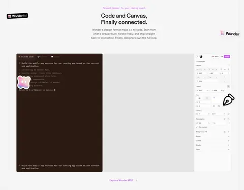
| 5 | feature-split | Light section with centered heading and description above a wide, multi-panel product visual. | Code-to-design workflow, Inline product link | Pale background, Code and canvas panels, Side-by-side composition |
| 6 | feature-grid | Dark section with heading and summary, followed by a dense multi-column feature grid. | Tool discovery, Prompt input | Dark canvas, Feature tiles, Code and image examples |
| 7 | pricing | Dark section with introductory title and three aligned plan columns. | Compare plans, Upgrade CTA | Free, Pro, Enterprise columns, Violet Pro action, Compact feature lists |
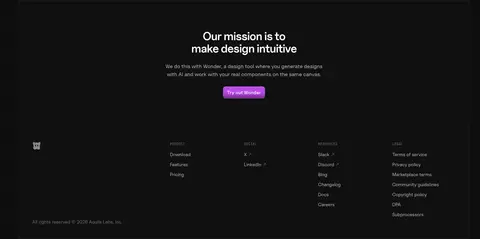
| 8 | footer | Centered mission and CTA above a multi-column footer navigation. | Closing CTA, Grouped site navigation | Dark full-bleed area, Centered mission block, Compact link columns |
## Source CSS custom properties (selected)
```css
--font-mono: "JetBrainsMono", "JetBrainsMono Fallback", monospace;
--background: lab(4.75859% 0 0);
--background-elevated: lab(7.78201% -.0000149012 0);
--background-inverted: lab(96.984% 0 0);
--foreground: lab(100% 0 0);
--foreground-inverted: lab(10.448% 0 0);
--foreground-secondary: lab(100% 0 0/.7);
--foreground-tertiary: lab(100% 0 0/.4);
--foreground-body: lab(100% 0 0/.85);
--accent: lab(52.8653% 63.6781 -60.5912);
--accent-muted: lab(28.2503% 49.3246 -49.4174);
--accent-subtle: lab(13.6229% 29.6437 -29.4625);
--accent-dark: lab(1.99521% 7.18552 -8.37012);
--surface: lab(14.044% 0 0);
--surface-hover: lab(100% 0 0/.1);
--popover-foreground: lab(100% 0 0/.8);
--border: lab(25.3993% 2.43703 -2.64763);
--border-subtle: lab(100% 0 0/.07);
--border-inverted: lab(0% 0 0/.08);
--grid-spacer: 6rem;
--radius: .625rem;
--ease-out-quad: cubic-bezier(.25, .46, .45, .94);
--ease-out-cubic: cubic-bezier(.215, .61, .355, 1);
--ease-out-quart: cubic-bezier(.165, .84, .44, 1);
--ease-out-quint: cubic-bezier(.23, 1, .32, 1);
--ease-out-expo: cubic-bezier(.19, 1, .22, 1);
--shadow-elev-1: 0 1px 1px -.5px #0000001f;
--shadow-elev-2: 0 1px 1px -.5px #0000001f, 0 3px 3px -1.5px #0000001f;
--shadow-elev-3: 0 1px 1px -.5px #0000001f, 0 3px 3px -1.5px #0000001f, 0 6px 6px -3px #0000001f;
--shadow-elev-4: 0 1px 1px -.5px #0000000a, 0 4px 8px -3px #00000014, 0 8px 16px -2px #00000014;
--shadow-card: 0 1px 1px -.5px #0000001f, 0 3px 3px -1.5px #0000001f, 0 6px 6px -3px #0000001f;
```
---
本文件由 AI 辅助生成:数值取自公开网页的实测样式,命名、用途说明与建议为模型解读。商标归原所有者。
Generated by Design DNA · https://four.wiralomi.com/style/wonder-design