North star · Keep the page quiet and warm so precise product diagrams—not decorative colour—carry the story.
The page is built on a warm near-white canvas (#fcfbf9), with almost no large colour fields; the product interface and diagrams carry the visual variety. Ink (#242424) anchors headings and key copy, while muted grays create hierarchy across navigation, supporting text, and labels. Blue appears sparingly in links and interface actions, and other saturated hues mostly belong to diagram mock-ups rather than the brand surface. Inter is the dominant typeface: a compact, confident headline contrasts with calm, readable body copy. A centered hero leads into carefully aligned product previews, logo proof, and feature modules arranged in two- and three-column grids. Generous section intervals let each demonstration breathe, while consistent hairline borders and restrained shadows separate white cards without heavy framing. The overall effect is technical and polished, but deliberately quiet: interface detail, not decoration, explains the product.
Headlines, navigation, body copy, buttons, and most interface labels.
Aa 设计
ui-monospace
系统字体 · 字重 400 / 500 / 600 · 占比 7%
免费替代:Roboto Mono
Small uppercase eyebrow labels and technical or code-like annotations.
角色
示例
字号
字重
行高
字距
一级标题
Centered hero headline and major page-level statement.
Eraser
44px
600
1.1
-0.035em
二级标题
Section-level headings and short editorial labels.
The quick brown fox 敏捷的狐狸
22px
400
1
0.32em
三级标题
Feature titles and card headings.
The quick brown fox 敏捷的狐狸
21px
600
0.95
-0.02em
四级标题
Supporting subheads and larger explanatory text.
The quick brown fox 敏捷的狐狸
20px
400
1.5
0
正文
Feature descriptions, testimonials, and explanatory copy.
The quick brown fox 敏捷的狐狸
15.5px
400
1.55
0
辅助文字
Compact card descriptions and supporting annotations.
The quick brown fox 敏捷的狐狸
14px
400
1.43
0
按钮
Primary and secondary CTA labels.
The quick brown fox 敏捷的狐狸
15px
600
1.33
0
导航
Top navigation and footer navigation links.
The quick brown fox 敏捷的狐狸
14px
400
1.43
0
眉题
Tiny uppercase labels above feature sections.
The quick brown fox 敏捷的狐狸
8.5px
400
2.35
0.08em
代码
Technical identifiers and compact code-style interface labels.
const style = 1;
8.5px
400
2.35
0.08em
间距与布局
基准单位 2px · 密度:适中
88px版块间距
6px元素间距
—卡片内边距
1200px内容最大宽度
1px
2px
3px
4px
5px
6px
7px
8px
9px
10px
11px
12px
14px
16px
18px
24px
Use a centered content frame capped at the measured 1200px maximum, with a comfortable density and generous section intervals. The hero is centered above a wide product preview; subsequent bands alternate between two-column demonstrations and three-column feature cards. Keep headings centered for most sections, with card copy aligned to its own content. A compact logo grid and testimonial panels provide proof between product modules. The footer switches to a multi-column link layout. Preserve whitespace around modules rather than compressing the page.
圆角与层次
按钮 · 8px
卡片 · 8px
图片 · 50%
徽标 · 3px
sm · other, text
sm · card, other
sm · card, other
sm · card
Keep most sections flat against the warm canvas. Separate product panels with fine pale borders and restrained soft shadows; the hero preview may feel slightly lifted. Use consistent rounded card and button corners, and avoid heavy dark outlines or dramatic depth.
组件
下面的预览按实测的按钮、输入框、徽标、卡片样式重建(字体用替代字体)。
Primary CTA
Near-black button with white semibold Inter text, an 8px radius, and measured 10px vertical by 18px horizontal padding.
Secondary CTA
Light or transparent button with a dark outline, compact semibold label, and an 8px radius.
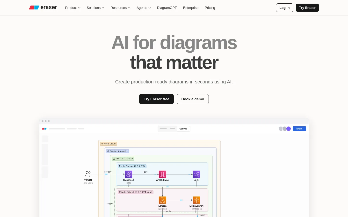
Product preview
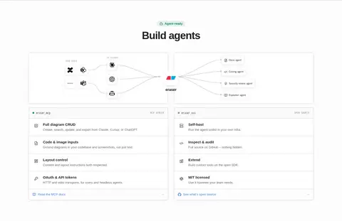
Wide, bordered interface capture with subtle shadow; diagram detail is the visual focus.
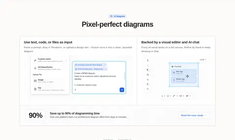
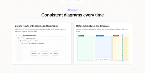
Feature card
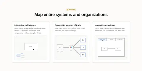
White-feeling panel with fine pale border, 8px radius, and restrained shadow; combines heading, copy, and illustration.
Eyebrow badge
Tiny uppercase monospace label, muted gray text, pale background, and compact 3px-radius treatment.
Text link
Blue Inter link, sometimes presented in a bordered light panel with generous internal padding.
Logo and quote grid
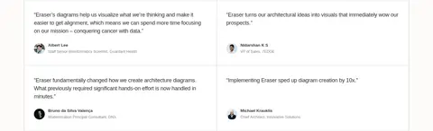
Aligned proof panels using quiet borders, restrained typography, and ample separation.
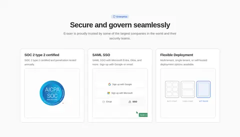
Imagery · Use product UI previews, technical diagrams, and interface illustrations rather than lifestyle photography. Frame previews as crisp, lightly elevated panels with fine borders; keep diagram content legible and let its internal colours provide restrained variety. Customer logos and security badges appear as supporting proof. The page relies on static visual demonstrations, not prominent video or decorative 3D imagery.
Use the warm ivory canvas as the dominant page colour.
Reserve blue accents for links and meaningful interface emphasis.
Let product diagrams demonstrate the tool in context.
Use Inter for clear, compact headlines and readable body copy.
Separate modules with thin borders and subtle shadows.
Keep feature groups aligned and generously spaced.
✕ 不该做
Do not turn illustration colours into large brand-colour bands.
Do not use heavy gradients or decorative colour washes.
Do not crowd the hero or compress section spacing.
Do not give every card a strong shadow.
Do not replace product demonstrations with generic stock photography.
Do not use oversized or highly decorative display typography.
给 AI 的提示词
想快速出一个同风格的新页面,把这段话连同 DESIGN.md 一起发给 AI。
Build a new page in Eraser’s quiet, technical visual style. Use Gallery Ivory (#fcfbf9) as the main canvas, Editorial Ink (#242424) for headings and important copy, and Soft Graphite (#666666) for navigation and supporting text. Use Link Blue (#457fe5) sparingly for links and functional emphasis; keep Diagram Amber (#fcd34d) and other saturated tones inside diagrams or small statuses. Set type in Inter, with compact semibold headlines and calm regular body copy; use a monospace face only for tiny uppercase labels. Organize content in a centered frame, with generous gaps, crisp product previews, modular two- or three-column feature groups, thin borders, and restrained shadows. Use near-black primary buttons and clear outlined secondary actions. Let authentic interface diagrams carry visual interest, keeping the surrounding page light and uncluttered.