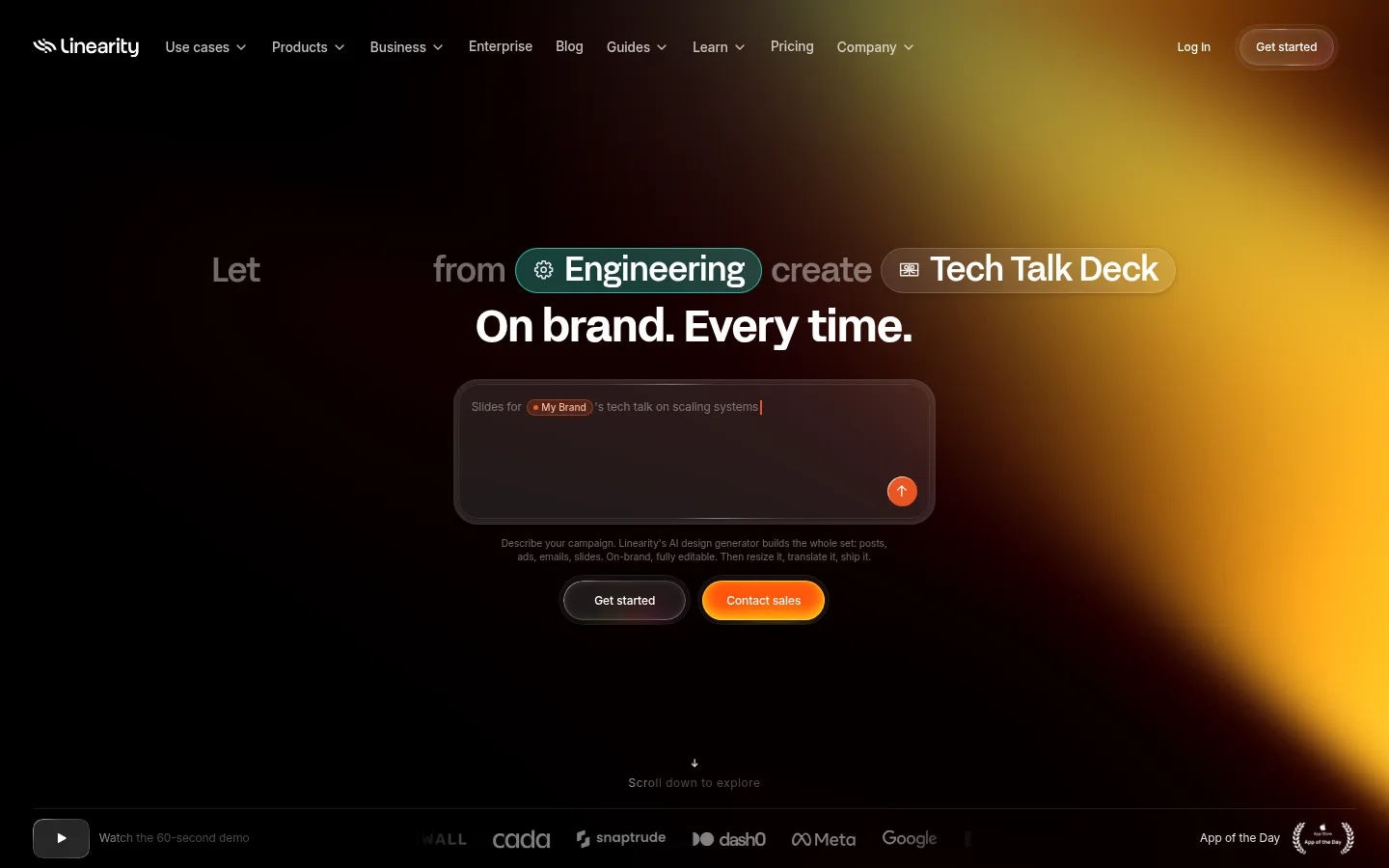
Linearity 首页以近黑画布、紧凑的白色文字和鲜明的营销素材案例构成视觉基调。页面用居中的 AI 提示输入框与橙色行动按钮引导用户,再延伸至宽阔的作品展示和产品对比区。
North star · Keep the page dark and spacious, using precise white type and orange actions to direct attention toward editable campaign visuals.
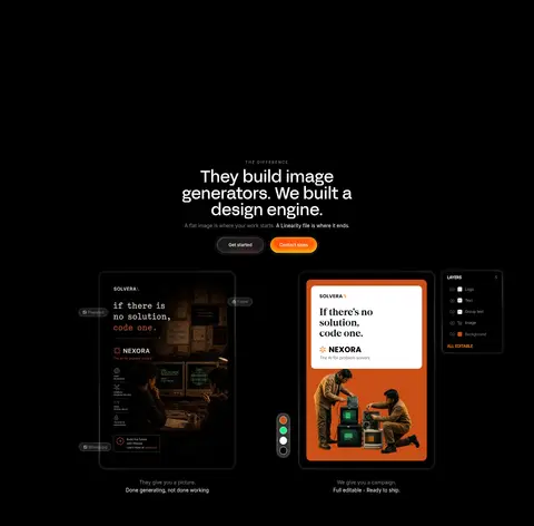
The page is built on a nearly uninterrupted black canvas, letting white headlines and the campaign artwork carry the visual weight. Orange is reserved for primary actions and small interface highlights; muted gray supports navigation, helper copy, and secondary information. AcidGrotesk gives the large centered headlines a distinctive display voice, while Inter handles navigation and compact supporting text. The hero is deliberately sparse: a slim navigation row sits above a centered headline, prompt field, short explanatory copy, and paired pill actions. Below, colorful campaign assets float against black with generous separation, so their varied imagery reads as a gallery rather than a dense grid. Later, a centered comparison heading introduces two contrasting outputs: a dark, flat image and a brighter editable campaign composition. Thin dark borders and restrained inset highlights define controls without adding heavy card elevation.
Navigation, body copy, captions, and compact interface labels.
Aa 设计
AcidGrotesk
网络字体 · 字重 400 / 500 / 700 · 占比 9%
免费替代:Space Grotesk
Large display headlines and prominent hero pill text.
角色
示例
字号
字重
行高
字距
一级标题
Bold hero headline and primary display statement.
Linearity
45.5px
700
1.1
-0.008em
二级标题
Large section headline introducing product comparison.
Linearity
44.5px
400
1
0
三级标题
Secondary feature or showcase headings.
Linearity
34.5px
500
1
-0.01em
正文
Short explanatory copy beneath headlines and around controls.
The quick brown fox 敏捷的狐狸
13.5px
400
1.5
0
辅助文字
Compact gallery labels and secondary notes.
The quick brown fox 敏捷的狐狸
12px
400
1.5
0
导航
Top navigation links and account actions.
The quick brown fox 敏捷的狐狸
13.5px
500
1.4
0
眉题
Small uppercase section marker above a display headline.
The quick brown fox 敏捷的狐狸
10.5px
500
1.4
0.22em
间距与布局
基准单位 1px · 密度:适中
86px版块间距
3px元素间距
17px卡片内边距
677px内容最大宽度
1px
2px
3px
4px
5px
7px
8px
10px
12px
14px
17px
18px
21px
27px
34px
The homepage uses a broad, dark canvas with a compact horizontal navigation row and a centered hero. The hero content is constrained into a narrow column, while the campaign artwork expands into a loose, staggered gallery that reaches toward the viewport edges. Lower comparison content returns to a centered heading above paired visual examples. Section transitions rely on generous black negative space rather than colored bands. Measured content width is constrained, with comfortable density and clear separation between elements.
圆角与层次
按钮 · 9999px
卡片 · 10px
图片 · 7px
导航 · 9999px
链接 · 9999px
inset · link, nav, other
inset · other
inset · button
inset · button
The visual system is mostly flat, with black space doing more work than shadows. Dark controls and prompt fields use fine charcoal borders and restrained inset highlights to define their edges. Rounded pill actions have subtle layered sheen, while the hero input has a larger soft-edged frame. Avoid broad, heavy drop shadows.
组件
下面的预览按实测的按钮、输入框、徽标、卡片样式重建(字体用替代字体)。
Top navigation
A compact horizontal row of white Inter links on black, with account access and a raised, pill-shaped Get started action.
Hero headline
Centered AcidGrotesk display text sits beneath a line of pill-like contextual labels, balancing bold white copy with subdued surrounding words.
Prompt field
A wide, rounded dark prompt box with a fine charcoal border, muted example text, and a small orange circular submit control.
Primary actions
Pair a dark Get started pill with an orange Contact sales pill; both use white compact labels and rounded ends.
Campaign gallery
A loose field of varied campaign artwork on black, with ample negative space and no prominent enclosing cards.
Editable-output comparison
A centered section title sits above two design examples: a dark flat image and a brighter campaign mockup with visible editor controls.
Imagery · Campaign artwork is the main source of color: a dispersed collection of varied promotional creatives floats on black, including product, editorial, and lifestyle compositions. The hero centers a dark prompt interface rather than photography. The comparison pairs a subdued, flat-looking campaign image with a brighter, editable design mockup. Keep artwork crisp and distinct; its internal colors belong to examples, not the core interface palette.
Use a black canvas as the dominant page background.
Reserve bright orange for the primary CTA and small action details.
Center the hero headline, prompt, and paired actions.
Use AcidGrotesk-style display type for major headlines.
Keep navigation and supporting copy compact in Inter.
Give campaign artwork generous black space to breathe.
✕ 不该做
Do not introduce large colored section backgrounds.
Do not use orange as a broad background or body-text color.
Do not pack campaign examples into a dense, uniform grid.
Do not add heavy shadows or bright card outlines.
Do not enlarge muted explanatory text to compete with headlines.
Do not treat colors inside campaign artwork as interface brand colors.
给 AI 的提示词
想快速出一个同风格的新页面,把这段话连同 DESIGN.md 一起发给 AI。
Build a new Linearity-style page on a near-black Canvas Black (#000000) background. Use Signal White (#ffffff) for headings and navigation, Quiet Gray (#8c8c8c) for secondary copy, and Action Orange (#ff4800) sparingly for primary actions. Set large centered headlines in a bold AcidGrotesk-like display face, with compact Inter-style navigation, body copy, and labels. Keep the first view open and focused: compact top navigation, centered headline, dark prompt panel with a fine Hairline Charcoal (#141414) border, and paired pill actions. Use broad negative space between sections. Present campaign visuals as a loose, staggered gallery rather than a dense grid, then use a centered heading and paired examples for any product comparison. Keep controls subtly layered, not heavily shadowed.