UY Studio 以编辑式、图像主导的页面呈现小众香氛与极简家居用品。暖调米白留白、克制的黑色文字与富有氛围感的产品摄影,共同突出产品本身。
North star · Keep the interface quiet and let large, carefully framed product photography carry the emotion and contrast.
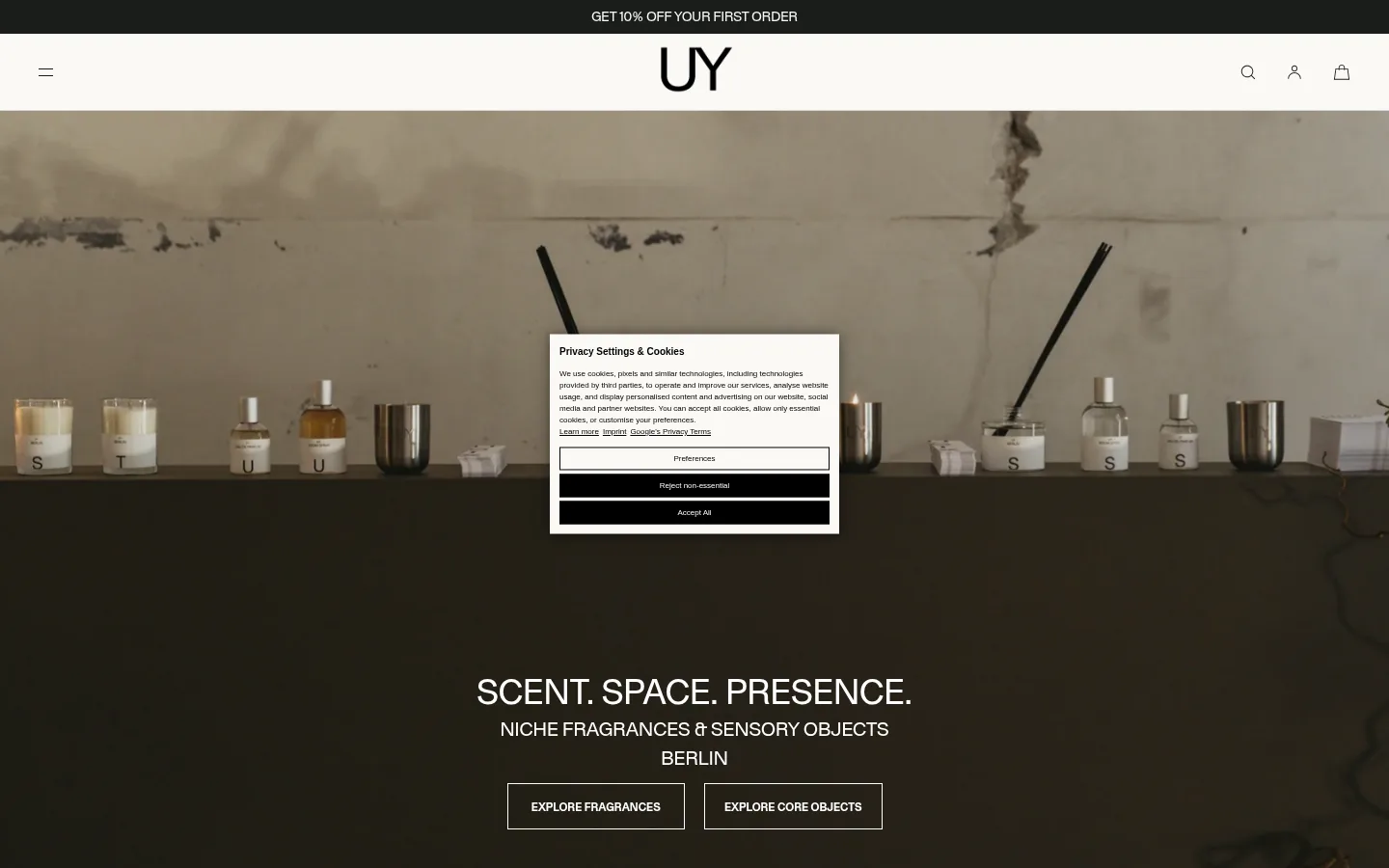
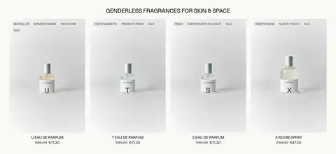
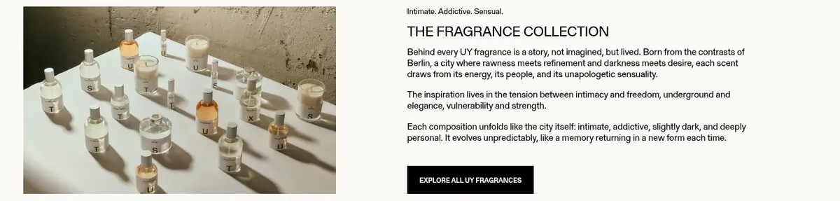
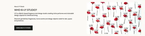
The visual system is built on a warm, nearly continuous #fbf9f6 canvas, with black typography and fine neutral dividers keeping the interface quiet. The hero uses full-bleed, cinematic studio imagery; its pale stone backdrop and dark shelf create a warm, earthy contrast that belongs to the photography rather than the UI palette. Product grids return to bright, soft-background pack shots, while editorial sections alternate image and copy in an asymmetric two-column rhythm. Gerstner Programm is used throughout: uppercase, regular-weight display headings contrast with small uppercase navigation and bold compact buttons. Product captions and body copy remain understated. The page feels spacious but not sparse, using centered headings for collections and left-aligned text for story blocks. Thin borders, square-edged controls, and minimal shadow preserve a flat, gallery-like presentation. Photography carries atmosphere; interface colors stay deliberately limited.
配色
点色块复制色值。用途说明来自对页面的实测位置(背景、文字、描边、按钮)与截图判读。
品牌色
表层色
中性色
功能色
页面底色 · Gallery Ivory表层 · Forest Ink主文字 · Studio Black次要文字 · Pure White弱文字 · Soft Graphite描边 · Quiet Stone
All headings, body copy, navigation, labels, product details, and controls.
角色
示例
字号
字重
行高
字距
一级标题
Centered uppercase hero statement.
UY Studio
36px
400
1.1
0
二级标题
Uppercase collection and editorial section headings.
The quick brown fox 敏捷的狐狸
24px
400
1.25
0
三级标题
Product names and smaller content headings.
The quick brown fox 敏捷的狐狸
20px
400
1.5
0
正文
Editorial descriptions and standard product or store information.
The quick brown fox 敏捷的狐狸
16px
400
1.2
0
辅助文字
Small product details and supporting metadata.
The quick brown fox 敏捷的狐狸
14px
400
1.2
0
按钮
Compact bold uppercase purchase and discovery actions.
The quick brown fox 敏捷的狐狸
11px
700
1
0
导航
Small uppercase utility and navigation labels.
The quick brown fox 敏捷的狐狸
10px
400
1
0
链接
Inline editorial links and product or collection links.
The quick brown fox 敏捷的狐狸
14px
400
1.2
0
间距与布局
基准单位 2px · 密度:适中
40px版块间距
20px元素间距
—卡片内边距
1360px内容最大宽度
2px
3px
5px
6px
7px
10px
12px
15px
16px
20px
30px
40px
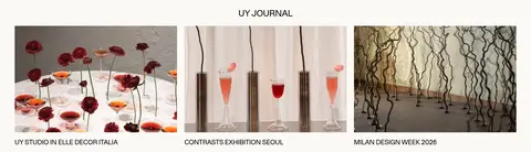
Use a centered content frame capped at the measured 1360px maximum width, with full-bleed media reserved for the hero. Product collections form four-column desktop grids; editorial stories alternate image and copy in two-column layouts, while press and journal content use three columns. Center collection headings and left-align story copy. The measured 40px section gap and comfortable density create a steady vertical rhythm, with generous image areas and clear breaks between product-led and editorial blocks.
圆角与层次
徽标 · 4px
sm · nav
The page is mostly flat, with no meaningful card shadows or elevated panels. Thin #d6d4d1 rules define selected boundaries, while controls and product tiles remain square-edged. A small rounded bestseller badge is the notable exception to the otherwise crisp, unembellished geometry.
组件
下面的预览按实测的按钮、输入框、徽标、卡片样式重建(字体用替代字体)。
Announcement bar
A narrow #1a1e1b strip above the light header, with centered compact uppercase promotional text.
Header
Quiet light navigation with centered UY wordmark, menu control at left, and search, account, and bag icons at right.
Hero
Full-width studio photograph with centered uppercase headline, supporting copy, and white outlined uppercase actions.
Product grid
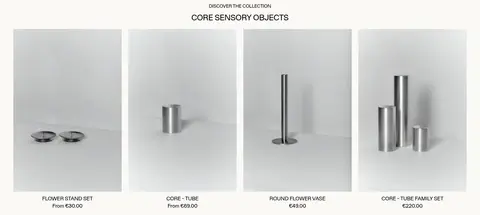
Four-column product presentation with pale-background pack shots, compact details, occasional sale labels, and restrained black actions.
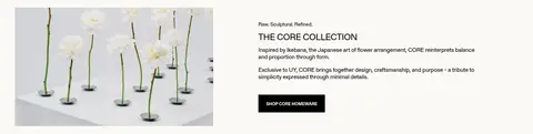
Editorial split
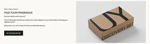
Alternating image-and-copy feature blocks, left-aligned text, uppercase headings, and a compact dark action button.
Bestseller badge
Small uppercase label with #e9e9e9 fill, #454545 text, and a subtle 4px radius.
Footer service row
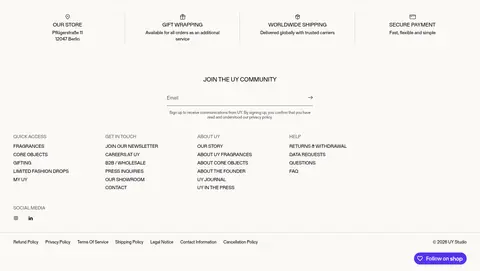
Four compact service and reassurance columns above the newsletter and grouped footer links.
Imagery · Photography is the primary expressive medium: cinematic studio scenes, pale seamless product shots, and lived-in editorial still lifes. Frame products simply and keep packaging legible; use wider images for story sections and full-bleed imagery in the hero. Press logos and journal thumbnails add small bursts of visual variety. The hero's warm taupe and deep brown tones belong to the photograph, not the interface palette.
Use photography as the main source of mood and color.
Set display headings in uppercase with regular weight.
Keep buttons compact, uppercase, and square-edged.
Alternate product grids with asymmetric editorial image-and-copy blocks.
Use thin neutral rules only where they clarify structure.
✕ 不该做
Do not add bright interface accent colors.
Do not turn every section into a bordered card.
Do not use heavy shadows or rounded control styling.
Do not center-align all editorial body copy.
Do not let decorative graphics compete with product photography.
Do not mistake photographic browns for brand UI colors.
给 AI 的提示词
想快速出一个同风格的新页面,把这段话连同 DESIGN.md 一起发给 AI。
Build a new premium fragrance and homeware page in UY Studio’s restrained editorial style. Use Gallery Ivory (#fbf9f6) as the continuous canvas, Studio Black (#000000) for type and links, Quiet Stone (#d6d4d1) for occasional hairlines, and Forest Ink (#1a1e1b) for dark announcement or inverse-action surfaces. Keep Gerstner Programm or a close sans-serif substitute throughout: uppercase regular display headings, small uppercase navigation, and compact bold uppercase buttons. Use spacious image-led layouts, four-column desktop product grids, and asymmetric two-column editorial stories. Favor pale seamless product photography and cinematic studio imagery; treat image color as photography, not UI palette. Keep surfaces flat, corners mostly square, and borders subtle. Preserve clear spacing and restrained hierarchy.