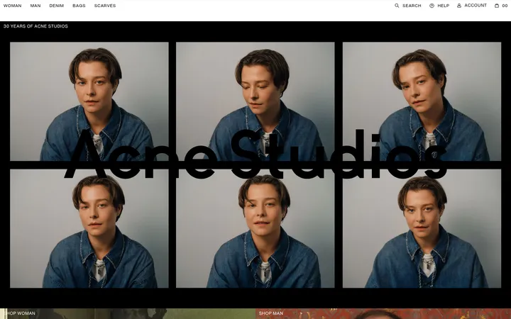
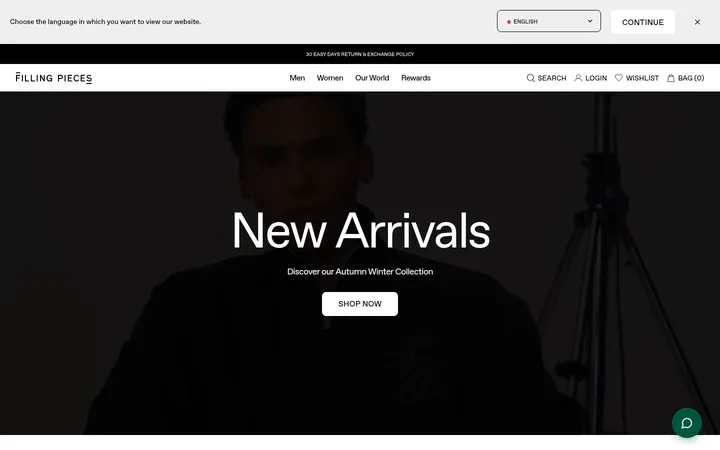
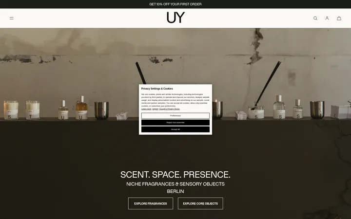
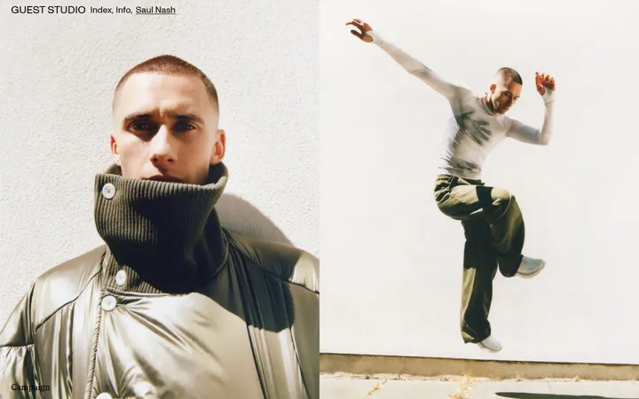
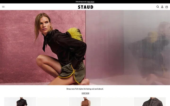
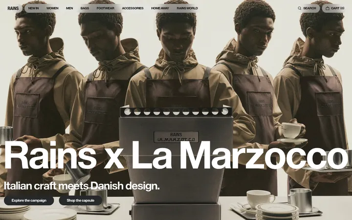
North star · Keep the interface quiet and flat so cinematic fashion imagery and clean product cutouts carry the visual emphasis.
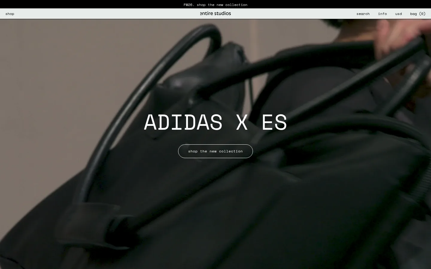
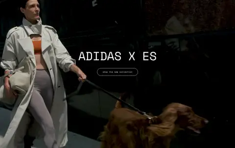
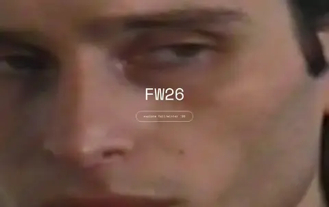
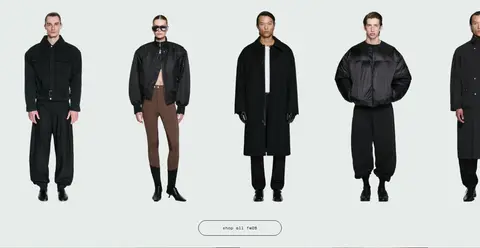
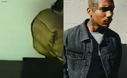
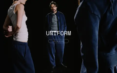
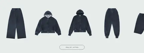
The page’s visual identity rests on a cool pale green-gray canvas (#e7ecea), used consistently behind navigation and product displays. Near-black (#000000) provides the primary text and dark outlined controls, while white (#ffffff) is reserved for light text and borders over dark campaign footage; the measured screenshot’s other dark and earthy tones belong to photography, not the interface palette. Space Mono gives navigation, product links, captions, and oversized campaign headings a precise, utilitarian voice. Full-bleed video heroes alternate with compact two-column lifestyle imagery and horizontal product showcases, producing a fashion-editorial rhythm without decorative section cards. Campaign titles and CTAs sit centered over image, while product imagery stays cleanly isolated against the pale canvas. Spacing is compact and the page is intentionally flat: thin outlines, pill-shaped campaign buttons, and little to no elevation keep attention on garments and motion.
配色
点色块复制色值。用途说明来自对页面的实测位置(背景、文字、描边、按钮)与截图判读。
表层色
中性色
页面底色 · Gallery Mist主文字 · Studio Ink次要文字 · Film White弱文字 · Gallery Mist描边 · Film White
文字
背景
对比度
WCAG
#000000 Studio Ink
#e7ecea Gallery Mist
17.58:1
AAA
#ffffff Film White
#e7ecea Gallery Mist
1.19:1
不达标
字体
字号阶梯:Custom(比例约 4.5,正文 16px)。示例用免费替代字体渲染,数值为实测。
Aa 设计
Space Mono
网络字体 · 字重 400 / 300 · 占比 100%
免费替代:IBM Plex Mono
Site-wide navigation, links, captions, buttons, and campaign display headings.
角色
示例
字号
字重
行高
字距
特大标题
Large uppercase campaign titles centered over full-bleed video.
entire studios
72px
300
1
0
正文
General interface and supporting text, including product and navigation links.
Monospaced text style; no distinct code block is evident.
const style = 1;
16px
400
1.5
0
间距与布局
基准单位 4px · 密度:紧凑
36px版块间距
12px元素间距
—卡片内边距
648px内容最大宽度
6px
8px
10px
12px
14px
16px
20px
36px
40px
The page is a full-width vertical sequence, with a slim announcement strip and navigation above broad campaign panels. Full-bleed video heroes alternate with two-column lifestyle imagery and horizontal product showcases, some arranged as dense multi-item rows. Hero titles and CTAs are centered; product labels sit close to the imagery. The measured content max width is 648px, with compact spacing and a recurring section gap. Keep the interface sparse and let image panels span the available viewport rather than enclosing them in cards.
圆角与层次
按钮 · 9999px
没有测到阴影:页面是扁平的,层次靠底色和描边区分。
The interface is predominantly flat, with no measured shadows or gradients. Separate regions through changes in imagery and the pale canvas rather than elevated cards. Campaign CTAs use thin outlines and fully rounded ends; dark text and borders provide definition on the light background, with white outlines over dark footage.
组件
下面的预览按实测的按钮、输入框、徽标、卡片样式重建(字体用替代字体)。
Announcement strip
A narrow black top band carries a centered, small white lowercase campaign link.
Utility navigation
Pale canvas bar with shop at left, centered wordmark, and compact search, info, currency, and bag links at right.
Campaign hero
Full-bleed video with a centered uppercase Space Mono title and a thin white outlined pill CTA.
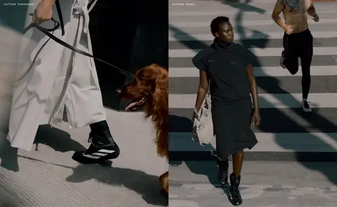
Category image pair
Two adjacent lifestyle images with small lowercase category links positioned close to their respective panels.
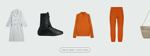
Product showcase
A horizontal row of isolated garment or accessory cutouts on the pale canvas, followed by a centered outlined shop CTA.
Campaign CTA pill
Lowercase 12px Space Mono text in a transparent pill with 1px outline, 24px radius, and 14px 20px padding.
Imagery · Fashion photography and campaign video dominate the page: close-up product details, models in motion, and editorial scenes with dark, cinematic grading. Hero footage fills the width with centered white text, while lifestyle photos appear side by side. Product cutouts are isolated against the pale canvas in horizontal showcases. Colors such as orange, denim blue, and olive appear within the imagery, not as added UI palette colors.
Use #e7ecea as the consistent interface and product-display canvas.
Keep black interface text and links crisp against the pale background.
Use white overlay text and outlines only where dark imagery supports contrast.
Set navigation, labels, and CTAs in Space Mono or a close monospace substitute.
Alternate full-bleed campaign footage with clean product showcases.
Center campaign titles and their primary CTAs over hero media.
✕ 不该做
Do not introduce extra interface colors from the photographs.
Do not add gradients, shadows, or raised card treatments.
Do not place product cutouts inside decorative card containers.
Do not use oversized rounded panels; reserve pill rounding for campaign CTAs.
Do not crowd campaign imagery with extra copy or controls.
Do not replace the compact editorial rhythm with generous, generic landing-page spacing.
给 AI 的提示词
想快速出一个同风格的新页面,把这段话连同 DESIGN.md 一起发给 AI。
Build a fashion-store page with the restrained editorial treatment of entire studios. Use Gallery Mist (#e7ecea) as the persistent canvas, Studio Ink (#000000) for interface text and dark outlines, and Film White (#ffffff) for readable overlays on dark photography. Set the interface in Space Mono or IBM Plex Mono; keep utility labels and CTA text lowercase, and campaign titles uppercase. Place a compact announcement strip above a slim navigation bar. Alternate full-bleed, cinematic video heroes with side-by-side lifestyle imagery and horizontal product cutouts on the pale canvas. Center hero titles and outlined pill CTAs over media. Keep the layout flat, compact, and full-width; avoid shadows, gradients, and extra colors outside the photography. Let the garments and campaign footage provide the visual richness.