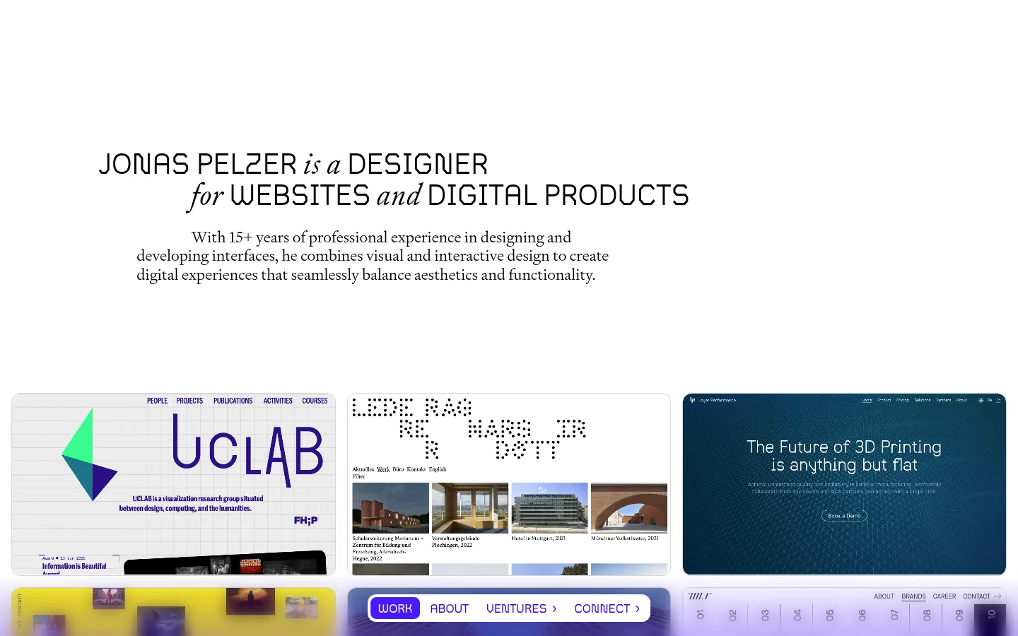
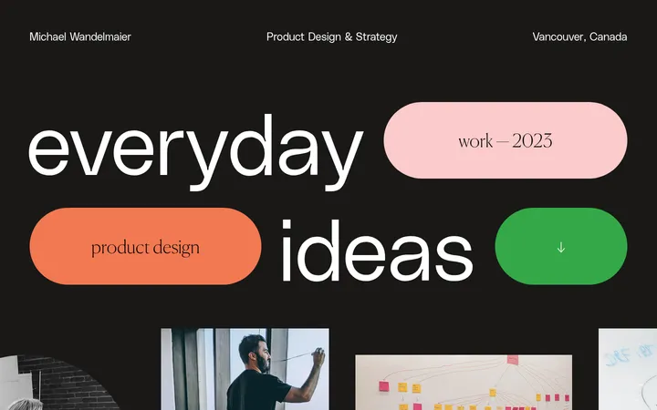
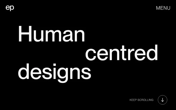
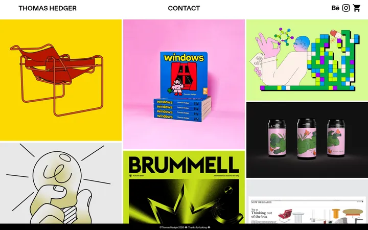
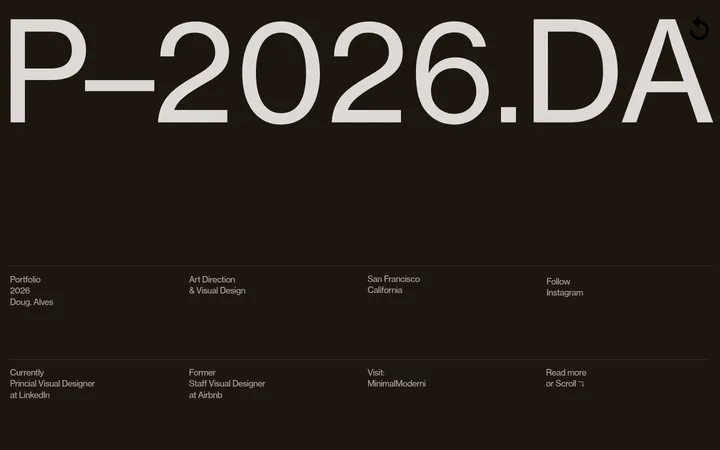
这是设计师 Jonas Pelzer 的个人作品集首页,以编辑感排版、大面积留白和项目画廊呈现其设计工作。黑色文字与少量紫色界面点缀保持克制,让不同风格的作品成为视觉焦点。
North star · Keep the page itself quiet and typographic so the varied project imagery provides the color and visual energy.
The page uses pure white as a continuous canvas, with near-black typography carrying nearly all of the interface hierarchy. Violet appears sparingly in interface details and in project imagery, not as a competing page-wide theme. The opening statement is centered within a relatively narrow text area, pairing a distinctive display face with a literary serif for an editorial, composed introduction. A large vertical pause separates this introduction from a dense, three-column project gallery. Project previews retain their own colors and visual identities, presented as rounded media tiles rather than recolored brand assets. Supporting work and contact content continue the restrained approach: text remains clear and direct, while borders and outlined controls are light. The overall contrast between spacious introductory content and compact, colorful portfolio thumbnails lets the designer’s work supply visual variety without sacrificing a coherent, quiet frame.
Primary literary serif for explanatory copy, project links, and secondary headings.
Aa 设计
Scope
网络字体 · 字重 400 · 占比 11%
免费替代:Jost
Display and interface face for the hero, uppercase labels, navigation, and buttons.
角色
示例
字号
字重
行高
字距
一级标题
Opening designer statement, set as the main display headline.
Jonas Pelzer
42px
400
1.1
0.02em
二级标题
Major sections such as work and about.
The quick brown fox 敏捷的狐狸
25.5px
400
1.2
0
三级标题
Subsection headings, including services content.
The quick brown fox 敏捷的狐狸
22px
400
1.2
0
正文
Introductory and supporting descriptive copy.
The quick brown fox 敏捷的狐狸
15.5px
400
1.2
0
辅助文字
Compact uppercase labels and metadata.
The quick brown fox 敏捷的狐狸
14px
400
1.2
0.036em
按钮
Uppercase calls to action and control labels.
The quick brown fox 敏捷的狐狸
17px
400
1.2
0.02em
导航
Uppercase primary navigation labels.
The quick brown fox 敏捷的狐狸
17px
400
1.2
0.02em
链接
Project titles and inline text links.
The quick brown fox 敏捷的狐狸
15.5px
400
1.2
0
眉题
Small uppercase section or content overlines.
The quick brown fox 敏捷的狐狸
14px
400
1.2
0.036em
间距与布局
基准单位 1px · 密度:宽松
209px版块间距
3px元素间距
—卡片内边距
1408px内容最大宽度
3px
4px
5px
6px
7px
9px
11px
14px
15px
16px
20px
37px
138px
154px
A spacious, centered introduction sits above a broad project gallery, with the measured page max width at 1408px. The hero text aligns as a compact block rather than spanning the viewport; the gallery below uses three columns and lets thumbnails form the dominant horizontal band. Generous section separation creates a clear change from introduction to work, while the later contact prompt returns to sparse text on white. Keep overall density low and preserve the contrast between quiet copy areas and image-rich work rows.
圆角与层次
按钮 · 12px
图片 · 12px
导航 · 8px
sm · other
The page is predominantly flat, with no prominent card shadows or layered panels. Light outlines define select controls, and rounded media edges separate project previews from the white canvas. Keep elevation subtle; avoid adding deep shadows or decorative containers that compete with the artwork.
组件
下面的预览按实测的按钮、输入框、徽标、卡片样式重建(字体用替代字体)。
Intro statement
A centered, two-line display statement with a short serif supporting paragraph beneath it; generous surrounding white space keeps it distinct.
Project gallery
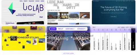
A three-column collection of wide website-preview tiles; each retains its source artwork, with rounded media framing.
Work CTA
A compact uppercase SEE MORE WORK control with a pale #d7ccff outline and violet text.
Primary work control
A small filled #491bff button with white uppercase WORK text, using the display/interface face.
Icon controls
Minimal icon-only buttons use a thin #d4d6dd border and rounded corners without a filled background.
Contact prompt
A plain text invitation and underlined contact link appear below the work area, with no enclosing card.
Imagery · Project imagery is the main source of color: a range of website and digital-product previews appears in a three-column gallery, each retaining its own palette and design language. Media tiles have softly rounded corners and consistent framing, while the screenshot shows mixed photographic, typographic, and graphic content inside them. Treat these as portfolio previews, not as a unified illustration system.
Keep the canvas white and the interface text black.
Use violet for small, purposeful interface accents.
Give the opening statement generous breathing room.
Let project previews retain their original colors.
Use serif copy alongside the distinctive display face.
Keep borders light and component surfaces mostly flat.
✕ 不该做
Do not add a dark page background.
Do not turn the violet accent into a broad gradient.
Do not force project thumbnails into one color treatment.
Do not crowd the hero with navigation or decoration.
Do not use heavy shadows or dense card styling.
Do not make every heading uppercase.
给 AI 的提示词
想快速出一个同风格的新页面,把这段话连同 DESIGN.md 一起发给 AI。
Build a designer portfolio page with a quiet editorial frame: use Gallery White (#ffffff) as the canvas and Editorial Ink (#000000) for headings, copy, links, and navigation. Set the introduction as a compact, centered statement with generous whitespace, using a display-style face paired with a literary serif for supporting text. Follow it with a broad three-column project gallery whose thumbnails keep their individual colors and visual identities. Use rounded media edges, minimal control outlines in Soft Divider (#d4d6dd), and a pale Lilac Outline (#d7ccff) for secondary actions. Reserve Electric Violet (#491bff) for one small filled primary control; keep other violet accents restrained. Leave clear vertical separation before a simple text-led contact prompt. Avoid heavy cards, shadows, gradients, and decorative backgrounds.