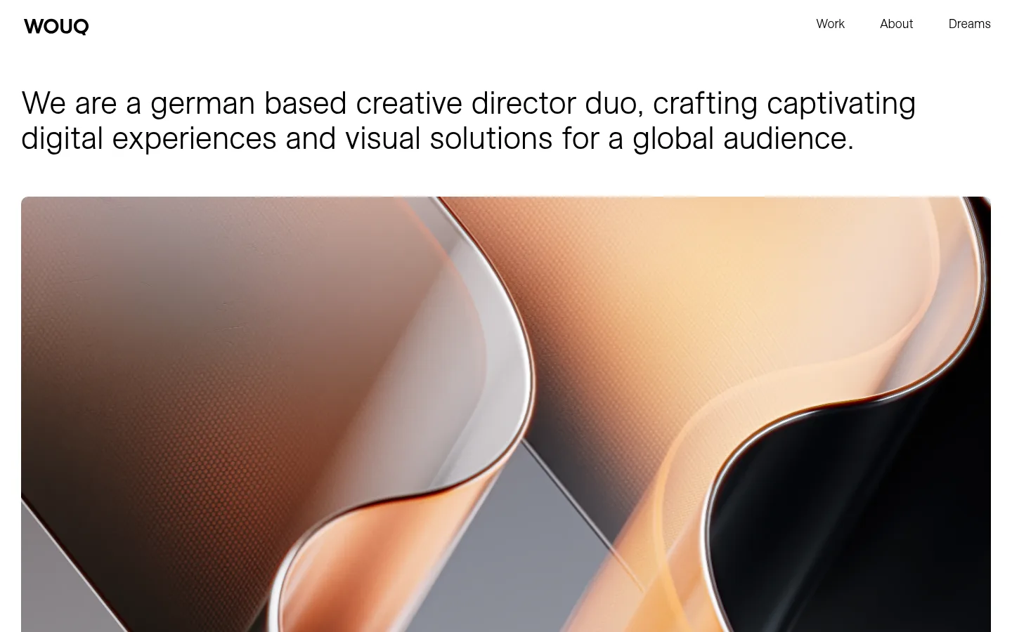
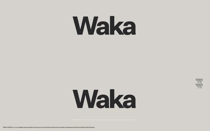
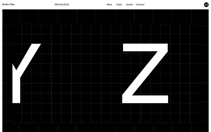
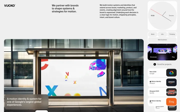
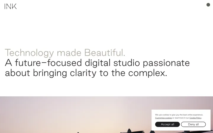
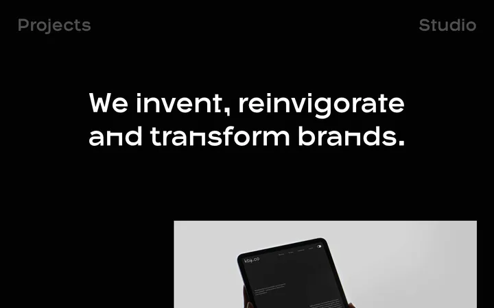
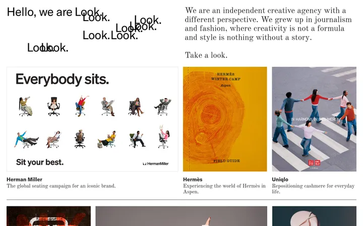
North star · Keep the interface nearly invisible: use white space and black type to frame large, distinctive project imagery.
The page uses a clean white canvas and black text as a restrained frame for a portfolio whose project imagery supplies most of its colour. Warm browns, peach, grey, and occasional dark scenes belong to the featured work rather than the site’s core palette. A light sans-serif carries both navigation and the large introductory statement, with regular weight and natural casing keeping the tone calm and direct. The header is sparse, while the introduction spans broadly above a dense, image-led project grid. Cards vary in width and height: a prominent lead image anchors the sequence, followed by paired and full-width projects. Small white captions sit over imagery where needed. Comfortable whitespace separates the introduction, media, and footer without competing with the images. Rounded image corners soften the otherwise crisp, flat layout; no prominent shadows, coloured UI bands, or decorative framing are evident.
配色
点色块复制色值。用途说明来自对页面的实测位置(背景、文字、描边、按钮)与截图判读。
表层色
中性色
页面底色 · Gallery White主文字 · Studio Ink次要文字 · Gallery White
Navigation, introduction, project captions, and links
角色
示例
字号
字重
行高
字距
一级标题
Large opening statement beneath the navigation.
WOUQ
45px
400
1.11
0
二级标题
Project and supporting section titles.
The quick brown fox 敏捷的狐狸
27px
400
1
0
正文
Studio introduction and supporting copy.
The quick brown fox 敏捷的狐狸
18px
400
1.5
0
导航
Header navigation links.
The quick brown fox 敏捷的狐狸
18px
400
1
0
链接
Project captions and footer links.
The quick brown fox 敏捷的狐狸
18px
400
1.5
0
间距与布局
基准单位 1px · 密度:适中
35px版块间距
—元素间距
—卡片内边距
1380px内容最大宽度
5px
10px
25px
30px
A broad, centered page canvas uses a measured maximum width of 1380px. The header places the wordmark at left and a compact navigation group at right. Below it, a large left-aligned introduction leads directly into a four-column project grid; featured media spans multiple columns while smaller projects sit side by side. The measured section gap is 35px, with a comfortable overall density. Keep the footer visually quiet and aligned with the same page margins.
圆角与层次
没有测到阴影:页面是扁平的,层次靠底色和描边区分。
The interface reads as flat: no measured shadows or gradients define the page. Project media is separated by white gutters and softly rounded corners, with captions layered directly over image content. Avoid adding card borders or elevated surfaces; let the imagery create depth.
组件
下面的预览按实测的按钮、输入框、徽标、卡片样式重建(字体用替代字体)。
Header
Minimal wordmark-and-navigation row on the white canvas; black text links align opposite the brand.
Intro statement
Large, left-aligned black sans-serif copy placed between the header and portfolio.
Featured project tile
Large image-led card spanning much of the grid width, with a small white descriptor and project title overlaid near the lower edge.
Paired project tiles
Smaller media cards sit side by side within the portfolio grid, each carrying a restrained white caption.
Portfolio grid
Four-column measured layout with varied full-width and multi-column project media; maintain clean white gutters.
Footer links
Compact black text links and studio details arranged in small groups beneath the final project.
Imagery · Use large project images and video as the primary visual content, with a mix of product renders, interiors, devices, and cinematic scenes. Preserve each project’s native colour and crop imagery into a varied grid, including wide feature panels and paired tiles. Captions are small and white over the media where shown. Treat warm image colours as project-specific, not as reusable brand accents.
Give project imagery the strongest visual presence.
Vary project tile sizes within the measured grid.
Place concise captions directly over media where appropriate.
Keep the header and footer understated.
Preserve comfortable white space between major blocks.
✕ 不该做
Do not turn portfolio-image colours into brand accents.
Do not add decorative colour bands or gradients.
Do not place heavy shadows beneath project tiles.
Do not make the navigation visually dominant.
Do not force every project into identical card dimensions.
Do not overlay long descriptions on the imagery.
给 AI 的提示词
想快速出一个同风格的新页面,把这段话连同 DESIGN.md 一起发给 AI。
Build a new creative-studio page in WOUQ’s restrained portfolio style. Use Gallery White (#ffffff) for the canvas and Studio Ink (#000000) for the wordmark, navigation, and editorial copy. Set a light sans-serif close to ESAllianz-Light, keeping natural casing and regular-looking weight. Create a sparse header, a prominent left-aligned introductory statement, and a varied four-column project grid with large image-led tiles, clean white gutters, and subtle rounded corners. Let project photography or video provide the colour; do not apply those image hues to interface elements. Add short, legible captions over media where useful, then finish with a quiet footer of studio details and links. Keep the page flat, spacious, and focused on the work; avoid prominent borders, shadows, gradients, and decorative UI.