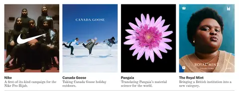
North star · Treat the page like a spacious editorial portfolio: neutral typography and hairlines frame, but never compete with, each project’s own imagery.
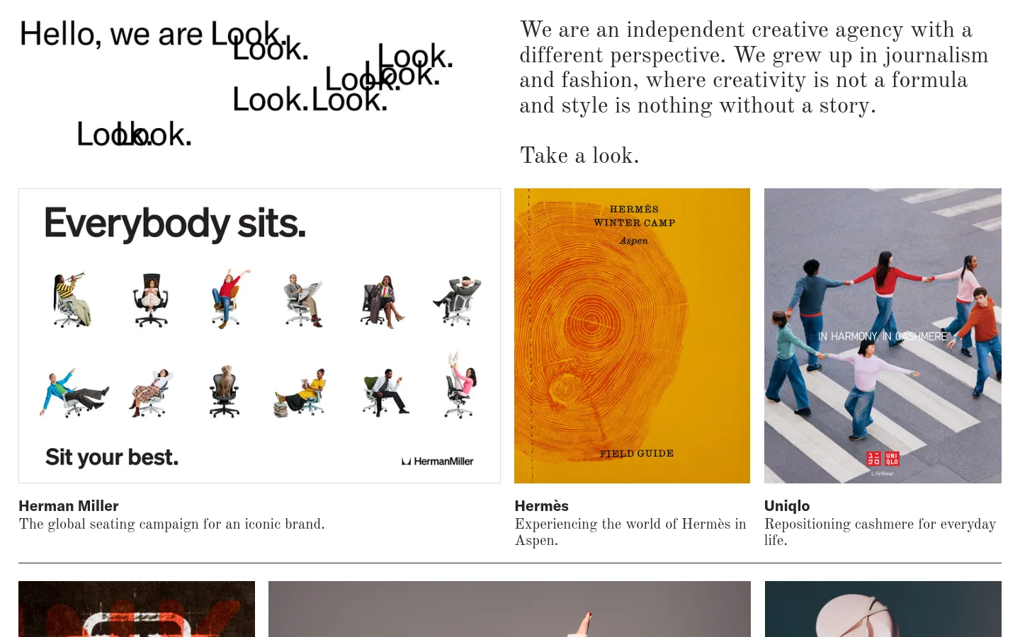
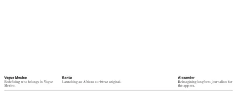
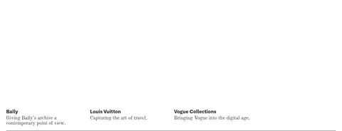
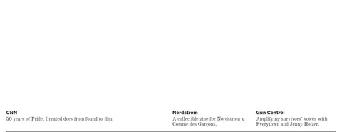
The page is anchored by a pure white canvas (#ffffff), giving a long portfolio room to breathe without coloured section bands. Near-black (#262626) carries the typography and most fine rules, while medium grey (#878787) appears sparingly as a softer hairline. The warm orange and varied hues visible in the first project row belong to campaign imagery, not the site’s core palette. Typography contrasts a clean, bold GT America sans for the opening statement and compact project labels with Old Standard serif for editorial copy and project descriptions. A two-part introduction gives way to an asymmetric, image-led portfolio: projects vary in width and grouping, with short captions directly beneath. Later projects become deliberately sparse, using names and descriptions separated by thin rules and substantial blank space. The overall effect is a printed editorial index rather than a conventional agency landing page, with flat surfaces and imagery providing the visual variation.
Editorial subheads and section statements in serif.
Look
32.5px
400
1.1
0
正文
Introductory copy and project descriptions.
The quick brown fox 敏捷的狐狸
18px
400
1.3
0
间距与布局
基准单位 2px · 密度:适中
—版块间距
—元素间距
—卡片内边距
1388px内容最大宽度
13px
16px
18px
26px
The measured page max width is 1388px, with a comfortable density and a responsive-looking grid that mixes two-column introductory content with variable-width project rows. The opening statement sits on the left and the longer agency introduction on the right. Portfolio groups vary their number and proportions of columns rather than repeating a rigid card template. Captions sit immediately below images, and thin horizontal rules mark row endings. Later text-only project groups retain the same broad grid alignment but leave large expanses of empty white canvas.
圆角与层次
没有测到阴影:页面是扁平的,层次靠底色和描边区分。
The interface is flat: there are no measured shadows, gradients, or rounded component treatments. Images sit directly on the white canvas, with thin horizontal rules providing quiet separation between project groups. Do not add card-like elevation or overlays to standard captions.
组件
下面的预览按实测的按钮、输入框、徽标、卡片样式重建(字体用替代字体)。
Opening statement
A large sans-serif greeting occupies the left side of a two-part introduction, with a loose cluster of repeated wordmark text nearby.
Agency introduction
Serif-led editorial copy sits opposite the opening statement, ending with a short invitation to view the work.
Project tile
A campaign image is followed by a bold sans-serif client name and a short serif project description.
Variable project row
Portfolio groups combine differently sized image slots and varying column counts; do not force every row into equal cards.
Text-only project entry
Client names and concise descriptions can sit in broad grid columns without imagery, with a thin rule closing the group.
About block
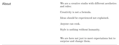
A two-column studio section pairs a concise label with a longer serif statement and separated principles.
Section hairline
A restrained horizontal rule separates portfolio groups and the about section against the white canvas.
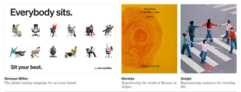
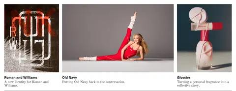
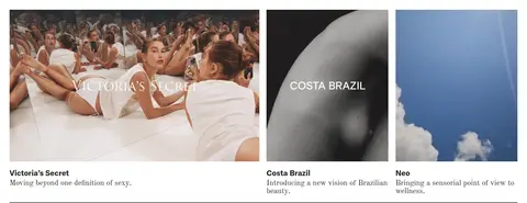
Imagery · Portfolio imagery is campaign photography and brand artwork, not a uniform illustration system. The first visible group mixes a wide seating campaign with narrower Hermès and Uniqlo visuals; subsequent rows vary in crop, subject, and colour. Keep images edge-aligned within their grid slots and allow their own hues and compositions to supply contrast. Captions remain outside the images, on the white canvas.
Keep project imagery varied in width and visual character.
Place captions directly beneath their corresponding images.
Use serif and sans-serif as distinct editorial voices.
Separate groups with thin, understated rules.
Preserve generous empty space, especially in text-only rows.
✕ 不该做
Do not introduce a coloured brand section background.
Do not treat campaign-image colours as site palette colours.
Do not standardize every project into an identical card.
Do not add shadows, gradients, or rounded card styling.
Do not overlay long captions on project images.
Do not fill the intentionally sparse later portfolio rows.
给 AI 的提示词
想快速出一个同风格的新页面,把这段话连同 DESIGN.md 一起发给 AI。
Build a new page in Look’s editorial portfolio style. Use Gallery White (#ffffff) as a continuous canvas and Editorial Ink (#262626) for clear typography and most fine rules; reserve Soft Rule (#878787) for occasional lighter hairlines. Pair a clean sans-serif for bold client labels and a prominent opening statement with an Old Standard-like serif for explanatory copy. Compose a two-part introduction, then an irregular portfolio grid with varied image proportions and captions immediately below each image. Let each project’s photography provide its own colour; do not turn those hues into interface accents. Use thin separators and preserve substantial whitespace, especially around text-only entries. Keep surfaces flat and avoid shadows, gradients, rounded cards, or decorative UI that competes with the work.