North star · Keep the page airy and product-led: dark-violet clarity on white, with pastel gradients reserved for large feature and conversion panels.
The visual system starts with a white canvas and uses broad, softly rounded pastel panels to distinguish selected feature, testimonial, and signup sections. The primary text colour is a very dark violet, with muted purple-grey for supporting copy and pale borders around controls and cards. A lavender-to-pink gradient is a recurring backdrop, while product UI contributes sharper violet and teal details. Britti Sans gives headings a rounded, contemporary display character; Inter handles navigation, body copy, labels, and interface-like details. The layout alternates centered headline-led panels with large product demonstrations and quieter informational blocks. Generous whitespace keeps the long page from feeling dense, while restrained shadows lift screenshots, cards, and compact navigation. Overall, the page balances approachable pastel atmosphere with credible, data-rich B2B software evidence.
Body copy, navigation, captions, badges, and interface-like labels.
Aa 设计
Britti Sans
网络字体 · 字重 500 · 占比 28%
免费替代:Manrope
Display and heading typography across hero, feature, testimonial, and CTA sections.
角色
示例
字号
字重
行高
字距
特大标题
Large campaign headlines and prominent section statements.
Wiza
64px
500
1
0
一级标题
Hero headline introducing verified contact data.
Wiza
56px
500
1
0
二级标题
Main feature, social-proof, and conversion section headings.
Wiza
40px
500
1
0
三级标题
Subsection titles and secondary feature headlines.
Wiza
32px
500
1
0
四级标题
Compact card or feature titles.
The quick brown fox 敏捷的狐狸
24px
500
1
0
正文
Paragraphs, descriptions, and supporting product explanations.
The quick brown fox 敏捷的狐狸
16px
400
1.5
0
辅助文字
Small labels, badges, ratings, and supporting metadata.
The quick brown fox 敏捷的狐狸
14px
400
1.3
0
导航
Primary navigation links and menu labels.
The quick brown fox 敏捷的狐狸
14px
400
1.5
0
间距与布局
基准单位 4px · 密度:适中
48px版块间距
4px元素间距
44px卡片内边距
1200px内容最大宽度
1px
4px
6px
8px
12px
16px
20px
24px
32px
40px
48px
The page is a long, single-column narrative on a white canvas, organized into broad centered blocks and occasional two-column feature presentations. Content sits within a measured 1200px maximum page width, with comfortable density and a measured 48px section rhythm. Large rounded pastel panels create visual chapters among white intervals. Headings and calls to action are commonly centered, while product screenshots and feature details can introduce more structured alignment. The sequence moves from hero and product proof through capabilities, testimonials, signup, and a multi-column footer.
圆角与层次
按钮 · 50%
输入框 · 10px
卡片 · 24px
图片 · 50%
徽标 · 6px
导航 · 8px
链接 · 8px
sm · other
lg · card
md · card
inset · other
Most surfaces stay flat, with thin pale outlines separating controls and cards from the white canvas. Soft, cool-toned shadows lift the floating navigation, product screenshots, and testimonial cards. Keep layering restrained: screenshots may overlap decorative elements, but avoid heavy dark shadows or dense stacks of cards.
组件
下面的预览按实测的按钮、输入框、徽标、卡片样式重建(字体用替代字体)。
Floating navigation
Compact centered pill-like bar with Wiza mark, Inter navigation links, and a small login control; use a subtle outline and soft shadow.
Hero CTA pair
Centered headline and short copy above a filled violet primary action and a quiet secondary demo action.
Product demonstration
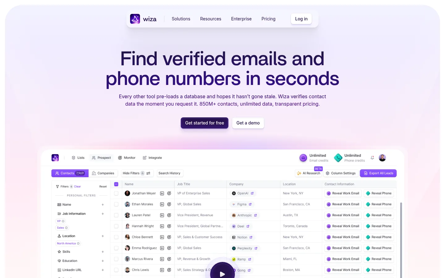
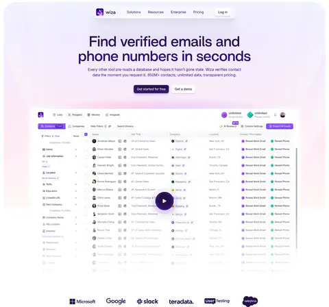
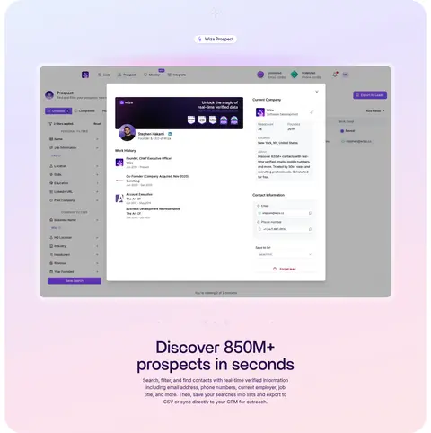
Large, detailed prospecting interface screenshot, treated as the main evidence of the product rather than generic decoration.
Pastel feature panel
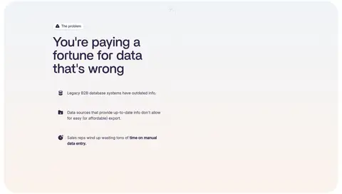
Large rounded section wash using pale lavender, blush, or cool blue-green gradients behind centered product storytelling.
Testimonial card
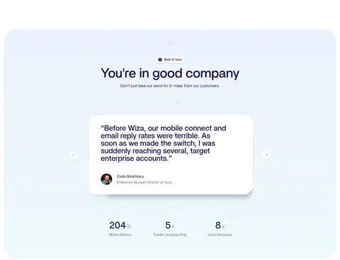
White rounded quote card with dark-violet text, customer attribution, and gentle shadow inside a cool pastel section.
Signup form
Email input with a pale outlined surface and a prominent violet account-creation action.
Footer columns
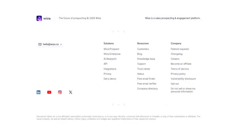
Quiet multi-column link directory with brand summary, contact email, social marks, and understated muted copy.
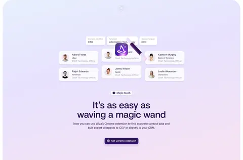
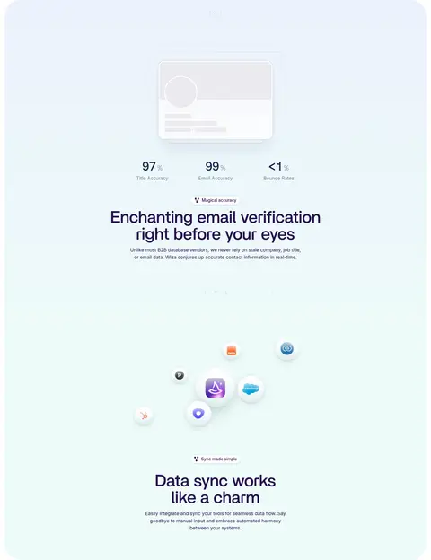
Imagery · Product UI screenshots and interface mockups are the main visual evidence, showing prospect lists, contact details, verification, and integrations. They sit large within their sections, often against white or pastel washes, and are paired with soft shadows rather than dramatic frames. Small customer logos and portrait thumbnails support credibility. The page also uses video-led product demonstrations and light decorative visual elements; imagery should feel clean and legible, not photographic or cinematic.
Reserve pastel gradients for large section panels.
Set display headings in Britti Sans or a close substitute.
Use Inter for navigation, body text, and UI labels.
Show real-looking product interfaces as evidence.
Keep borders and shadows soft and low contrast.
✕ 不该做
Do not turn every section into a gradient panel.
Do not use saturated colours as large background fills.
Do not crowd the centered hero or feature headings.
Do not replace product UI with generic stock photography.
Do not use heavy borders or dramatic shadows.
Do not introduce unmeasured colour values.
给 AI 的提示词
想快速出一个同风格的新页面,把这段话连同 DESIGN.md 一起发给 AI。
Build a new Wiza-style SaaS page with a white Canvas White (#ffffff) foundation, Deep Wisteria (#26114a) headings, and Slate Violet (#615e6e) supporting copy. Use Britti Sans-like rounded medium headings and Inter for navigation, body, labels, and controls. Create a compact floating navigation, centered headline-led hero, and a prominent prospecting product screenshot. Break up the long page with only a few broad, softly rounded pastel panels using Lavender Wash (#e8e2fe), Petal Pink (#fce2f0), Rose Tint (#fce6ea), or Pale Sky (#ebf2fc). Use restrained borders and shadows, generous whitespace, and crisp interface detail. Include feature storytelling, trust proof, customer testimonials, a simple email signup, and a calm multi-column footer. Keep the experience light, credible, and product-led.