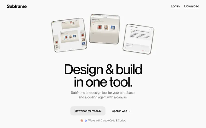
North star · Keep the page quiet and legible in neutral tones, using the rainbow gradient as a restrained frame for real product UI.
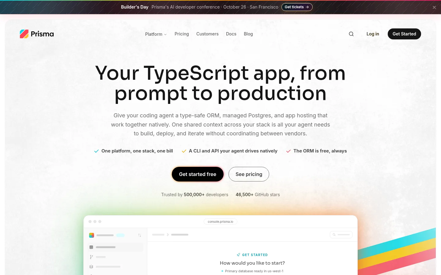
The visual system is built on a white canvas with charcoal text and muted gray supporting copy. The colorful identity appears selectively: soft cyan, pale yellow, and blush tint product panels and ambient hero artwork, while a saturated cyan-to-yellow-to-coral spectrum is reserved for decorative edges and branded moments. Sora gives headings a contemporary, geometric presence; Inter handles navigation, body copy, labels, and links with compact clarity. The centered hero leads with a large headline, concise supporting text, proof points, and pill-shaped actions, followed by a framed product preview. Lower sections alternate between centered statements, structured comparisons, product demonstrations, pricing, testimonials, and FAQ content. Cards are mostly white with thin gray borders and rounded corners rather than heavy fills. Spacing is generous around major sections, while card content remains dense and practical.
Navigation, body copy, labels, links, captions, and compact interface text.
Aa 设计
Sora
网络字体 · 字重 500 / 380 · 占比 5%
免费替代:Space Grotesk
Display and section headings, plus prominent button labels.
角色
示例
字号
字重
行高
字距
一级标题
Centered hero headline introducing the TypeScript platform.
Prisma
48px
500
1.1
0
二级标题
Major section headings, including stack, pricing, and testimonials.
The quick brown fox 敏捷的狐狸
24px
500
1.33
0
三级标题
Feature titles and subordinate product or content headings.
The quick brown fox 敏捷的狐狸
20px
500
1.4
0
正文
Explanatory paragraphs, feature descriptions, and card copy.
The quick brown fox 敏捷的狐狸
15px
500
1.5
0
辅助文字
Small supporting labels, metadata, and understated annotations.
The quick brown fox 敏捷的狐狸
12px
380
1.33
0
按钮
Prominent calls to action and action labels.
The quick brown fox 敏捷的狐狸
16px
500
1.5
0
导航
Primary site navigation and utility menu items.
The quick brown fox 敏捷的狐狸
14px
600
1.43
0
链接
Inline and card-level navigation links.
The quick brown fox 敏捷的狐狸
14px
600
1.43
0
间距与布局
基准单位 4px · 密度:紧凑
32px版块间距
12px元素间距
24px卡片内边距
768px内容最大宽度
2px
4px
6px
8px
10px
12px
14px
16px
20px
23px
24px
28px
32px
36px
The page uses a centered, restrained content measure, with measured page max width of 768px for core content. The hero centers its heading, copy, proof points, and actions above a wide product preview. Below it, sections shift between two- and three-column arrangements, broad product panels, and full-width decorative areas. Major section spacing is generous, while compact lists and card details stay dense. The footer returns to a multi-column link layout. Keep alignments deliberate and avoid filling the open white canvas.
圆角与层次
按钮 · 9999px
卡片 · 18px
图片 · 10px
徽标 · 9999px
导航 · 9999px
链接 · 9999px
hairline · media
sm · badge
md · card
md · other
The page favors flat white surfaces, thin pale-gray outlines, and modest rounded corners over heavy shadows. Product previews and selected cards may sit above soft ambient gradient fields, but keep their interfaces crisp. Use subtle separation to distinguish panels; avoid strong elevation that competes with the clean canvas.
组件
下面的预览按实测的按钮、输入框、徽标、卡片样式重建(字体用替代字体)。
Announcement strip
A slim dark top banner with centered event copy, a compact ticket action, and a close control; a narrow multicolor accent runs along its edge.
Primary CTA
Black pill-shaped action with white label, paired with a light outlined pill for the secondary action.
Hero product preview
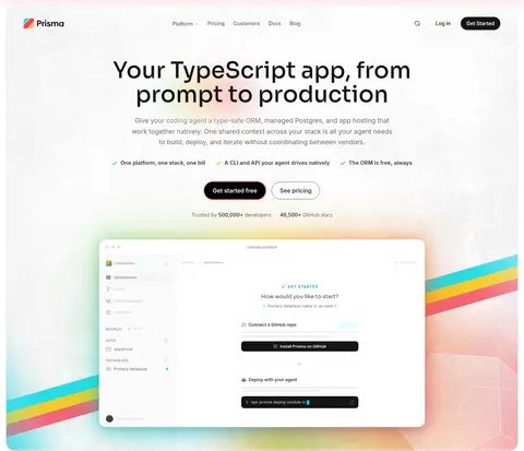
Large browser-like product panel beneath centered hero copy, framed by a soft multicolor glow and broad gradient bands.
Feature card
White panel with a thin #f0f0f0 border, rounded corners, and concise product or testimonial content.
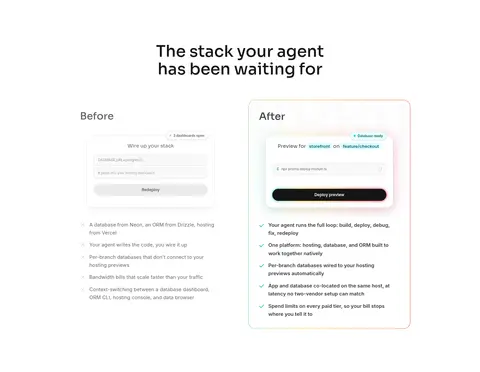
Comparison panel
Before-and-after presentation contrasting fragmented setup with an integrated deployment preview.
Product badge
Compact rounded label with subtle border or soft cyan fill; use deep teal text for cyan-tinted badges.
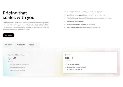
Pricing card
Side-by-side pricing comparison with tab-like plan choices, concise feature lists, and a softly colored product backdrop.
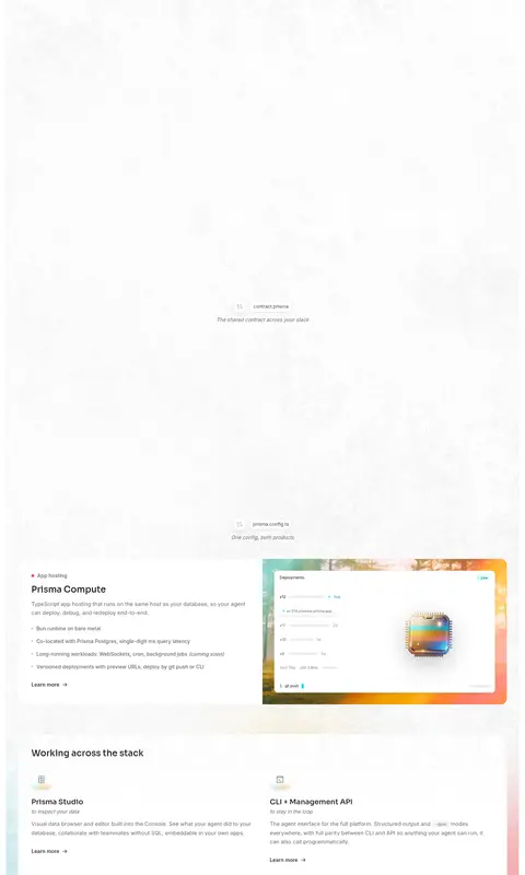
Imagery · Product imagery is primarily interface-led: browser-like panels, deployment views, pricing comparisons, and small diagrams. Frame these previews in softly rounded white cards and let cyan, yellow, and coral gradient light sit behind or around them. The screenshots show little conventional photography; logos and interface elements carry the content. Treat large gradients as atmospheric framing, not as a substitute for legible product UI.
Use Graphite Ink for prominent text and Quiet Gray for supporting copy.
Use Sora for headings and Inter for interface and body text.
Reserve vivid gradients for product framing and brand accents.
Make primary and secondary actions rounded pills.
Separate cards with fine, pale borders rather than heavy fills.
✕ 不该做
Do not turn every section into a colored band.
Do not use gradient text for ordinary headings or body copy.
Do not let decorative color overpower product screenshots.
Do not crowd the hero; preserve its centered hierarchy.
Do not rely on deep shadows to define cards.
Do not introduce unmeasured colors into the brand palette.
给 AI 的提示词
想快速出一个同风格的新页面,把这段话连同 DESIGN.md 一起发给 AI。
Build a new Prisma-style developer SaaS page on a clean Gallery White (#ffffff) canvas. Use Graphite Ink (#3a3b3c) for headings and copy, Quiet Gray (#646567) for secondary text, and fine Feather Line (#f0f0f0) borders for cards. Set geometric Sora headings against practical Inter interface text. Create a clear centered introduction, then use product UI previews, comparison panels, and concise feature cards to explain the product. Keep layouts airy between sections but compact inside cards. Use pill-shaped dark primary actions and restrained outlined secondary actions. Apply Mist Cyan (#b3f4f9), Soft Marigold (#fae7b2), and Blush Mist (#ffcfd1) as pale ambient surfaces; reserve Signal Cyan (#01d7e4) and Prisma Gold (#f3c306) for selective spectrum accents. Prioritize crisp, believable interface imagery over decorative illustration.