North star · Keep the page predominantly white and spacious, using oversized black typography, restrained blue actions, and colorful product previews as the focal contrast.
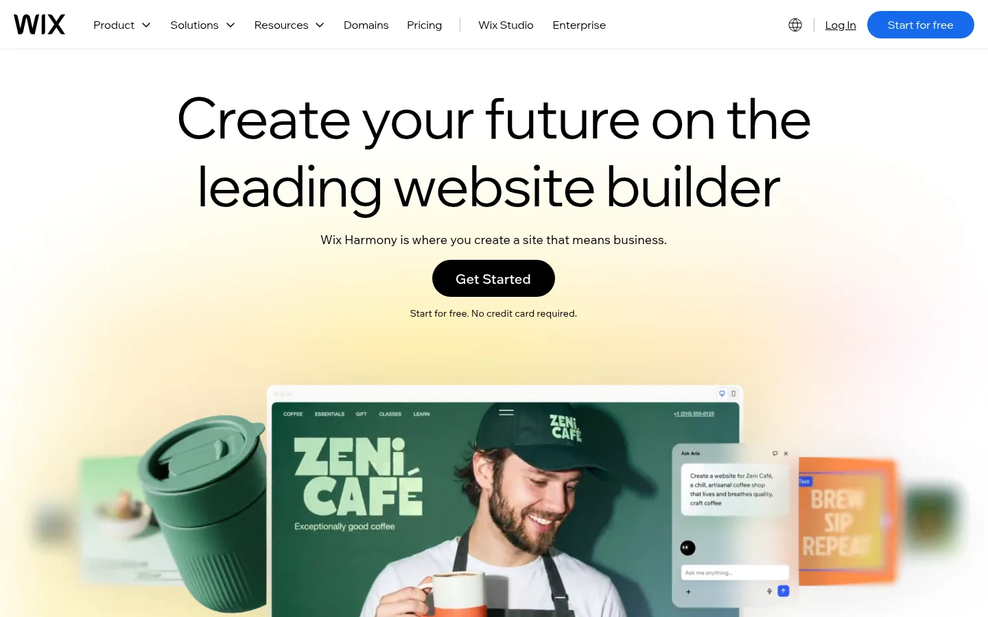
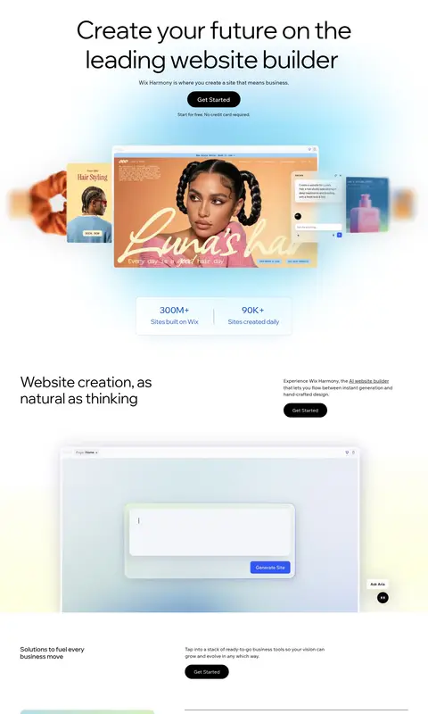
The page is anchored by a white canvas, black text, and a compact top navigation that lets the oversized, centered hero headline take focus. Wix Madefor Display gives headlines a light, open character; Wix Madefor Text handles supporting copy and navigation with a restrained, readable rhythm. Blue is reserved for the prominent primary CTA and selected interface details, while most secondary CTAs appear as black pills. Pale green, blue, and warm cream gradients soften large transitions without replacing the white foundation. Product imagery is presented as layered website previews, devices, and interface mockups; their brighter colors belong to the showcased examples, not the core brand palette. Below the hero, alternating editorial text-and-image arrangements, sparse feature rows, and broad section gaps create a spacious scroll. Thin gray rules organize functional lists, and rounded controls contrast with otherwise flat, border-light sections.
Body copy, supporting text, and most measured links.
Aa 设计
wix-madefor-display-v2
网络字体 · 字重 400 / 500 · 占比 29%
免费替代:DM Sans
Display headlines, section headings, and captions.
Aa 设计
Madefor-Display
网络字体 · 字重 400 · 占比 1%
免费替代:DM Sans
Navigation labels and primary CTA text.
角色
示例
字号
字重
行高
字距
特大标题
Oversized hero message and prominent brand statements.
Wix
82.5px
400
1.2
-0.02em
一级标题
Primary hero headline.
Wix
72px
400
1
0
二级标题
Major section headings and feature introductions.
Wix
54px
400
1.1
-0.02em
三级标题
Secondary feature and product-section headings.
Wix
48px
400
1.14
-0.01em
四级标题
Compact feature titles and emphasized subheads.
The quick brown fox 敏捷的狐狸
21px
500
1.14
-0.01em
正文
Supporting descriptions and explanatory copy.
The quick brown fox 敏捷的狐狸
16px
400
1.44
0
辅助文字
Small notes, labels, and image captions.
The quick brown fox 敏捷的狐狸
12px
400
1.25
0
导航
Top navigation links and menu labels.
The quick brown fox 敏捷的狐狸
16px
400
normal
0
链接
Inline text links within supporting content.
The quick brown fox 敏捷的狐狸
7.5px
400
1.6
0
间距与布局
基准单位 1px · 密度:宽松
98px版块间距
15px元素间距
—卡片内边距
—内容最大宽度
1px
2px
5px
6px
7px
8px
10px
12px
13px
15px
18px
20px
21px
30px
38px
45px
Use a wide desktop composition with a compact full-width navigation and a centered hero. The hero headline and CTA sit on the central axis, with a large product-preview visual below. Continue with broad, spacious section bands and editorial two-column text-and-image layouts; alternate alignments where useful. Keep copy blocks narrow beside large media, and use generous vertical separation rather than dense card grids. The measured page is spacious; no reliable maximum content width was captured, so match the screenshot proportions instead of inventing one.
圆角与层次
按钮 · 9999px
输入框 · 9999px
图片 · 15px
inset · other
lg · other
xl · input
The interface is mostly flat: white canvas, clean section transitions, and restrained gray hairlines do most of the structural work. Use only soft atmospheric shadows or glows around product mockups and search-style controls. Rounded pill CTAs provide shape contrast; avoid adding heavy card shadows or thick borders across the page.
组件
下面的预览按实测的按钮、输入框、徽标、卡片样式重建(字体用替代字体)。
Top navigation
A white horizontal bar with the black Wix wordmark, compact text links, small dropdown indicators, utility icons, login link, and a blue pill-shaped “Start for free” CTA.
Hero headline
Large centered black display type over a spacious white and softly tinted backdrop, followed by a short supporting sentence.
Primary CTA
Blue #166aea pill button with white text; keep the label concise and the treatment clean.
Secondary CTA
Black pill button used repeatedly in content sections, paired with white text and minimal surrounding decoration.
Product showcase
Large website and builder interface previews, layered with floating UI panels and occasional soft shadow or glow.
Feature row
Spacious editorial split: concise heading and explanation alongside a large interface or website preview.
Hairline list
Large black feature labels organized by subtle gray horizontal separators, with supporting details kept compact.
Domain search
Wide rounded input and blue search action centered within a pale gradient field, with small explanatory text below.
Imagery · Use large, colorful website previews and interface mockups as the main imagery, often layered with device frames, floating panels, or overlapping examples. Keep the surrounding page mostly white or softly gradient-tinted so the imagery reads clearly. Product screenshots may contain vivid photography, color, and illustration; treat these as showcase content rather than extending them into the core brand palette.
Use large, regular-weight black display headlines.
Center the hero headline and main action.
Reserve blue for primary actions and select interface cues.
Use pale gradients as soft atmospheric backdrops.
Show product previews prominently and let their imagery supply color.
Separate sections with generous whitespace and occasional hairlines.
✕ 不该做
Do not turn the page into a dense dashboard.
Do not use strong saturated colors as large brand backgrounds.
Do not make every CTA blue; secondary actions are black pills.
Do not add heavy card borders or shadows.
Do not use bold, condensed, or all-caps display typography.
Do not mistake colors inside showcased websites for Wix brand colors.
给 AI 的提示词
想快速出一个同风格的新页面,把这段话连同 DESIGN.md 一起发给 AI。
Build a new Wix-style page with a white #ffffff canvas, black #000000 typography, and spacious editorial pacing. Use a compact full-width navigation, an oversized centered hero headline, concise supporting copy, and a clear pill-shaped primary CTA in Builder Blue #166aea with white text. Use black pill CTAs for secondary actions. Set headlines in an open, regular-weight display sans similar to DM Sans and supporting text in a readable sans like Inter. Add pale Sky Tint #dcf0ff, Cream Glow #fefef0, and Mint Wash #bdead5 only as soft background atmosphere. Structure lower content as generous text-and-image feature rows, using colorful website previews as the main visual focus. Keep borders subtle in Quiet Rule #c6c6c6, avoid dense card grids, and make product imagery—not decorative UI—the strongest color source.