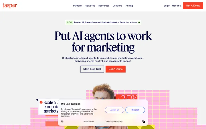
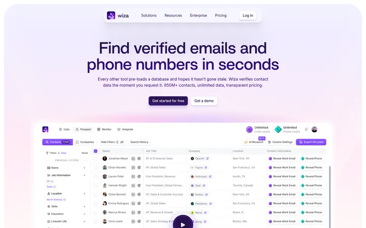
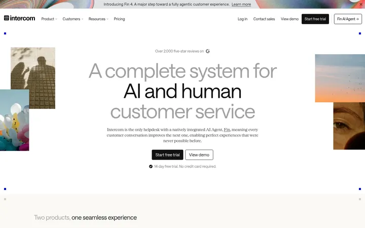
North star · Use warm, spacious editorial layouts to make automation feel clear, credible, and easy to act on.
The visual system is built on a warm near-white canvas (#fffefb), with pale cream and soft stone section bands creating broad, calm transitions down the page. Zapier orange (#ff4f00) is reserved for high-intent actions and selective headline emphasis, while near-black text provides strong contrast. Inter carries navigation, body copy, labels, and buttons; a light serif adds an editorial voice to selected section headings and testimonials, supported by a distinctive display face for the hero. The opening is centered and spacious, followed by alternating split layouts, product demonstrations, and wide testimonial and trust sections. Product imagery appears in large rectangular frames and is treated as contextual evidence rather than decoration. Most surfaces stay flat: fine borders define cards and security panels, while minimal shadowing keeps the interface crisp. Generous vertical gaps separate dense information into readable, purposeful blocks.
Navigation, body copy, captions, labels, buttons, and most interface text.
Aa 设计
Serrif
网络字体 · 字重 300 / 200 · 占比 13%
免费替代:Lora
Light editorial section headings and longer testimonial quotations.
Aa 设计
Degular Display
系统字体 · 字重 500 · 占比 4%
免费替代:DM Sans
Hero display headline and primary large display typography.
角色
示例
字号
字重
行高
字距
特大标题
Large display headings that establish the page’s strongest typographic moments.
Zapier
56px
500
1
0
一级标题
Hero headline announcing automation in the agentic era.
Zapier
48px
500
1
0
二级标题
Light, editorial section headings, including feature and testimonial areas.
Zapier
40px
300
1.08
-0.04em
三级标题
Secondary editorial headings within product and customer-story content.
Zapier
28px
300
1.25
-0.015em
四级标题
Compact interface or card headings.
The quick brown fox 敏捷的狐狸
20px
400
normal
-0.01em
正文
Explanatory copy, product descriptions, and customer-story details.
The quick brown fox 敏捷的狐狸
14px
400
1.5
0
辅助文字
Small supporting notes, metadata, and fine-print labels.
The quick brown fox 敏捷的狐狸
12px
400
1.5
0
按钮
Prominent action labels, primarily signup and exploration CTAs.
The quick brown fox 敏捷的狐狸
16px
600
normal
0
导航
Header navigation and utility links.
The quick brown fox 敏捷的狐狸
14px
400
1.71
0
眉题
Small uppercase category labels above major section headings.
The quick brown fox 敏捷的狐狸
12px
400
1.5
0.04em
间距与布局
基准单位 8px · 密度:宽松
96px版块间距
16px元素间距
—卡片内边距
—内容最大宽度
4px
6px
8px
10px
12px
16px
20px
24px
32px
40px
48px
80px
96px
The homepage alternates a centered hero with broad media, single-column feature introductions, and two-column product or testimonial splits. Customer stories and security content expand into wider multi-column arrangements. The measured spacing system uses an 8px base, with a 96px section gap and 16px element gap; keep the overall rhythm spacious rather than tightly packed. Align hero and trust messaging centrally, then use left-aligned copy alongside right-side product media in feature bands. Avoid inventing a fixed max width; retain the generous margins and broad content frames visible in the screenshots.
圆角与层次
按钮 · 4px
导航 · 4px
hairline · button
The page is predominantly flat, with section background changes doing most of the structural work. Use fine warm-gray borders for cards, story panels, and security elements; the measured button shadow is only a one-pixel dark hairline. Keep product media and floating UI layers distinct through framing, not heavy drop shadows.
组件
下面的预览按实测的按钮、输入框、徽标、卡片样式重建(字体用替代字体)。
Primary CTA
Zapier-orange button with warm-white text and a thin orange border; measured variants use compact or standard padding and subtle corner rounding.
Outlined secondary action
Light surface with a dark fine outline and dark Inter label, paired beside orange signup actions or below feature copy.
Top navigation
Slim light header with dark Inter links, wordmark, utility actions, and an orange signup button at the right.
Product feature split
Left-aligned eyebrow, editorial heading, explanatory copy, and compact actions paired with a large right-side product demonstration.
Customer story panel
Warm-gray story area combining a serif quotation, customer identity, outcome figures, and branded media, with fine divider lines.
Security capability grid
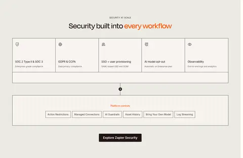
Broad pale-stone band with centered heading, thinly outlined capability cells, and a contained governance control illustration.
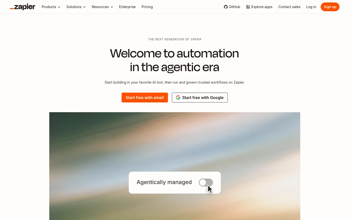
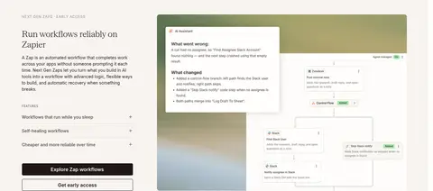
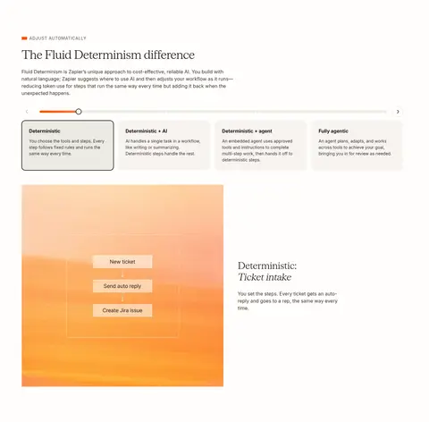
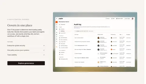
Imagery · Use large, rectangular product demonstrations and interface screenshots as the main proof of functionality. The hero media is a soft-focus atmospheric video or image with a small floating control; later sections show app integrations, workflow diagrams, and governance screens. Customer-story imagery uses branded fields or photography. Keep media cleanly framed and let its native color carry visual interest rather than adding decorative overlays.
Keep the canvas warm and near-white rather than stark blue-white.
Reserve Zapier Orange for key actions and selective emphasis.
Use Inter for interface text and a light serif for editorial contrast.
Give major sections generous vertical breathing room.
Pair product copy with large, clear demonstrations.
Use fine borders instead of heavy card shadows.
✕ 不该做
Do not flood whole sections with the accent orange.
Do not make every heading serif or decorative.
Do not compress the page into a dense dashboard layout.
Do not add strong shadows or glossy gradients to interface panels.
Do not treat product imagery as generic ornament.
Do not invent fixed spacing, widths, or component radii beyond measured values.
给 AI 的提示词
想快速出一个同风格的新页面,把这段话连同 DESIGN.md 一起发给 AI。
Build a new SaaS page in Zapier’s warm, editorial visual style. Use Warm Canvas (#fffefb) as the main background, Oat Cream (#f8f4f0) and Stone Mist (#eceae3) for broad section bands, and Roasted Ink (#201515) for primary text and occasional dark blocks. Apply Zapier Orange (#ff4f00) sparingly to primary CTAs and selected heading emphasis. Use Inter for navigation, body, labels, and buttons; reserve a light serif for editorial headings and quotes. Structure the page with a centered opening, generous vertical gaps, alternating copy-and-product-media splits, and wider story or capability sections. Keep product visuals rectangular and informative. Favor fine Warm Divider (#c5c0b1) outlines over shadows, and maintain a calm, spacious reading rhythm.