North star · Let oversized condensed black typography and generous white space lead, using muted beige only for purposeful calls to action and data emphasis.
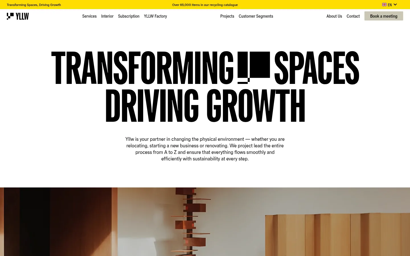
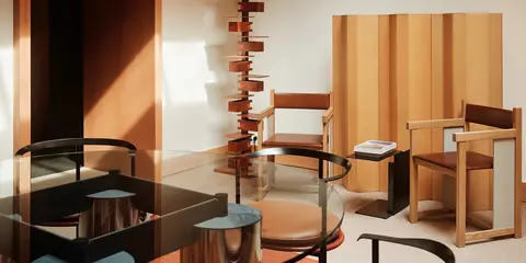
The page uses a bright white canvas and black typography as its consistent foundation, with muted beige as a restrained signal for appointment buttons and the sustainability statistics band. A vivid yellow announcement strip appears in the screenshot header; it is a small, high-contrast navigation detail rather than the main palette. Large uppercase condensed headings create a strong editorial identity, while compact body copy remains centered or aligned within spacious sections. The layout alternates between sparse text-led blocks, thinly divided service rows, metric cards and broad photographic sections. Workplace and interior images supply warm wood, brown and cream tones, but these are photographic content, not interface colours to reproduce as brand swatches. Cards and controls stay mostly flat, with delicate borders and minimal corner rounding. The overall visual rhythm balances unusually bold headline scale with substantial white space and straightforward conversion links.
Shared display and interface family for headings, paragraphs, navigation, links and buttons.
角色
示例
字号
字重
行高
字距
特大标题
Oversized uppercase hero display headline.
Yllw
165.5px
700
0.88
-0.015em
一级标题
Primary page headline and major campaign statements.
Yllw
116px
700
0.96
-0.006em
二级标题
Section titles and prominent editorial headings.
Yllw
64px
400
0.96
-0.01em
三级标题
Process, service and case-study card headings.
Yllw
40.5px
400
1
-0.01em
四级标题
Supporting subsection headings and compact service titles.
Yllw
40px
400
1
-0.01em
正文
Introductory copy, descriptive paragraphs and service explanations.
The quick brown fox 敏捷的狐狸
18px
400
1.28
0
辅助文字
Image labels, metadata and compact supporting text.
The quick brown fox 敏捷的狐狸
16px
400
1.28
0
按钮
Appointment and service-action labels.
The quick brown fox 敏捷的狐狸
16px
500
1
0
导航
Header links and navigation labels.
The quick brown fox 敏捷的狐狸
16px
400
1.5
0
链接
Inline and outlined calls to action.
The quick brown fox 敏捷的狐狸
16px
500
1
0
间距与布局
基准单位 8px · 密度:紧凑
32px版块间距
8px元素间距
20px卡片内边距
1392px内容最大宽度
1px
8px
12px
16px
20px
24px
32px
48px
Use a compact header above a broad, centered hero, then alternate spacious editorial sections with full-bleed media, process grids, metric cards and service lists. The measured page max width is 1392px; preserve the balance of centered headline blocks and left-aligned content rows. Follow the measured 8px base spacing system and compact density, while allowing the screenshots’ large open intervals around hero and case-study content to shape the rhythm. Thin dividers organize repeated rows without enclosing every block.
圆角与层次
按钮 · 2px
链接 · 2px
inset · link
inset · link
hairline · button
The interface is predominantly flat: white surfaces meet through spacing and fine separators rather than pronounced shadows. The measured taupe and pale-grey borders define cards and rows. Buttons and links use slight 2px corners; measured inset hairlines appear on some outlined links, while photography supplies the strongest visual depth.
组件
下面的预览按实测的按钮、输入框、徽标、卡片样式重建(字体用替代字体)。
Announcement and navigation
A narrow yellow announcement strip sits above a white header with black wordmark and links; the appointment action uses a Quiet Taupe fill.
Hero headline
A large, centered uppercase condensed headline sits on white, followed by a short centered introduction and ample breathing room.
Media showcase
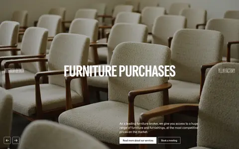
Wide workplace photography or video carries service context, with concise overlays and simple outlined or filled actions.
Process grid
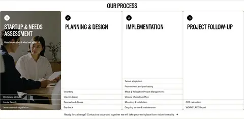
Four numbered stages form a horizontally aligned sequence, with thin dividers and compact lists of service details.
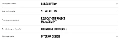
Service accordion
Editorial service rows pair a small descriptor with a prominent uppercase heading and a simple plus affordance.
Metrics band
A Quiet Taupe section presents sustainability figures in a four-column strip with compact explanatory labels.
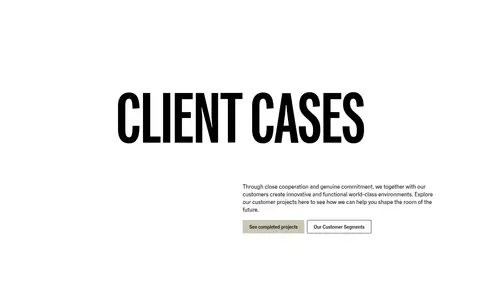
Client case gallery
Project photography is arranged asymmetrically with generous white space and small client or category captions.
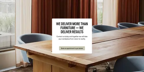
Imagery · Use real workplace, furniture and interior photography, including wide room scenes and smaller project images. The page also includes video-led furniture imagery and client logos. Keep photographs naturally warm and architectural, with room context and furniture visible; their browns and creams belong to the photos, not the reusable interface palette. Avoid decorative illustration or 3D treatments that compete with the photography.
Use the measured Gd Grio Vf family or a close condensed sans substitute.
Set major headings in uppercase with strong scale contrast.
Keep white as the dominant interface surface.
Reserve Quiet Taupe for meaningful actions and data emphasis.
Use warm workplace photography as content, not as interface colour.
Separate editorial modules with space and fine hairlines.
Keep buttons simple, compact and lightly rounded.
✕ 不该做
Do not apply bright yellow across large content areas.
Do not add gradients or decorative colour effects.
Do not wrap every section in a raised card.
Do not use soft, rounded consumer-app styling.
Do not crowd the headline and introduction together.
Do not treat photographic brown tones as brand swatches.
给 AI 的提示词
想快速出一个同风格的新页面,把这段话连同 DESIGN.md 一起发给 AI。
Build a new Yllw-style workplace transformation page with a white-first editorial canvas. Use Deep Ink (#000000) for type, Gallery White (#ffffff) for most surfaces, Soft Black (#191919) only for occasional inverse sections, Quiet Taupe (#cac7b4) for appointment actions and data emphasis, and Pale Line (#e5e5e5) for subtle separators. Use a condensed sans family such as Oswald if Gd Grio Vf is unavailable. Make headings large, bold, tightly tracked and uppercase; keep body copy calm and readable. Compose a compact header, spacious centered introduction, architectural workplace photography, ordered service or process rows, and clear conversion actions. Preserve generous whitespace, restrained borders, minimal corner rounding and a flat presentation. Use warm image tones only within photography, not as extra UI colours.