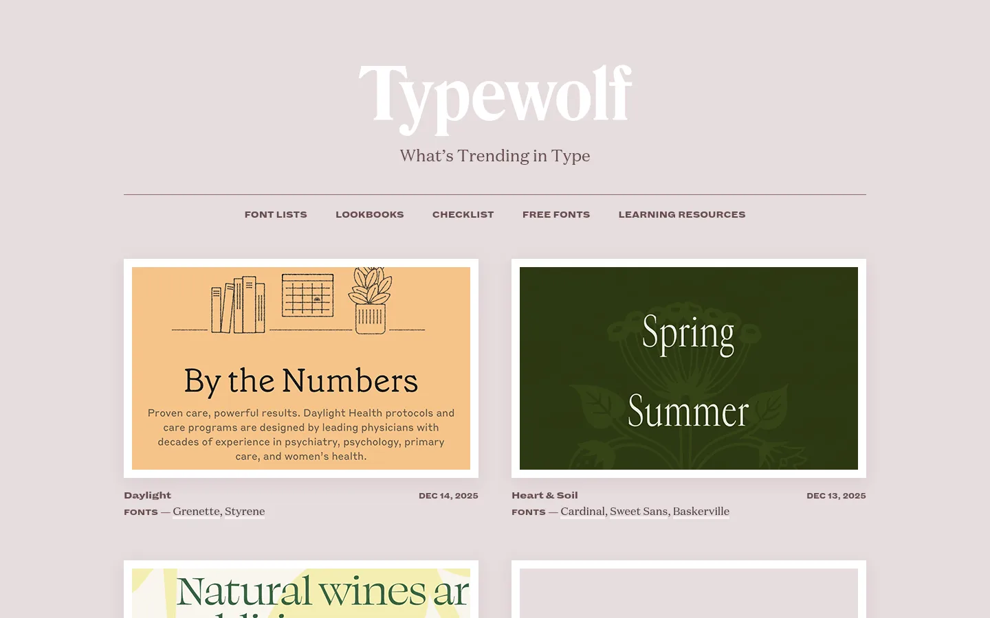
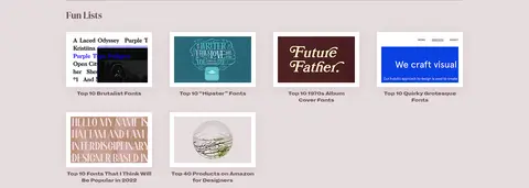
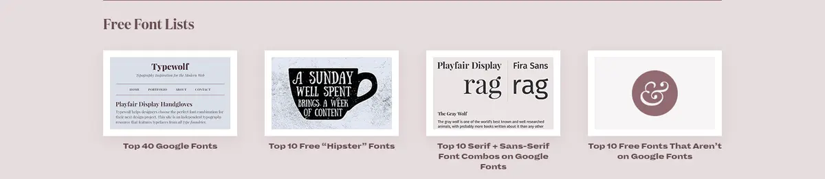
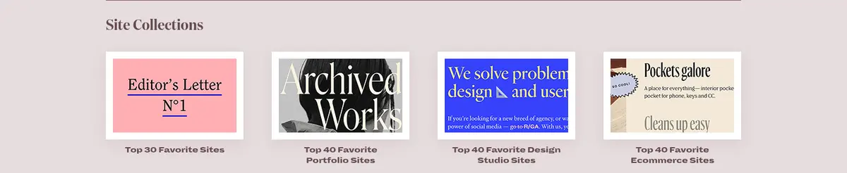
North star · Let expressive type samples lead, while a muted continuous canvas and consistent white framing make the long editorial feed feel composed.
The page uses a soft, dusty mauve-gray canvas (#e6ddde) as a continuous backdrop rather than alternating large color bands. Deep plum text (#443235 and #654a4e) carries the wordmark, navigation, headings, metadata, and links; white frames separate colorful editorial thumbnails from the background. Typography is the main identity: refined display serifs headline the page, while a compact, heavy sans serif handles navigation, labels, and metadata. The centered masthead and narrow navigation sit above a two-column feed of large image-led cards. Farther down, content becomes a sequence of compact resource lists and thumbnail grids, punctuated by thin rules and small dark-plum buttons. Spacing feels measured and comfortable, with clear gaps between content groups but a substantial amount of information on the long page. Illustration colors inside the thumbnails are examples, not brand palette.
配色
点色块复制色值。用途说明来自对页面的实测位置(背景、文字、描边、按钮)与截图判读。
品牌色
强调色
表层色
中性色
页面底色 · Dusty Mauve表层 · Blush Paper主文字 · Deep Aubergine次要文字 · Plum Ink弱文字 · Frame White描边 · Frame White
Heavy sans serif for body labels, navigation, links, and buttons.
Aa 设计
DomaineText
网络字体 · 字重 400 · 占比 35%
免费替代:Lora
Serif for paragraph copy, captions, and supporting editorial text.
Aa 设计
DomaineDisplayNarrow
网络字体 · 字重 700 · 占比 8%
免费替代:Bodoni Moda
Display serif for large page and section headings.
角色
示例
字号
字重
行高
字距
一级标题
Masthead and main page title.
Typewolf
46px
700
1.2
0
二级标题
Prominent section headings.
Typewolf
42px
700
1.2
0
三级标题
Editorial card and feature titles.
Typewolf
28px
400
1.25
0
四级标题
Secondary resource headings.
The quick brown fox 敏捷的狐狸
26px
700
1.2
0
正文
Compact, emphatic labels and feed metadata.
The quick brown fox 敏捷的狐狸
15px
900
1.2
-0.03em
辅助文字
Supporting descriptions and image captions.
The quick brown fox 敏捷的狐狸
14px
400
1.5
0
按钮
Uppercase action labels on filled buttons.
The quick brown fox 敏捷的狐狸
13px
900
1.3
-0.03em
导航
Uppercase primary navigation links.
The quick brown fox 敏捷的狐狸
14px
900
2.2
0
链接
Prominent font and resource links.
The quick brown fox 敏捷的狐狸
15px
900
1.2
-0.03em
间距与布局
基准单位 4px · 密度:适中
48px版块间距
—元素间距
37px卡片内边距
1128px内容最大宽度
3px
4px
8px
9px
11px
12px
15px
16px
18px
19px
20px
24px
42px
48px
The page content is centered within a measured maximum width of 1128px. The masthead and nav are centered, with a fine horizontal rule separating navigation from the feed. Featured content begins as a two-column grid; later editorial and resource sections use compact thumbnail grids and single-column section sequences. Left-aligned headings introduce each group, with thin rules and generous section spacing. The long page remains comfortably dense, using clear separation rather than large colored bands.
圆角与层次
卡片 · 4px
图片 · 50%
md · media, button, card
inset · link, footer
The page is mostly flat, with the background and typography doing the structural work. White media frames create crisp separation; pale surfaces support selected cards. Measured cards use a subtle rosewood-tinted shadow, while links and footer details can use a faint inset highlight. Avoid heavy outlines, layered panels, or prominent rounded corners.
组件
下面的预览按实测的按钮、输入框、徽标、卡片样式重建(字体用替代字体)。
Masthead
Centered white serif wordmark with a small serif tagline, followed by a horizontal rule and centered uppercase navigation.
Editorial feed card
Large image preview in a white frame, followed by compact title, font names, and date metadata.
Resource thumbnail
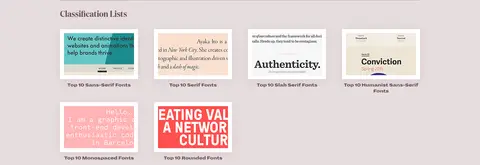
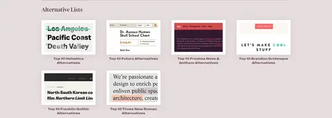
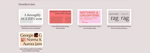
Small framed typographic preview with a concise centered or left-aligned caption beneath it.
Section heading
Left-aligned serif title introduced by spacing and a thin horizontal divider.
Primary action
Square-corner dark plum button with uppercase heavy sans text and a restrained tinted shadow.
Search and newsletter fields
Simple light input surface with dark text, thin border, and nearby compact plum subscribe action.
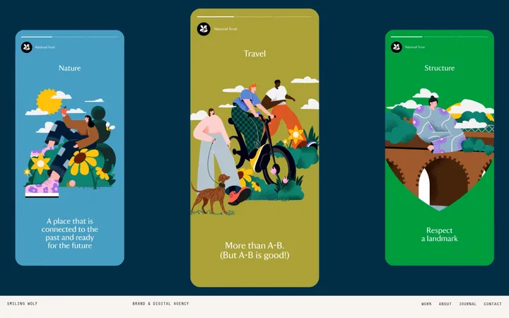
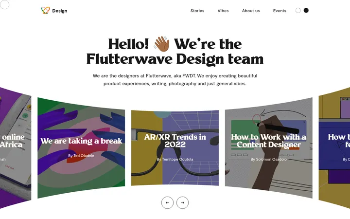
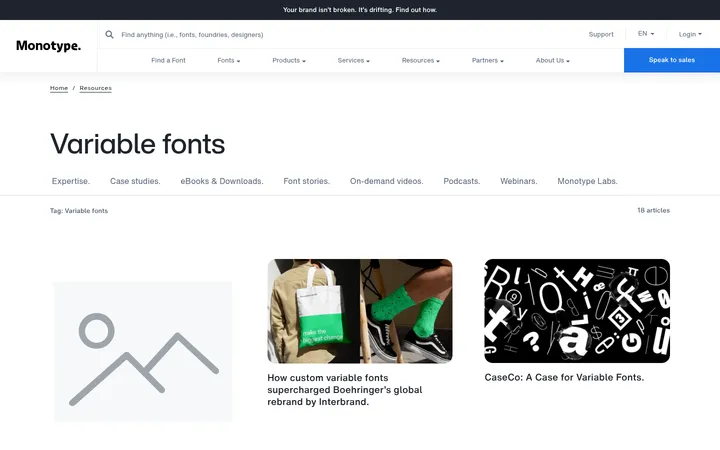
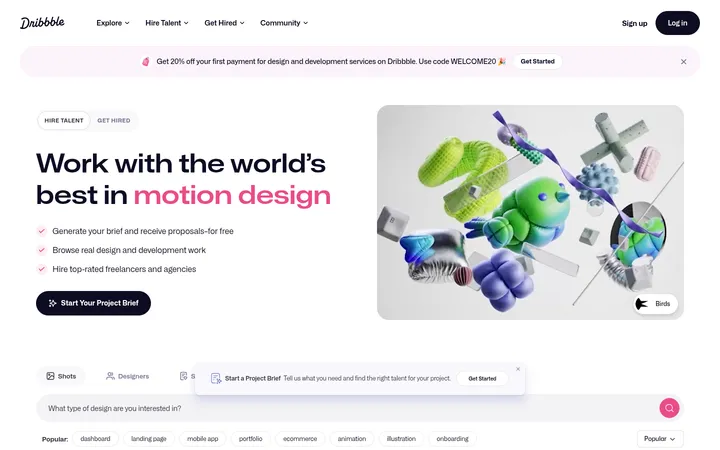
Imagery · Use editorial website screenshots, typographic specimens, and occasional small illustrations as the primary visual content. Place each image in a crisp white frame, keeping its original colors and typography visible rather than applying a uniform brand tint. The screenshots include warm orange and deep green examples; treat these as content artwork, not palette colors. Maintain consistent thumbnail crops and let type samples remain legible.
Keep the dusty mauve canvas continuous across the page.
Use expressive serif display type for prominent headings.
Reserve heavy sans type for navigation, labels, and actions.
Frame content screenshots with clean white borders.
Group long-form content with fine rules and clear spacing.
Keep buttons square-cornered, compact, and dark plum.
Treat colors inside featured artwork as content, not brand colors.
✕ 不该做
Do not introduce bright brand bands or gradients.
Do not recolor or over-style the typographic examples.
Do not use oversized rounded cards or pill buttons.
Do not replace the serif-led identity with a generic sans system.
Do not use heavy shadows as the primary separation method.
Do not make navigation or metadata visually louder than the featured work.
给 AI 的提示词
想快速出一个同风格的新页面,把这段话连同 DESIGN.md 一起发给 AI。
Build a new editorial design page in the Typewolf visual style. Use Dusty Mauve (#e6ddde) as a continuous canvas, Deep Aubergine (#443235) and Plum Ink (#654a4e) for text and navigation, and Frame White (#ffffff) for image borders. Set expressive serif display headings against compact, heavy sans navigation, metadata, and buttons; use a readable serif for supporting copy. Center the masthead and content within a restrained maximum width, then organize image-led cards into a clear grid. Break long content into compact thumbnail groups with left-aligned headings and thin dividers. Keep imagery colorful and authentic, letting type specimens remain the focus. Use subtle shadows sparingly, square-cornered controls, and comfortable section spacing. Do not invent extra brand colors or let thumbnail artwork redefine the palette.