North star · Keep the page quiet and editorial: use whitespace and product evidence to carry the story, not decorative colour or heavy containers.
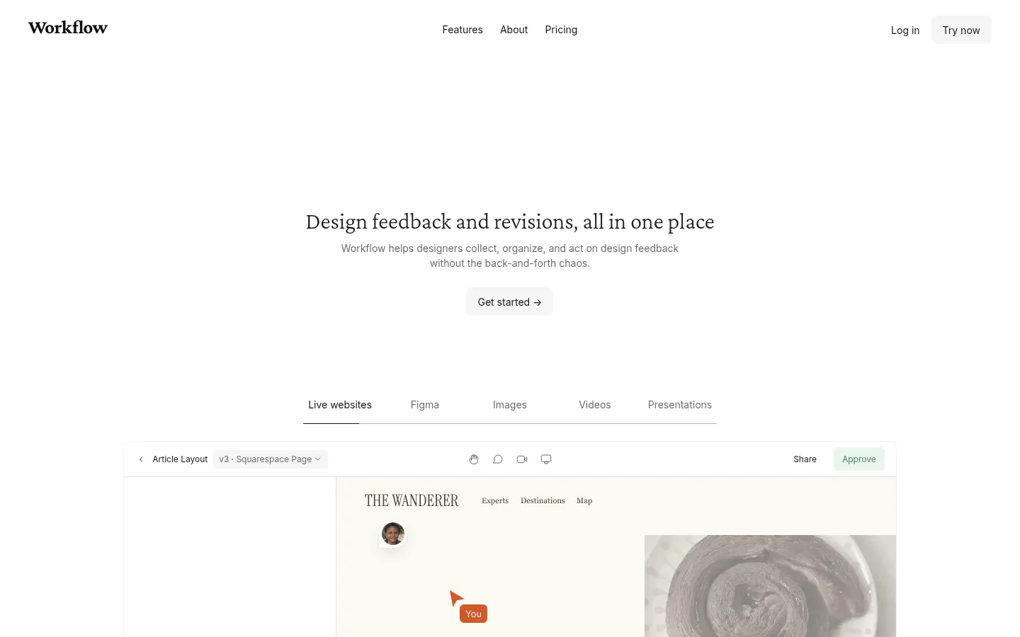
The page uses a near-white canvas as its defining visual feature, with charcoal text and pale gray surfaces keeping attention on the message and product interface. The measured palette is almost entirely neutral; green approval indicators appear as functional states within interface examples rather than as a broad brand accent. Georgia headlines provide an editorial voice, while Inter handles navigation, buttons, and small interface labels. A light Crimson Pro display face appears in subordinate headings. The centered hero sits in a large field of whitespace before product tabs and an expansive interface preview. Below, the page alternates centered statements and testimonials with modular feature and review panels, maintaining a calm, long-scroll rhythm. Screenshots and customer portraits add visual evidence and variation without changing the restrained page palette. Cards are mostly pale and flat, with delicate borders and soft shadows used selectively to separate layered product previews.
Navigation, buttons, captions, badges, and product-interface labels.
Aa 设计
Georgia
系统字体 · 字重 400 · 占比 31%
免费替代:Lora
Primary hero and section headlines, plus measured body copy.
Aa 设计
Crimson Pro
网络字体 · 字重 300 · 占比 9%
免费替代:Crimson Pro
Light-weight secondary display headings and smaller feature titles.
角色
示例
字号
字重
行高
字距
一级标题
Centered hero headline introducing the design feedback product.
Workflow
46px
400
1.2
-0.012em
二级标题
Large section headlines for major feature and conversion blocks.
Workflow
45px
400
1.1
0.02em
三级标题
Light display titles within subordinate feature content.
Workflow
32px
300
1
0
四级标题
Smaller feature or card headings in the product story.
The quick brown fox 敏捷的狐狸
26px
300
1
0
正文
Editorial explanatory copy and selected longer descriptions.
The quick brown fox 敏捷的狐狸
13px
400
1.62
0
辅助文字
Compact interface labels, testimonial credits, and supporting metadata.
The quick brown fox 敏捷的狐狸
12px
400
1.75
0
按钮
Short CTA labels such as Get started and Try now.
The quick brown fox 敏捷的狐狸
14px
400
1.5
0
导航
Header navigation and utility links.
The quick brown fox 敏捷的狐狸
14px
400
1.5
0
间距与布局
基准单位 8px · 密度:适中
48px版块间距
16px元素间距
12px卡片内边距
1408px内容最大宽度
1px
2px
4px
6px
7px
8px
10px
12px
16px
20px
24px
40px
48px
The page follows a single, centered long-scroll composition on a measured maximum width of 1408px. Hero copy is centered above a horizontal product-mode tab row and a wide interface preview. Later sections alternate centered introductions with two-column feature panels, logo strips, testimonials, and three-column review or AI-check layouts. The measured density is comfortable, with a 48px section gap and 16px element gap as reference values. Large blank intervals between major stories are essential to the page’s pacing; keep the footer compact and divided into columns.
圆角与层次
按钮 · 8px
卡片 · 12px
图片 · 50%
徽标 · 6px
md · other
sm · card
lg · card
md · other
The page is mostly flat: white canvas, pale gray panels, and fine borders do most of the separation. Use soft, low-opacity shadows selectively beneath layered interface previews or review cards. Avoid strong outlines and stacked, heavy card treatments; rounded corners are present in controls and selected cards, not as a dominant motif.
组件
下面的预览按实测的按钮、输入框、徽标、卡片样式重建(字体用替代字体)。
Primary CTA
A restrained pale-gray button with charcoal Inter text, measured 8px radius, and compact padding; keep its contrast quiet against white.
Product mode tabs
A centered horizontal row of modes above the hero preview, with a thin underline marking the selected mode.
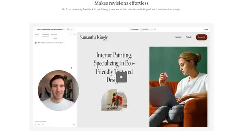
Product preview
A wide screenshot-led workspace with a light toolbar, comment areas, review controls, and embedded client-site imagery.
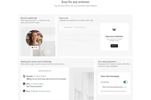
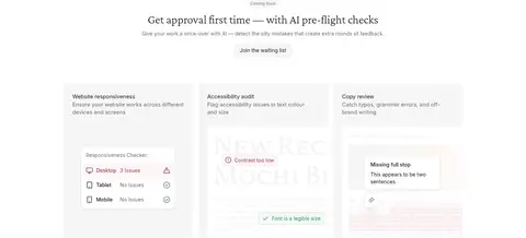
Feature panel
Pale-gray modular panels pair a short title and supporting copy with an interface demonstration or walkthrough video.
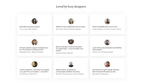
Testimonial
Centered quotation with a small circular portrait and subdued attribution, separated from neighboring content by generous whitespace.
Review card
A low-contrast review tile with concise customer copy and a small portrait; use gentle separation rather than prominent borders.
Footer link columns
A thin top divider introduces a compact two-column footer with grouped navigation, comparison, help, and policy links.
Imagery · Use product-interface screenshots as the primary visual material, framed in broad, pale panels with realistic comment overlays and review controls. Customer portraits appear as small circular crops beside quotations. The interface examples contain their own imagery, video, and occasional approval colours; treat these as product content, not as the page’s brand palette. Keep the surrounding page clean and avoid decorative illustration.
Use Georgia for editorial headlines and Inter for interface text.
Center hero and major section introductions.
Let product screenshots provide the main visual detail.
Use pale surfaces and fine hairlines to group content.
Leave generous whitespace between major sections.
✕ 不该做
Do not add a saturated brand accent across the page.
Do not turn product-interface colours into global site colours.
Do not crowd the hero with extra badges or copy.
Do not use heavy borders or dense card stacks.
Do not replace the serif editorial headlines with generic bold sans text.
Do not reduce testimonial portraits and attributions to decorative clutter.
给 AI 的提示词
想快速出一个同风格的新页面,把这段话连同 DESIGN.md 一起发给 AI。
Build a new Workflow-style page with a white Gallery White (#ffffff) canvas and a restrained editorial tone. Use Charcoal Ink (#1a1a1a) for headings and navigation, Quiet Gray (#6a6a6a) for supporting copy, and Soft Paper (#f6f6f6) with Mist Gray (#e9e9e9) for subtle panels and buttons. Set major headlines in Georgia or a close editorial serif; use Inter for navigation, controls, and compact labels. Center the hero, place a mode-tab row above a wide product screenshot, then alternate modular feature panels with centered testimonials and review cards. Give sections ample breathing room and use Fine Rule (#e3e3e3) sparingly for separators. Keep shadows soft and selective, and treat any colour inside screenshots as product UI rather than brand styling.