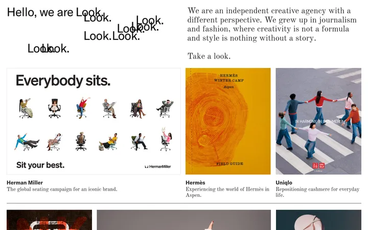
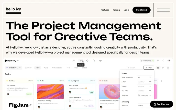
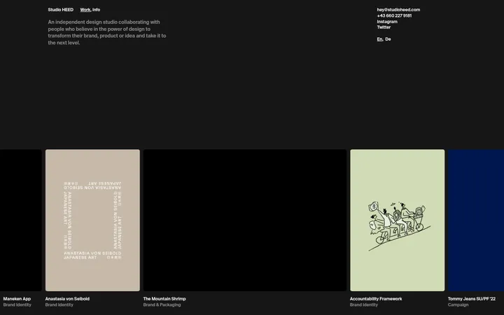
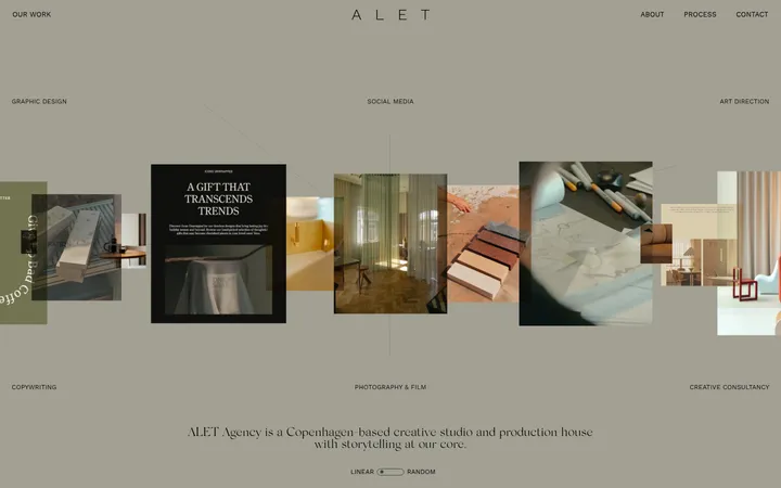
North star · Let a precise, quiet grid frame the work; keep interface color restrained so project imagery supplies the variation.
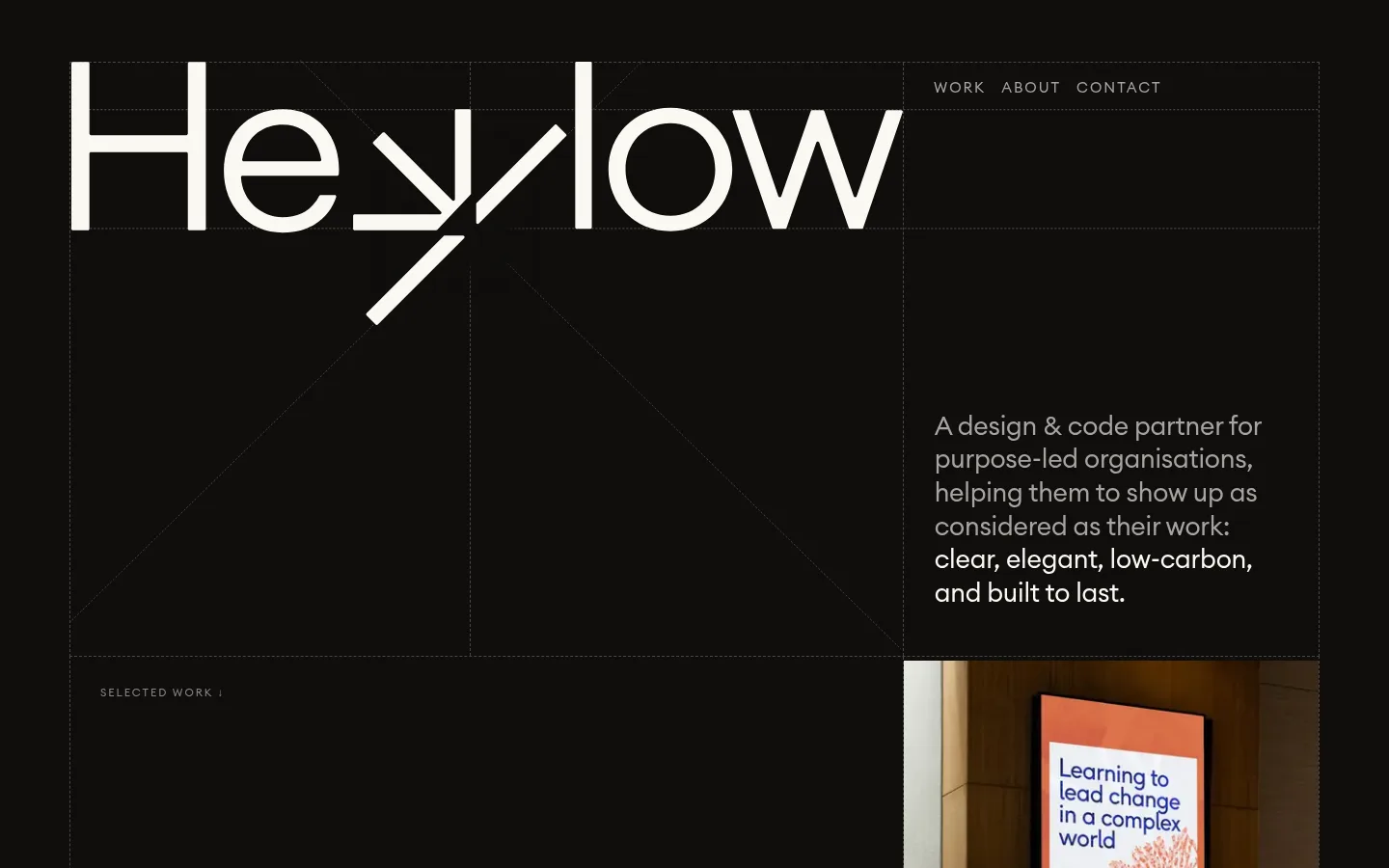
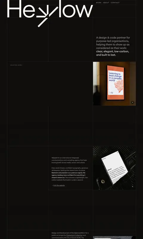
The page is built on a near-black canvas, with warm off-white reserved for the oversized Hey Low wordmark and emphasized copy. Muted warm gray carries navigation, supporting text, and project links, while a subdued gray-brown hairline draws a precise modular grid across the long page. Typography stays light and unbolded: a geometric circular sans gives the hero and project descriptions a measured, contemporary voice, while small uppercase labels mark navigation and section context. The opening is deliberately asymmetric, balancing the large wordmark and open grid against a compact introduction on the right. Below, project descriptions and images occupy alternating cells, so client work provides the color and visual variety rather than decorative UI. Generous dark intervals let each project breathe; the overall density is comfortable despite the long, tightly ruled portfolio structure. Rounded plus controls are small exceptions to the otherwise flat, square-edged system.
Primary page type for headings, navigation, labels, body copy, and links.
角色
示例
字号
字重
行高
字距
一级标题
Large brand wordmark and primary introductory heading.
The quick brown fox 敏捷的狐狸
26.5px
400
1.3
-0.009em
二级标题
Project or supporting section headings.
The quick brown fox 敏捷的狐狸
20px
400
1.6
0
正文
Introductory copy and project descriptions.
The quick brown fox 敏捷的狐狸
15px
400
1.6
0
辅助文字
Small uppercase labels such as selected work.
The quick brown fox 敏捷的狐狸
11.5px
400
1.1
0.178em
按钮
Compact plus controls and skip-to-content text.
The quick brown fox 敏捷的狐狸
20px
400
normal
0
导航
Uppercase primary links in the top navigation.
The quick brown fox 敏捷的狐狸
15px
400
1.6
0.133em
链接
Project destination links and supporting inline links.
The quick brown fox 敏捷的狐狸
15px
400
1.6
0
眉题
Small uppercase context labels above content.
The quick brown fox 敏捷的狐狸
15px
400
1.6
0.133em
间距与布局
基准单位 2px · 密度:适中
—版块间距
16px元素间距
—卡片内边距
1294px内容最大宽度
1px
6px
12px
15px
16px
32px
A centered page frame uses a measured maximum width of 1294px and a modular, column-based grid. The hero places an oversized wordmark across the left and central area, with navigation and a short introduction aligned in the right column. Project rows alternate descriptive text and media within the same fine-lined structure. The page feels comfortable rather than dense: broad dark intervals separate groups, while alignment and hairlines keep the long scroll coherent.
圆角与层次
按钮 · 50%
没有测到阴影:页面是扁平的,层次靠底色和描边区分。
The interface is predominantly flat, with no measured shadow system. Thin graphite rules define cells and section boundaries rather than raised cards. Small circular plus controls sit over project imagery, but remain visually quiet; preserve the sense of layering through placement, not drop shadows.
组件
下面的预览按实测的按钮、输入框、徽标、卡片样式重建(字体用替代字体)。
Top navigation
A compact uppercase WORK, ABOUT, CONTACT link group, aligned in the upper-right grid area and colored muted gray.
Hero wordmark
Large warm off-white Hey Low lettering spans the upper-left and central grid, functioning as the main visual anchor.
Introductory statement
A short multi-line description sits in the right column; supporting lines are muted and key closing phrases become off-white.
Grid rules
Fine gray-brown hairlines divide the hero and portfolio into aligned rectangular cells against the dark canvas.
Project row
Each portfolio entry combines compact descriptive copy and a flush project image in adjacent grid cells, with generous dark space between entries.
Project link
A restrained muted-gray text link appears beneath project copy, without a filled button treatment.
Plus control
A small circular plus control overlays project imagery as a discrete affordance.
Imagery · Client project photography and website mockups are the primary color accents, including printed work, mobile interfaces, and garden or fashion sites. Media sits flush within grid cells and is shown with minimal framing or effects. The broad dark canvas around each image keeps attention on the projects; avoid adding illustration or decoration that competes with the portfolio.
Keep grid lines fine, quiet, and consistently aligned.
Set primary text in warm off-white and supporting text in muted gray.
Let client imagery provide most of the page's color.
Use regular-weight sans-serif typography and restrained uppercase labels.
Alternate project copy and images within the shared grid.
✕ 不该做
Do not introduce bright interface accents absent from the measured palette.
Do not turn project entries into raised, rounded cards.
Do not add decorative shadows or gradients.
Do not bold every heading or link for emphasis.
Do not crowd the page with extra badges or ornamental graphics.
Do not make the layout a uniform stack of full-width images and text.
给 AI 的提示词
想快速出一个同风格的新页面,把这段话连同 DESIGN.md 一起发给 AI。
Build a new page in the Hey Low visual style: a dark, editorial portfolio composed on a precise modular grid. Use Soft Charcoal (#0f0e0c) as the continuous canvas, Warm Porcelain (#faf8f3) for the main wordmark and emphasized copy, Ash Taupe (#a8a3a1) for navigation and supporting text, and Graphite Rule (#4a4643) for fine dividers. Use a light, regular geometric sans throughout, with expanded-tracking uppercase navigation and small labels. Balance a large typographic anchor with compact introductory copy, then present work in alternating text-and-image cells. Keep spacing generous, surfaces flat, and project imagery flush to its grid cells. Avoid shadows, gradients, decorative accents, and card-like containers; preserve a quiet, structured rhythm.