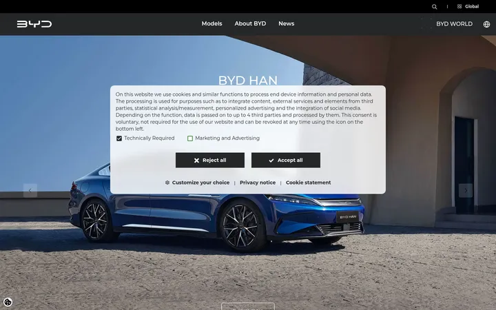
North star · Let cinematic vehicle photography lead, and keep the surrounding interface quiet, spacious, and strictly neutral.
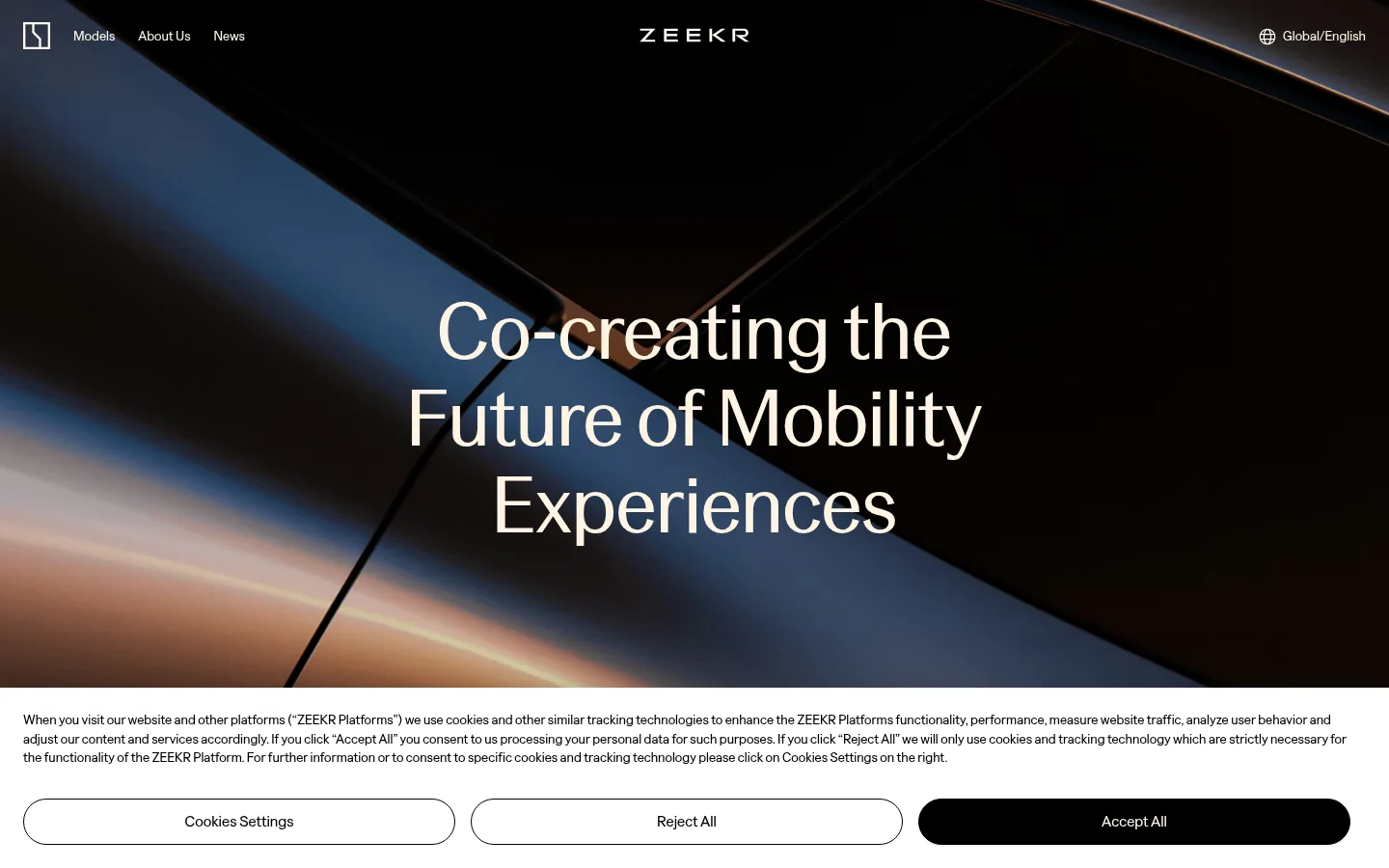
The page uses a restrained palette to let full-bleed vehicle imagery carry most of the visual energy. Near-black hero and footer sections frame the experience, while white and warm stone-gray bands distinguish the brand introduction, model showcase, and news feed. Typography is clean and unembellished: ZeekrHeadline gives large headings a refined editorial feel, while ZeekrText handles navigation, body copy, and controls. The first viewport centers a large, pale headline over dramatic photography; subsequent sections shift to quieter, more open layouts. A broad warm-gray model area groups large vehicle images with concise names and pill-shaped black Learn More buttons. News appears as a three-column card row on white. The layout favors wide content, generous section breaks, and simple alignment over decorative UI. Borders are subtle, shadows are minimal, and color beyond the measured neutrals primarily comes from photography rather than interface accents.
Navigation, body copy, links, card copy, and buttons.
Aa 设计
ZeekrHeadline
网络字体 · 字重 400 · 占比 18%
免费替代:DM Sans
Display, page headings, and editorial headlines.
角色
示例
字号
字重
行高
字距
特大标题
Oversized centered hero statement over full-bleed imagery.
Zeekr
82px
400
1.1
0
一级标题
Primary page-level headline where a section needs strong emphasis.
Zeekr
48px
400
1.1
0
二级标题
Section headings such as the model introduction and latest news.
The quick brown fox 敏捷的狐狸
24px
400
1.4
0
正文
Supporting copy, model descriptions, dates, and footer text.
The quick brown fox 敏捷的狐狸
14px
400
1.4
0
导航
Header links and language selector.
The quick brown fox 敏捷的狐狸
16px
400
1.4
0
链接
Text links and calls to action within news and model content.
The quick brown fox 敏捷的狐狸
16px
400
1.4
0
间距与布局
基准单位 4px · 密度:宽松
120px版块间距
12px元素间距
—卡片内边距
1392px内容最大宽度
8px
12px
16px
20px
24px
32px
40px
48px
60px
120px
Use a wide, spacious canvas with measured page max width of 1392px and a single-column flow for the major bands. The hero is full bleed, with centered headline placement; the model showcase shifts into a broad image-led grid, and news resolves into three columns. Keep text alignment simple and section transitions clear. The measured section gap is 120px, with a 12px element gap and a 4px base spacing unit; maintain a low-density rhythm rather than crowding content.
圆角与层次
按钮 · 9999px
hairline · button
hairline · button
xl · section
The interface is predominantly flat, with section color and photography providing depth instead of layered cards. Buttons use subtle hairline shadows and thin dark outlines. Model cards have no measured radius or shadow, while the hero image itself supplies the strongest contrast and layering. Reserve the larger shadow treatment for section transitions only when needed.
组件
下面的预览按实测的按钮、输入框、徽标、卡片样式重建(字体用替代字体)。
Global navigation
Light navigation sits over the dark hero image, with compact links at the left, centered Zeekr wordmark, and language control at the right.
Cinematic hero
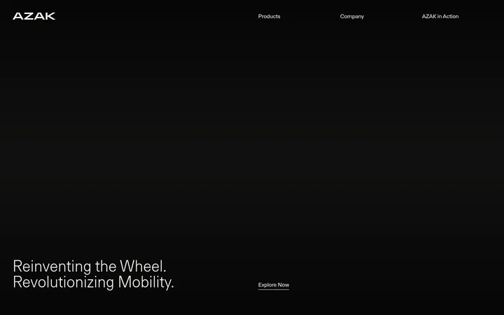
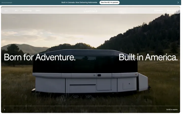
Full-bleed dark automotive image with a large centered pale headline; preserve image contrast behind the text.
Model showcase
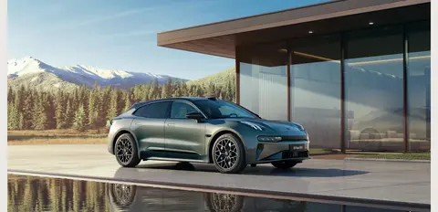
Warm Stone (#ebe8e3) band presenting vehicle imagery in a spacious grid with concise model labels and black pill-shaped Learn More buttons.
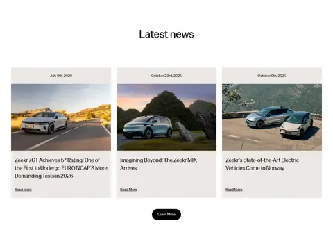
News cards
Three-column editorial feed on Gallery White (#ffffff), combining date, vehicle image, headline, and a small text link.
Pill CTA
Black-filled, thin black-outlined button with white or ivory text, ZeekrText at 16px, and a fully rounded 9999px radius.
Dark footer
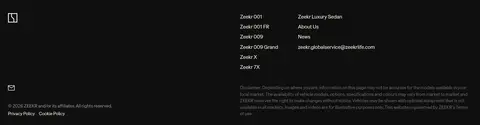
Night Charcoal (#0f0f0f) footer with vehicle and company link groups, contact information, and low-emphasis legal copy.
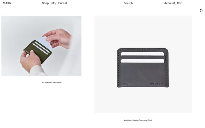
Imagery · Use large, high-quality automotive photography as the main visual material: cinematic hero framing, outdoor vehicle scenes, architectural backdrops, and close model views. Images are broad and rectangular, with little visible decoration or framing. The page's blue, sky, landscape, and vehicle tones come from photography, not interface accents. Avoid illustrative or decorative graphics as substitutes for the photographic vehicle focus.
Use measured neutral colors for interface surfaces and text.
Let full-bleed automotive photography anchor the hero.
Keep the hero headline centered and visually dominant.
Give section bands generous separation and breathing room.
Use ZeekrHeadline for display and editorial headings.
Keep buttons fully rounded and visually simple.
✕ 不该做
Do not introduce bright interface accent colors.
Do not add gradients or decorative UI treatments absent from the page.
Do not crowd vehicle imagery with dense copy.
Do not give model cards unmeasured radii or shadows.
Do not treat colors found in photography as brand palette accents.
Do not use heavy typography or bold display styling.
给 AI 的提示词
想快速出一个同风格的新页面,把这段话连同 DESIGN.md 一起发给 AI。
Build a new Zeekr-style page with a spacious, editorial automotive feel. Use Gallery White (#ffffff), Warm Stone (#ebe8e3), and Night Charcoal (#0f0f0f) as the principal section surfaces; use Carbon Ink (#000000) for body text and primary buttons, and Ivory Glow (#fff4e2) for text on dark imagery. Keep the interface neutral and allow vehicle photography to supply color and atmosphere. Use ZeekrHeadline or a close editorial sans substitute for prominent headings, and ZeekrText or Inter for navigation, copy, and controls. Favor wide image-led sections, simple grids, generous separation, and clear alignment. Keep card treatment flat and use thin borders and fully rounded pill CTAs. Avoid invented accent colors, ornamental gradients, and crowded layouts.