North star · Use generous empty space and restrained type to let high-contrast product media carry the story.
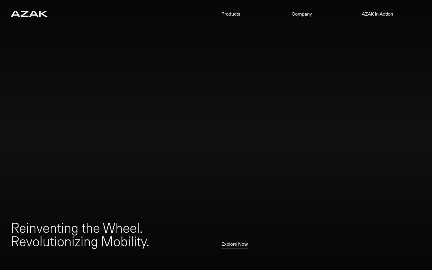
The visual strategy is built around contrast and restraint: near-black hero and footer areas alternate with a warm off-white canvas, creating clear visual chapters without decorative framing. A muted gray is reserved for secondary text, while a subdued green-gray appears in product media rather than acting as a prominent interface accent. FT Aktual carries the whole page, using light-weight, generously sized headings against compact, quiet body copy. The layout shifts between a sparse, full-width opening, long light content stretches, dark feature bands, and split performance content. Product videos and large contextual product imagery provide most of the visual complexity; the surrounding interface stays flat and uncluttered. Sections are spacious and comfortable rather than card-dense, with alignment and negative space doing the work of hierarchy. Links remain understated and text-led.
Sole typeface for navigation, headings, body text, captions, and links.
角色
示例
字号
字重
行高
字距
特大标题
Oversized, light-weight statements in prominent hero or feature moments.
AZAK
67.5px
300
1
0
一级标题
Primary page or section headline, set large and light.
AZAK
45px
300
1
0
二级标题
Section headings on light and dark feature bands.
AZAK
30px
300
1.1
0
三级标题
Small feature labels or subordinate headings.
The quick brown fox 敏捷的狐狸
20.5px
300
3.33
0
正文
Product explanation and supporting descriptive copy.
The quick brown fox 敏捷的狐狸
16px
400
1.4
0
辅助文字
Compact secondary notes and footer details.
The quick brown fox 敏捷的狐狸
11.5px
400
1.99
0
导航
Quiet, regular-weight navigation links.
The quick brown fox 敏捷的狐狸
16px
400
1.4
0
间距与布局
基准单位 2px · 密度:适中
72px版块间距
4px元素间距
—卡片内边距
—内容最大宽度
3px
4px
6px
8px
17px
18px
36px
72px
144px
The page uses broad, alternating full-width section bands and sparse content arrangements rather than a card-based grid. The opening is a dark, expansive hero with navigation at the top and headline content low in the viewport. Light sections use split or multi-column compositions, while feature copy is often offset rather than centered. Preserve the measured comfortable density and generous section gaps; the supplied data does not establish a maximum content width. Keep text alignment purposeful and leave substantial negative space around media and copy.
圆角与层次
没有测到阴影:页面是扁平的,层次靠底色和描边区分。
The interface is predominantly flat, with no measured shadow system or radius scale. Use color bands, spacing, and media placement to separate content rather than cards or raised panels. Borders are not a defining visual feature; avoid introducing ornamental outlines or layered containers.
组件
下面的预览按实测的按钮、输入框、徽标、卡片样式重建(字体用替代字体)。
Top navigation
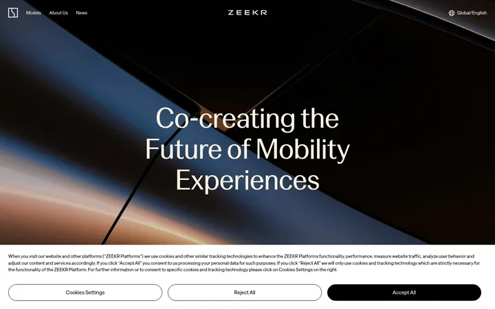
A minimal row over the dark hero, with a contrasting AZAK wordmark and widely distributed text links.
Hero headline and link
Large light-weight two-line statement near the bottom of the dark opening; pair it with a small, understated Explore Now text link.
Product explanation
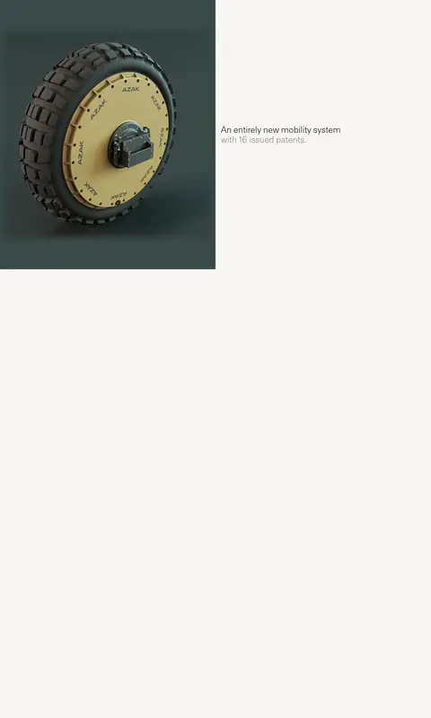
Warm-white content area combining product video with concise copy about the mobility system and its patents.
Dark feature band
Inverse-color section for design-freedom messaging; measured controls are square-cornered with no shadow.
Performance feature
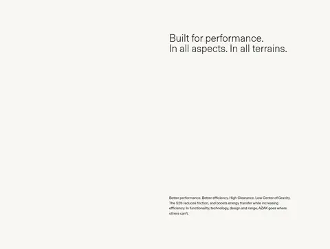
Light section with a heading, supporting copy, and product video arranged in a sparse split layout.
Product showcase
Dark product section featuring large imagery and a simple Explore Now link.
Footer
Dark, multi-column information area for company, products, contact details, and muted copyright text.
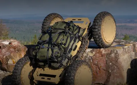
Imagery · Product video and large product visuals are the main expressive elements. Media shows the wheel system and a rugged vehicle application, with natural, muted industrial colors; it sits within otherwise quiet layouts. Treat imagery as immersive or as a deliberate split-panel focal point, not as decorative thumbnail content. The green-gray measured color belongs to the product-media environment, not the core UI palette.
Alternate warm-white and near-black section bands.
Use FT Aktual or a close neutral sans-serif substitute.
Keep display headlines light and visually calm.
Let product media command broad areas of the page.
Use muted gray only for secondary information.
Separate content with whitespace instead of cards.
✕ 不该做
Do not add bright interface accents.
Do not introduce gradients or decorative shadows.
Do not place every feature inside a card.
Do not make headings heavy or tightly tracked.
Do not treat product-image colors as UI brand accents.
Do not compress the long-form sections into a dense grid.
给 AI 的提示词
想快速出一个同风格的新页面,把这段话连同 DESIGN.md 一起发给 AI。
Build a new AZAK-style mobility page with a restrained editorial feel. Use Gallery White (#f8f7f3) for light content and Soft Black (#121211) or True Black (#000000) for inverse bands; reserve Stone Gray (#85837e) for supporting text. Wheel Slate (#3a4a49) may appear in product imagery, not as a UI accent. Use a clean sans-serif such as Inter, with light, large headlines and quiet regular-weight body copy. Compose full-width sections with generous negative space, alternating dark and light chapters, and occasional split layouts. Make product photography or video the visual focus, framed simply without cards, shadows, or ornamental borders. Keep navigation and links understated and text-led. Preserve a comfortable, spacious rhythm and make each section feel like a deliberate change of chapter.