North star · Treat the vivid blue-violet canvas as the main visual surface, using black graphic mass and crisp white information panels to create an editorial poster-like page.
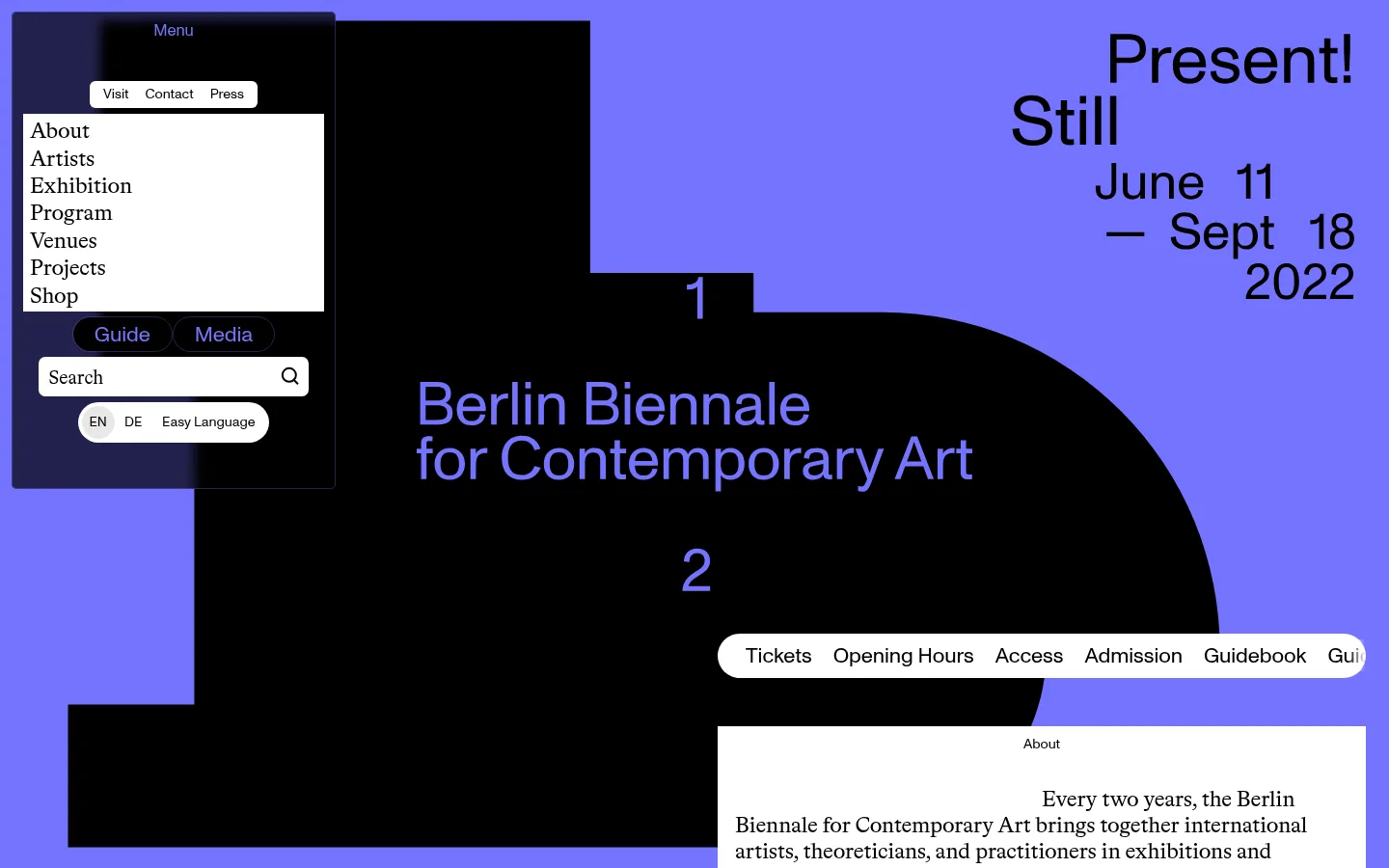
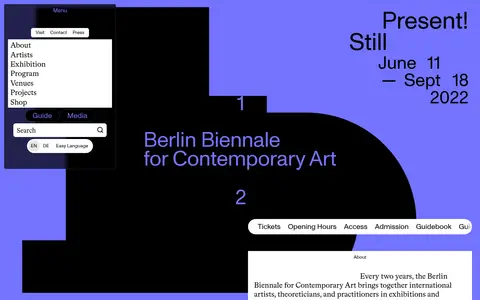
The page is built on a nearly uninterrupted #7373ff blue-violet canvas, with black typography and a monumental black abstract shape creating a high-contrast poster composition. White information panels and pill-like utility strips interrupt the field without changing its overall color dominance; pale gray appears only in small labels and secondary controls. A restrained type pairing gives the layout its editorial character: a modern sans carries practical text and much of the display work, while a literary serif lends contrast to navigation and selected headings. The hero uses oversized, staggered lettering and date blocks rather than a conventional centered title. Farther down, visitor information, program entries, and venue listings form compact white cards against broad blue expanses. A map is the main detailed image, treated in the same blue family. Generous separation between content clusters lets the vivid canvas remain an active part of the design.
配色
点色块复制色值。用途说明来自对页面的实测位置(背景、文字、描边、按钮)与截图判读。
品牌色
表层色
中性色
功能色
页面底色 · Electric Periwinkle表层 · Paper White主文字 · Poster Ink强调 · Electric Periwinkle
Primary sans for body copy, links, buttons, and prominent display lettering.
Aa 设计
BradfordLLSub
网络字体 · 字重 400 · 占比 33%
免费替代:Cormorant Garamond
Editorial serif for navigation and selected section headings or supporting display text.
角色
示例
字号
字重
行高
字距
一级标题
Bold sans title and primary Biennale identity.
12th Berlin Biennale for Contemporary Art
32px
700
normal
0
二级标题
Serif editorial headings for prominent information sections.
12th Berlin Biennale for Contemporary Art
30px
400
1.15
-0.01em
三级标题
Sans subheadings for program and content entries.
The quick brown fox 敏捷的狐狸
25.5px
400
1.15
-0.01em
四级标题
Serif secondary headings and supporting labels.
The quick brown fox 敏捷的狐狸
23px
400
1.15
-0.01em
正文
Compact sans paragraphs in visitor and about panels.
The quick brown fox 敏捷的狐狸
14.5px
400
1.03
-0.004em
辅助文字
Small supporting labels, metadata, and card annotations.
The quick brown fox 敏捷的狐狸
12px
400
1.15
0
按钮
Large sans labels for ticket and utility actions.
The quick brown fox 敏捷的狐狸
22px
400
1.02
-0.004em
导航
Large serif navigation links in the expanded menu.
The quick brown fox 敏捷的狐狸
23px
400
1.03
-0.01em
链接
Compact sans links, venue actions, and program highlights.
The quick brown fox 敏捷的狐狸
14.5px
400
1.03
-0.004em
间距与布局
基准单位 1px · 密度:宽松
235px版块间距
—元素间距
15px卡片内边距
—内容最大宽度
2px
3px
4px
5px
6px
7px
8px
9px
11px
12px
17px
18px
22px
24px
An asymmetric, poster-like composition replaces a conventional centered page grid. The hero places a large black silhouette across the left and middle, while title and date typography occupy the open blue area on the right. A floating menu sits in the upper-left. Below, compact content cards align in offset clusters; the venue list meets a broad map panel. Section content remains sparse relative to the canvas, with especially long blank intervals before the footer. Avoid imposing an invented max-width or rigid column system.
圆角与层次
按钮 · 5px
输入框 · 7px
徽标 · 3px
导航 · 3px
链接 · 3px
没有测到阴影:页面是扁平的,层次靠底色和描边区分。
The interface is predominantly flat, with no measured shadow system or decorative border treatment. Contrast comes from overlapping black and blue shapes and white panels placed directly on the canvas. Cards are simple rectangular surfaces; controls use modest rounding, while selected menu and utility elements layer above the page as floating blocks.
组件
下面的预览按实测的按钮、输入框、徽标、卡片样式重建(字体用替代字体)。
Floating menu
A compact black overlay in the upper-left groups utility tabs, a white list of primary destinations, search, and language controls.
Hero identity
A large black abstract shape supports the Biennale name and numbered marks in blue, balanced by oversized date and theme lettering.
Visitor links strip
A horizontal white pill-like bar presents practical destinations such as tickets, opening hours, access, and guidebook.
About panel
A white rectangular information card pairs a small section label with serif-led descriptive copy and a learn-more action.
Program cards
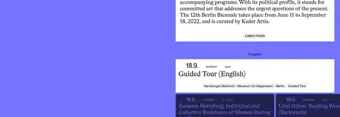
Compact white and dark-blue event panels combine date, time, title, venue, and small pale category badges.
Venue map
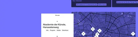
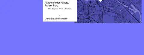
A white venue list sits beside a detailed blue city map with distinct lettered location markers.
Footer links
A sparse two-column footer uses small utility links and institutional credits against the blue canvas.
Imagery · The hero’s defining image is an abstract, solid-black geometric mass rather than photography. A blue-toned city map provides the main informational visual, with labeled venue markers. The rest of the page relies on typography, white cards, and colored space; avoid adding generic stock photos or decorative illustration that would compete with the poster composition.
Build the hero around a bold black graphic silhouette.
Keep the title and date blocks offset and asymmetric.
Use white panels for practical, information-dense content.
Pair the modern sans with selective editorial serif accents.
Preserve broad empty blue intervals between content clusters.
✕ 不该做
Do not turn the page into a conventional centered landing-page template.
Do not add gradients, shadows, or ornamental borders.
Do not introduce extra colors outside the measured palette.
Do not fill the large blue spaces with decorative content.
Do not use stock photography as a substitute for the abstract hero.
Do not make every heading use the same typeface or scale.
给 AI 的提示词
想快速出一个同风格的新页面,把这段话连同 DESIGN.md 一起发给 AI。
Build a new contemporary-art event page using the measured Biennale visual language. Keep Electric Periwinkle (#7373ff) as the dominant canvas, with Poster Ink (#000000) for typography and a bold abstract hero shape. Use Paper White (#ffffff) for information cards and utility controls; reserve Soft Label Gray (#f2f2f2) for small chips. Compose the hero asymmetrically, with oversized identity and date typography rather than a centered headline. Use a clean grotesque sans for practical text and an editorial serif for selected navigation or headings. Arrange visitor links, event cards, and venue details in offset clusters, leaving large areas of open canvas between them. Keep surfaces flat, use only modest control rounding, and avoid shadows, gradients, stock imagery, or invented palette colors.