North star · Use the blue sidebar as a bold frame and keep the white content column legible, editorial, and carefully divided by fine rules.
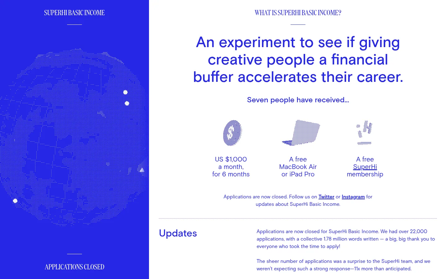
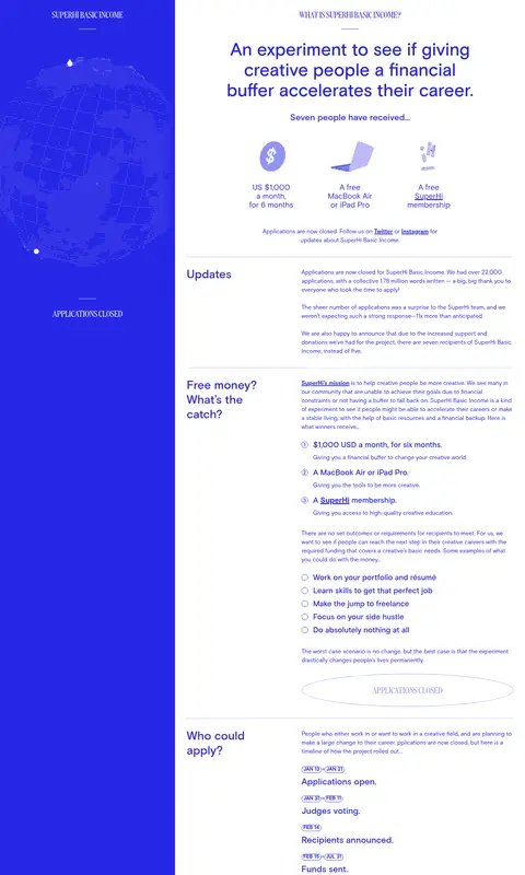
The visual identity is built around a strict two-colour palette: saturated blue (#2727e6) carries nearly all text and link emphasis, while white (#ffffff) forms the main reading canvas. A full-height blue sidebar anchors the composition with condensed display lettering and a dotted globe illustration; the broad white column holds the page’s explanatory content. Basis provides the practical reading voice, from large centered opening statements to small, closely organized paragraphs, while DDC adds a distinct uppercase display accent. The page uses a repeated editorial rhythm: short section headings sit opposite longer text blocks, separated by subtle horizontal rules. Lists, numbered steps, outlined date badges, and pill-shaped outlined controls make information scannable without adding cards or shadows. Generous open space around the opening statement contrasts with the denser FAQ and process sections, keeping the page distinctive while supporting a long read.
配色
点色块复制色值。用途说明来自对页面的实测位置(背景、文字、描边、按钮)与截图判读。
品牌色
中性色
页面底色 · Gallery White主文字 · Signal Blue描边 · Signal Blue强调 · Signal Blue
Primary reading type for headings, paragraphs, links, labels, and informational lists.
Aa 设计
DDC
网络字体 · 字重 400 · 占比 1%
免费替代:Oswald
Condensed display lettering for uppercase section markers and the primary circular CTA.
角色
示例
字号
字重
行高
字距
一级标题
Opening statement and primary page headline
SuperHi Basic Income
48px
500
1.17
0
二级标题
Major content section headings
SuperHi Basic Income
32px
500
1.25
0
三级标题
Condensed uppercase display labels
The quick brown fox 敏捷的狐狸
24px
400
1
0
四级标题
Subsection headings and emphasized statements
The quick brown fox 敏捷的狐狸
21px
500
1.33
0
正文
Explanatory paragraphs and supporting copy
The quick brown fox 敏捷的狐狸
16px
400
1.5
0
辅助文字
Compact uppercase labels and dates
The quick brown fox 敏捷的狐狸
14px
700
1.14
0
按钮
Uppercase display text inside CTA controls
The quick brown fox 敏捷的狐狸
24px
400
1
0
链接
Bold inline references and social links
The quick brown fox 敏捷的狐狸
16px
700
1.5
0
间距与布局
基准单位 8px · 密度:适中
—版块间距
24px元素间距
—卡片内边距
—内容最大宽度
4px
8px
16px
24px
32px
Build a tall, two-column editorial composition: a persistent blue sidebar beside a white reading column. The sidebar carries identity and status markers; the main column pairs short left-aligned section labels with longer right-hand copy. The opening content is centered and more spacious, while later sections become dense, structured reading blocks. Separate sections with fine horizontal rules. Preserve generous whitespace around the introduction and tighter, consistent spacing within lists and FAQs.
圆角与层次
按钮 · 9999px
徽标 · 9999px
链接 · 9999px
没有测到阴影:页面是扁平的,层次靠底色和描边区分。
The composition is predominantly flat, with no measured shadows or gradients. Use thin blue or subtle gray rules to separate editorial sections, and outlined controls rather than raised cards. The full-height blue sidebar supplies the principal visual layering through contrast with the white content area.
组件
下面的预览按实测的按钮、输入框、徽标、卡片样式重建(字体用替代字体)。
Blue identity sidebar
A full-height #2727e6 panel with condensed white identity labels, a dotted globe illustration, and application-status lettering.
Opening statement
Centered blue headline and short supporting line on white, followed by three benefit illustrations and a concise status note.
Editorial section row
Short section heading sits opposite longer text, with sections divided by fine horizontal rules.
Numbered information list
Compact numbered points organize benefits, process details, and project principles; bold blue text highlights each lead.
Date badge
Small uppercase date labels use bold Basis text within a thin blue pill outline.
Outlined CTA
A large rounded outline control uses uppercase DDC lettering, blue text, and no shadow or filled background.
FAQ links
A dense vertical list of short blue questions uses small triangular markers and restrained spacing.
Imagery · The page is illustration-led rather than photographic. A large dotted globe occupies the blue sidebar, with small point-like marks that read as elements of the graphic, not extra brand colors. Small reward illustrations accompany the opening benefits. Keep imagery flat, sparse, and subordinate to the information; avoid photorealistic assets and decorative image-heavy sections.
Anchor the composition with a saturated blue sidebar.
Use white as the main reading surface.
Keep section labels distinct from longer copy blocks.
Separate major content groups with fine rules.
Use bold blue text to make links easy to identify.
Reserve condensed uppercase type for short display moments.
✕ 不该做
Do not introduce unmeasured brand colors.
Do not add shadows or gradient effects.
Do not turn every text group into a card.
Do not use photography to compete with the editorial content.
Do not make the long-form column visually unstructured.
Do not use display lettering for paragraphs.
给 AI 的提示词
想快速出一个同风格的新页面,把这段话连同 DESIGN.md 一起发给 AI。
Create a new long-form project page in the SuperHi Basic Income visual style. Use Signal Blue (#2727e6) for the identity sidebar, text, links, and outlined controls; use Gallery White (#ffffff) as the primary reading canvas. Build a strong split composition with a persistent blue identity rail and an editorial content column. Let Basis-style sans serif handle headlines, paragraphs, and links; use a narrow uppercase display face only for short labels and CTA text. Organize content as paired section headings and copy blocks, divided by fine rules. Use compact numbered lists, simple badges, and flat outlined buttons. Keep illustration sparse and graphic, with no photo-led hero, shadows, gradients, or invented palette colors. Balance a spacious introduction with tighter long-form sections.