North star · Use a restrained black-and-white editorial framework, then reserve blue and coral for unmistakable community and event signals.
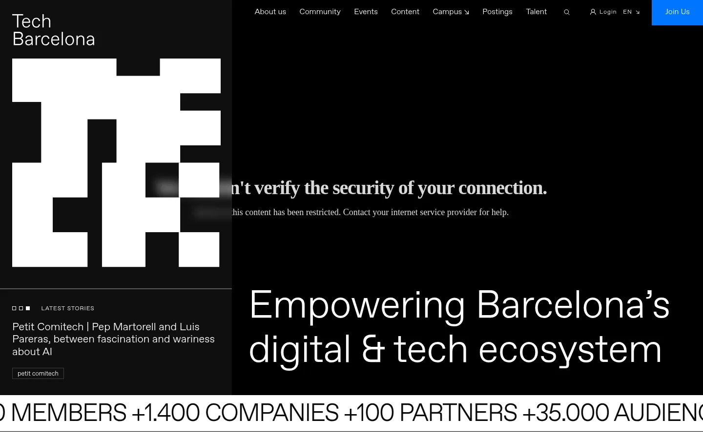
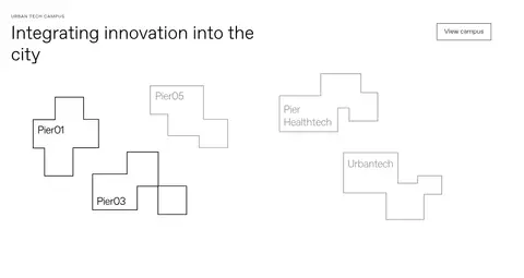
The visual strategy contrasts a near-black opening panel with the white canvas used through most of the page. The oversized white geometric TB mark and large, light-weight headline create an immediate identity, while a narrow story column sits beside the main hero field. FavoritPro-Light keeps typography airy and consistent: headlines are spacious and restrained, with uppercase display treatments used selectively. Bright blue is a signal for membership and community strips; coral distinguishes featured event content rather than acting as a general background. Below the hero, full-width architectural photography gives way to compact feature tiles, campus diagrams, event cards, and editorial stories. The layout alternates broad open regions with dense, image-led grids, using thin rules and square-edged controls instead of decorative elevation. Keep whitespace generous, align content deliberately, and let the black, white, blue, and coral blocks do the visual organizing.
Major section headings, including editorial and feature areas.
Tech Barcelona
40px
400
1.31
0
三级标题
Subsection and feature-tile headings.
Tech Barcelona
35px
400
1.15
0
四级标题
Card and smaller editorial headings.
Tech Barcelona
30px
400
1.15
-0.01em
正文
Story summaries, supporting copy, and explanatory text.
The quick brown fox 敏捷的狐狸
16px
400
1.59
0
辅助文字
Small category labels and metadata.
The quick brown fox 敏捷的狐狸
13px
400
1.59
0
按钮
CTA labels and prominent action links.
The quick brown fox 敏捷的狐狸
18px
400
1.59
0
导航
Top-level navigation items.
The quick brown fox 敏捷的狐狸
16px
400
1.33
0
链接
Prominent text links and full-width event-list action.
The quick brown fox 敏捷的狐狸
22px
400
1.15
0
眉题
Compact uppercase section and content labels.
The quick brown fox 敏捷的狐狸
12px
400
1.33
0.08em
间距与布局
基准单位 2px · 密度:适中
39px版块间距
—元素间距
23px卡片内边距
1110px内容最大宽度
1px
2px
3px
6px
8px
10px
13px
14px
15px
19px
20px
22px
23px
25px
27px
28px
The opening uses a strongly asymmetric composition: a narrow identity and latest-stories rail beside a broad headline field. Subsequent sections span the viewport, but their content sits in tidy, aligned grids and image cards. The measured page max width is 1110px; the section gap is 39px, with comfortable density and 23px card padding. Preserve substantial whitespace around the campus and story modules, then use tighter card groupings for events and news. Thin horizontal rules and full-width ticker bands establish rhythm between sections.
圆角与层次
没有测到阴影:页面是扁平的,层次靠底色和描边区分。
The interface is predominantly flat, with no measured shadows or rounded corners. Use square-edged cards and controls, relying on color blocks, whitespace, and thin grey or black rules to separate content. Layering is strongest in the hero, where a dark field and identity rail create a bold split composition.
组件
下面的预览按实测的按钮、输入框、徽标、卡片样式重建(字体用替代字体)。
Hero navigation
A compact horizontal menu and blue Join Us button sit across the top of a black opening area.
Identity and story rail
Place the white geometric TB mark and wordmark above a thin divider and a latest-story preview in a dark narrow column.
Hero statement
Set the main ecosystem statement in large, light sans-serif white type against a black field.
Outline CTA
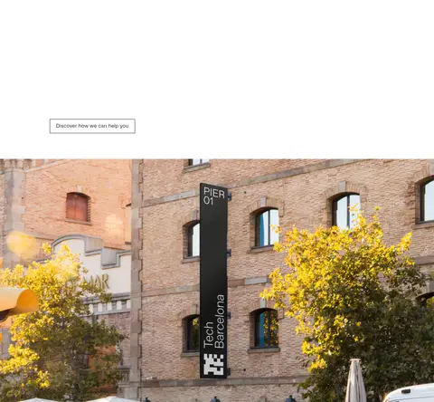
Use a square-cornered black outline button for Discover how we can help you; measured border is 1px solid black.
Community ticker
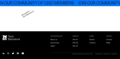
Repeat a large uppercase community message in a bright blue full-width strip with black text.
Event cards
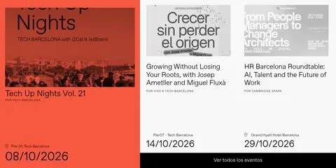
Mix pale grey and coral event surfaces, with concise event titles, venue details, and date information.
Editorial story cards
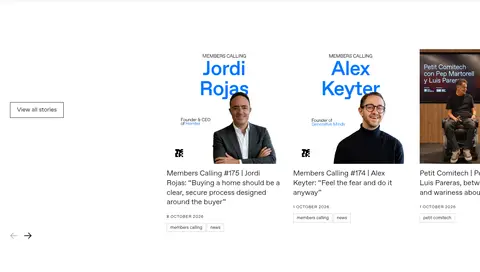
Present news and member stories as image-led rectangular cards with compact category badges and summaries.
Footer
Finish with a black footer, white identity, grouped navigation links, and restrained social and legal details.
Imagery · Use documentary photography of the campus, people, talks, and events, framed as rectangular cards or wide architectural scenes. Keep imagery natural and image-led rather than heavily filtered. The oversized geometric TB logo and campus-map-like outlines provide graphic identity; photographs carry the human and place-based storytelling. Bright coral may appear as a strong event-card field.
Build the hero around a high-contrast black-and-white split.
Keep typography light, clean, and sans-serif.
Use Signal Blue for membership and community actions.
Reserve Event Coral for featured event surfaces.
Use rectangular photography and square-edged cards.
Separate modules with whitespace and thin rules.
✕ 不该做
Do not add gradients or decorative shadows.
Do not round the measured square-cornered controls.
Do not spread coral across ordinary page sections.
Do not use blue as the default text color.
Do not make every section equally dense.
Do not replace documentary photography with generic 3D visuals.
给 AI 的提示词
想快速出一个同风格的新页面,把这段话连同 DESIGN.md 一起发给 AI。
Build a new Tech Barcelona page using a light editorial framework with a dramatic Stage Black (#000000) hero, Gallery White (#ffffff) typography, and an asymmetric identity/story rail beside a broad headline field. Use FavoritPro-Light or a close light sans-serif substitute, with oversized restrained headlines and compact uppercase labels. Keep the remaining canvas open and white; organize campus, event, and story content into rectangular grids with documentary photography and generous whitespace. Use Signal Blue (#0075ff) only for key membership actions and recurring community bands. Reserve Event Coral (#f6583f) for a featured event card. Favor thin Rule Grey (#cccccc) dividers, square corners, flat surfaces, and crisp alignment. Avoid gradients, rounded pills, and shadows; let contrast, photography, and spacing establish hierarchy.