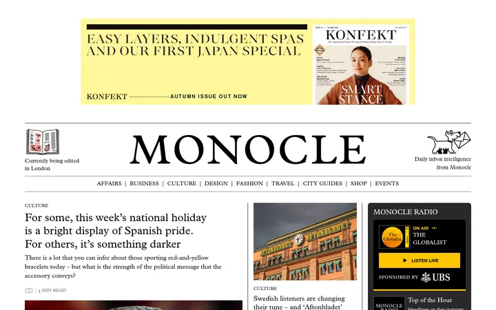
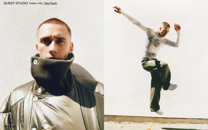
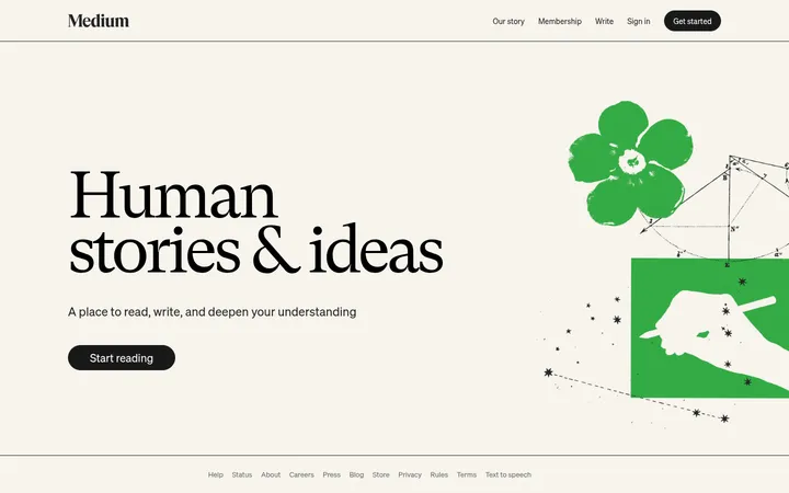
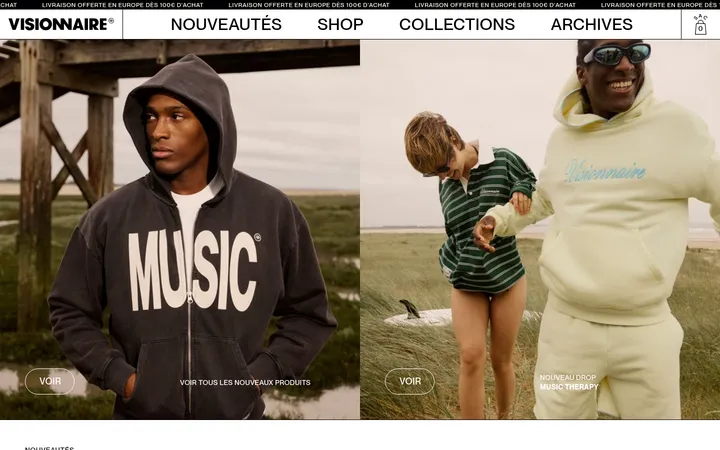
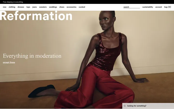
North star · Let full-bleed fashion photography and sharp typographic contrast lead, keeping supporting UI flat, white, and editorially restrained.
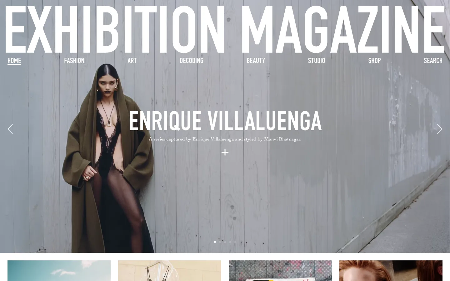
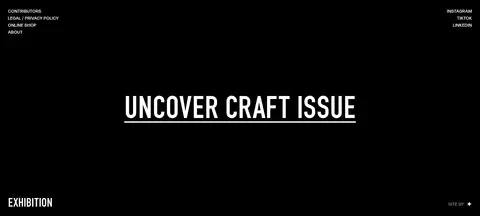
The page is built around a quiet palette: white (#ffffff) forms the content canvas and story grid, black (#000000) defines editorial text and the closing footer, while gray (#a8a8a8) belongs chiefly to the muted hero-media field rather than acting as a general brand accent. Oversized uppercase DIN lettering anchors the opening, with condensed navigation sitting directly over the photograph in white. Cochin provides a contrasting literary voice for story titles and small descriptions; the restrained display sans adds a fine uppercase register for compact labels and links. Layout alternates a full-bleed image-led feature with a white multi-column story feed, using photography as the principal color and texture. Content is dense in the grid but separated by generous white bands. The final black section is deliberately sparse, with small peripheral links and one centered, underlined issue callout. The overall treatment is flat and editorial, without decorative shadows or ornamental UI.
Editorial story titles, descriptions, and other reading text.
Aa 设计
DIN
网络字体 · 字重 400 · 占比 24%
免费替代:Barlow Condensed
Oversized masthead, hero titles, and uppercase primary navigation.
Aa 设计
forma-djr-display
网络字体 · 字重 500 · 占比 5%
免费替代:Oswald
Small uppercase captions, eyebrows, and compact links.
角色
示例
字号
字重
行高
字距
特大标题
Oversized uppercase magazine masthead across the hero.
Exhibition Magazine
100px
400
1
0
一级标题
Large uppercase title centered over the lead photograph.
Exhibition Magazine
90px
400
0.75
-0.004em
二级标题
Serif editorial headings within content sections.
Exhibition Magazine
46px
400
1.5
0
三级标题
Uppercase story or feature headlines.
Exhibition Magazine
40px
400
0.75
-0.008em
四级标题
Secondary uppercase headings and issue callouts.
Exhibition Magazine
36px
400
1.2
0
正文
Serif story descriptions and supporting editorial copy.
The quick brown fox 敏捷的狐狸
16px
400
1.2
0
辅助文字
Tracked uppercase contributor labels and compact metadata.
The quick brown fox 敏捷的狐狸
13px
500
1.6
0.062em
导航
Large uppercase primary site navigation over the hero.
The quick brown fox 敏捷的狐狸
25px
400
1.2
0
链接
Compact uppercase footer and editorial links.
The quick brown fox 敏捷的狐狸
13px
500
1.6
0.062em
眉题
Small tracked uppercase labels above or beside content.
The quick brown fox 敏捷的狐狸
13px
500
1.6
0.062em
间距与布局
基准单位 4px · 密度:适中
60px版块间距
—元素间距
—卡片内边距
618px内容最大宽度
4px
6px
8px
12px
16px
18px
24px
60px
100px
A full-bleed hero spans the page width, with the masthead and navigation layered over its image and the feature title centered below. The white editorial feed shifts to a four-column desktop story grid, mixing compact image cards with broad photographic features between rows. Content stays visually open through white gutters and larger blank bands rather than visible card containers. The measured page max width is 618px for constrained content; preserve the clear contrast between full-width media and compact editorial elements. A centered issue link anchors the two-column black footer.
圆角与层次
按钮 · 50%
没有测到阴影:页面是扁平的,层次靠底色和描边区分。
The interface is essentially flat: no measured shadows or gradients, and borders are not a defining system. Separate stories with white space and image edges rather than raised cards or outlines. The hero is layered through text over full-bleed photography, while the final black footer forms a clear section change.
组件
下面的预览按实测的按钮、输入框、徽标、卡片样式重建(字体用替代字体)。
Hero masthead and navigation
Large uppercase DIN magazine title and uppercase navigation are placed directly over the full-bleed lead image in white.
Lead editorial feature
A centered condensed uppercase feature title, small serif credit line, and simple plus affordance overlay the hero photograph.
Story card
Editorial image followed by a compact uppercase headline and short Cochin description, arranged in a multi-column white grid.
Feature image band
Wide photographic story breaks up the card feed, with its headline and brief credit set over the image.
Load-more link
Centered, uppercase condensed text with an underline, presented as a text-led continuation control on white.
Black editorial footer
A full black closing band places small white site links near the edges and a centered underlined issue callout.
Imagery · Fashion and culture photography is the primary visual material: full-width editorial scenes lead, while cropped portrait, object, and artwork images populate the story grid. Images retain their own varied colors and textures rather than being forced into a brand-color treatment. Hero text and navigation sit directly over photography in white; use strong, composed frames and avoid decorative illustration or 3D effects.
Use full-bleed editorial photography for lead stories.
Set mastheads and primary navigation in uppercase condensed sans.
Pair display type with a literary serif for story copy.
Keep the story feed on a clean white canvas.
Use image edges and open space instead of card borders.
Reserve black section backgrounds for strong editorial transitions.
✕ 不该做
Do not introduce unmeasured brand accent colors.
Do not add shadows, gradients, or elevated card treatments.
Do not place the hero inside a rounded container.
Do not let decorative UI compete with the photographs.
Do not make editorial descriptions resemble product interface labels.
Do not use gray as a general-purpose accent beyond the media context.
给 AI 的提示词
想快速出一个同风格的新页面,把这段话连同 DESIGN.md 一起发给 AI。
Build a new editorial page in the Exhibition Magazine visual style. Use Gallery White (#ffffff) for the reading canvas and story feed, Editorial Ink (#000000) for text and a decisive closing band, and Photo Mist (#a8a8a8) only where a muted media field is appropriate. Lead with edge-to-edge fashion or culture photography, overlaying an oversized uppercase condensed masthead and simple uppercase navigation in white. Use condensed sans for display headlines, a contrasting literary serif for story titles and descriptions, and tracked uppercase labels for compact metadata. Arrange stories as a tight editorial image grid interrupted by occasional wide image features. Keep cards unboxed and the UI flat: no shadows, gradients, or invented accent colors. Finish with a sparse black footer and a centered underlined issue link.