North star · Let vivid, candid party imagery carry the excitement while keeping the interface itself white, black, and easy to scan.
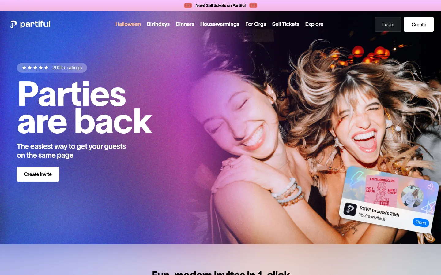
The visual strategy contrasts a high-energy opening with a light, open page below. The hero uses a full-bleed photograph with blue-violet and pink light, white headline text, and a compact announcement strip; these vivid hues are image-led rather than the core interface palette. Subsequent sections return to white, with very pale blue and lavender washes around invitation previews and feature areas. Black anchors headings and primary actions, while gray provides supporting copy; the measured blue gradient tones are section atmospherics, not strong UI accents. Typography combines expressive Partiful display faces and TWK Lausanne sans with tight tracking and compact line-height in large headlines. Layout alternates broad visual showcases, template imagery, feature cards, and editorial content, leaving generous whitespace between them. Cards use restrained shadows and rounded corners rather than prominent borders. Overall, the page feels social and celebratory without sacrificing clarity or scanability.
配色
点色块复制色值。用途说明来自对页面的实测位置(背景、文字、描边、按钮)与截图判读。
强调色
表层色
中性色
页面底色 · Gallery White主文字 · Party Ink次要文字 · Soft Graphite弱文字 · Deep Slate
Oversized hero headline, set prominently over the opening photograph.
Partiful
112px
825
0.8
-0.03em
一级标题
Primary page or major section heading.
Partiful
48px
500
1
-0.02em
二级标题
Section titles such as feature and template introductions.
Partiful
42px
400
1.2
0
三级标题
Feature card and subsection headings.
Partiful
40px
500
1.2
-0.02em
四级标题
Smaller strong headings in content areas.
Partiful
36px
400
1.2
-0.04em
正文
Supporting descriptions and explanatory section copy.
The quick brown fox 敏捷的狐狸
18px
400
1.4
-0.02em
辅助文字
Fine print, small labels, or image-related metadata.
The quick brown fox 敏捷的狐狸
11px
400
1.4
-0.02em
导航
Top navigation links and menu labels.
The quick brown fox 敏捷的狐狸
18px
400
1.2
-0.04em
链接
Compact inline links and secondary actions.
The quick brown fox 敏捷的狐狸
14px
400
1.4
-0.02em
间距与布局
基准单位 4px · 密度:紧凑
40px版块间距
12px元素间距
15px卡片内边距
1360px内容最大宽度
4px
6px
8px
10px
12px
16px
20px
24px
30px
40px
60px
80px
The page moves through wide, mostly full-width sections on a white canvas, with showcase content centered within a broad measured max width. The measured layout uses a 12-column grid in the template area and three columns for feature cards, while major image sections can break into a single full-bleed composition. Headings are predominantly left-aligned, with centered treatments for selected campaign blocks. Spacing is compact inside cards but generous between large showcases, leaving conspicuous blank intervals that give colorful imagery room to breathe.
圆角与层次
按钮 · 4px
卡片 · 8px
图片 · 12px
导航 · 4px
链接 · 4px
sm · card
xl · card
md · link
The page is largely flat: white space and image placement establish hierarchy instead of borders. Feature cards use subtle soft shadows and rounded corners, while larger preview media has more generous rounding. Avoid heavy outlines or dramatic drop shadows; layering is reserved for overlapping invitation previews, collage imagery, and the hero composition.
组件
下面的预览按实测的按钮、输入框、徽标、卡片样式重建(字体用替代字体)。
Hero and navigation
Full-bleed party photo with white brand/navigation text, a narrow announcement strip, oversized headline, supporting copy, and a white primary action.
Invitation showcase
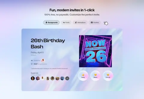
Pale blue-tinted presentation area with a large invitation and RSVP preview, paired with a short heading and compact customization controls.
Template gallery
A spacious white section introducing templates, followed by a visually rich invitation collection.
Occasion feature banner
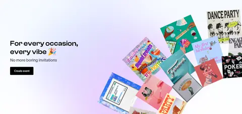
Split composition pairing a short left-aligned message and dark action with a broad, overlapping spread of invitation artwork.
Feature cards
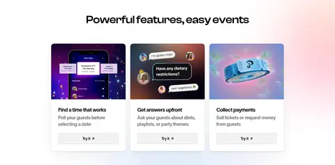
Three-column set of rounded cards with image-led tops, concise titles, supporting copy, and light secondary Try it links.
Editorial feed
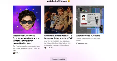
Three-column story cards with vivid thumbnail images, compact headlines, brief descriptions, and publication or author details.
Footer
Quiet white closing area with brand mark, grouped navigation links, and low-emphasis policy and social details.
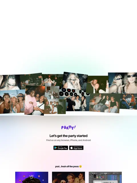
Imagery · Candid party photography dominates the hero, with smiling people framed edge to edge against saturated blue-violet and pink light. Product previews show invitation designs and RSVP screens, while feature illustrations and party-photo collages provide visual variety further down. Images are colorful and energetic; pale atmospheric washes soften showcase sections. Keep interface mockups legible and treat their embedded colors as content rather than brand tokens.
Use white as the default canvas and let imagery introduce most vivid color.
Set primary headlines in expressive rounded display typography.
Use black for primary text and strong filled actions.
Keep supporting copy gray, compact, and clearly subordinate.
Give major showcases generous surrounding whitespace.
Use soft shadows and rounded corners for feature cards.
Make party photography feel candid, joyful, and full-bleed where appropriate.
✕ 不该做
Do not turn the pale blue tints into saturated interface accents.
Do not use heavy borders to divide every section or card.
Do not crowd the page with dense grids or continuous text.
Do not let decorative gradients compete with the headline or imagery.
Do not mistake colors inside invitation mockups for global brand colors.
Do not use all-caps styling as the default for headings.
给 AI 的提示词
想快速出一个同风格的新页面,把这段话连同 DESIGN.md 一起发给 AI。
Build a new Partiful-style page with a clean #ffffff Gallery White canvas and #000000 Party Ink typography and primary actions. Use vivid party photography as the emotional focal point; reserve soft #eaf3ff Cloud Blue and #f4f9ff Mist Blue for subtle atmospheric section washes, not buttons. Pair rounded, expressive display headings with a clean sans-serif such as DM Sans for display and Inter for interface text. Keep sections broad and airy, with a strong full-bleed hero, carefully spaced showcases, and compact three-column feature cards. Use subdued gray supporting copy, restrained rounded card corners, and soft shadows rather than borders. Let invitation mockups and photo collages provide varied color and texture, while keeping navigation, calls to action, and editorial content easy to scan.