North star · Let oversized, precise typography and generous white space establish the identity; keep project information quiet, aligned and monochrome.
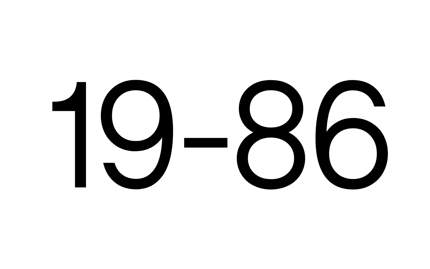
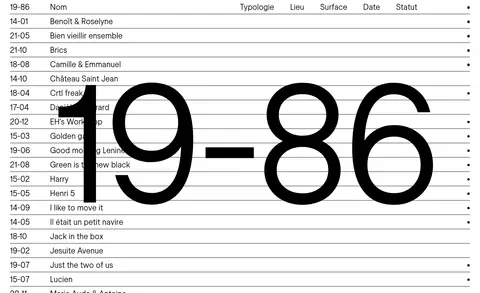
The visual identity is built from only two measured colours: white (#ffffff) forms the uninterrupted canvas, while black (#000000) carries the wordmark, navigation, project text and rules. The opening viewport is intentionally sparse: an enormous “19–86” sits alone on white, with no decorative colour or supporting copy competing for attention. A page overview reveals the contrasting project-list treatment: compact rows of text, delicate black horizontal separators and a small status mark at the far edge. Store Norske Ja Light supplies a restrained, contemporary typographic voice; the display scale makes the numerals feel architectural, while smaller repeated labels organize the work like a catalogue. The layout relies on open space around the identity and dense, orderly alignment in the index rather than cards, shadows or filled panels. Project imagery may appear in the portfolio, but it does not define the measured first viewport’s brand palette.
配色
点色块复制色值。用途说明来自对页面的实测位置(背景、文字、描边、按钮)与截图判读。
品牌色
表层色
页面底色 · Gallery White主文字 · Studio Ink描边 · Studio Ink
Display wordmark, body copy, navigation and project links
角色
示例
字号
字重
行高
字距
特大标题
Oversized 19–86 identity across the opening canvas.
19–86
489.5px
400
1
-0.02em
正文
Supporting studio or project information in the portfolio.
The quick brown fox 敏捷的狐狸
24px
400
1.2
0
导航
Compact site and project-index navigation labels.
The quick brown fox 敏捷的狐狸
24px
400
1.2
0
链接
Project actions such as “Voir le projet”.
The quick brown fox 敏捷的狐狸
24px
400
1.2
0
间距与布局
基准单位 4px · 密度:宽松
112px版块间距
—元素间距
—卡片内边距
1380px内容最大宽度
5px
8px
12px
24px
30px
The first viewport is a single, open white field with the oversized wordmark centered as the dominant element. The measured page maximum width is 1380px, and the overall density is spacious, with a 112px section gap. In the full-page overview, the project index switches to a much denser catalogue rhythm: aligned text columns, repeated horizontal rules and a right-edge status mark. Preserve clear alignment and generous separation between major page regions; no multi-column card grid is measured.
圆角与层次
导航 · 50%
没有测到阴影:页面是扁平的,层次靠底色和描边区分。
The interface reads as flat: no measured shadows, gradients or raised cards. Use thin black horizontal rules to separate index rows, not layered panels. Keep the white canvas continuous and let typography, spacing and alignment provide hierarchy.
组件
下面的预览按实测的按钮、输入框、徽标、卡片样式重建(字体用替代字体)。
Oversized wordmark
Set “19–86” in the measured light display face, in black against the open white canvas.
Project index rows
Use compact, aligned project metadata with fine horizontal separators and a small far-right status mark, as shown in the page overview.
Project link
Render “Voir le projet” as plain black 24px text in Store Norske Ja Light, without a filled button treatment.
Navigation labels
Use plain black 24px Store Norske Ja Light text; the measured “Lieu” navigation entries have horizontal padding.
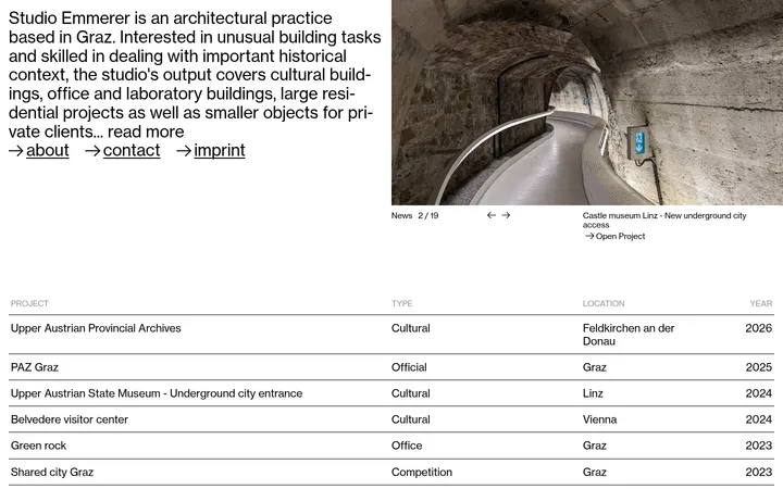
Imagery · The first viewport contains no visible photography, illustration, 3D or video; the wordmark itself is the visual focus. The full-page overview suggests a project-led portfolio, where architectural imagery can support individual entries without altering the restrained black-and-white identity. Keep media treatment quiet and let project documentation remain distinct from the sparse opening canvas.
Use black for the wordmark, text, links and rules.
Give the display numerals ample surrounding white space.
Keep project-index columns precisely aligned.
Separate catalogue rows with fine horizontal rules.
Use the measured light typeface consistently.
✕ 不该做
Do not introduce unmeasured accent colours.
Do not add shadows, gradients or raised cards.
Do not crowd the opening wordmark with supporting content.
Do not turn project links into filled CTA buttons.
Do not use decorative illustrations to define the brand.
Do not replace the orderly index with a card grid.
给 AI 的提示词
想快速出一个同风格的新页面,把这段话连同 DESIGN.md 一起发给 AI。
Build a new architecture-studio page in 19–86’s restrained editorial style. Use Gallery White (#ffffff) as the continuous canvas and Studio Ink (#000000) for the wordmark, navigation, links, project text and fine dividers; do not add accent colours. Set typography in Store Norske Ja Light, or a close free substitute, with an oversized tightly tracked identity and quieter, regular-weight labels. Keep the opening area sparse and spacious, then organize portfolio entries as a precise catalogue with aligned metadata columns, thin horizontal rules and optional small status marks. Prefer flat surfaces over cards, shadows or gradients. Let architectural project imagery appear as supporting content, not as a reason to alter the monochrome identity. Preserve a calm contrast between the expansive hero and denser index.