North star · Keep the interface nearly invisible: use white space and a single strong architectural image to carry the story.
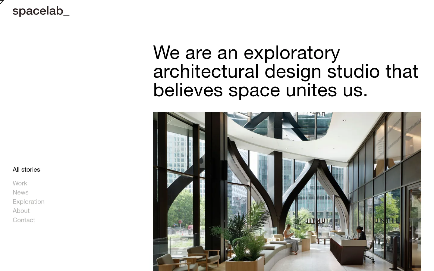
The page uses a white canvas (#ffffff) as its dominant visual field, with black (#000000) for the studio statement and selected navigation, and muted grey (#b2b4b1) for secondary links. These measured interface colours define the brand; darker and softer tones visible in the screenshot belong mainly to the architectural photograph, not additional UI palette colours. HelveticaNeue gives the oversized introductory statement a clean, editorial voice, with regular weight and tight, even lines. The composition is deliberately asymmetric: a compact wordmark sits at the upper left, while the headline and wide architectural image occupy the right side. A small vertical story list anchors the lower-left area. Large areas of unoccupied white space separate these elements, making the photograph feel like the page’s principal feature without enclosing it in a card. The overall impression is calm, precise, and image-led, with no visible decorative borders, shadows, or coloured section bands.
配色
点色块复制色值。用途说明来自对页面的实测位置(背景、文字、描边、按钮)与截图判读。
品牌色
表层色
中性色
页面底色 · Gallery White主文字 · Studio Ink次要文字 · Quiet Grey
Used for the large introductory statement, wordmark, and story navigation.
角色
示例
字号
字重
行高
字距
正文
Large introductory studio statement above the featured architecture image.
Spacelab
62px
400
1
0.011em
辅助文字
Story navigation links and smaller supporting interface text.
The quick brown fox 敏捷的狐狸
21px
400
1.2
0
间距与布局
基准单位 1px · 密度:适中
84px版块间距
—元素间距
—卡片内边距
—内容最大宽度
5px
21px
39px
42px
63px
84px
147px
Use a spacious, asymmetric composition rather than centered content. Place the wordmark near the upper-left edge, set the main statement in a broad column on the right, and align the large image directly beneath it. Keep story navigation in a separate left-side column, vertically offset from the top. Preserve generous white gaps between the header, statement, image, and navigation; the page feels comfortable and sparse, with no visible boxed grid or constrained card system.
圆角与层次
没有测到阴影:页面是扁平的,层次靠底色和描边区分。
The interface is flat: white canvas, plain text, and an unframed photograph. No measured shadows, card surfaces, or visible border system define the page. Establish hierarchy through placement, scale, and contrast instead of layered panels or decorative effects.
组件
下面的预览按实测的按钮、输入框、徽标、卡片样式重建(字体用替代字体)。
Wordmark
Small black “spacelab_” wordmark at the upper left, separated from the main content by substantial white space.
Introductory statement
Large, regular-weight black HelveticaNeue statement, broken into short lines and aligned above the featured image.
Story navigation
Vertical list of plain text links at the left; the active “All stories” link is black and other links use #b2b4b1.
Featured architecture image
Wide, unframed photograph beneath the statement, showing a contemporary interior and occupying most of the right content column.
Imagery · Use a large, edge-aligned architectural photograph as the primary visual element. The reference shows a bright contemporary interior with tall glazing, dark structural supports, greenery, and people for scale. Keep the image natural and documentary in feel, with no visible frame, caption overlay, illustration, or graphic treatment.
该做与不该做
✓ 该做
Keep the canvas white and visually quiet.
Use black for the primary statement and active link.
Set secondary navigation in muted grey.
Place the statement and image in a right-side column.
Keep the story list separate on the left.
Let one architectural photograph dominate the content.
✕ 不该做
Do not add bright accent colours to the interface.
Do not center every element into a uniform column.
Do not wrap the photograph in a card or border.
Do not add decorative shadows or gradients.
Do not make secondary navigation as prominent as the statement.
Do not treat photograph colours as additional brand palette colours.
给 AI 的提示词
想快速出一个同风格的新页面,把这段话连同 DESIGN.md 一起发给 AI。
Build a new page in Spacelab’s restrained architectural editorial style. Use Gallery White (#ffffff) as the canvas, Studio Ink (#000000) for the main statement and active navigation, and Quiet Grey (#b2b4b1) for secondary links. Set text in a clean HelveticaNeue-like sans serif, regular weight. Create an asymmetric layout: a compact wordmark at upper left, a vertical navigation list farther down that side, and a large statement above a prominent architectural photograph on the right. Let the image sit directly on the page without a frame or card treatment. Use generous, measured white space to separate elements; avoid shadows, gradients, coloured bands, and unnecessary interface decoration. Keep the result calm, image-led, and precise.