Studio Emmerer 将简洁的工作室介绍、建筑项目图片与详尽的项目目录结合呈现。黑白灰界面让作品成为视觉重点,留白与细线则营造出编辑式的档案质感。
North star · Keep the interface white, typographic, and rigorously aligned so the architecture—not decorative UI—carries the page.
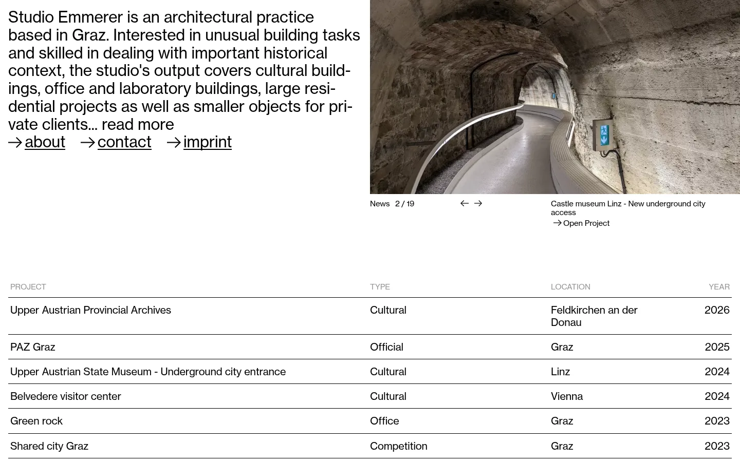
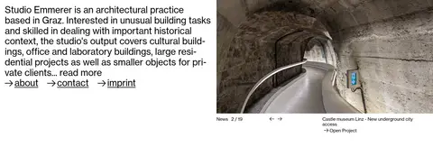
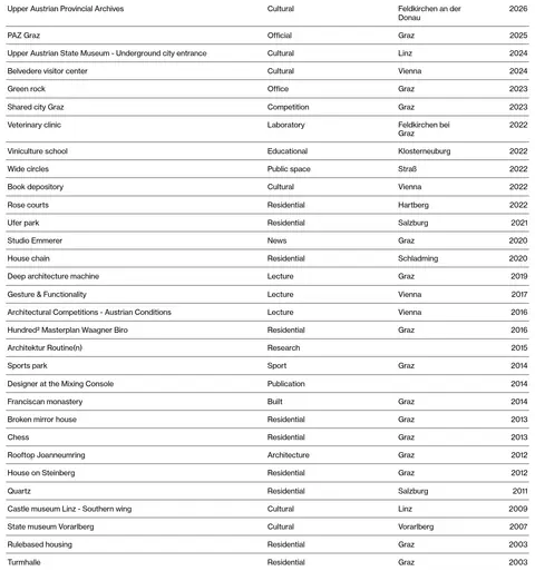
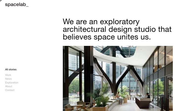
The page uses a white canvas and black text as its defining visual system; the measured palette contains no dedicated accent colour. Light grey appears sparingly in secondary text, while the warmer stone and brown tones visible in the screenshots belong to architectural photography rather than the interface. NHaasGrotesk is used throughout in regular weight, with large, closely tracked studio copy balanced by smaller captions and project links. The opening area is arranged in two broad columns: an introductory text block on the left and a project image with compact news navigation and caption on the right. Below, a wide project archive reads as a four-column table, with uppercase muted headers, black project links, and thin horizontal rules separating rows. The layout is flat and spacious rather than card-based: generous separation distinguishes the introduction from the dense archive, while aligned columns preserve scanability.
Used throughout for the studio introduction, navigation, project names, captions, and table labels.
角色
示例
字号
字重
行高
字距
一级标题
Large studio introduction at the top of the page.
Studio Emmerer
30px
400
1.16
-0.005em
正文
Prominent descriptive copy and project-list entries.
The quick brown fox 敏捷的狐狸
20px
400
1.16
-0.008em
辅助文字
Compact project captions and secondary table labels.
The quick brown fox 敏捷的狐狸
15px
400
1.16
-0.011em
导航
Large introductory-area navigation links.
Studio Emmerer
30px
400
0.9
-0.005em
链接
Smaller calls to action and project links.
The quick brown fox 敏捷的狐狸
15px
400
1.16
-0.011em
间距与布局
基准单位 4px · 密度:适中
90px版块间距
—元素间距
—卡片内边距
1408px内容最大宽度
4px
12px
16px
Use a broad, centered page canvas with a measured maximum width of 1408px. The opening region places introductory copy beside a featured image and its controls; the project archive follows as a four-column table aligned to the same page edges. Preserve generous separation between these regions, then keep archive rows tightly and consistently ruled. The overall density is comfortable: large open areas above a long, compact index.
圆角与层次
没有测到阴影:页面是扁平的,层次靠底色和描边区分。
The interface is flat: measured components show no shadows, gradients, or card surfaces. Separate project rows with thin black hairlines instead of boxed cards. Keep images flush to their layout area and avoid extra decorative layers; whitespace, alignment, and rules provide the page's structure.
组件
下面的预览按实测的按钮、输入框、徽标、卡片样式重建(字体用替代字体)。
Studio introduction
Large regular-weight black copy occupies the left side of the opening region, ending in a read-more prompt and compact about, contact, and imprint links.
Featured project image
A wide architectural photograph sits in the right opening column, followed by a small news position indicator and previous/next arrows.
Project caption
Place the project name and an Open Project text link below the featured image in compact black type.
Project archive table
Present projects in four aligned columns for project, type, location, and year; use muted uppercase headers and thin horizontal separators.
Project links
Use plain black text links for project names, with no filled button treatment, border, or radius.
Imagery · Use documentary architectural photography, with buildings and interiors shown as the actual project subject rather than decorative illustration. The featured image is a wide crop of a stone passage and contemporary circulation ramp; natural material tones remain within the photograph. Keep image edges clean and rectangular, with small captions and controls immediately below.
Align archive columns consistently across every row.
Use architectural photography with restrained captions.
Preserve generous whitespace before the project index.
✕ 不该做
Do not add an unmeasured accent colour.
Do not turn archive rows into cards.
Do not add shadows, gradients, or rounded treatments.
Do not use bold weights absent from the measured type system.
Do not let image colours dictate interface colours.
Do not replace the ruled archive with decorative tiles.
给 AI 的提示词
想快速出一个同风格的新页面,把这段话连同 DESIGN.md 一起发给 AI。
Build a new architecture-studio page in Studio Emmerer's restrained editorial style. Use Gallery White (#ffffff) for the canvas, Archive Ink (#000000) for primary copy and hairlines, and Quiet Grey (#999999) only for secondary labels. Set all interface typography in a regular-weight NHaasGrotesk-like sans serif, with Inter as a practical free substitute and subtle negative tracking. Compose the opening with a large studio statement beside a clean, rectangular architectural photograph and compact controls or caption. Follow it with an aligned, four-column project archive separated by fine horizontal rules. Keep the page flat: no shadows, gradients, cards, or rounded UI. Use whitespace to separate major regions, but keep archive rows compact and easy to scan. Let photographic material colours remain inside the images.