North star · Keep the interface nearly invisible so oversized architectural imagery and clear black-on-white navigation lead.
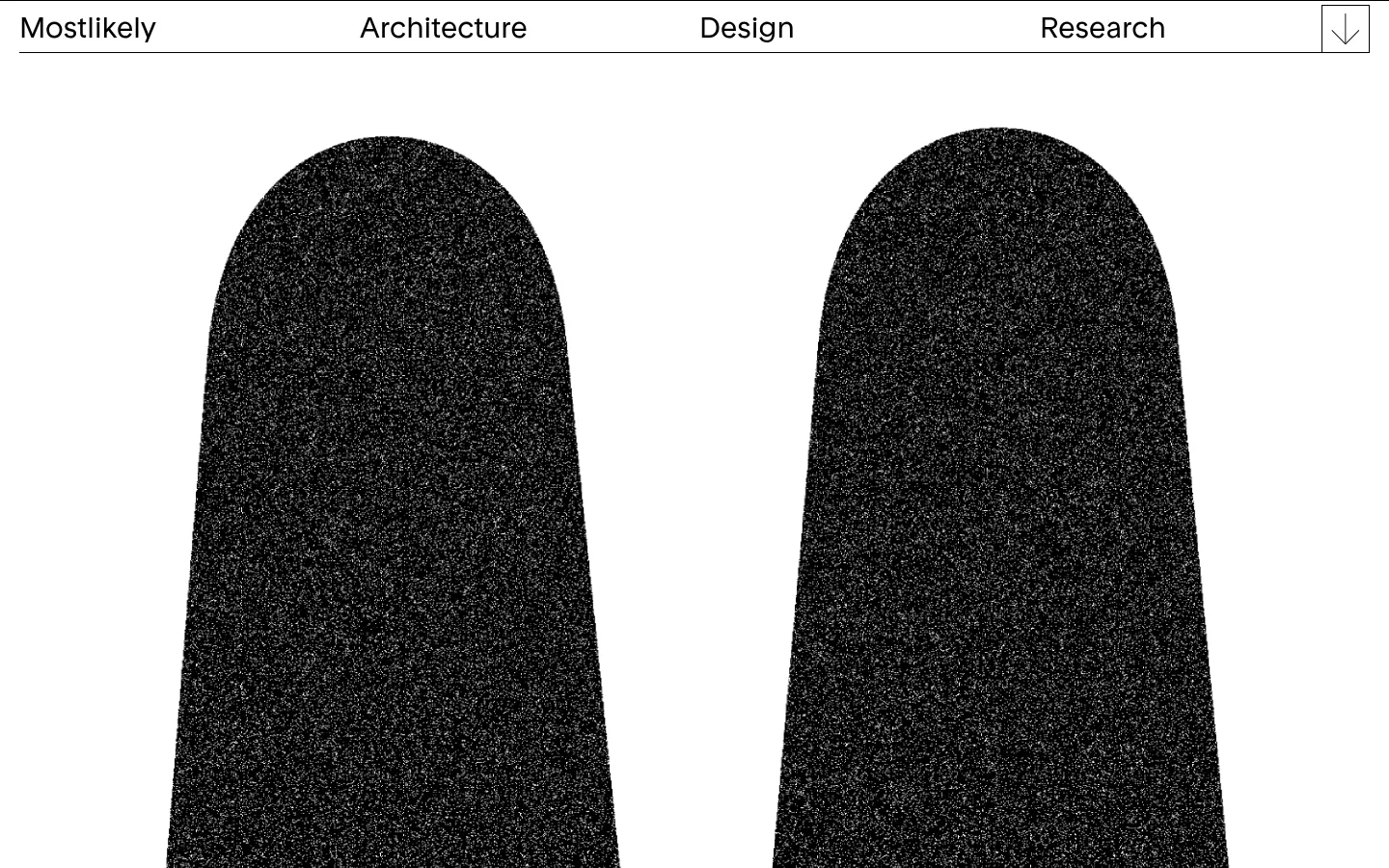
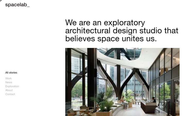
The page uses a strict black-and-white palette: white carries nearly the entire canvas, while black defines navigation text, links, and fine rules. The large dark forms in the hero image create contrast and visual weight, but read as project imagery rather than additional brand colours. Rondelle, a clean sans-serif, appears in regular weight with no apparent tracking or uppercase treatment. Navigation labels are unusually prominent and distributed across a single horizontal row, while the rest of the page keeps interface ornament to a minimum. The image-led composition places generous white space around monumental, vertically cropped forms. A thin rule underlines the navigation, and a compact outlined down-arrow control sits at the far right. The overall strategy is quiet and editorial: use a simple typographic frame, clear alignment, and large-scale imagery rather than colour accents, cards, shadows, or decorative effects.
配色
点色块复制色值。用途说明来自对页面的实测位置(背景、文字、描边、按钮)与截图判读。
品牌色
表层色
页面底色 · Studio White主文字 · Architectural Ink描边 · Architectural Ink
文字
背景
对比度
WCAG
#000000 Architectural Ink
#ffffff Studio White
21:1
AAA
字体
字号阶梯:Custom(比例约 2.143,正文 14px)。示例用免费替代字体渲染,数值为实测。
Aa 设计
Rondelle
网络字体 · 字重 400 · 占比 100%
免费替代:Jost
Navigation, page headings, body copy, and links
角色
示例
字号
字重
行高
字距
一级标题
Page-level heading, if present; no heading is visible in the captured viewport.
mostlikely
30px
400
1.4
0
正文
Supporting studio and project copy.
The quick brown fox 敏捷的狐狸
14px
400
1.4
0
导航
Large labels across the top navigation row.
mostlikely
30px
400
1.4
0
链接
Compact supporting links and text actions.
The quick brown fox 敏捷的狐狸
14px
400
1.4
0
间距与布局
基准单位 1px · 密度:适中
55px版块间距
10px元素间距
—卡片内边距
1400px内容最大宽度
5px
10px
20px
55px
70px
A single horizontal navigation row spans the page, with the studio name at left, discipline labels distributed across the row, and a small arrow control at right. A fine rule anchors the header. Below it, the hero is a sparse, image-led composition with two monumental forms and broad white margins. The measured page maximum width is 1400px; spacing follows a comfortable rhythm, with clear separation between elements rather than dense content blocks.
圆角与层次
没有测到阴影:页面是扁平的,层次靠底色和描边区分。
The interface is flat: no measured shadows, gradients, or card surfaces. Use the white canvas as the only page surface, and rely on a thin black navigation rule and the arrow control's fine outline for separation. Let image contrast and whitespace provide depth rather than layered UI.
组件
下面的预览按实测的按钮、输入框、徽标、卡片样式重建(字体用替代字体)。
Top navigation
One row of black Rondelle labels on white, with the studio name and Architecture, Design, and Research distributed horizontally.
Header rule
A fine black horizontal line sits directly beneath the navigation, separating it from the image area.
Down-arrow control
A small outlined rectangular control at the far right of the header contains a simple downward arrow.
Hero imagery
Oversized, vertically cropped, grain-textured dark architectural forms sit against the white canvas with substantial negative space.
Imagery · The first viewport is dominated by two tall, rounded architectural forms rendered in near-black grain against white. Their speckled texture and scale make them feel like project imagery, not interface decoration or a palette extension. Keep images large, vertically cropped, and visually quiet around the edges; avoid adding captions or overlays unless the page content requires them.
Use only measured black and white for the interface palette.
Keep navigation labels on one clear horizontal line.
Use Rondelle regular or a restrained sans-serif substitute.
Give hero imagery a monumental, image-led presence.
Preserve generous white space around content.
Use fine rules and outlines sparingly.
✕ 不该做
Do not introduce unmeasured accent colours.
Do not add shadows, gradients, or elevated cards.
Do not clutter the header with extra controls.
Do not turn the imagery into small thumbnails.
Do not use heavy, condensed, or uppercase typography.
Do not mistake textured artwork for a UI colour treatment.
给 AI 的提示词
想快速出一个同风格的新页面,把这段话连同 DESIGN.md 一起发给 AI。
Build a new page in the mostlikely visual style: quiet, architectural, monochrome, and image-led. Use Studio White (#ffffff) as the canvas and Architectural Ink (#000000) for navigation, links, and fine rules. Set type in Rondelle regular, or a close restrained sans-serif substitute, with simple casing and no ornamental effects. Keep the header in one horizontal row, distribute the navigation labels clearly, and use a subtle underline rule; a small outlined arrow control may sit at the far edge when relevant. Give the main content generous whitespace and let large, carefully cropped architectural imagery carry the visual weight. Keep the interface flat: no cards, shadows, gradients, or invented accent colours. Match the measured comfortable rhythm, and make alignment and image scale do the work.