North star · Let a deep black canvas and light, spacious typography frame cinematic imagery without competing with it.
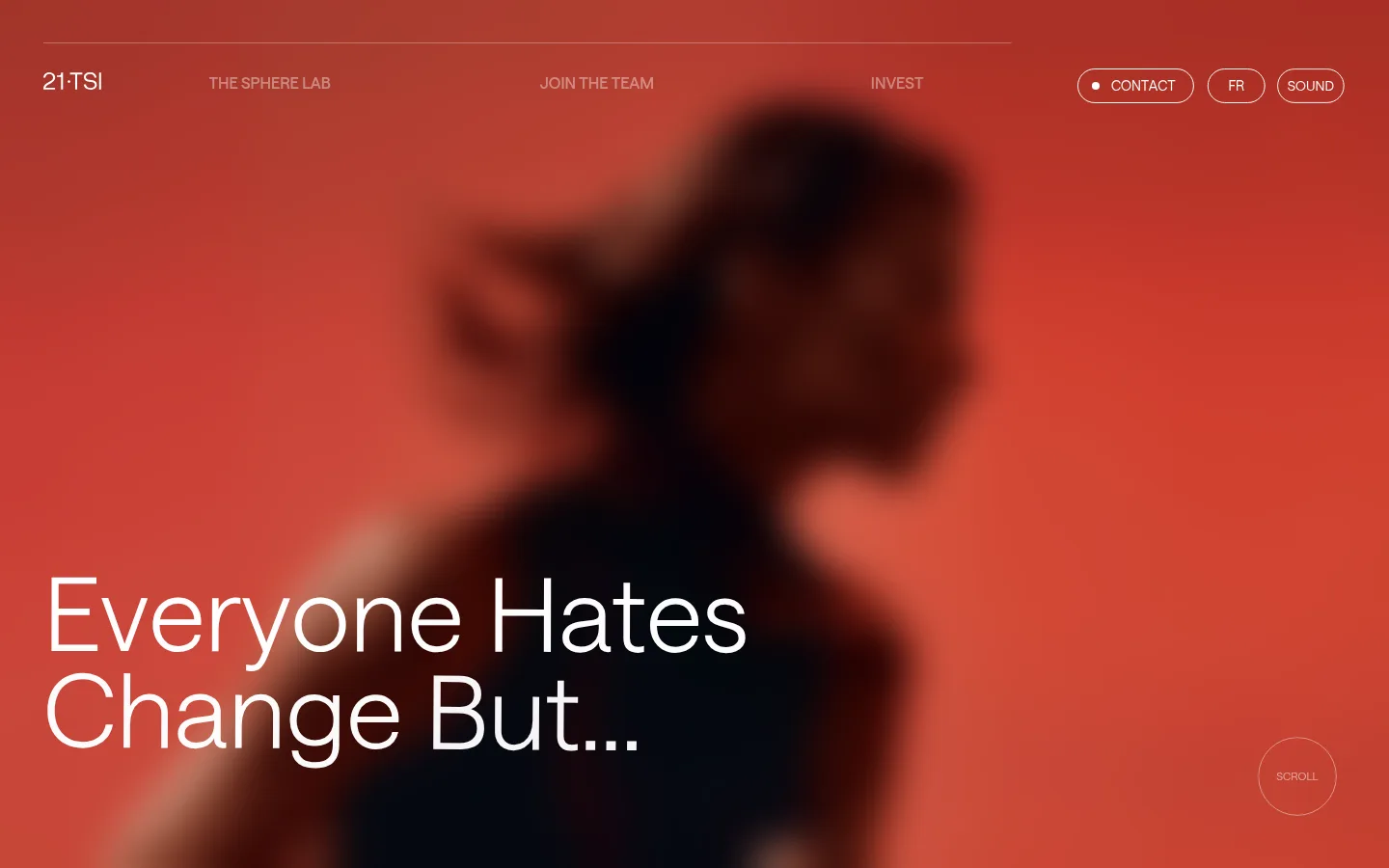
The visual system is built around a near-total black canvas (#000000), with white (#ffffff) typography and restrained gray (#4d4d4d) borders. These measured colors define the interface; the vivid reds in the opening screenshot belong to the hero film imagery, not the measured UI palette. Saans is used throughout, with light display and heading weights that give the large text a quiet, editorial presence. Uppercase navigation, links, and captions provide compact counterpoints to the airy headlines and body copy. The page favors long, full-bleed-feeling black sections over boxed content, separated by generous vertical intervals. A fine horizontal rule and delicate outlined circular controls add structure without introducing filled panels or shadows. Navigation and labels stay small and unobtrusive, while large statements sit at the left edge and carry the narrative. Recreate the contrast between sparse interface elements and cinematic imagery rather than adding decorative color or dense cards.
配色
点色块复制色值。用途说明来自对页面的实测位置(背景、文字、描边、按钮)与截图判读。
表层色
中性色
页面底色 · Pitch Black主文字 · Studio White描边 · Graphite Line
文字
背景
对比度
WCAG
#ffffff Studio White
#000000 Pitch Black
21:1
AAA
字体
字号阶梯:Custom(比例约 2.302,正文 20px)。示例用免费替代字体渲染,数值为实测。
Aa 设计
Saans
网络字体 · 字重 300 / 380 / 570 · 占比 100%
免费替代:Inter
Site-wide typeface for headlines, body copy, navigation, captions, and links.
角色
示例
字号
字重
行高
字距
特大标题
Oversized editorial statements and prominent hero messaging.
21 TSI
106px
300
1.3
0
一级标题
Primary section headings such as the mission and Sphere Lab titles.
21 TSI
47px
300
1
0
正文
Light-weight explanatory and manifesto copy.
The quick brown fox 敏捷的狐狸
20px
300
1.15
0
辅助文字
Compact uppercase supporting labels and metadata.
The quick brown fox 敏捷的狐狸
14px
380
1.14
0
导航
Uppercase primary navigation labels.
The quick brown fox 敏捷的狐狸
16px
570
1.38
0
链接
Uppercase utility links and small calls to action.
The quick brown fox 敏捷的狐狸
14px
380
1.14
0
眉题
Uppercase, letter-spaced section preheads.
The quick brown fox 敏捷的狐狸
14px
380
1.14
0.05em
间距与布局
基准单位 2px · 密度:宽松
150px版块间距
—元素间距
—卡片内边距
1350px内容最大宽度
7px
8px
10px
11px
15px
20px
30px
35px
60px
63px
150px
The page uses a spacious, mostly single-column editorial structure within a measured maximum width of 1350px. Content aligns to the left, with the navigation distributed horizontally across the top and key actions gathered at the right. Very tall black intervals separate the hero, manifesto, question-led copy, image-led passage, and Sphere Lab content. Preserve the open composition and avoid dense grids: measured section spacing is generous, with a 150px section gap and sparse content density.
圆角与层次
按钮 · 9999px
卡片 · 50%
链接 · 9999px
没有测到阴影:页面是扁平的,层次靠底色和描边区分。
The interface is flat: measured data contains no shadows or gradients, and the page relies on black space rather than layered cards. Use restrained thin borders in #4d4d4d for outlined elements and hairlines. Circular controls and outlined navigation actions sit directly on their background, with no filled surface or raised treatment.
组件
下面的预览按实测的按钮、输入框、徽标、卡片样式重建(字体用替代字体)。
Top navigation
A thin horizontal rule anchors a distributed row of small uppercase links; brand mark sits left, navigation spans the middle, and outlined contact, language, and sound controls sit right.
Hero statement
Large, light-weight white editorial text overlays the lower-left area of blurred sports imagery; keep the image cinematic and the copy sharply legible.
Outlined utility pills
Contact, language, and sound actions use white uppercase text inside thin rounded outlines; the measured control radius is pill-like.
Scroll cue
A small outlined circular control with understated uppercase text sits near the hero’s lower-right area.
Editorial section link
Small uppercase action text sits on a long, fine horizontal rule with a discreet downward arrow, positioned away from the main copy.
Statement sections
Single-column sections use large, light headings with concise supporting copy on the black canvas, leaving ample surrounding negative space.
Imagery · The opening is dominated by a full-viewport-feeling, softly blurred sports figure against vivid red-toned footage. Treat that red as image color, not a UI token. The subject is cropped large and atmospheric, with white headline text overlaid near the lower left. Later page sections appear largely black in the scaled screenshots, so keep imagery selective and cinematic rather than filling every section with decorative visuals.
Keep outlined rules and controls fine and understated.
Use Saans or a close neutral sans-serif substitute.
Favor light headline weights and uppercase utility labels.
Reserve saturated reds for cinematic image assets.
Maintain generous vertical breathing room between sections.
✕ 不该做
Do not treat the hero’s red footage as a measured brand color.
Do not add gradients, shadows, or raised card treatments.
Do not pack content into dense multi-column grids.
Do not make utility navigation compete with the hero statement.
Do not introduce bright UI accents beyond the measured palette.
Do not add filled buttons where the design uses outlined controls.
给 AI 的提示词
想快速出一个同风格的新页面,把这段话连同 DESIGN.md 一起发给 AI。
Build a new 21 TSI page as a sparse, cinematic editorial experience. Use Pitch Black (#000000) for the dominant canvas, Studio White (#ffffff) for typography and controls, and Graphite Line (#4d4d4d) only for fine borders and hairlines. Use Saans, or a close neutral sans-serif substitute, with light, oversized statements and compact uppercase navigation and utility labels. Keep navigation distributed across the top, with outlined pill-like actions at the right. Pair editorial copy with selective full-bleed-feeling sports imagery; vivid red may appear inside the image, not as an invented interface token. Organize content in spacious, mostly single-column sections, leaving generous black intervals. Keep the interface flat: no shadows, gradients, dense cards, or decorative UI clutter.