North star · Use a cinematic near-black canvas and clear, spacious storytelling; let real merchant imagery carry the color.
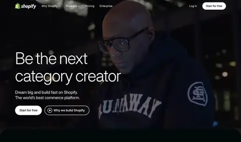
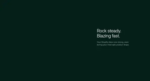
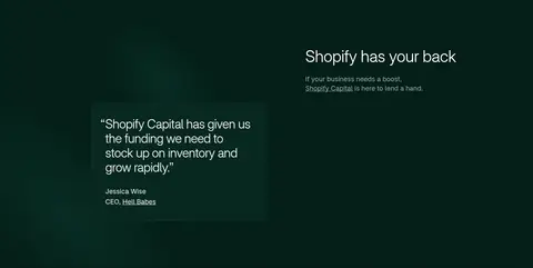
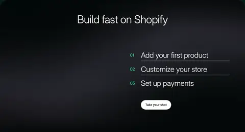
The page is built around a near-black canvas, with subtly distinct dark teal, forest-green, and midnight-blue bands dividing the story without breaking its immersive mood. White is reserved for prominent headings, navigation, and primary actions; muted gray-green tones carry supporting copy. Shopify-Inter supplies a light, modern voice: large headings use thin weights and tight negative tracking, while body copy stays calm and readable. A full-bleed, darkened merchant video leads into image galleries, product-interface collages, feature cards, proof points, and customer stories. Content alternates between single-column feature storytelling and multi-column card groups, generally aligned to a shared wide page frame. Rounded media panels and pill-shaped CTAs soften the dark technology aesthetic. Accents are selective: mint-green appears in small highlights and metrics, while saturated blue-violet gradients and vivid details are confined mostly to feature imagery. Generous section pauses give the long homepage a deliberate, paced rhythm.
配色
点色块复制色值。用途说明来自对页面的实测位置(背景、文字、描边、按钮)与截图判读。
强调色
表层色
中性色
功能色
页面底色 · Pure Black表层 · Deep Teal Black表层 2 · Forest Depth表层 3 · Midnight Navy表层 4 · Deep Petrol主文字 · Clean White次要文字 · Quiet Gray弱文字 · Soft Sage描边 · Indigo Hairline强调 · Signal Mint强调 2 · Electric Indigo
Primary family for display headings, body copy, navigation, links, and buttons.
Aa 设计
ui-monospace
系统字体 · 字重 400 · 占比 7%
免费替代:Roboto Mono
Small uppercase code and technical labels in developer-focused content.
角色
示例
字号
字重
行高
字距
特大标题
Oversized hero and major campaign-style display headings.
Shopify
96px
300
1.08
-0.02em
一级标题
Primary page-level and leading section headings.
Shopify
64px
330
1.08
-0.02em
二级标题
Large feature and major section headings.
Shopify
56px
330
1.08
-0.03em
三级标题
Feature-card and subsection headings.
Shopify
44px
330
1.1
-0.01em
四级标题
Smaller feature titles and supporting panel headings.
Shopify
34px
330
1.14
-0.02em
正文
Main descriptive copy and feature explanations.
The quick brown fox 敏捷的狐狸
18px
400
1.4
0
辅助文字
Compact supporting notes and secondary details.
The quick brown fox 敏捷的狐狸
16px
400
1.5
0
按钮
Large primary CTA label styling.
Shopify
56px
330
1
-0.02em
导航
Header navigation labels and compact menu text.
The quick brown fox 敏捷的狐狸
14px
420
1.29
0
链接
Inline and supporting links throughout the page.
The quick brown fox 敏捷的狐狸
16px
400
1.5
0
代码
Technical labels and code-like developer content.
const style = 1;
12px
400
1.5
0.02em
间距与布局
基准单位 4px · 密度:适中
64px版块间距
16px元素间距
16px卡片内边距
1260px内容最大宽度
2px
4px
5px
8px
10px
12px
13px
16px
20px
24px
32px
40px
64px
80px
90px
128px
The homepage uses a wide centered content frame with full-bleed media and dark section bands. The opening hero overlays text on video; subsequent content shifts between single-column storytelling, two-column feature splits, and multi-column merchant or app cards. Headings generally align to the start of the content, with occasional centered statements and setup steps. Comfortable spacing separates major sections, while cards keep tighter internal groupings. Media-heavy blocks provide visual pauses in a long, scroll-led page.
圆角与层次
按钮 · 9999px
卡片 · 8px
图片 · 12px
链接 · 4px
inset · other
md · other
md · card, other
inset · link
The visual system relies more on dark surface shifts and media layering than on pronounced shadows. Cards use subtle dark green or indigo hairlines, with rounded corners and restrained inset treatments. Product screenshots and videos create depth through overlap and contrast; avoid adding heavy shadows or glossy effects to ordinary content blocks.
组件
下面的预览按实测的按钮、输入框、徽标、卡片样式重建(字体用替代字体)。
Hero overlay
Full-bleed merchant video or photography with large, light-weight white headline, short copy, and paired pill CTAs.
Primary CTA
White pill button with black Shopify-Inter text; secondary actions use a transparent fill and thin white outline.
Merchant gallery
A row or grid of storefront and merchant images, introduced by a concise statement and set against a black section.
Feature card
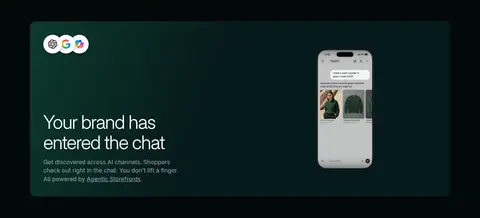
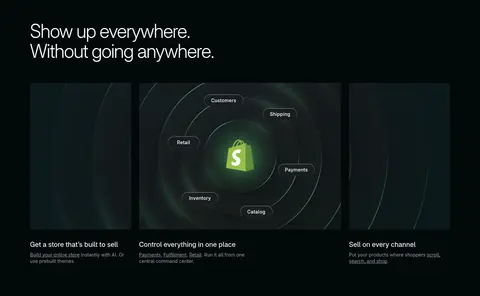
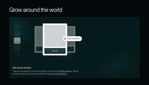
Dark media-led panel with rounded corners, a subtle outline, concise heading, and muted explanatory copy.
Product showcase
Layered checkout, storefront, or admin interface imagery arranged as a feature visual rather than a plain screenshot.
Proof point panel
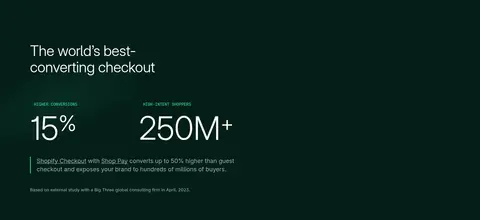
Large white metrics and short labels on a forest-green surface, separated from nearby content with spacious layout.
Footer navigation
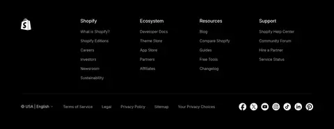
Black footer with multiple link columns, compact muted text, and social or locale controls.
Imagery · Merchant photography and video are central, including the immersive opening and customer stories. Product interfaces, storefronts, app icons, checkout screens, and commerce diagrams appear in layered showcases and card groups. Media is framed in rounded dark panels and often sits against near-black backgrounds; introductory footage is visibly darkened so white copy remains legible. Bright color is largely carried by the featured imagery rather than the page chrome.
Keep the overall canvas near-black and use section bands to distinguish chapters.
Use white for primary headings and high-priority navigation.
Choose merchant and product imagery as the main sources of visual color.
Use thin, lightly weighted display typography with tight tracking.
Make primary actions white pills and secondary actions outlined pills.
Let long-form sections breathe with clear spacing and varied layouts.
✕ 不该做
Do not turn every section into a card grid.
Do not use bright accents as large general-purpose backgrounds.
Do not place dense copy over busy imagery without a dark treatment.
Do not use heavy shadows or prominent borders on routine cards.
Do not make every heading bold or tightly packed.
Do not force the page into a uniformly centered layout.
给 AI 的提示词
想快速出一个同风格的新页面,把这段话连同 DESIGN.md 一起发给 AI。
Build a new Shopify-style page with a cinematic, commerce-first feel. Use Deep Teal Black (#02090a) and Pure Black (#000000) as the core canvas, with Forest Depth (#041e18) and Midnight Navy (#000a1e) reserved for deliberate section changes. Set headings in a light Shopify-Inter-like sans serif, with white text and tight tracking; keep body copy muted and concise. Use full-bleed merchant imagery, product interface compositions, and video-style framing as the main visual content. Keep CTA buttons white pill shapes with dark text, and use outlined white pills for secondary actions. Apply Signal Mint (#36f4a4) and Electric Indigo (#072670) selectively, mostly in small highlights or feature visuals. Alternate editorial feature splits, galleries, and proof-point sections within a wide centered frame. Favor subtle borders and layering over heavy shadows.