North star · Keep the warm neutral canvas and editorial whitespace dominant; use cinematic imagery and product UI as deliberate, contained focal points.
A warm off-white canvas (#f0f0eb) carries nearly the entire page, giving the homepage a calm editorial foundation. The first viewport deliberately breaks from that neutral field: a full-bleed blue-toned photograph supports a very large, light serif headline, white supporting copy, and compact rounded calls to action. Treat those blues as image-led atmosphere, not as a measured interface palette. Below, black display text and muted secondary copy sit amid substantial open space; customer marks and software previews provide visual rhythm without introducing loud section bands. Cranny supplies the expressive headline voice, while ABC Diatype and Satoshi keep navigation and body copy functional. Pale gray-green surfaces distinguish product cards and UI mockups, with fine borders defining edges instead of shadows. The layout favors centered statements and isolated product demonstrations, letting each idea breathe and making the interface imagery the main evidence of the product.
配色
点色块复制色值。用途说明来自对页面的实测位置(背景、文字、描边、按钮)与截图判读。
品牌色
表层色
中性色
功能色
页面底色 · Warm Canvas表层 · Soft Graphite表层 2 · Mist Panel表层 3 · Stone Panel主文字 · Near Ink次要文字 · Muted Charcoal弱文字 · Deep Teal描边 · Soft Graphite
Navigation, links, utility labels, and interface headings
Aa 设计
Satoshi
网络字体 · 字重 400 · 占比 39%
免费替代:Manrope
Body copy and supporting explanatory text
Aa 设计
Cranny
网络字体 · 字重 400 / 300 · 占比 10%
免费替代:Instrument Serif
Display and primary editorial headlines
Aa 设计
Cabinetgrotesk
网络字体 · 字重 500 / 700 · 占比 6%
免费替代:Space Grotesk
Strong secondary headings
角色
示例
字号
字重
行高
字距
特大标题
Oversized, light editorial statement in the hero.
Frontify
80px
300
1
0
一级标题
Primary page and section headline, including the hero title.
Frontify
61px
400
1.1
0
二级标题
Emphatic secondary section heading.
Frontify
40px
700
1
0
三级标题
Product-feature or interface subheading.
The quick brown fox 敏捷的狐狸
18px
400
1.3
0.01em
正文
Supporting paragraphs and explanatory copy.
The quick brown fox 敏捷的狐狸
14px
400
1.3
0.01em
导航
Top navigation labels and menu items.
The quick brown fox 敏捷的狐狸
14px
500
1.67
0
链接
Text links and utility actions such as Pricing or Search.
The quick brown fox 敏捷的狐狸
14px
400
1.67
0
间距与布局
基准单位 8px · 密度:宽松
80px版块间距
32px元素间距
30px卡片内边距
—内容最大宽度
4px
6px
8px
12px
14px
15px
16px
18px
24px
32px
48px
60px
80px
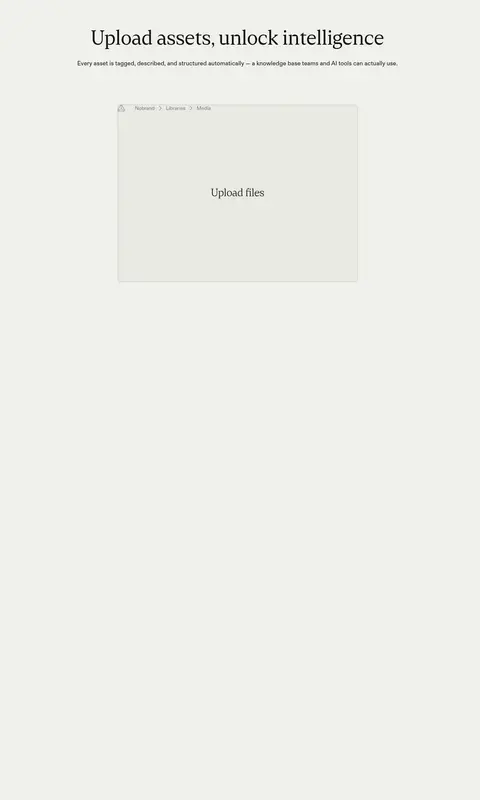
Use a spacious, mostly single-column editorial flow on the warm canvas. The hero spans the viewport with centered title and actions over full-bleed media; subsequent areas return to centered headings and isolated product demonstrations. A logo strip creates a narrow transition, while product previews sit in restrained, centered grids or panels. Measured spacing uses an 8px base, with a spacious density and long section gaps; preserve this generous rhythm rather than compressing content. The crawler did not provide a page max-width, so let screenshots guide responsive container sizing.
圆角与层次
按钮 · 24px
卡片 · 8px
导航 · 9999px
链接 · 9999px
没有测到阴影:页面是扁平的,层次靠底色和描边区分。
The page reads as largely flat: no measured shadows or gradients. Use pale fills and fine borders to separate cards, controls, and mockup panes from the canvas. Rounded controls and softly rounded product cards provide the main depth cues; reserve stronger layering for the hero’s image overlay and floating UI elements.
组件
下面的预览按实测的按钮、输入框、徽标、卡片样式重建(字体用替代字体)。
Top navigation
A light rounded navigation bar sits over the hero media, with compact ABC Diatype labels, menu indicators, a light outlined Login control, and a dark Demo CTA.
Hero actions
Pair a Near Ink (#111110) filled demo button with white text and a transparent, white-outlined secondary action; both use pill-like rounded ends.
Logo strip
Customer marks appear in a horizontal band on the same Warm Canvas (#f0f0eb), acting as a quiet credibility transition rather than a colored section.
Product cards
Show interface content on Mist Panel (#e9e9e3) or Stone Panel (#e1e1db) fills, with Deep Teal (#042a2b) text and restrained rounded corners.
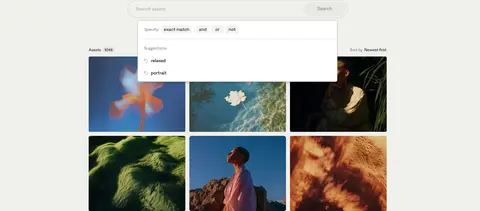
Asset search preview
A search field and filters sit above a compact thumbnail gallery; use a clear input area, understated controls, and image-led results.
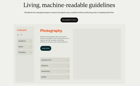
Guideline showcase
Present the product UI as a wide, pale mockup with a narrow navigation pane, content column, and large preview area.
Imagery · Lead with a full-bleed cinematic photograph featuring a person in an outdoor landscape, with a framed asset-tool overlay. Later imagery is mostly customer marks, asset thumbnails, and software UI previews. Keep photography rich and atmospheric, while product mockups remain pale, crisp, and low-contrast; vivid colors within thumbnails belong to imagery, not the core palette.
Keep Warm Canvas (#f0f0eb) as the dominant page field.
Use Cranny for large, editorial headline moments.
Keep navigation and body copy compact and functional.
Let product mockups sit on pale gray-green surfaces.
Use near-black filled buttons for primary actions.
Give sections generous breathing room.
Treat hero blues as photography, not interface palette.
✕ 不该做
Don't introduce a saturated brand-color system absent from the measured palette.
Don't turn every section into a colored card or band.
Don't add drop shadows as a default separation method.
Don't crowd headings, copy, and product previews together.
Don't use decorative gradients to imitate the hero photograph.
Don't make product UI louder than the editorial headline.
给 AI 的提示词
想快速出一个同风格的新页面,把这段话连同 DESIGN.md 一起发给 AI。
Build a new Frontify-style SaaS page with a warm, spacious editorial character. Use Warm Canvas (#f0f0eb) for the main background, Near Ink (#111110) for headlines and primary buttons, and Muted Charcoal (#464643) for supporting copy. Set large headlines in an expressive light serif close to Cranny; use a clean utility sans close to ABC Diatype for navigation and controls. Give the opening section a cinematic, full-bleed photograph with centered copy and compact pill-shaped actions, then return to quiet neutral sections with generous gaps. Use Mist Panel (#e9e9e3) and Stone Panel (#e1e1db) for restrained product UI previews, with Deep Teal (#042a2b) for interface text. Prefer fine borders over shadows, keep imagery distinct from interface colors, and preserve strong whitespace around each product demonstration.