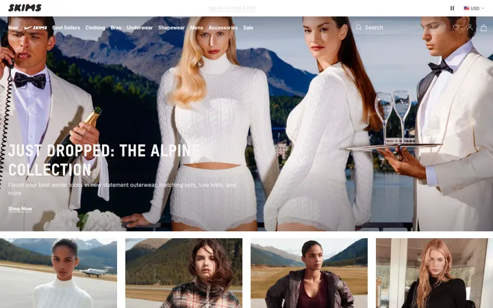
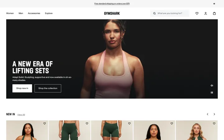
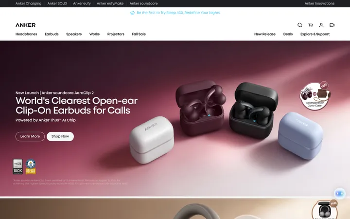
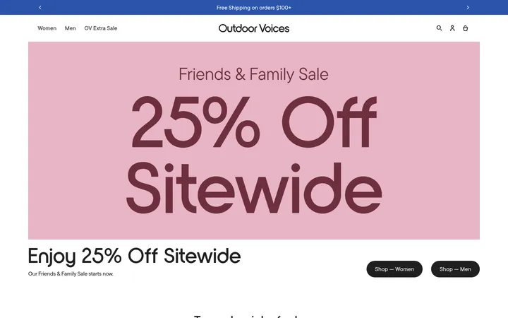
North star · Keep the storefront quiet and legible so full-bleed sports campaigns and product photography provide the visual impact.
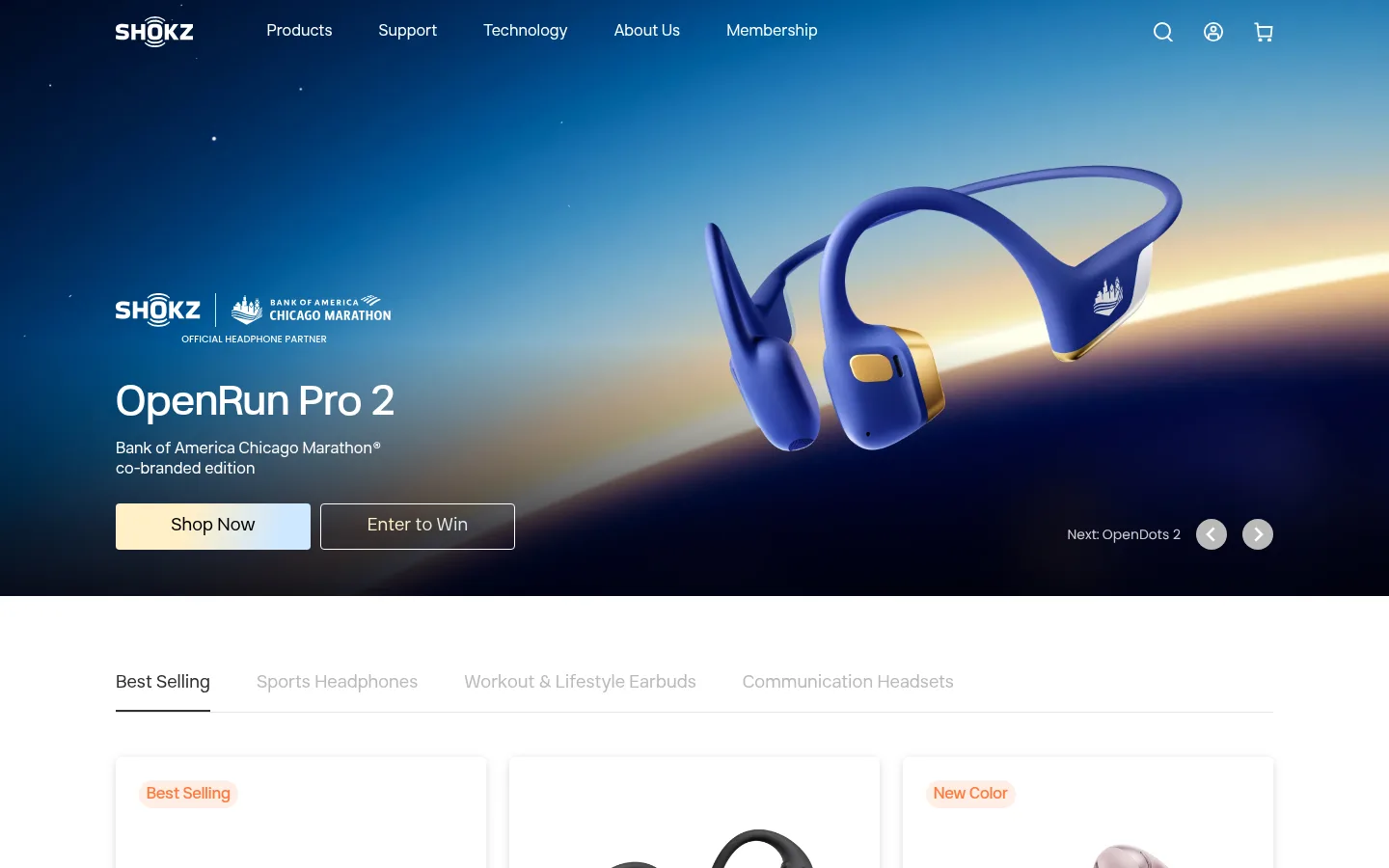
The page uses a white canvas as the quiet frame for a sequence of product, editorial, and community stories. Pale gray bands and cards separate content without competing with imagery; black is reserved for the footer and select inverse sections. Product and athlete photography carry most of the color, while the hero’s blue-to-night campaign image creates the strongest visual contrast. Shokz Sans Display gives headings a clean, open shape, and Shokz Sans Text handles navigation, descriptions, and commerce details in a consistent sans-serif voice. Layout alternates full-bleed campaign panels with centered product and benefit grids, leaving generous breathing room between major stories. Product cards remain light and restrained, with fine borders and subtle shadow rather than heavy framing. Warm and cool button fills appear as campaign accents, not as a site-wide color system.
Navigation, body copy, captions, buttons, links, and commerce details.
Aa 设计
Shokz Sans Display
网络字体 · 字重 400 / 500 · 占比 21%
免费替代:Montserrat
Headings and selected display-style links or campaign controls.
角色
示例
字号
字重
行高
字距
一级标题
Campaign hero headline and major page-level titles.
Shokz
42px
400
1.05
0
二级标题
Section titles and prominent story headings.
Shokz
28px
500
1.1
0
三级标题
Product and feature card titles.
The quick brown fox 敏捷的狐狸
22.5px
400
0.72
0
四级标题
Secondary headings within editorial or service content.
The quick brown fox 敏捷的狐狸
20px
400
1.2
0
正文
Product descriptions, benefit details, and standard explanatory copy.
The quick brown fox 敏捷的狐狸
16px
400
1.3
0
辅助文字
Small labels and compact supporting information.
The quick brown fox 敏捷的狐狸
14px
400
1.3
0
按钮
Primary and secondary calls to action.
The quick brown fox 敏捷的狐狸
18px
400
1.3
0
导航
Header navigation and primary site links.
The quick brown fox 敏捷的狐狸
16px
400
1.3
0
链接
Inline actions, secondary destinations, and footer links.
The quick brown fox 敏捷的狐狸
14px
400
1.5
0
间距与布局
基准单位 4px · 密度:适中
80px版块间距
10px元素间距
24px卡片内边距
1200px内容最大宽度
1px
2px
3px
4px
6px
8px
10px
12px
14px
16px
18px
20px
24px
32px
48px
60px
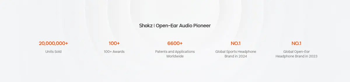
The homepage alternates full-width campaign imagery with centered commerce and editorial content. The measured layout uses a 1200px maximum page width, a comfortable density, and a flexible multi-column grid: product cards, benefits, and stories align in tidy rows while some image-led sections span the viewport. Section spacing is generous, with tighter groupings inside cards and navigation. Most headings align to the start of their content; selected discovery and brand-stat blocks are centered. Keep the footer and newsletter visually distinct from the white shopping canvas.
圆角与层次
按钮 · 4px
卡片 · 6px
链接 · 4px
md · link
The page is predominantly flat: white backgrounds, pale gray cards, and fine separators do the structural work. Product cards have restrained borders and a subtle measured shadow rather than pronounced depth. Use dark overlays only where white campaign copy sits on photography, and reserve strong contrast for the black footer and hero.
组件
下面的预览按实测的按钮、输入框、徽标、卡片样式重建(字体用替代字体)。
Campaign hero
Full-bleed sports campaign with white navigation and copy, product imagery, and paired filled and outlined CTAs.
Product category tabs
Horizontal category navigation with a dark active underline and muted inactive labels.
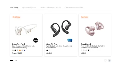
Product cards
Light cards with product images, compact names, descriptions, pricing, and occasional small promotional labels.
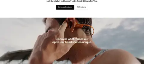
Discovery feature
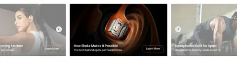
Large immersive image or video with centered copy, followed by smaller image-led technology and sport cards.
Benefits row
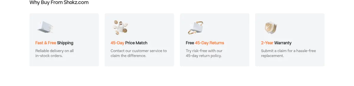
Four pale gray service cards covering shipping, price matching, returns, and warranty.
Community banner
Full-width group photograph with darkened treatment, centered white message, and two contrasting actions.
Newsletter and footer
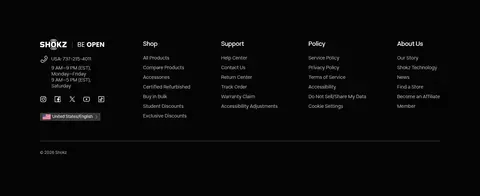
Compact signup area above a black footer with light logo, contact details, and grouped link columns.
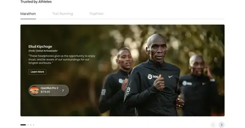
Imagery · Use large, cinematic sports and lifestyle photographs for campaign banners and athlete stories, with product photography isolated on bright, uncluttered card backgrounds. Hero imagery can be full bleed and high contrast, showing headphones clearly against a dramatic outdoor scene. Editorial sections mix wide photographs with compact cards; video is used as an immersive discovery feature. The measured palette includes illustration-like gradient colors, but the screenshots show photography—not decorative gradients—as the defining brand imagery.
Use white space to separate shopping, editorial, and community content.
Let full-bleed campaign photography carry the strongest visual color.
Keep product imagery clean and clearly visible inside light cards.
Use Shokz Sans Display for headings and Shokz Sans Text for interface copy.
Build category navigation with a clear active underline and muted inactive labels.
Keep borders and shadows subtle rather than adding heavy card depth.
✕ 不该做
Do not turn the entire storefront into a dark interface.
Do not apply the campaign gradient as a default page background.
Do not add strong shadows or thick borders to product cards.
Do not let decorative color compete with headphone photography.
Do not compress major sections into a dense continuous grid.
Do not use all-caps typography or exaggerated letter spacing.
给 AI 的提示词
想快速出一个同风格的新页面,把这段话连同 DESIGN.md 一起发给 AI。
Build a responsive consumer-electronics storefront page in the Shokz visual style. Use Gallery White (#ffffff) as the main canvas, Mist Panel (#f3f4f6) for selected cards and bands, Charcoal Text (#2f2f2f) for UI copy, and Near Black (#0a0a0a) for primary headings. Use Shokz Sans Display or a close geometric sans for headings, with Inter-like text for navigation and body content. Structure the page as alternating full-bleed campaign imagery and centered commerce or editorial grids. Keep product cards light, orderly, and subtly outlined; use strong photography rather than decorative gradients for visual impact. Reserve Midnight Black (#050505) for inverse sections and the footer. Use warm cream and sky tint only as restrained campaign accents. Maintain generous section breathing room and clear active navigation states.